
Nasty Gal
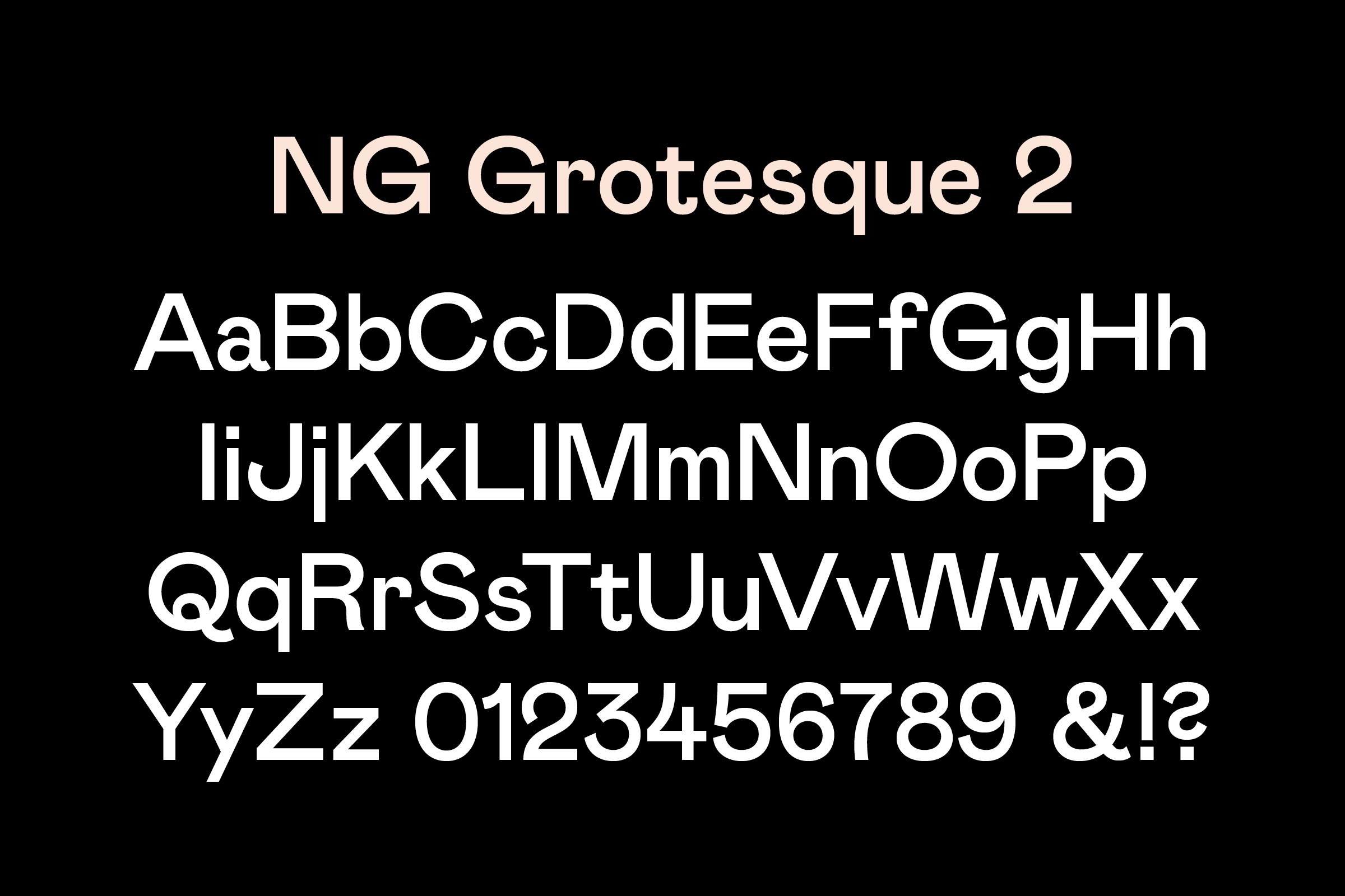
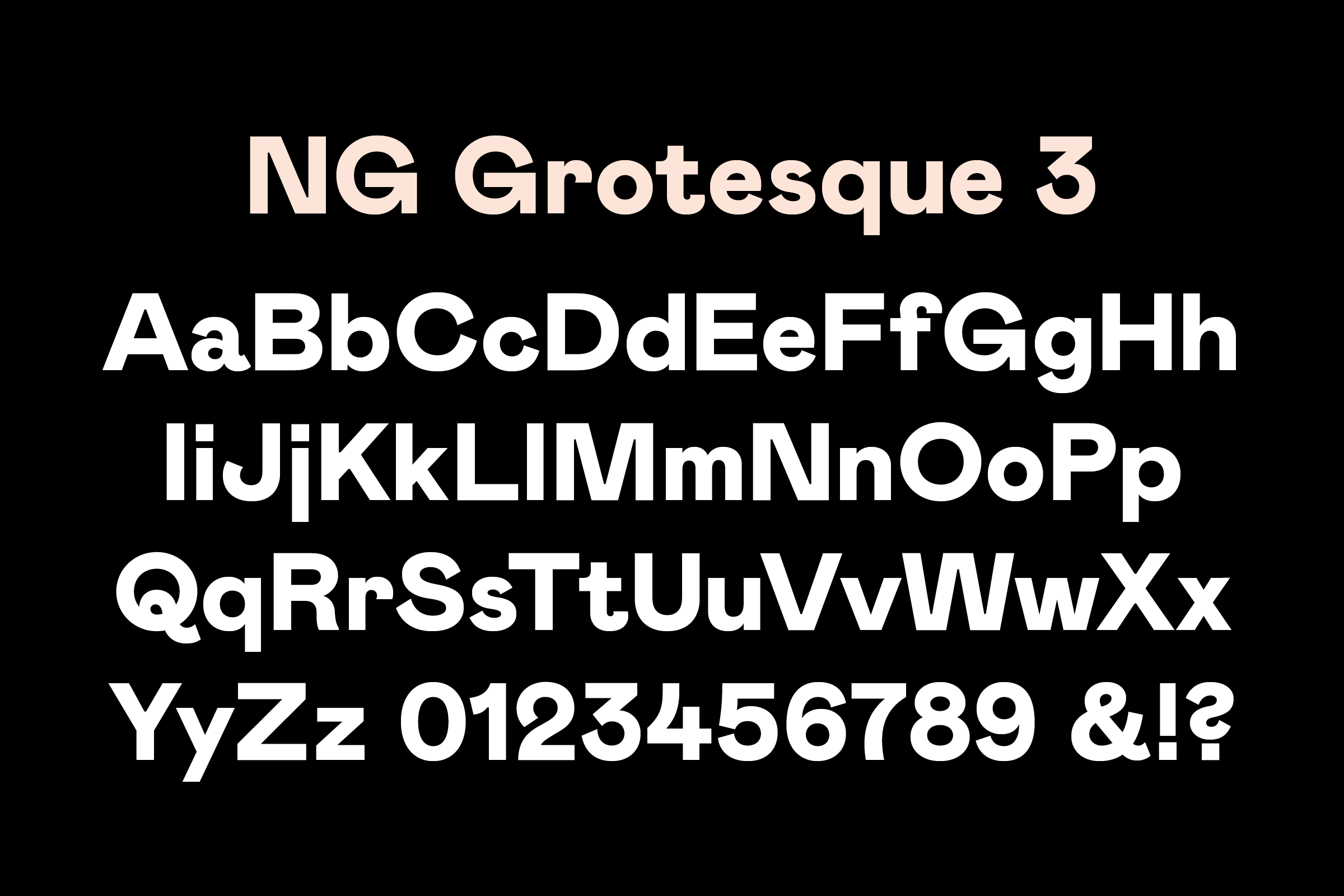
For its 2014 brand refresh, Colophon was commissioned to create a workhorse sans-serif that the LA-based apparel company could use in concert with several rotating display types. Our proposal to the creative team at Nasty Gal was to create a three-weight type toolkit (as opposed to a traditional type ’family’). This programme negated the inclusion of conventional italics in favor of stylistic features, and also did away with a conventional naming structure (substituting 1, 2, 3 in place of Light, Medium, Bold), allowing in-house designers to respond to the forms inherent to the three weights as opposed to the common use-cases and hierarchies associated with ‘Light’, ‘Medium’, and ‘Bold’.
- Typeface
- NG Grotesque
- Comissioner
- Nasty Gal
- Year
- 2014
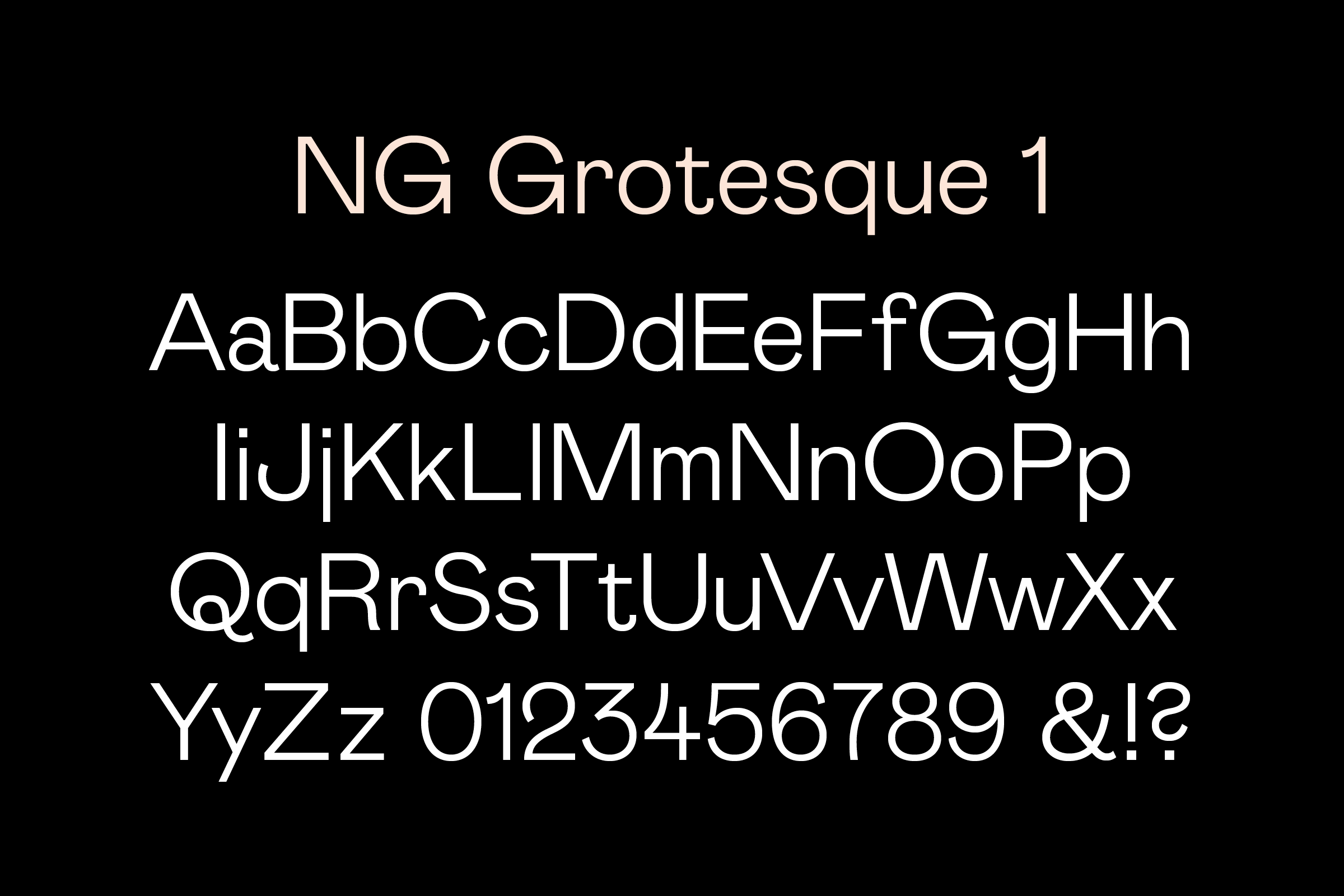
- Styles
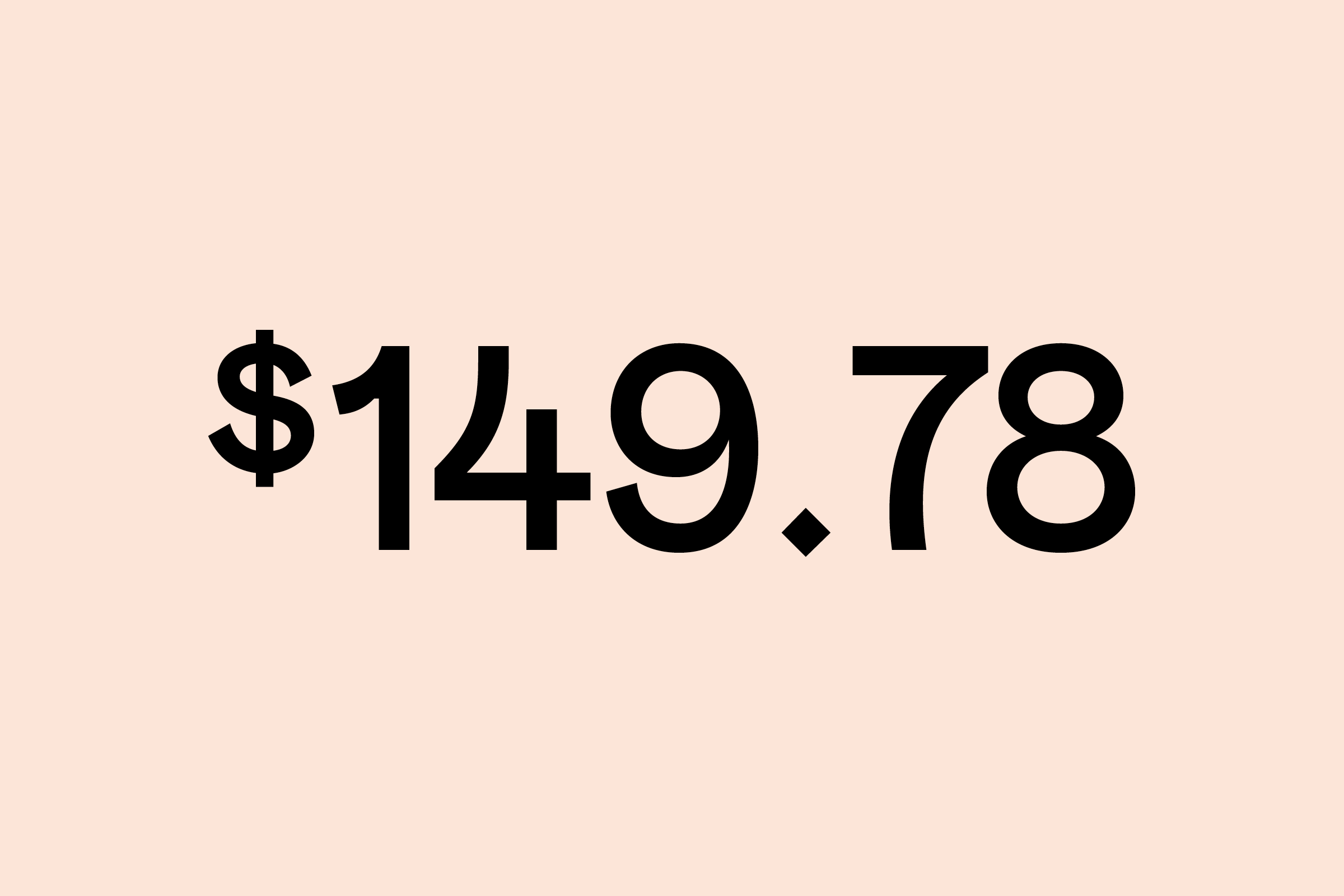
- 3 Styles: 1 (Light), 2 (Medium), 3 (Bold)
- Coverage
- Adobe Latin-2
- Classification
- Grotesque Sans Serif
- URL
- nastygal.com
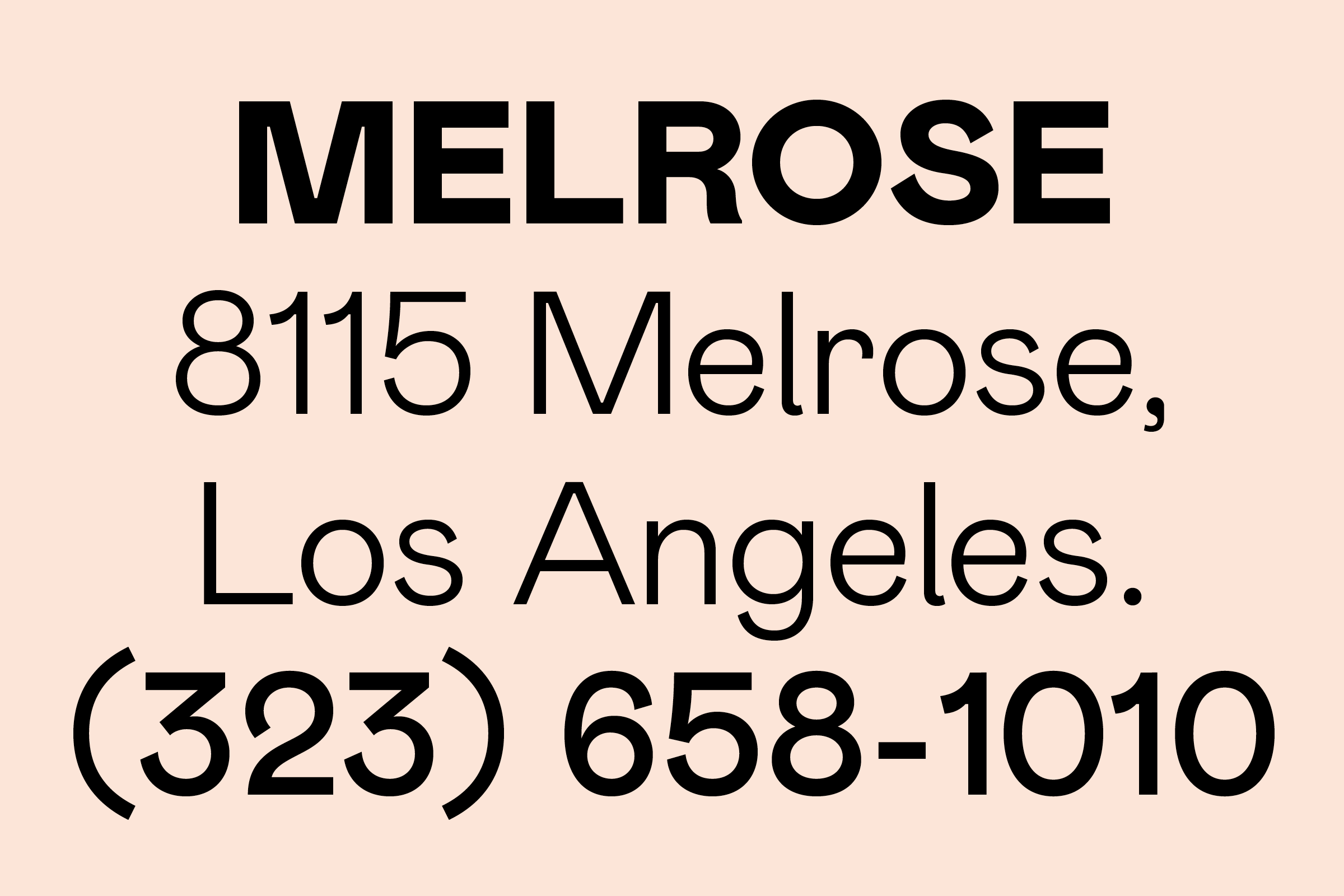
A portion of our initial brainstorming document reads: "With one foot amidst the rational geometries of early-to-mid 20th Century sans-serifs (Renner & Futura), and the other in the idiosyncratic forms of the late 19th Century grotesks (Berthold & Akzidenz), NG Grotesque posits itself as many things at once — simultaneously Contemporary and Historic, Rigorous and Gestural, Objective and Subjective, Well-Behaved and Misbehaved.” Nasty Gal adored the classicism of a wordmark like Chanel’s but wanted to filter it through the aesthetics born of the Riot Grrrl and third-wave feminism.
)
)
This intentionally-split personality of the brand and its customer seeks to convey a concurrent youthfulness and sophistication. Dualities abound: the corresponding type is candid and unapologetic, but is also a bit mischievous at times. It can be be very forthright in certain settings but also contains necessary moments of sensitivity and delicacy in its drawing. It is cultivated but imprecise; refined and coarse all at once.
The company’s frequent use of outside collaborators and freelancers, and the wide range of abilities and sensibilities within that workforce, further prompted us to seek out ways of expanding the innate gesture or expressivity built into the type. To this end, the three weights of NG Grotesque have copious, easily-accessible stylistic alternates in the name of keeping type settings consistent but textural.
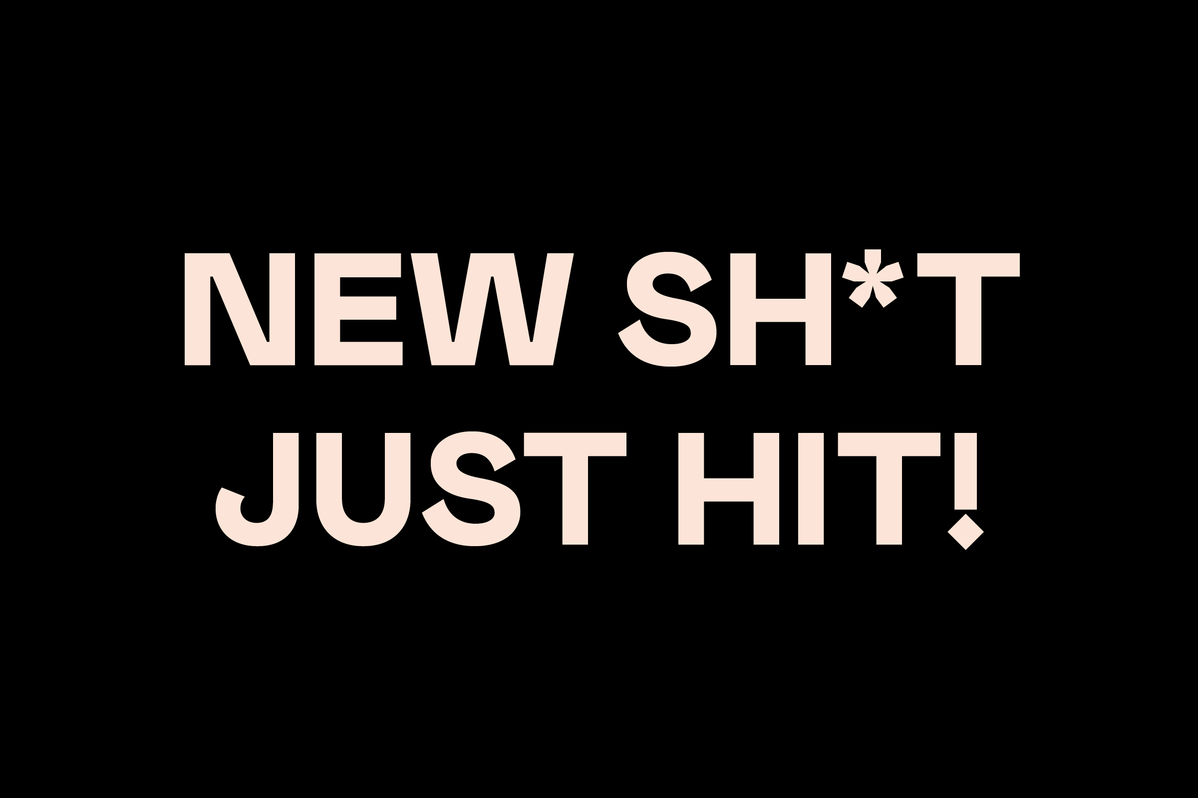
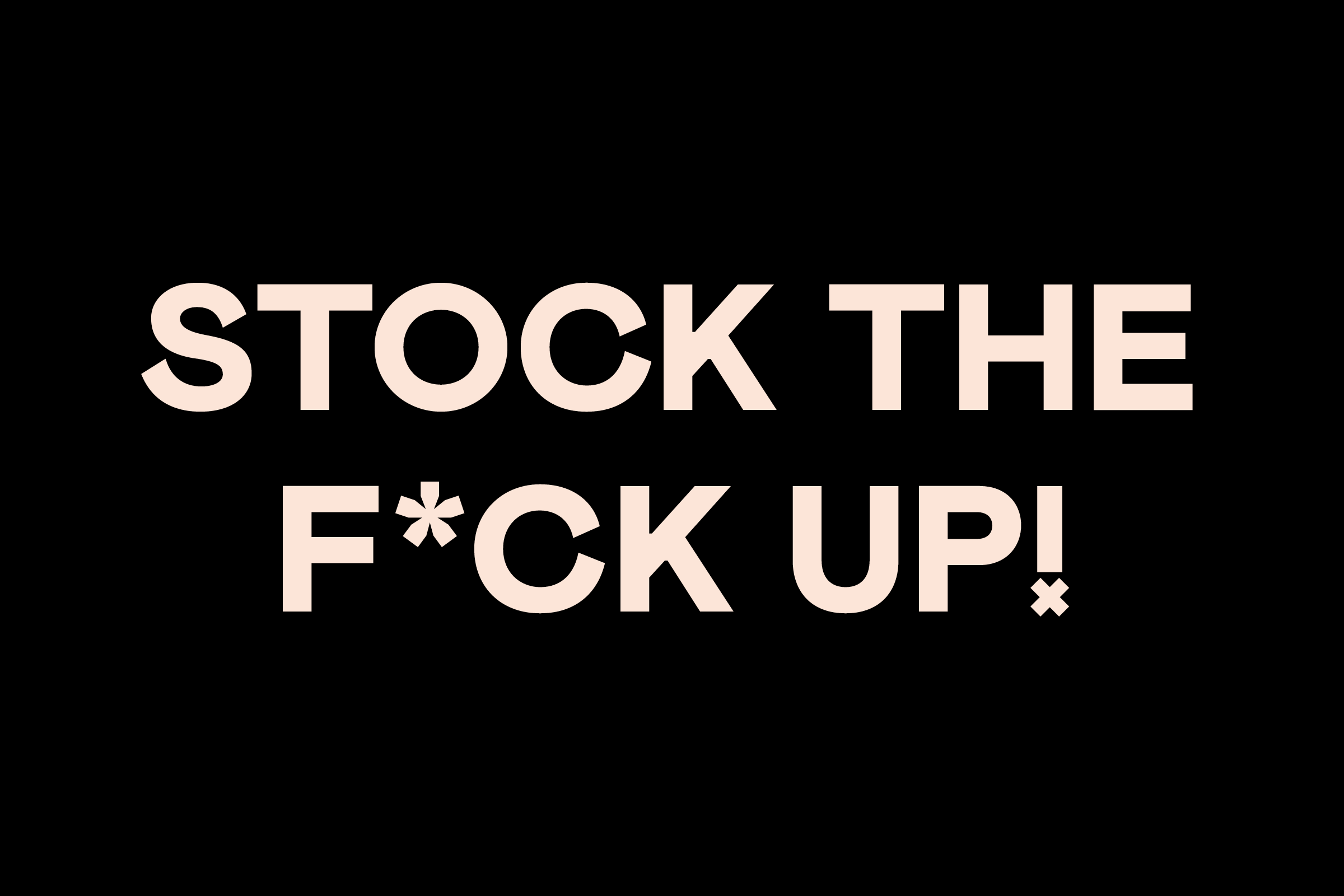
In tandem, art directors and senior designers at Nasty Gal were fascinated by different shapes of punctuation and would often manually swap out square for circle, and vice versa. As an answer to this tedious task, we included four punctuation shapes that designers could use interchangeably — the standard square / rectangle could just as easily be swapped out for a slightly more playful circle, a decidedly British diamond, or a more impish x-shape.
In the case of Nasty Gal and NG Grotesque, our initial explorations ultimately led us toward a series of types that, in their ideal state, manage to reference a vague past, capture a version of the present, and posit an amorphous timelessness for the brand.
)
)
Recent Custom Projects
View all

Let’s Work Together
To talk to us about your project, please get in touch.
