
Lafayette Anticipations
Shortly after it was announced that Rem Koolhaas' OMA would be heading up the contemporary renovation of a 19th-century Parisian building for the Galeries Lafayette Foundation, Wolff Olins set to work crafting a graphic identity for the new arts venue that would dialogue directly with the architecture and its future occupants. Commissioning Colophon to draw a typeface that would lead the way, the London-based branding agency was keen to foster a typographic call-and-response with the new infrastructure of the building: a courtyard tower with a set of four motorised platforms that dynamically change the programming across the building's seven static floors.
- Typeface
- Anticipations Sans
- Comissioner
- Wolff Olins, London
- Year
- 2016
- Styles
- 2 Styles: Condensed
- Coverage
- Adobe Latin-2
- Awards
- 2 x D&AD Awards 2018 Fast Company Innovation by Design Awards 2018 Silver Lion, Cannes Lion 2018
- Classification
- Dynamic Display
- URL
- wolffolins.com
- lafayetteanticipations.com/en

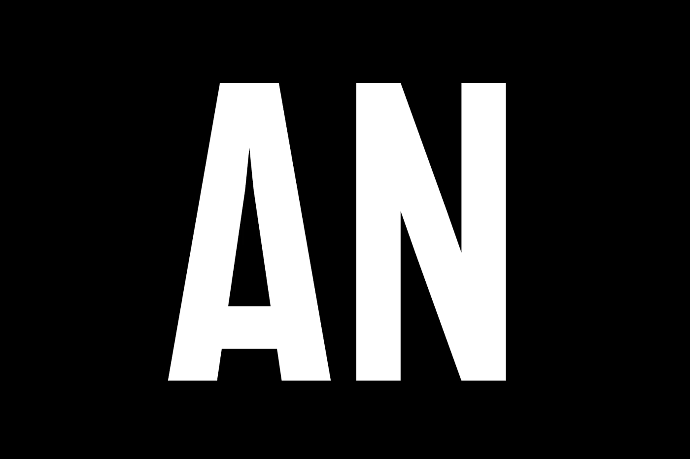
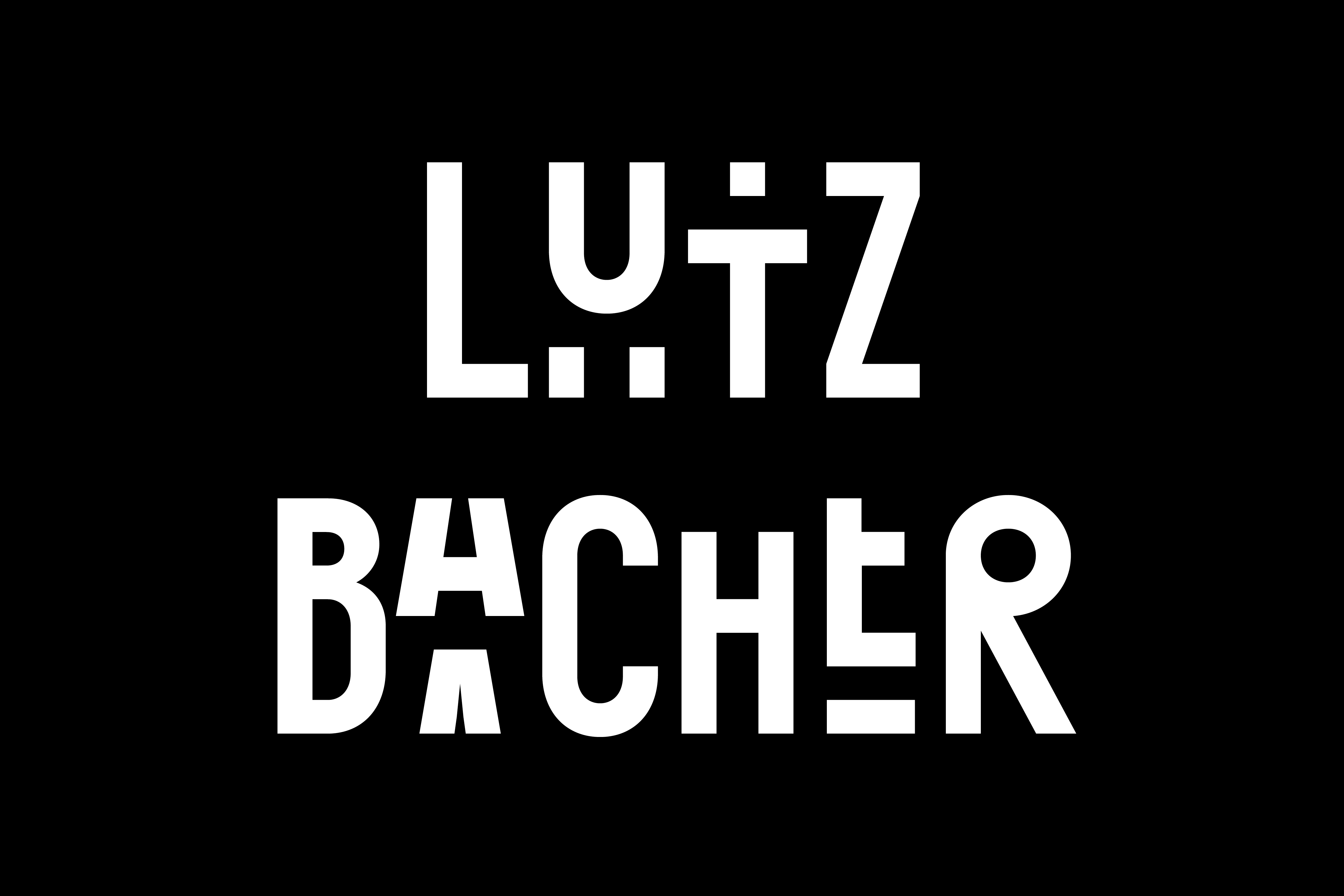
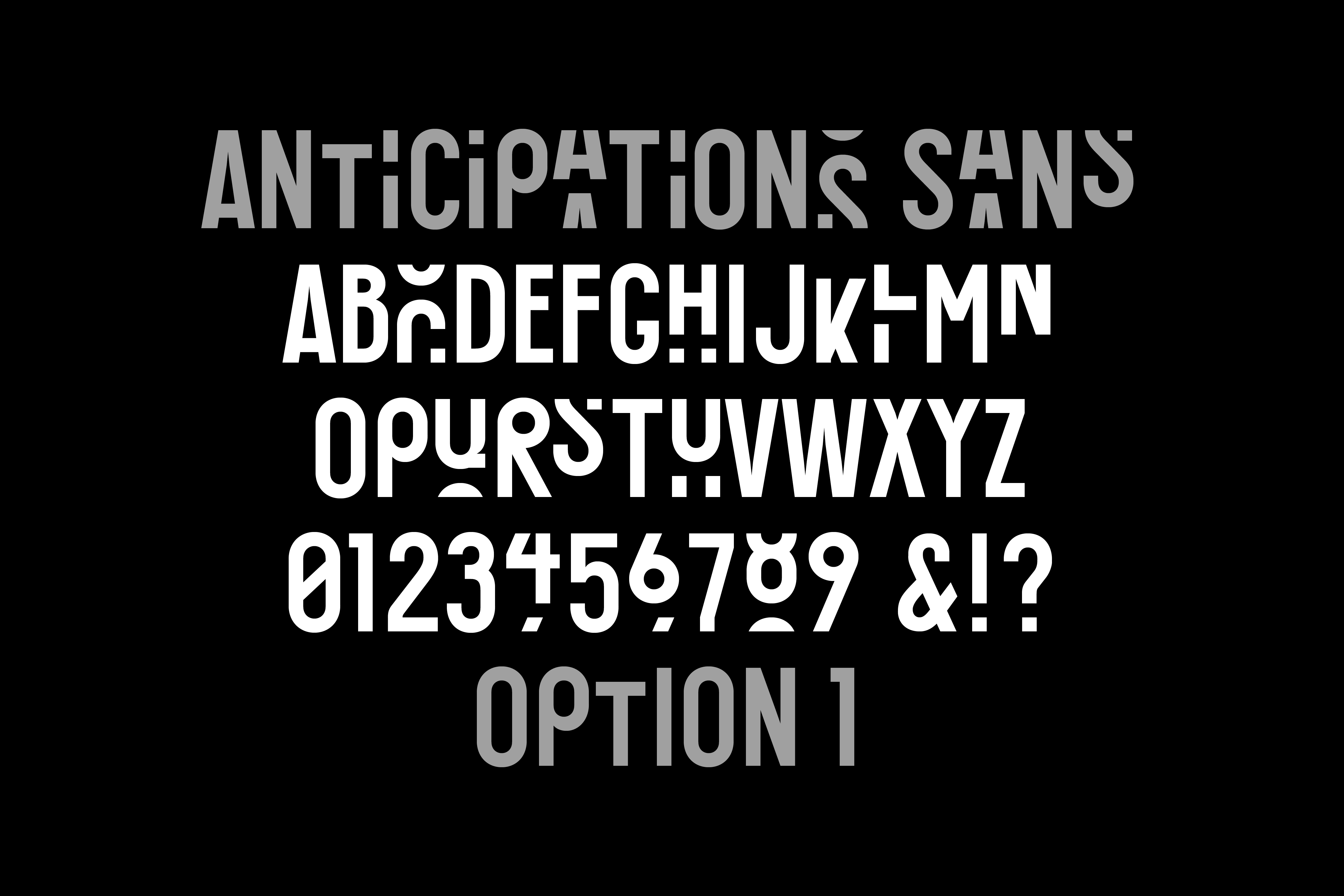
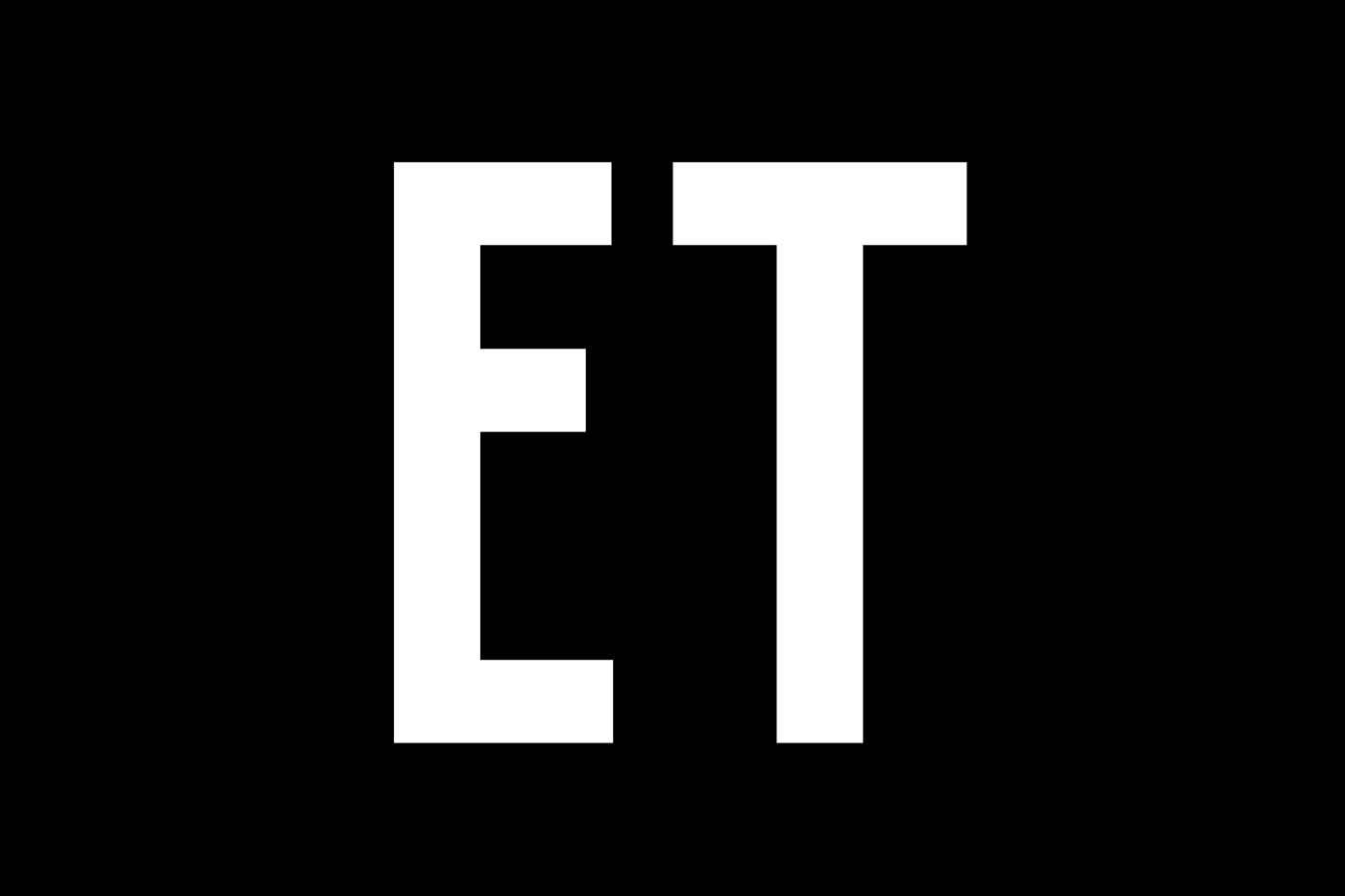
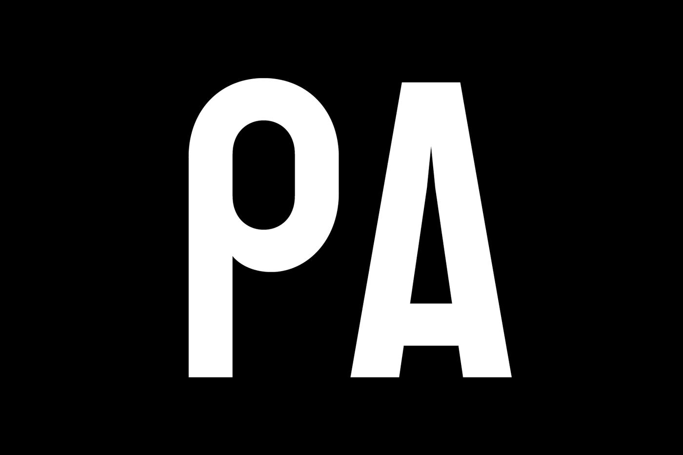
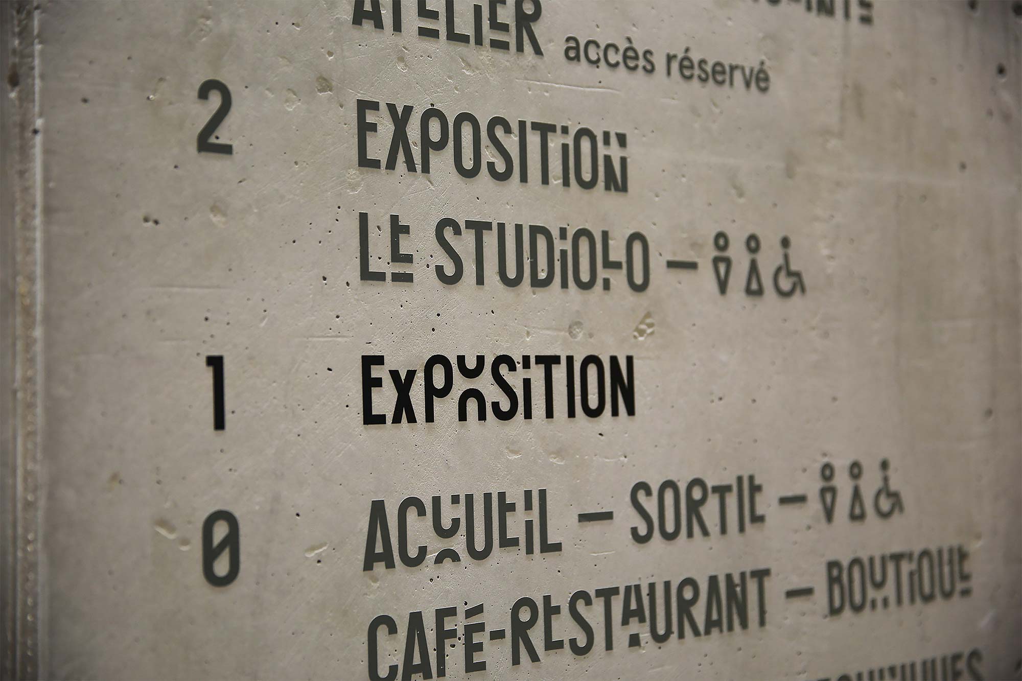
Derived from the need for flexibility, the architectural concept offered the Foundation a new curatorial dimension, complementing and re-framing the traditional use of the heritage-preserved classical structure. In designing and engineering an accompanying typeface, we brought this conceit to the fore: ever-changing capital letters move in and out of a character's given frame, concealing and revealing pieces of language as a means of mimicking the shifting exhibition tower, while also prompting anticipatory readings of semi-familiar words and phrases.
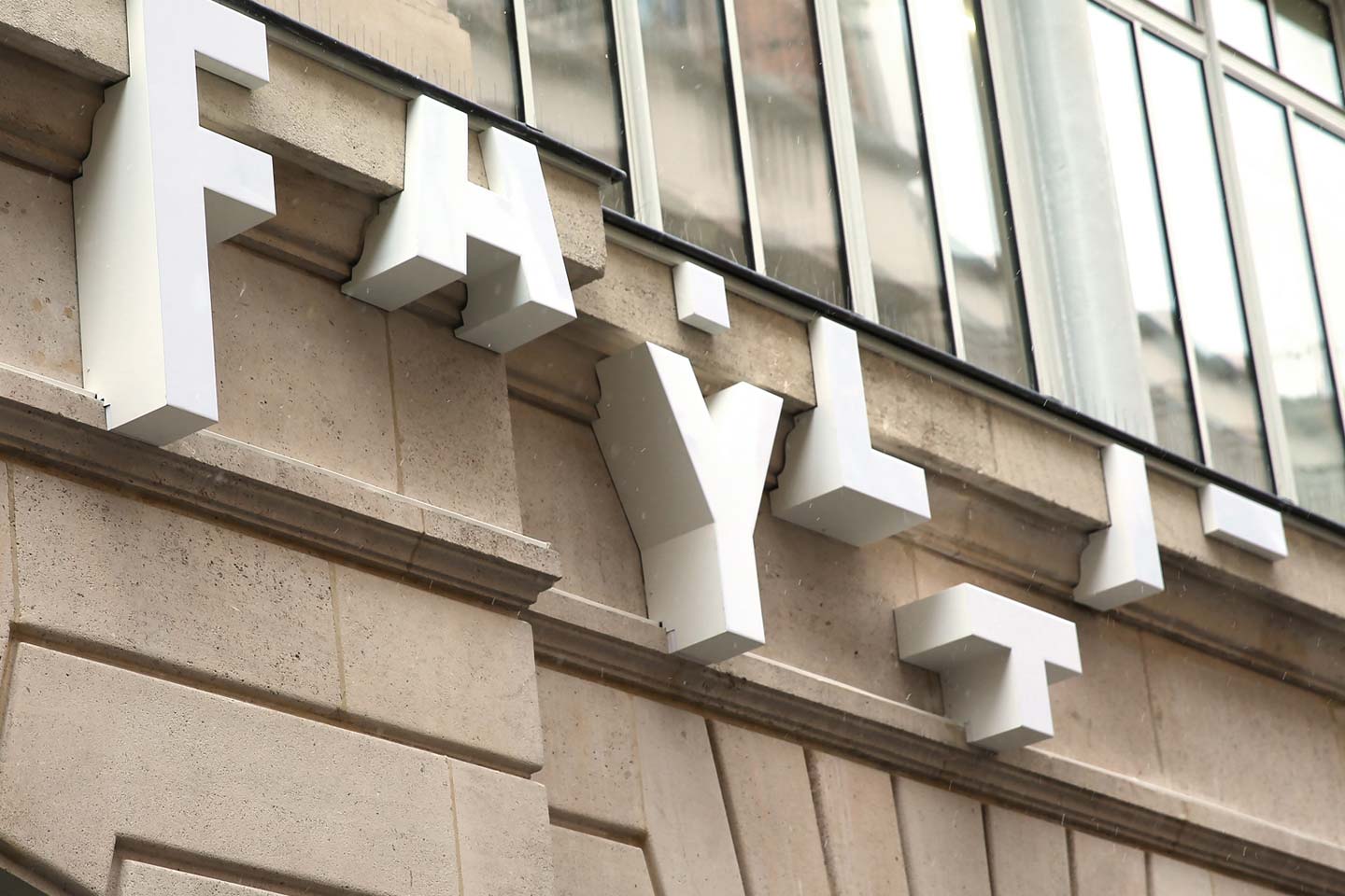
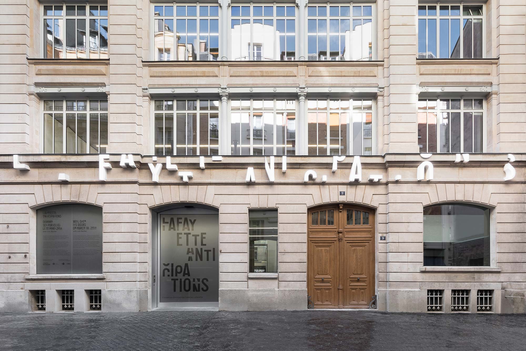
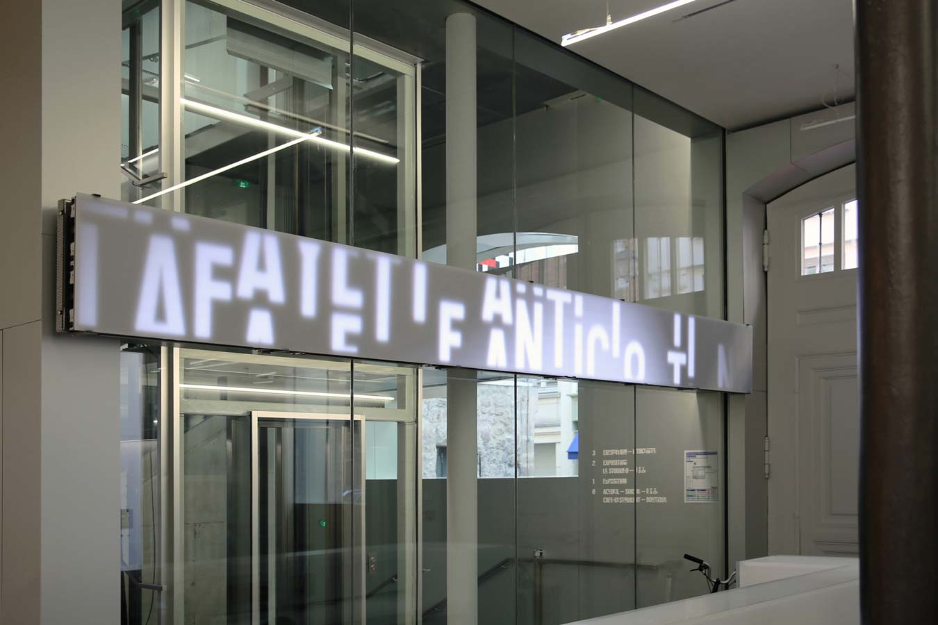
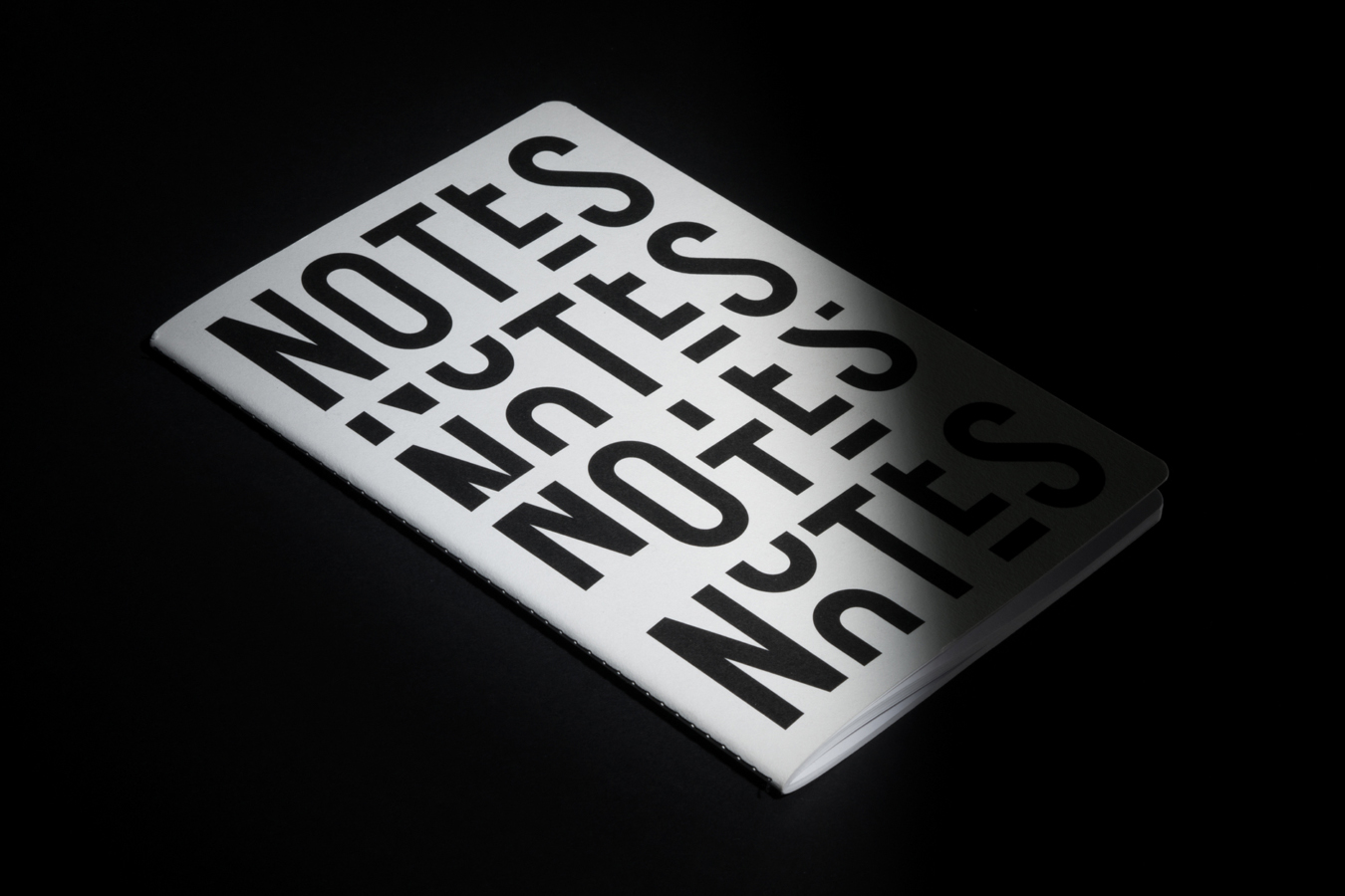
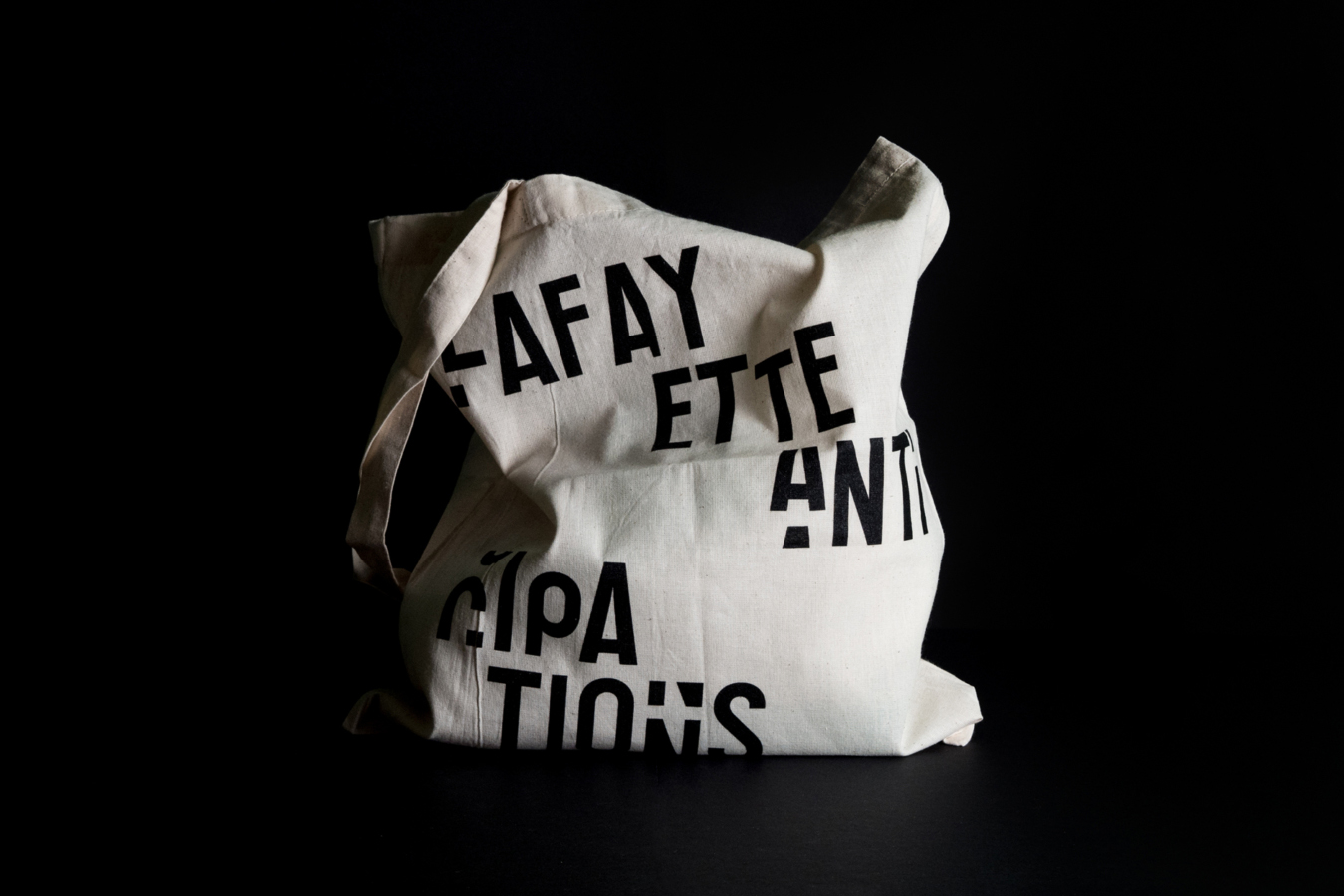
The façade of Lafayette Anticipations — at 9 Rue de Platres in Le Marais, just east of the similarly devious Centre Pompidou — was soon adorned with a customized setting of the type, and followed shortly after by applications across architectural signage, wayfinding, print collateral, products, garments, and digital applications in order to ultimately support diverse programmes in sculpture, ceramics, fashion, design, and performance.
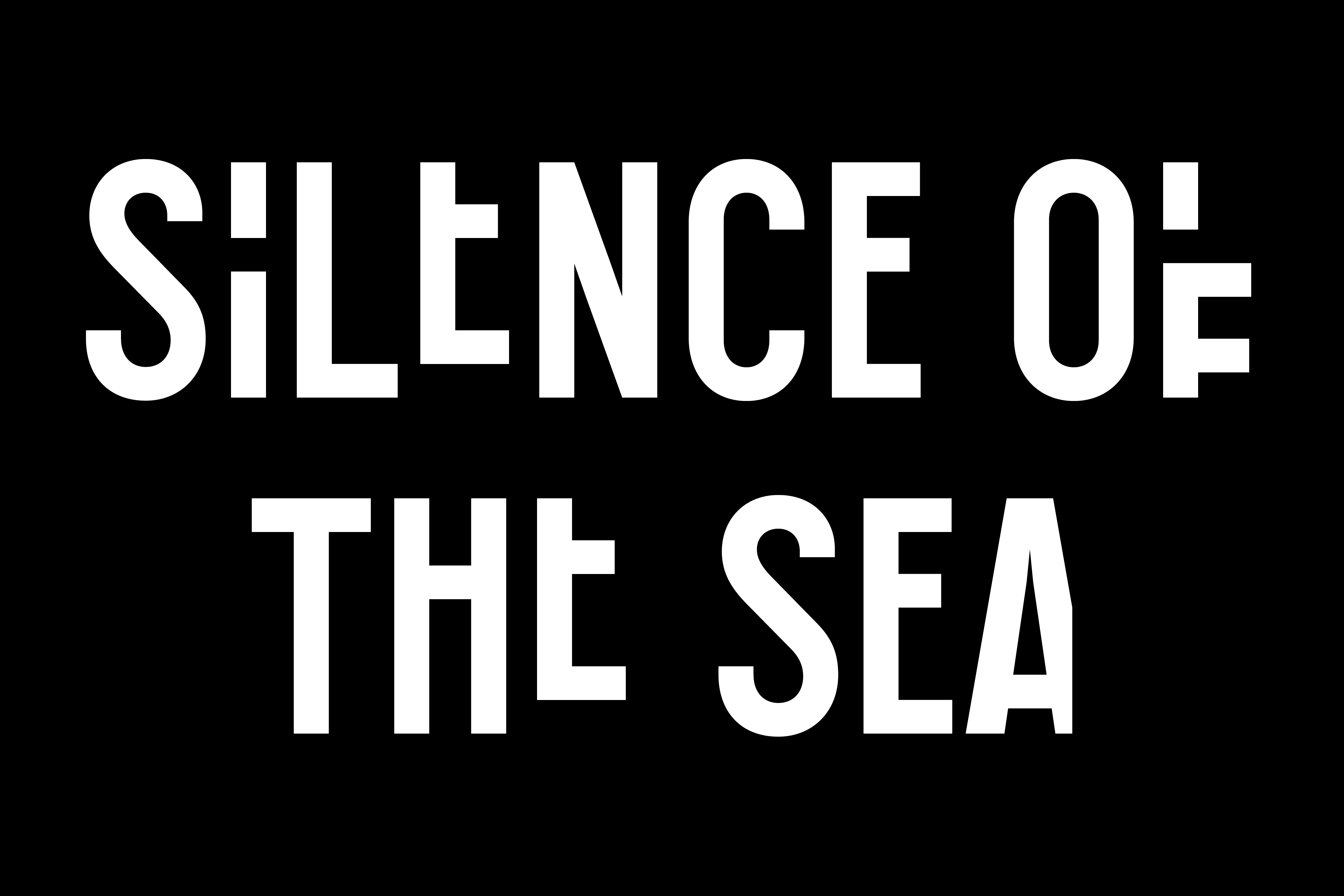
In typographically answering to the 49 different configurations achievable via the building's pioneering system of moving platforms, Wolff Olins proposed a strict character grid that allowed for seven different vertical arrangements of each A–Z letterform, prompting a 182-character alphabet with a vast number of unique character pairs. In order to then assist in the facile application of an otherwise idosyncratic set of types, Colophon built several tools that allowed succinct visual communication among Foundry, Agency, and Client.
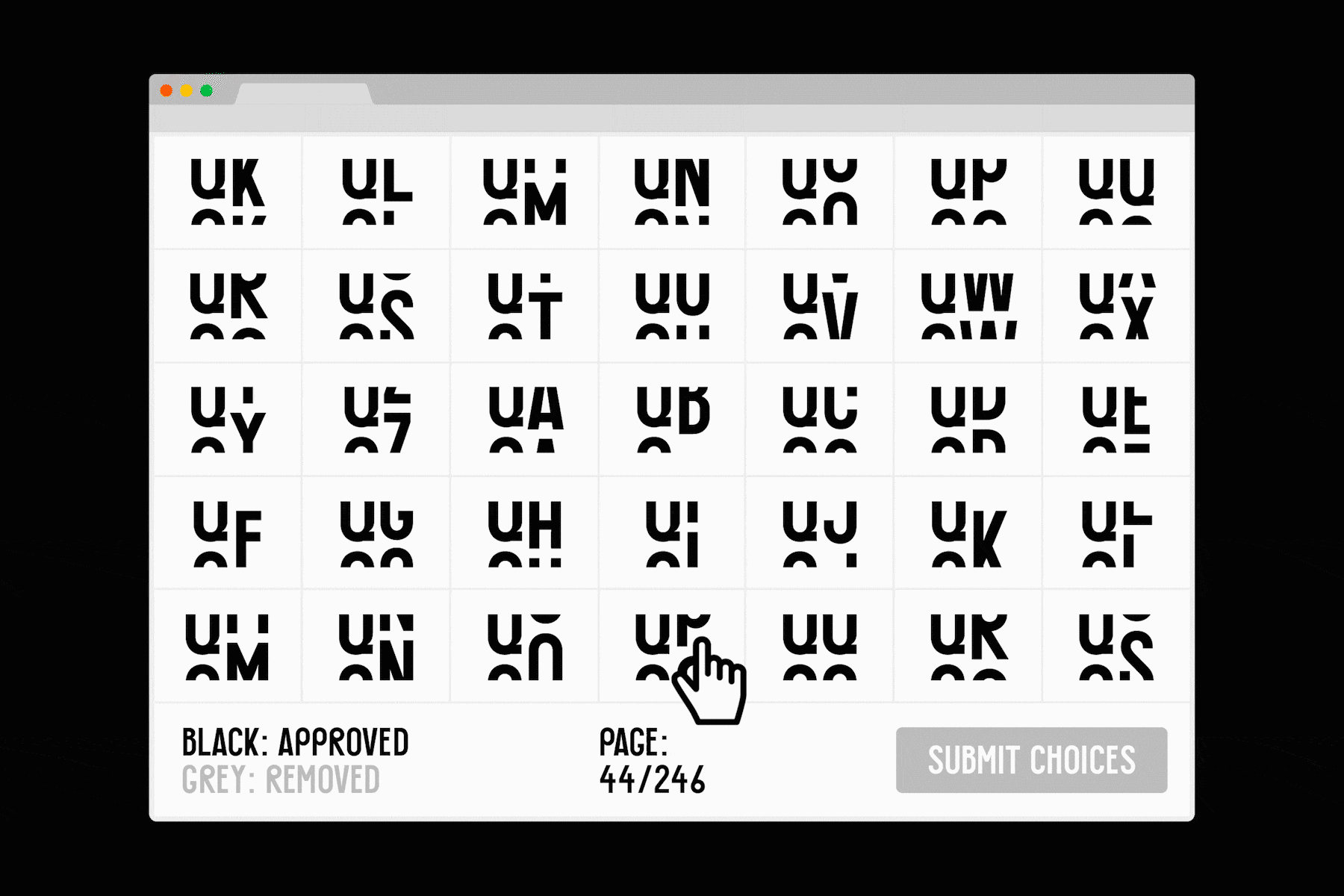
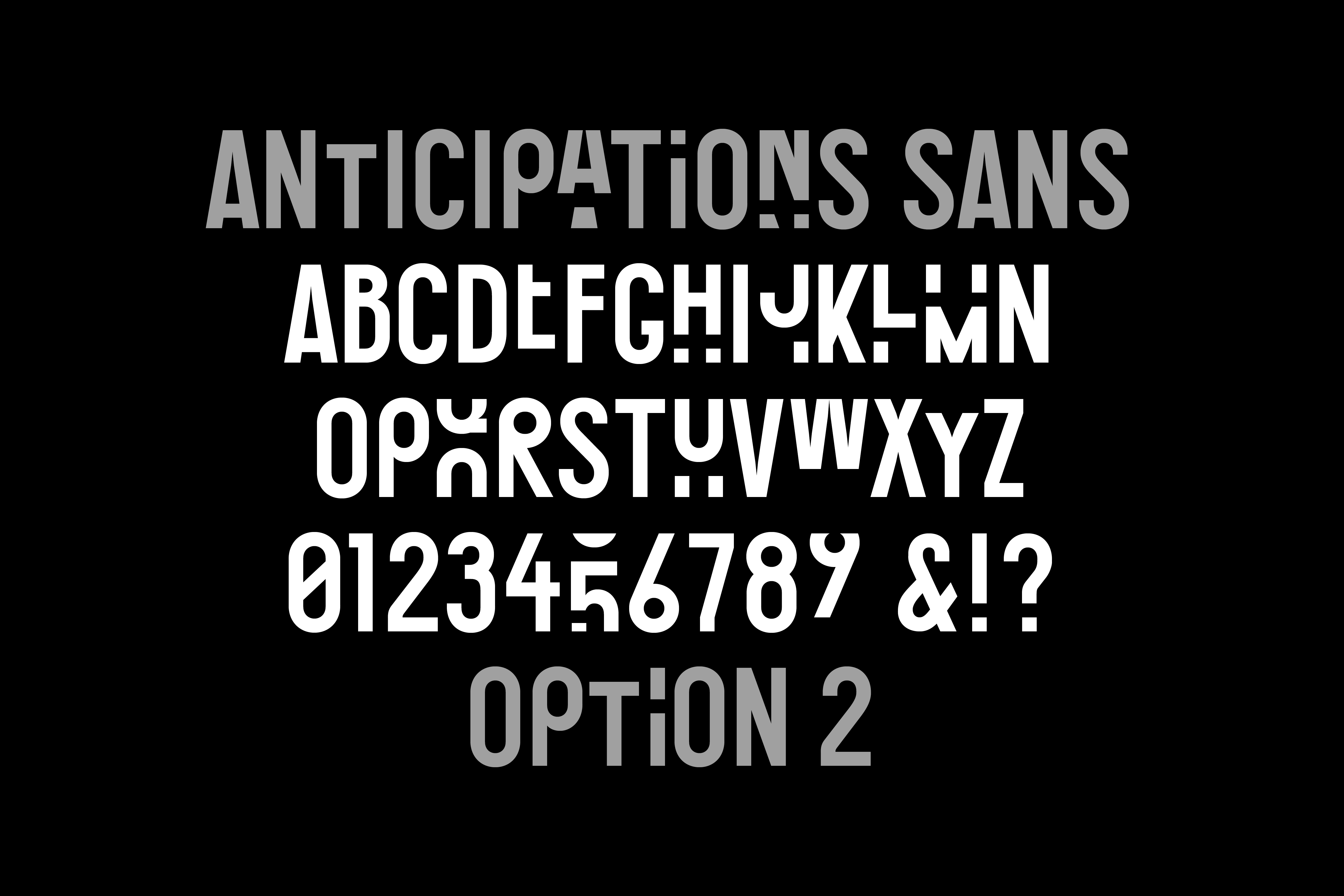
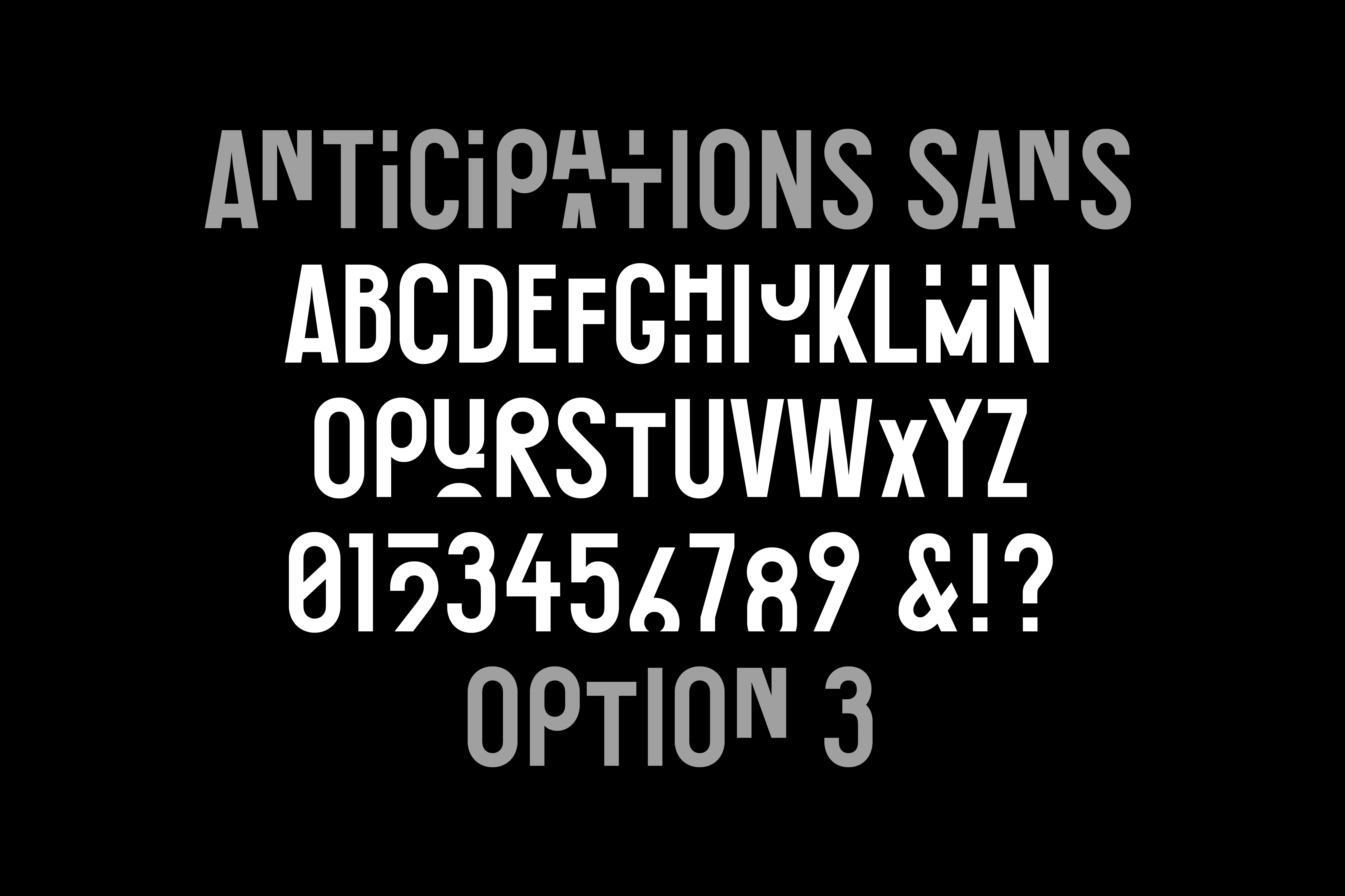
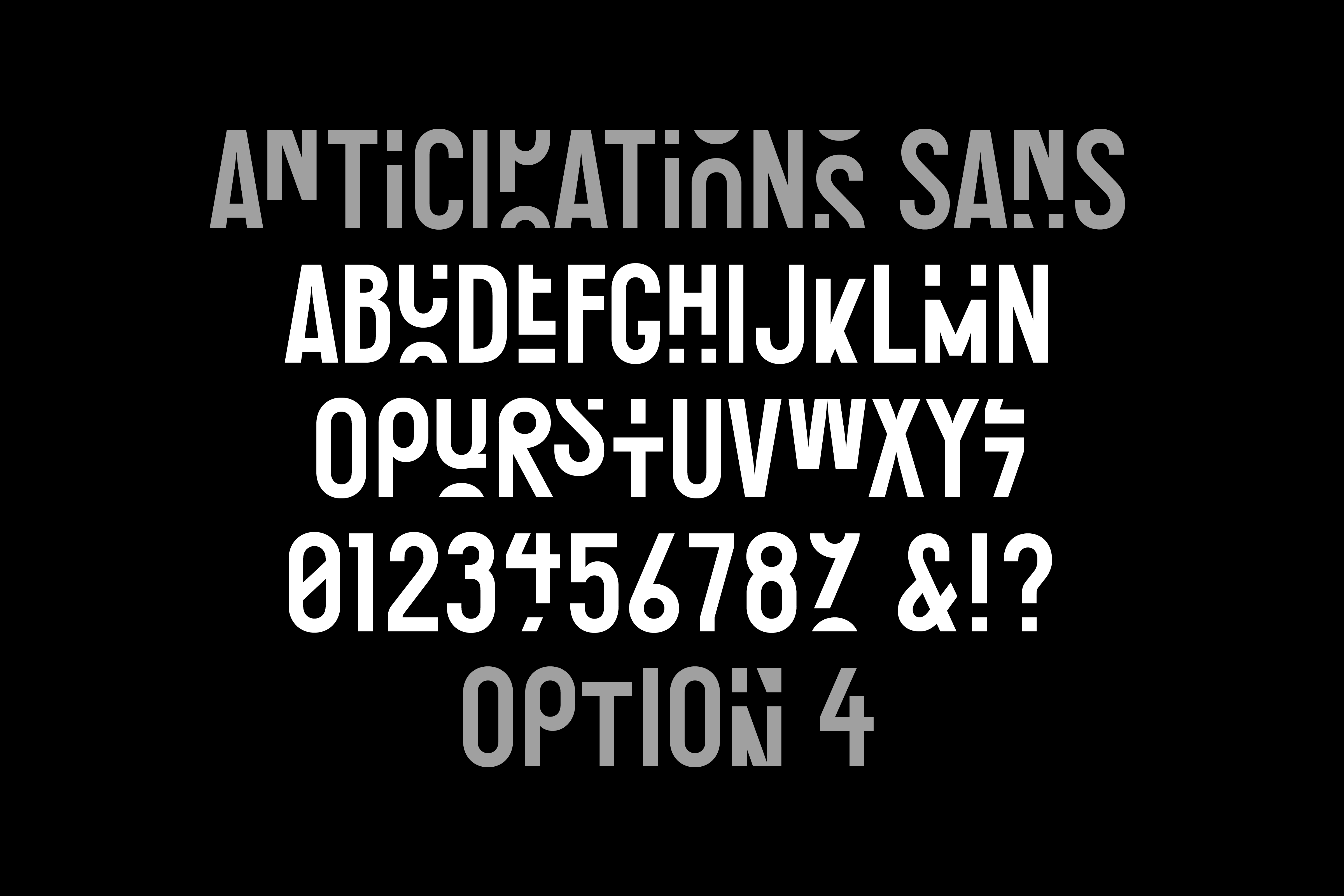
In a feat of design, maths, and code working in tandem, we developed a digital script (based loosely on theories observed in quantum mechanics) that 'looks' at contextual character placement in order to collate a holistic set of random combinations. This functionality was then coupled with a custom web application that enabled both Wolff Olins and Galeries Lafayette to select compelling letter pairings from thousands of possibilities, and seamlessly pass those preferences off to Colophon as data sets.
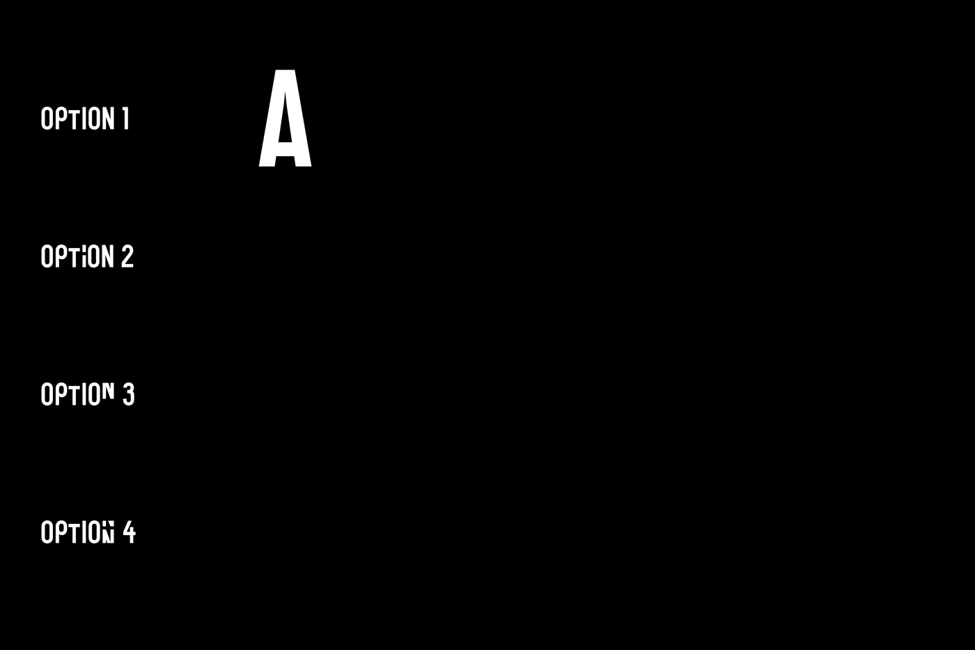
To put these pairings to use, an additional algorithm was built into the final font files that allows the same set of language to yield a different appearance each time its rendered, giving the type a sense of constant motion and perennial transformation — an overt homage to the building, its commissioners, and its new inhabitants.
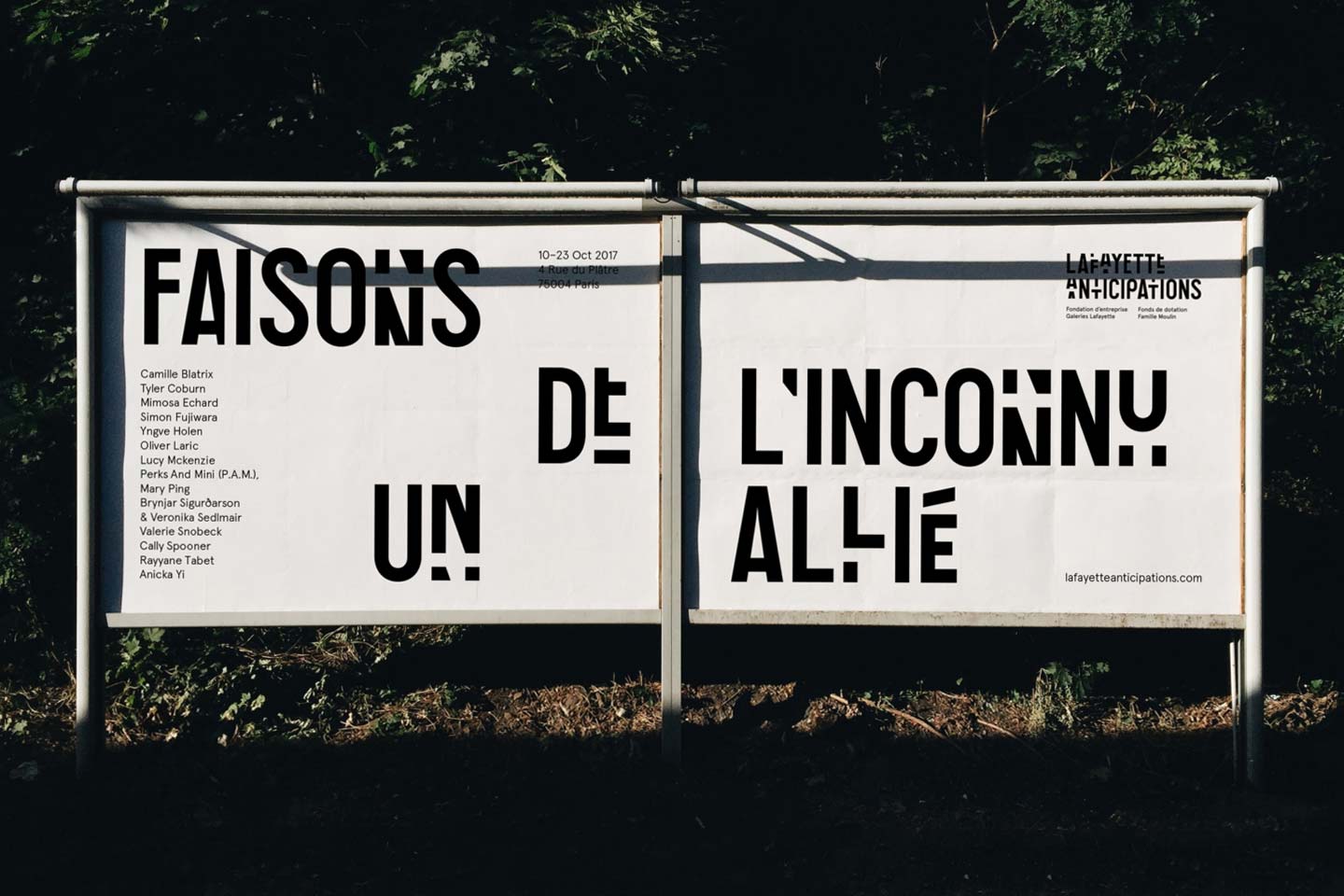
Opened in March of 2018 to great fanfare (and warm press coverage) that often noted the branding and typography of the new cultural venue, Lafayette Anticipations' simple-yet-radical custom typeface flies an intentionally contemporary flag in concert with Galeries Lafayette's 120-year history as one of France's oldest department stores. An interconnected system of responsive typographic assets lend the arts institution a sturdy brand foundation amidst the inevitability and anticipation of perpetual change.
With thanks to Wolff Olins for the photography.
Recent Custom Projects
View all

Let’s Work Together
To talk to us about your project, please get in touch.
