)
Liberty of Southwark
The Liberty of Southwark is the combined efforts of TfL, development firm U+I, architects Allies and Morrison and design and branding agency BCMH to transform a derelict 1.7-acre site in the London borough of Southwark into a new cultural and social hub — offering new office space, restaurants, cafes, shops, flexible workspaces and homes to the neighborhood.
- Typeface
- Clink
- Comissioner
- BCMH
- Year
- 2020
- Styles
- 1 Weight, 1 Style (UPPERCASE only)
- Coverage
- Adobe Latin-2
- Classification
- Serif
- URL
- thelibertyofsouthwark.com
- bcmh.co.uk
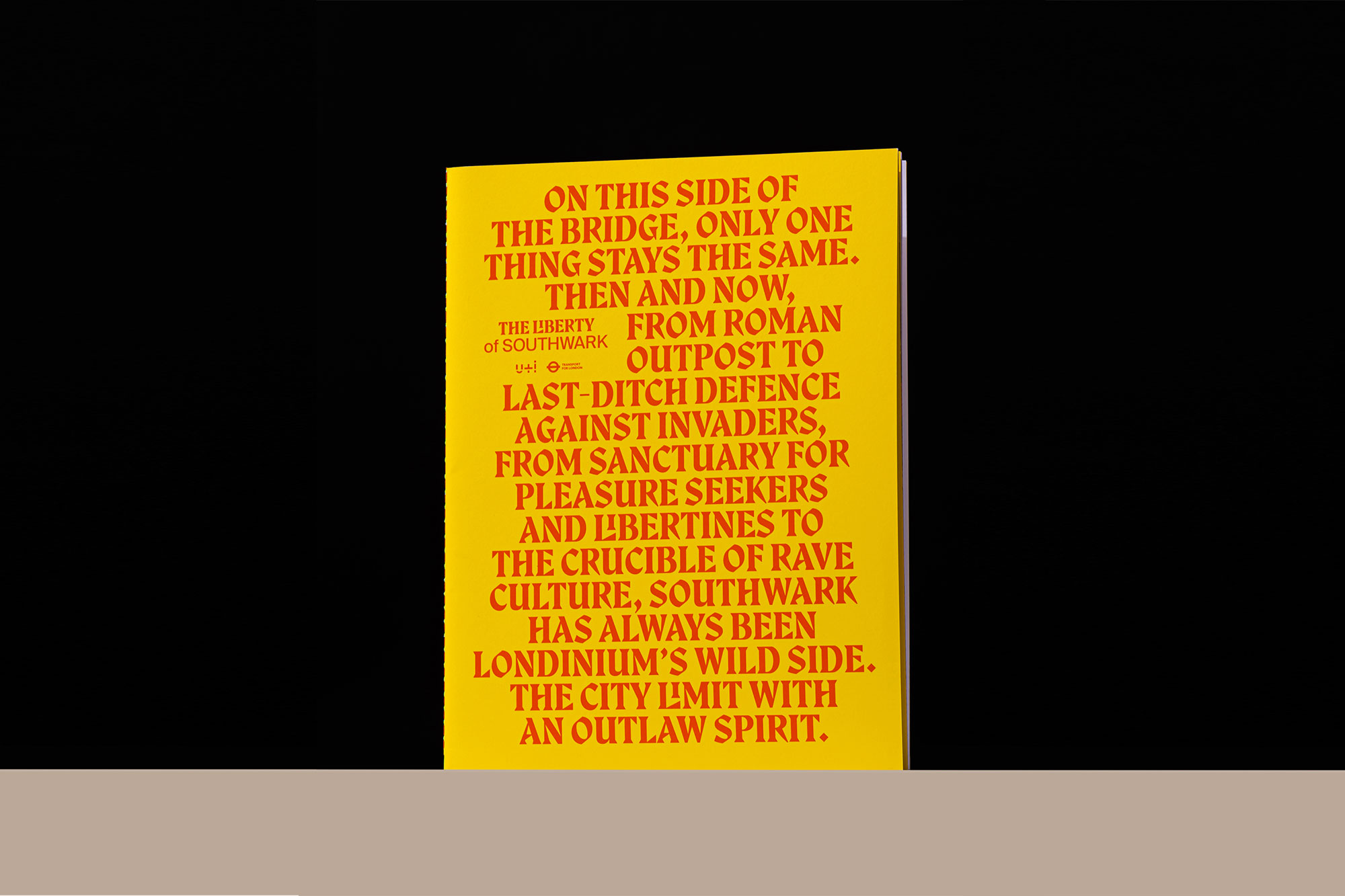
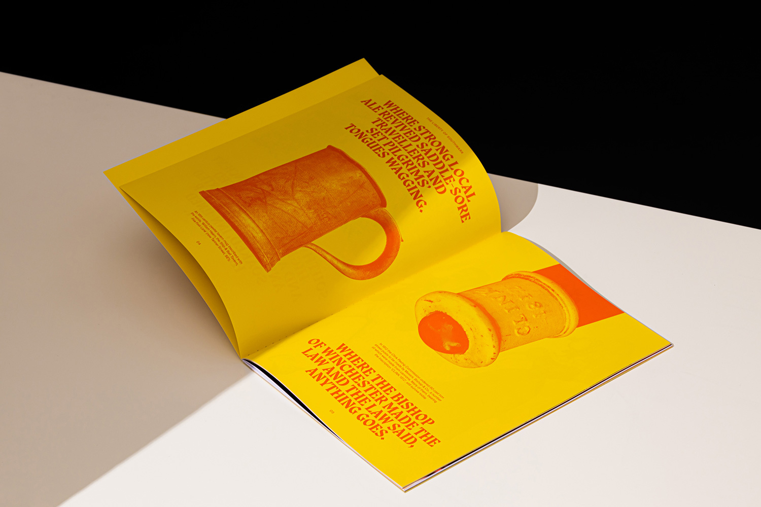
The project draws heavily on the history and legacy of the borough, beginning in the 12th century, when the area was gifted to the Bishop of Winchester and therefore operated outside the jurisdiction of the City of London. It subsequently became known as “the Liberty of the Clink”, with the Bishop and his clergy granting license to previously forbidden activities — from hosting brothels to establishing theaters (including, notably, The Globe). The area established itself as a place of freedom, providing sanctuary to outlaws who escaped across the river.
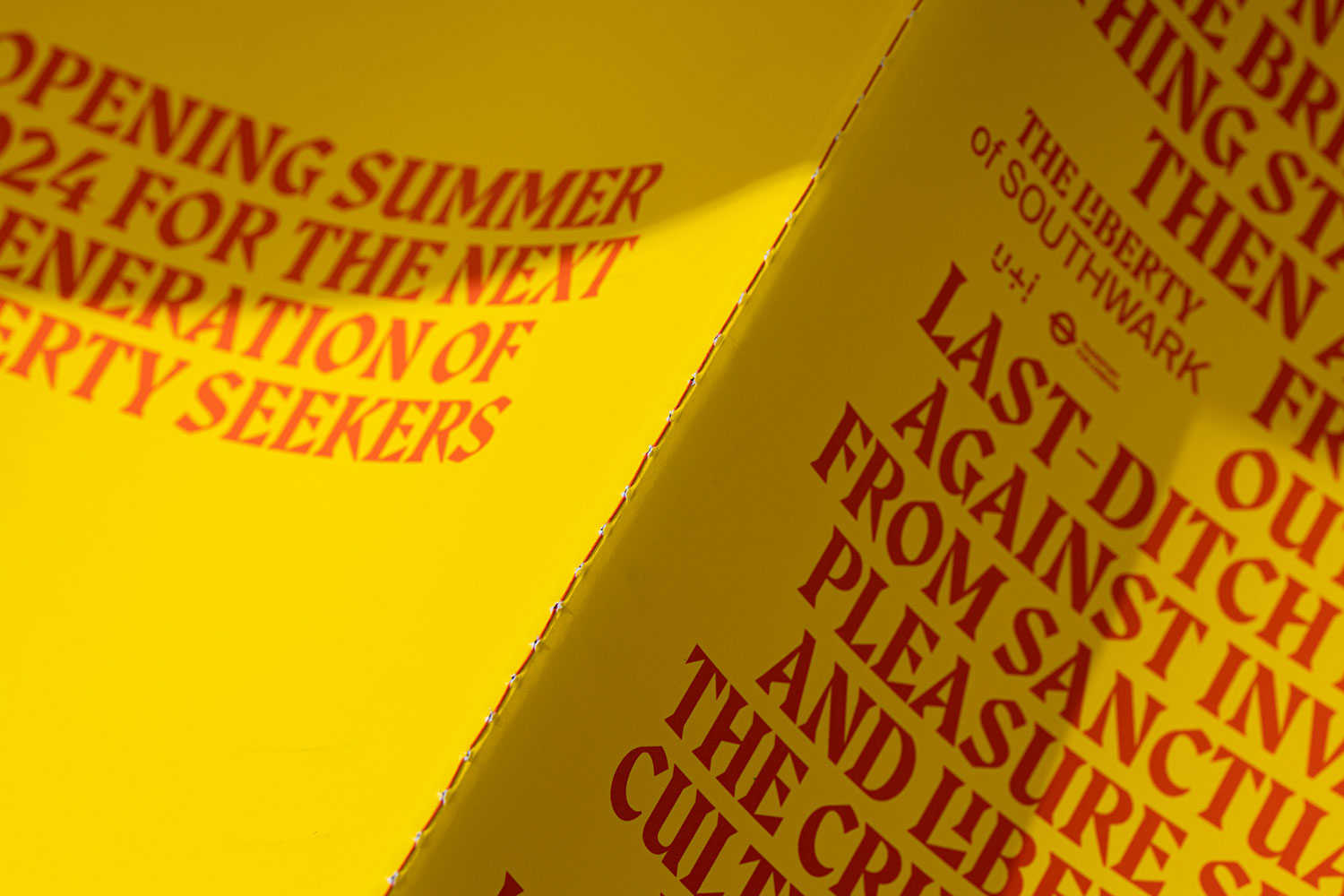
Building on its 12th century reputation, the borough later became known as home to a collection of renowned modern dance music venues in the 1980s. The new development aims to play its role in the next phase of the area's renewal and become home to the new custodians of the spirit of Southwark. The accompanying branding campaign uses distinctive imagery and a unique typographic identity to articulate the independently-minded attitude of the development and its future inhabitants.
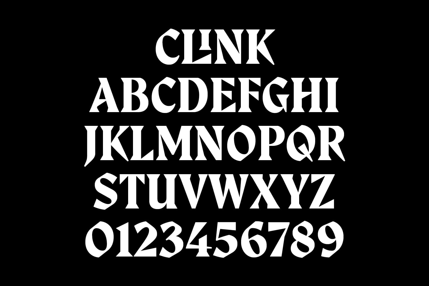
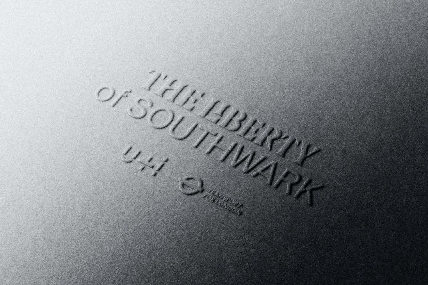
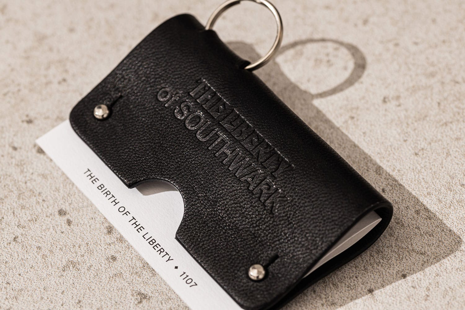
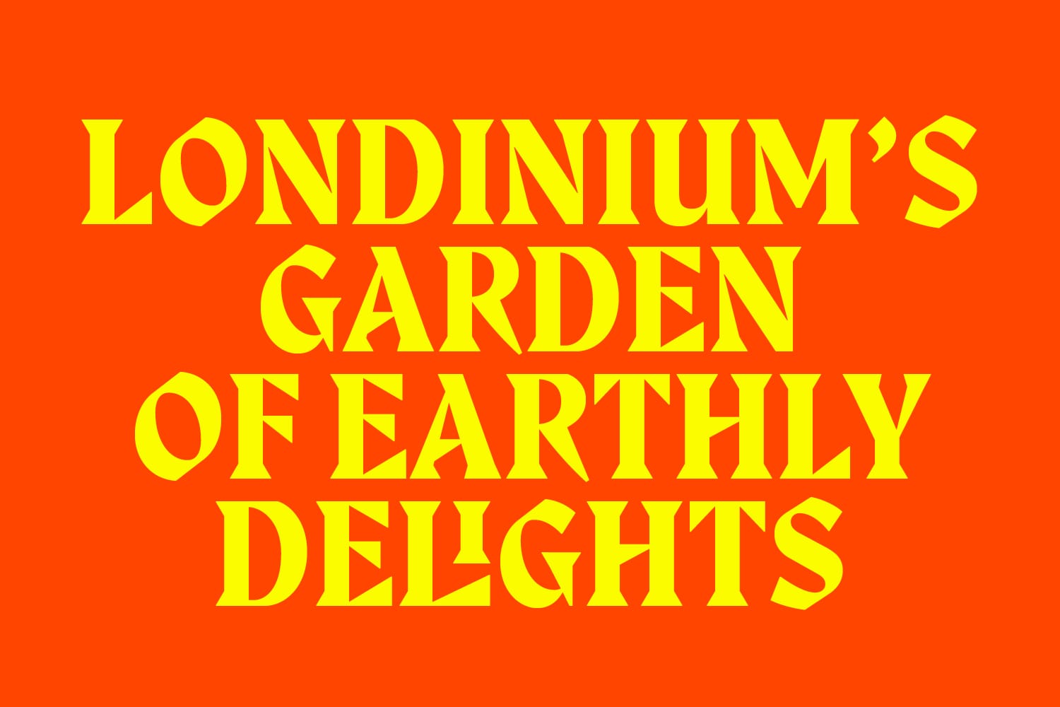
Colophon worked closely with BCMH to develop the unicase typeface “Clink” (from the aforementioned Liberty of the Clink). Partially inspired by the typeface Albertus, used on the City of London street signs, as well as other Blackletter style characteristics, the display-oriented typeface conveys the rich history of the area while maintaining a modern approach.
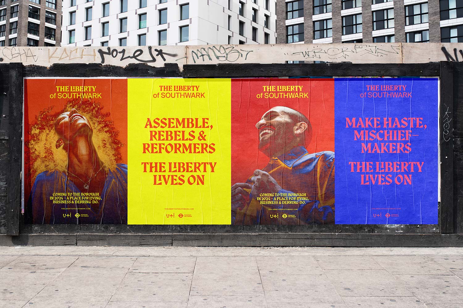
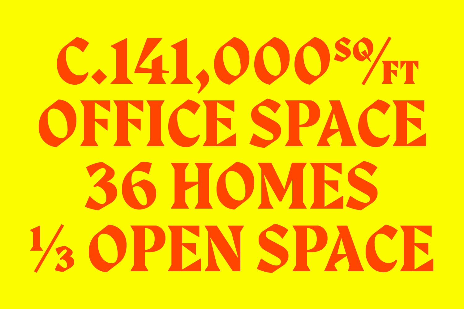
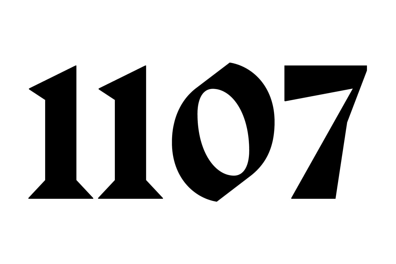
“Clink” is characterized by diagonal, angular Serifs which are juxtaposed with softer interior curves. Asymmetrical contrast levels and overall forms, such as the unique diagonals in the “M” and “N”, add further idiosyncrasies and distinctiveness to the typeface. Specialist Li and Ll ligatures allow for shorter word lockups and build a recognisable mini-identity into key phrases and taglines (“The Liberty / Lives in You”) as well as forming the basis of the logomark. True to its architectural roots, specific lockups were created to indicate square meters and square feet, which would also play an integral role in the development’s communications.
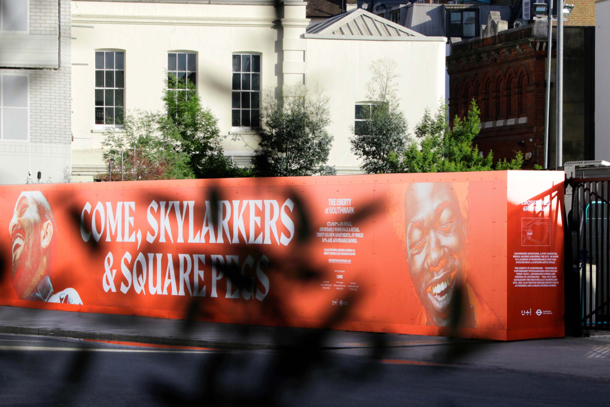
The Liberty of Southwark will be opening in 2023, providing 141,000 square ft of office space, 36 new homes, 22,700 square feet of retail space and 486 secure cycle spaces.
With thanks to BCMH for the images.
Recent Custom Projects
View all

Let’s Work Together
To talk to us about your project, please get in touch.
