
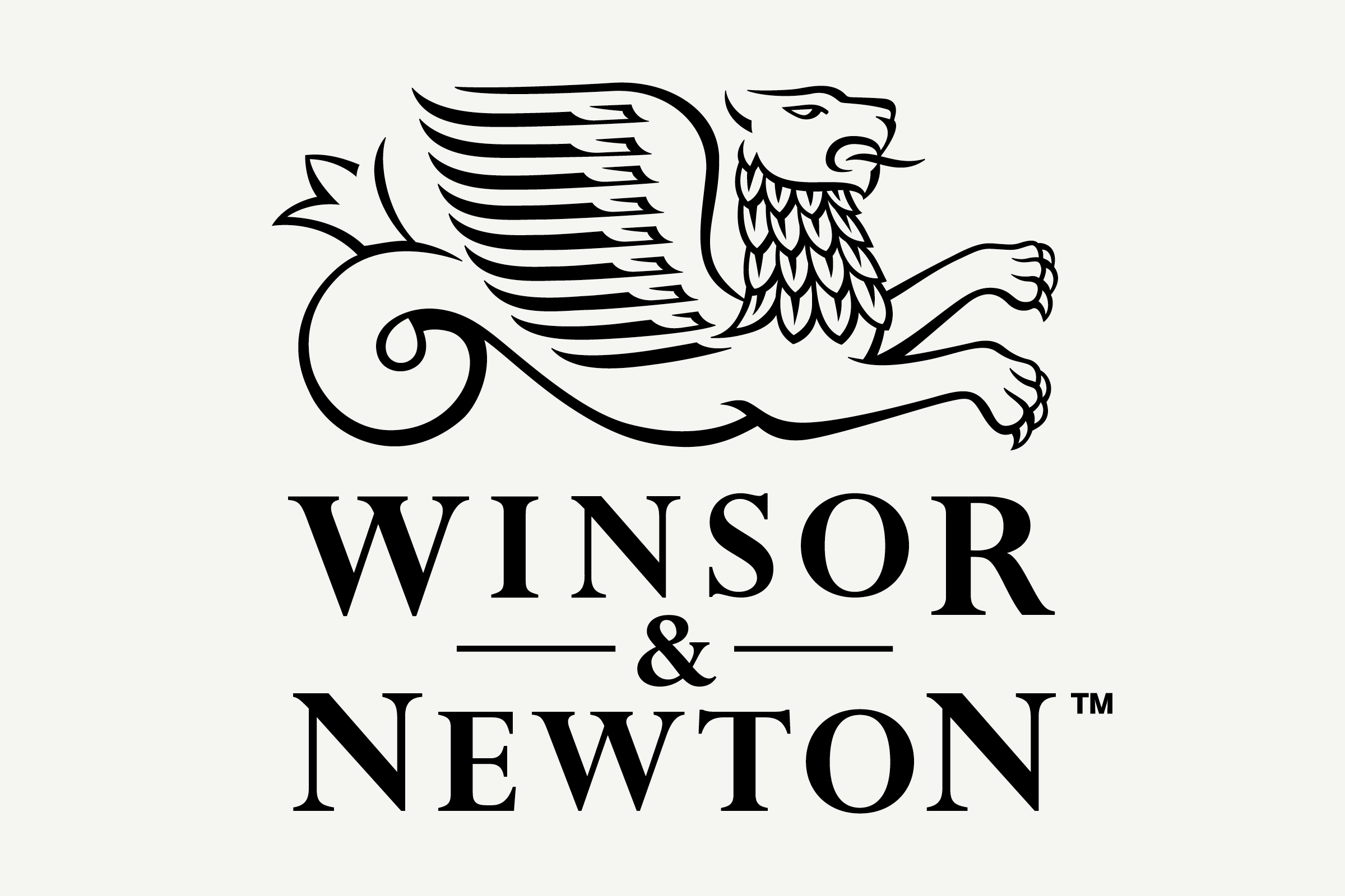
Winsor & Newton
For Winsor & Newton, who celebrated their 175th anniversary in 2007, we were asked by design consultancy Carl Nas Associates to subtly update and refine the manufacturer’s iconic maker’s mark: the Winged Lion, first introduced as the company’s brand in 1881.
- Typeface
- N/A
- Comissioner
- Carl Nas Associates / Winsor & Newton
- Year
- 2015
- Styles
- N/A
- Coverage
- N/A
- Classification
- Logomark
- URL
- winsornewton.com
The mark, which is consistently reproduced across the company’s fine art tools and products — from paint tubes to solvents to brushes and everything in between — had degraded over time due to digital wear and tear (often caused by transferral across media) and also suffered from being consistently used as a white (or light) mark upon a black (or dark) ground, despite initially being drawn for use as a black (dark) mark on a white (light) ground.
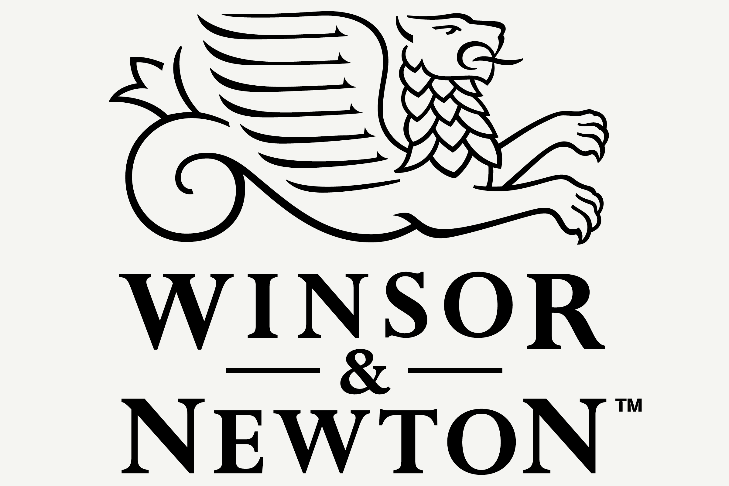
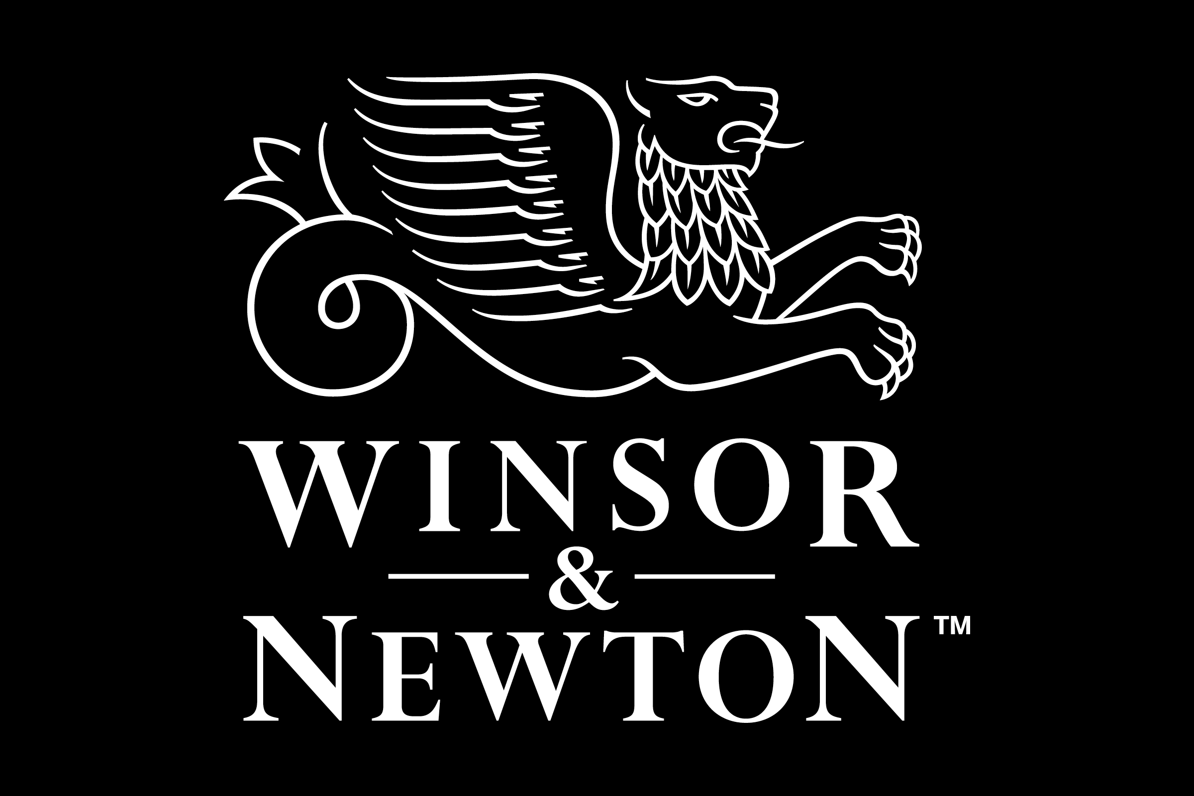
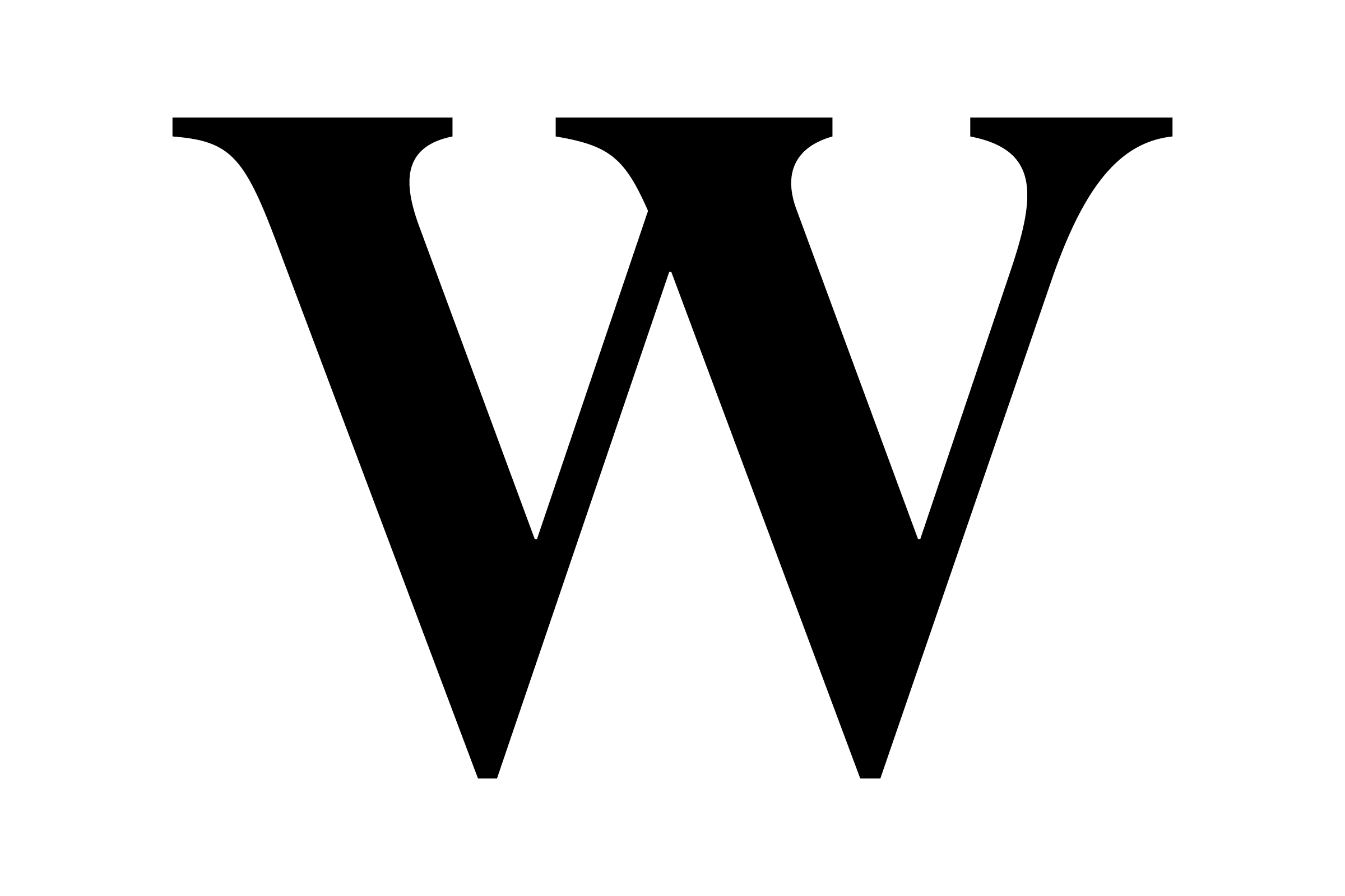
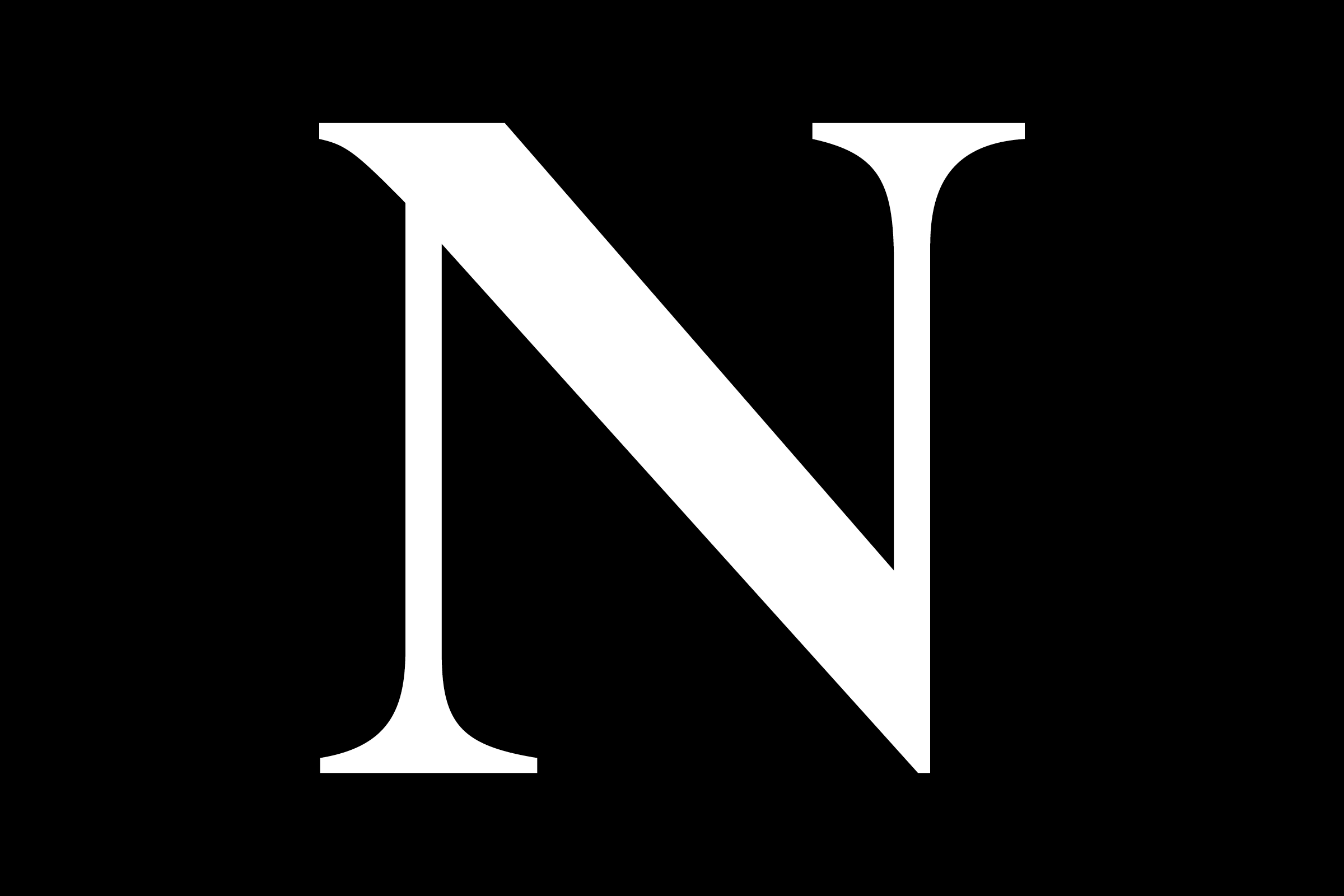
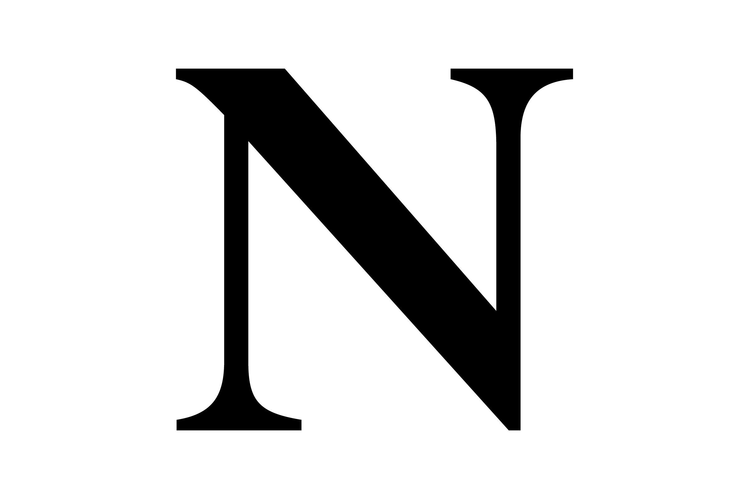
In response, our redevelopment of the Winsor & Newton trademark was three-fold. The first undertaking was an overall optimisation of the historic dark-on-light logo, which involved adjusting line weights, simplifying shadowing and detailing, and re-shaping the type. The second phase involved a subtle redrawing and lightening of this new mark for reversed-out (light on dark) settings, in which a standard inversion often causes a boldening halo effect that must be corrected for.
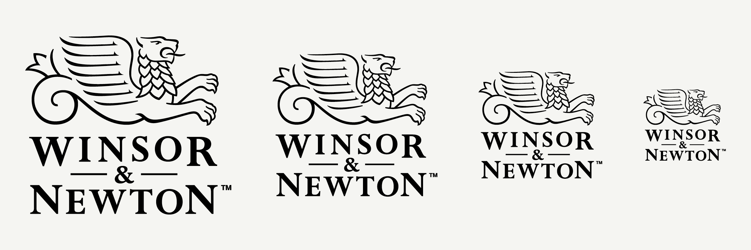
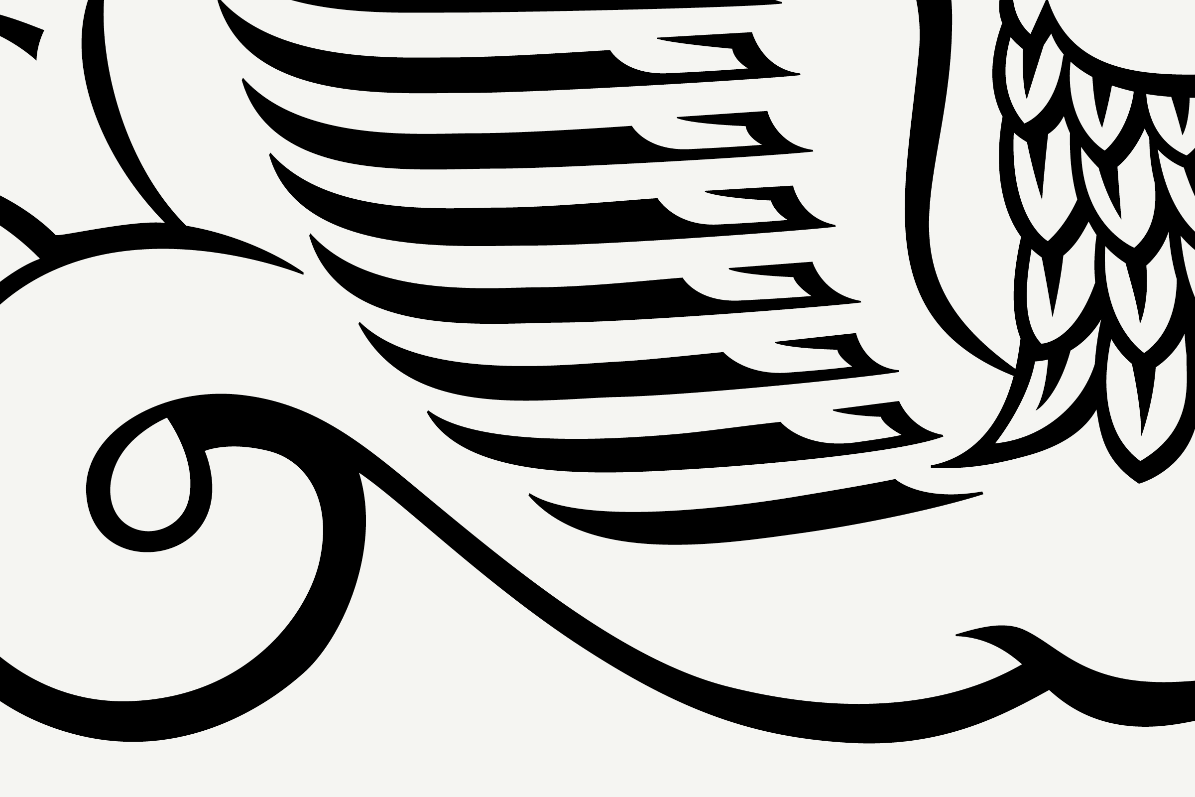
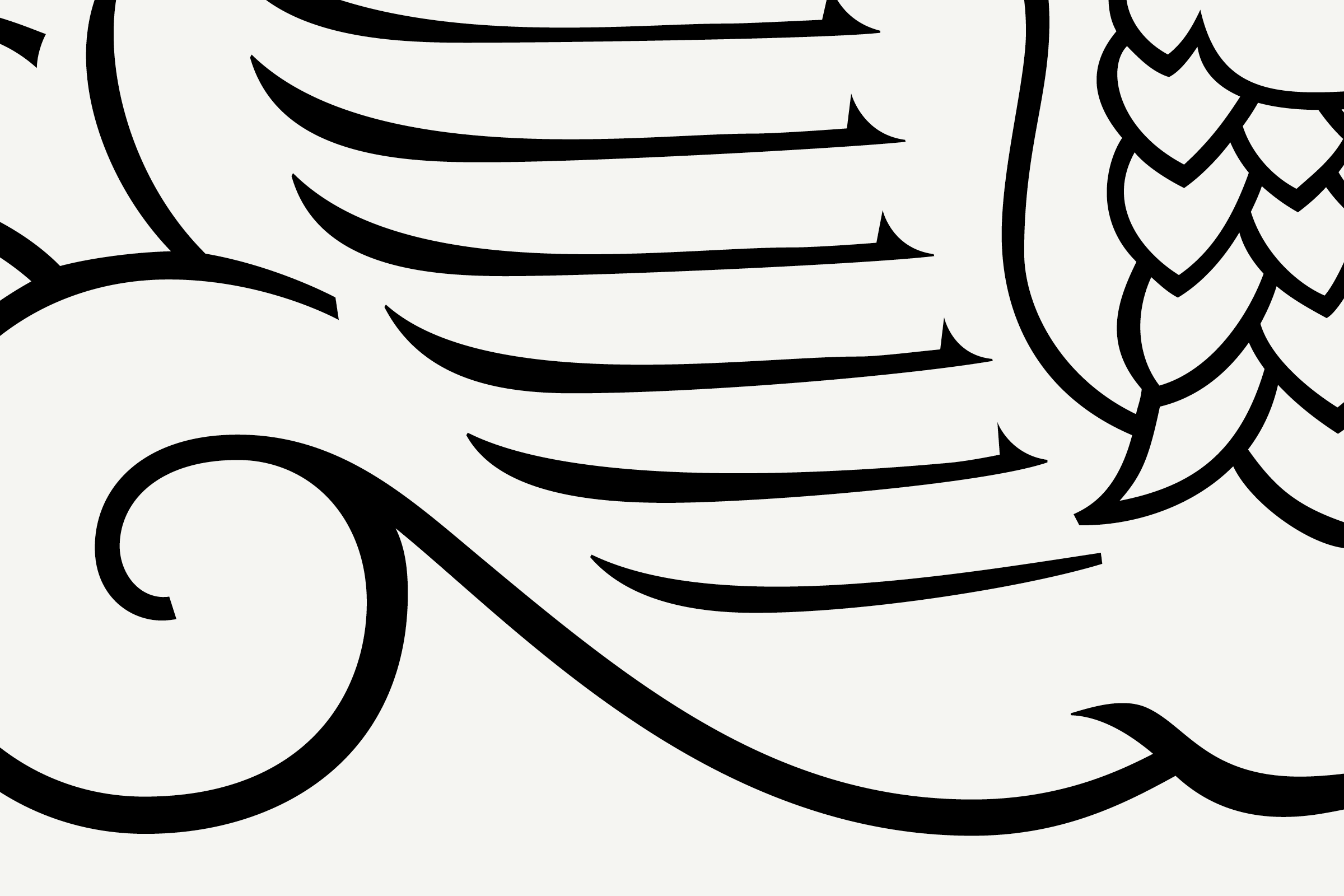
After optically synchronising the two versions of the primary mark and its accompanying type, the third stage of the logo’s improvement and expansion demanded a commission-specific variant of the Winged Lion for use at extremely small sizes (imprinted on the side of a very small paintbrush, for example). Distillation of the mark included simplifying decorative elements overall, reducing the number of wing and mane feathers, regulating contrast in the type, and adding ink traps where necessary.
Wing count has been reduced to accomodate the density of size.
Forms also simplified to just essential shapes.
Forms also simplified to just essential shapes.
Space inbetween wings and mane increased
Mane complexity has been reduced from 4 rows to 3 to simplify the forms at small sizes
Simplified tail shape
Claw definition is reduced yet retains the overall shape
Typography overall has reduced contrast to prevent breakup
Additional ink traps added
In the end, the optimisations should practically go unnoticed; like a well-composed score in a film, subtlety and support is tantamount. While still retaining recognition and preserving the brand equity that comes with 135 years of iconic use, the revamped marks function as a toolkit to ensure legibility, clarity, and precision across media.
In addition to commissions for custom typefaces, Colophon takes on projects related to logo and mark Development, Expansion, Restoration, Refinement, and Optimisation.

Recent Custom Projects
View all

Let’s Work Together
To talk to us about your project, please get in touch.
