
Dunkin'
Fast-food chain Dunkin’ (Donuts) is an American multinational coffee/donut company and quick service restaurant. Founded by William Rosenberg in Quincy, Massachusetts in 1950, Dunkin’ currently exists as more than 11,000 restaurants throughout the world; the chain is one of the largest baked goods outlets globally, but is more locally renowned for its coffee, of which it serves 30 cups a second on average — leading to Dunkin’ coining the phrase “America runs on Dunkin’”.
- Typefaces
- Dunkin Sans, Dunkin Serif
- Comissioner
- JKR, New York
- Year
- 2018
- Styles
- Headline, Book, Serif
- Coverage
- Latin-A, Arabic & Cyrillic logotypes
- Classification
- Sans Serif Serif Display Logomark
- URL
- dunkin.com
- jkrglobal.com
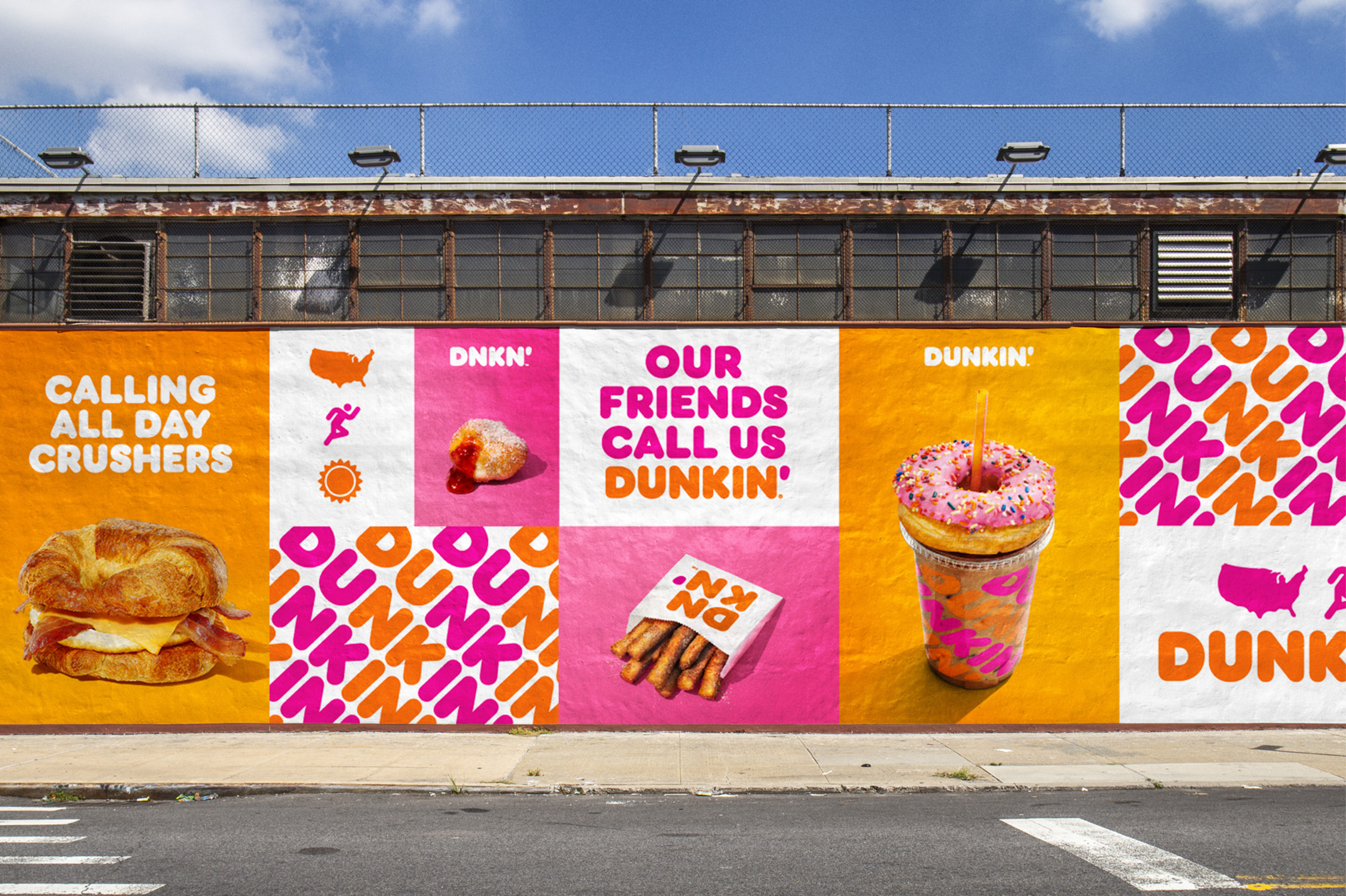
As society has become more health conscious, Dunkin’ repositioned themselves, redacting the “Donuts” part of their brand naming and re-focusing the business to become a more “beverage-led brand”. This being part of a blueprint for growth to modernize the Dunkin’ experience for customers.
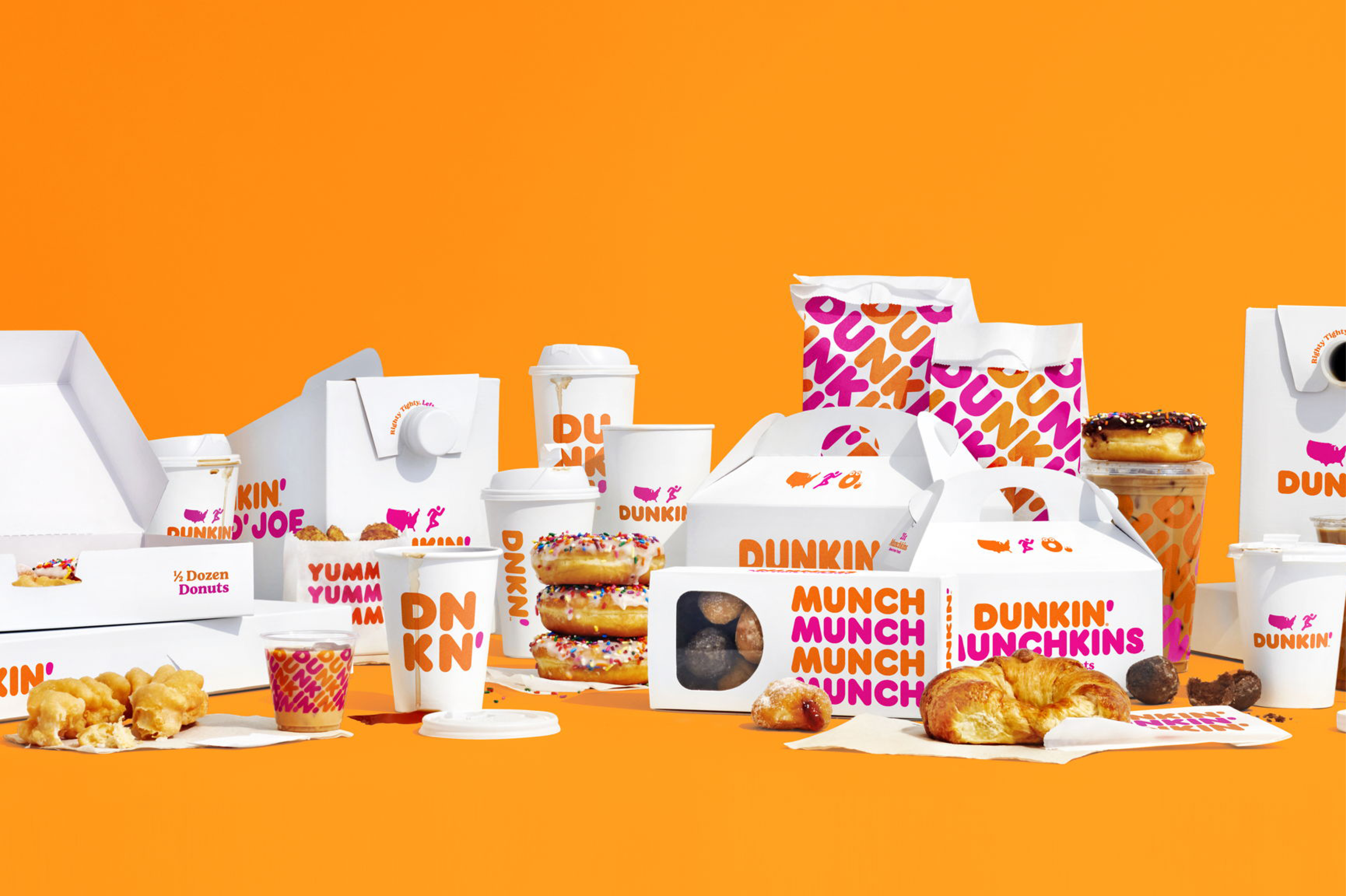
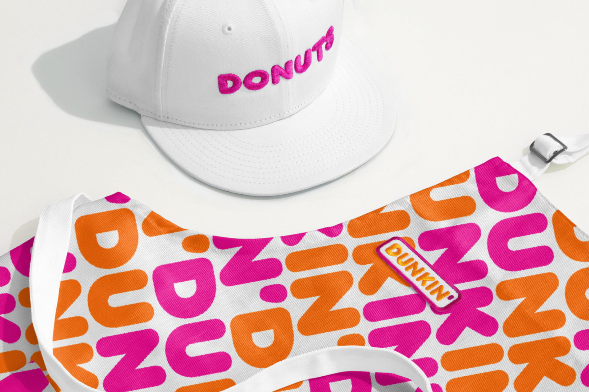
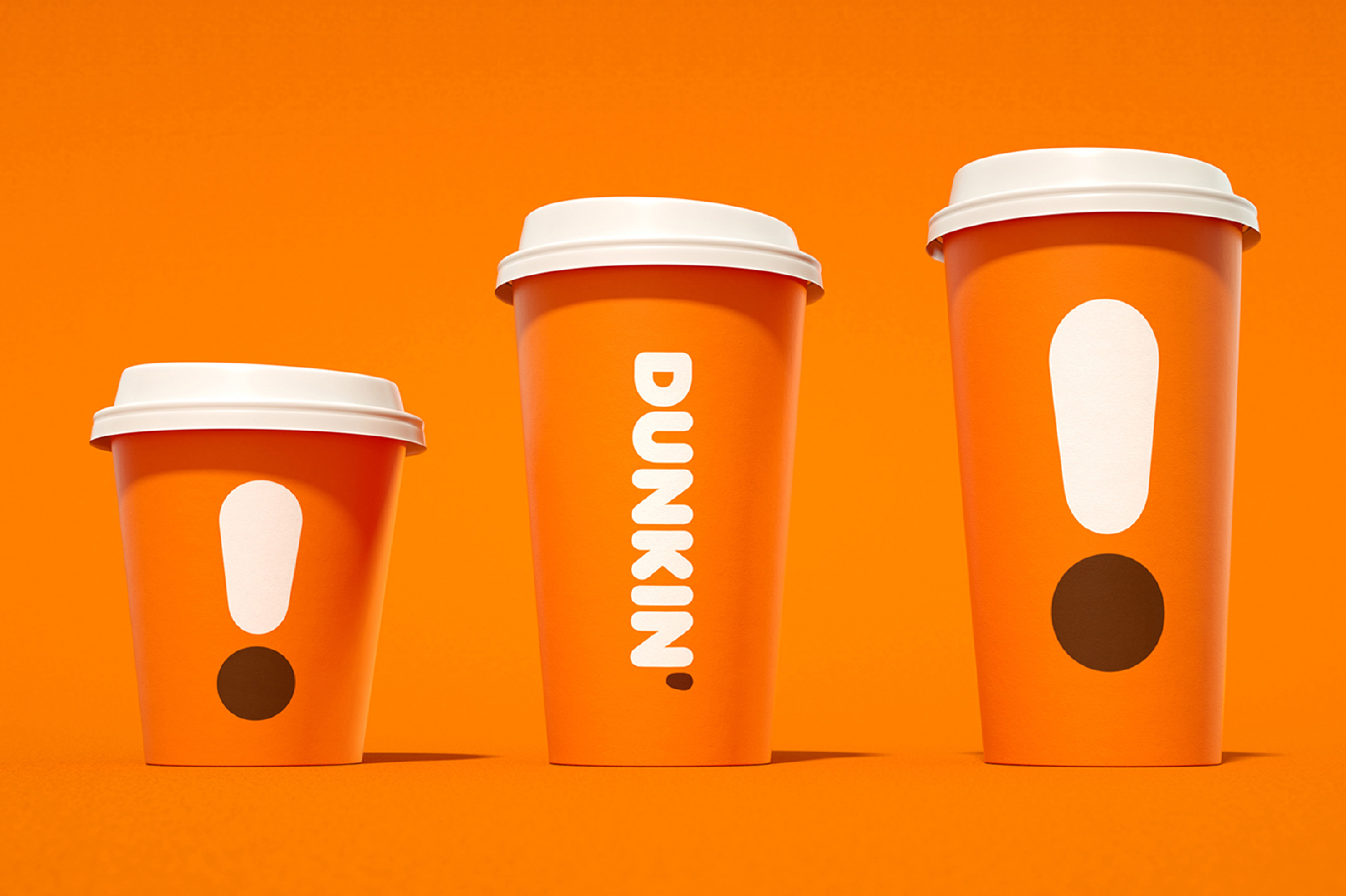
As part of this, JKR, New York led the re-branding effort and tasked to refresh the overall brand, bringing more focus to this re-positioning of the business. This exercise would be applied to all matter of touchpoints utilised by Dunkin’ — from menu screens, to wrappers, to out of home application.
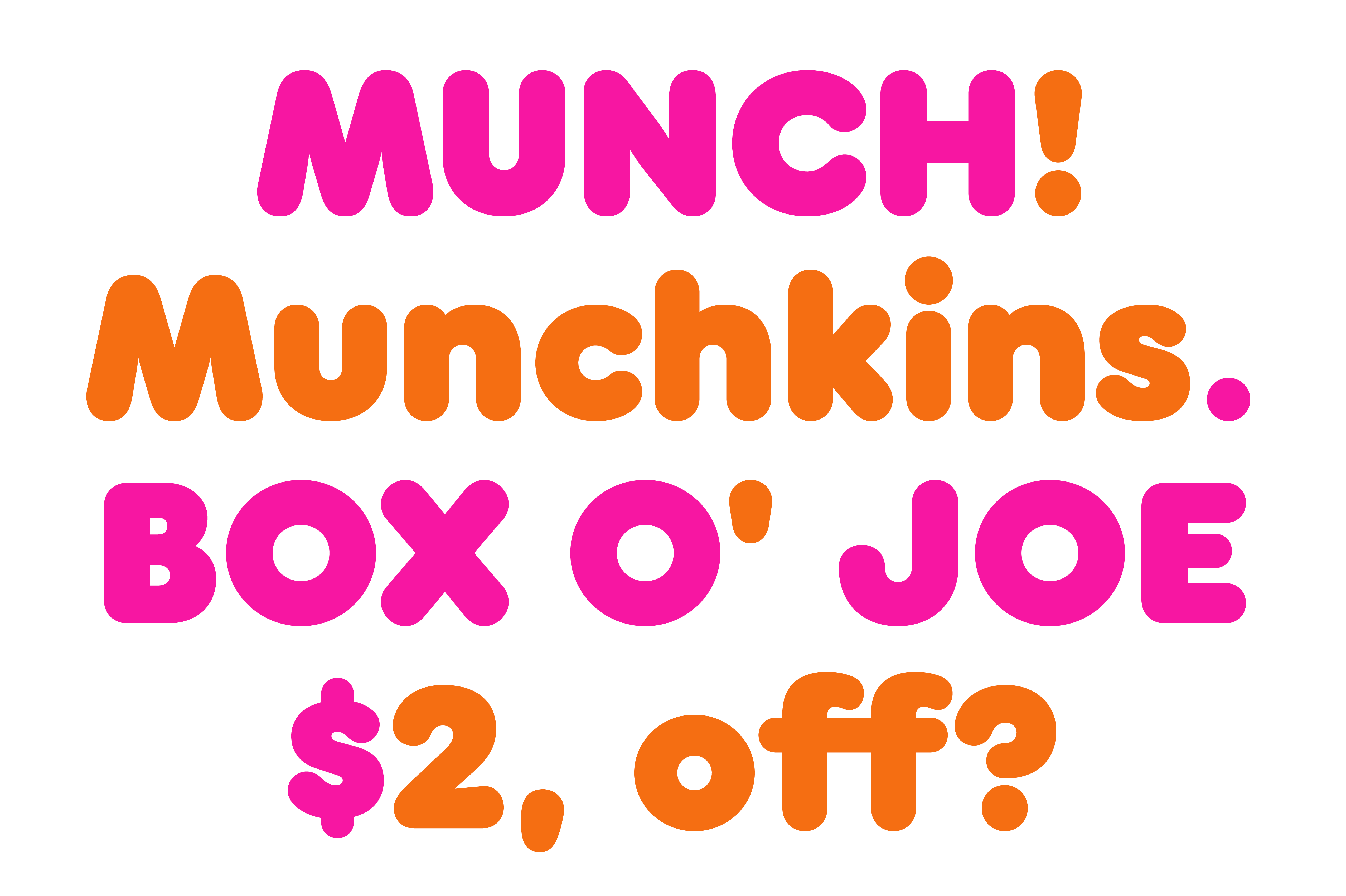
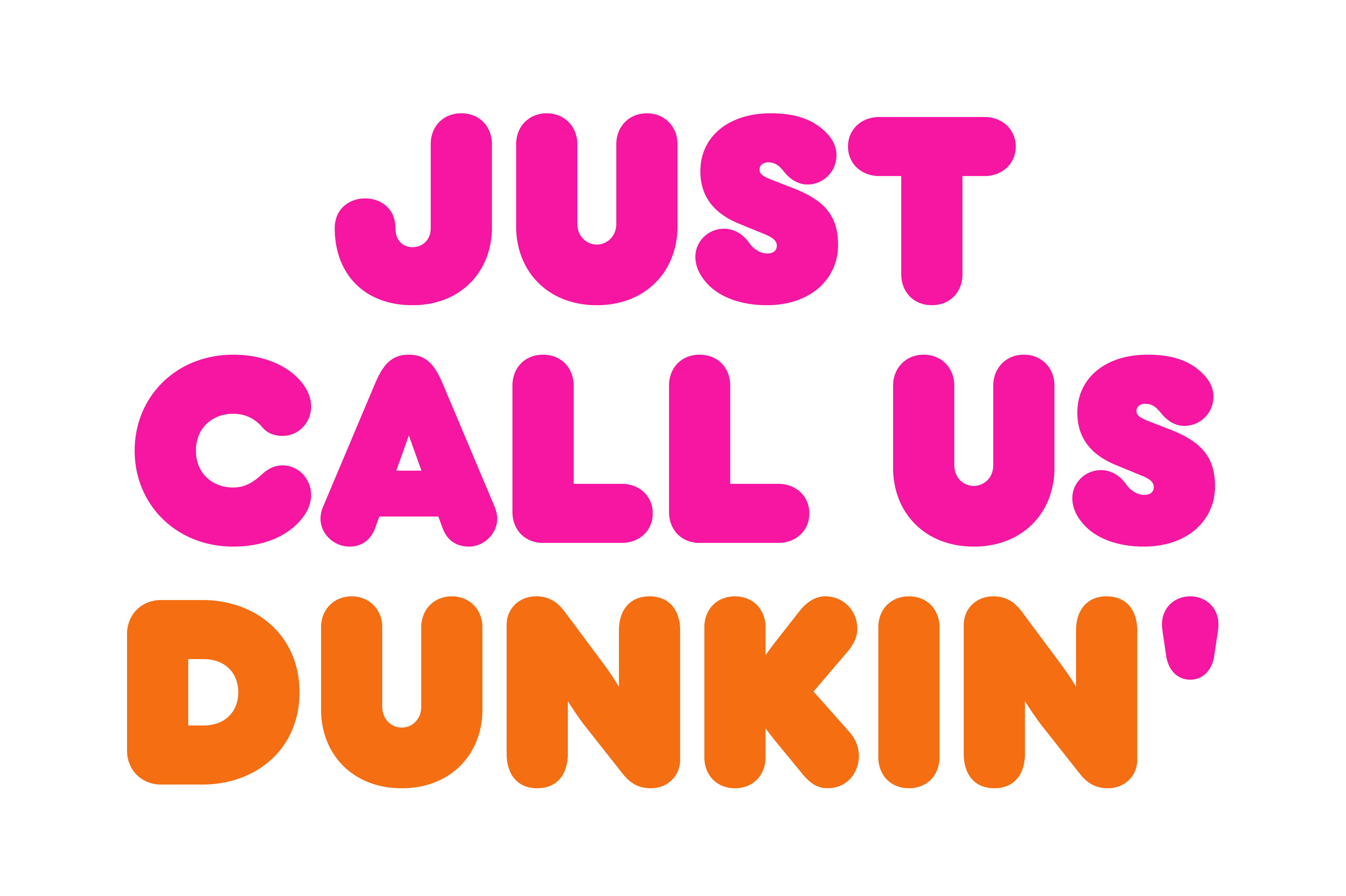
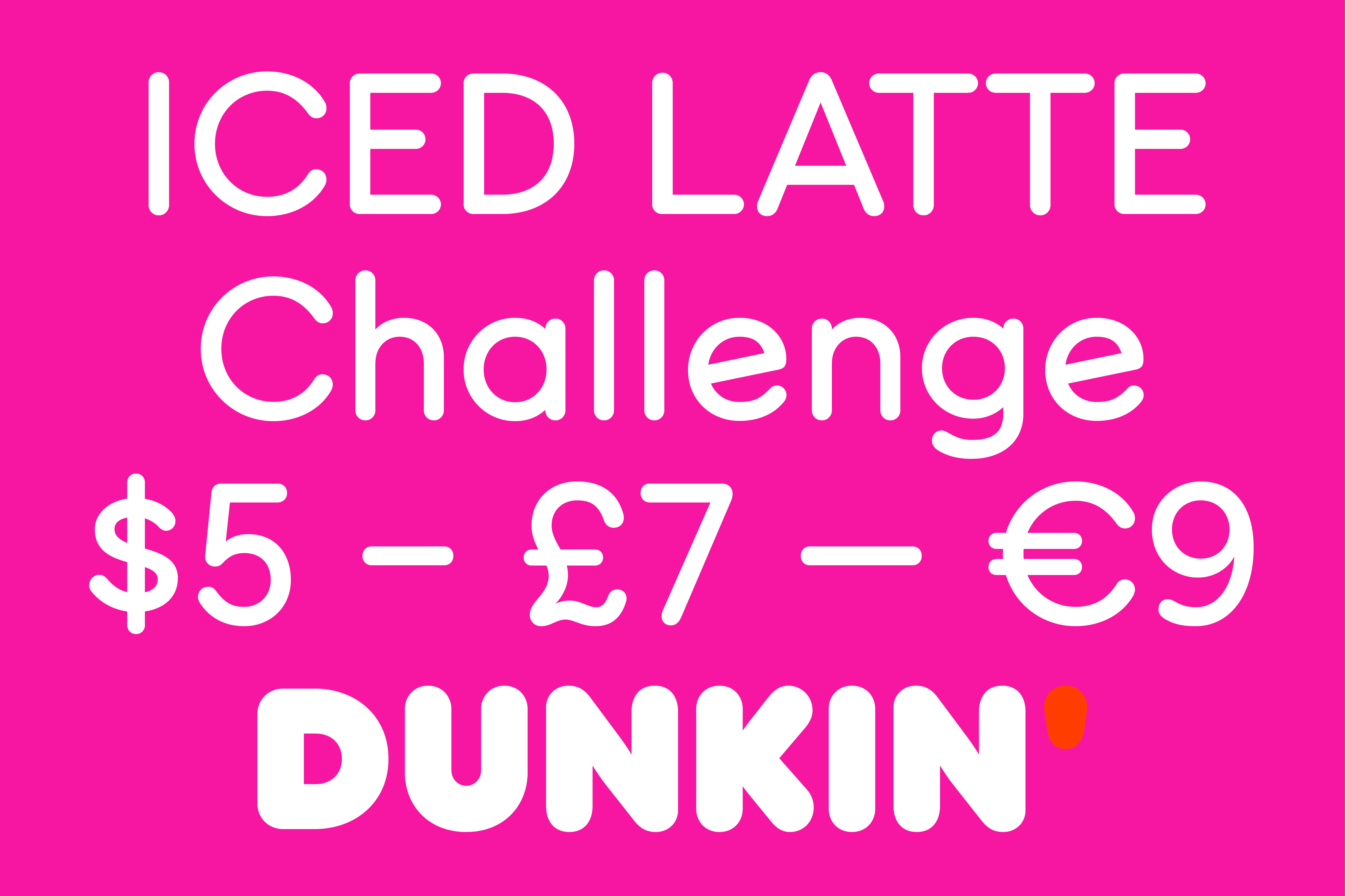
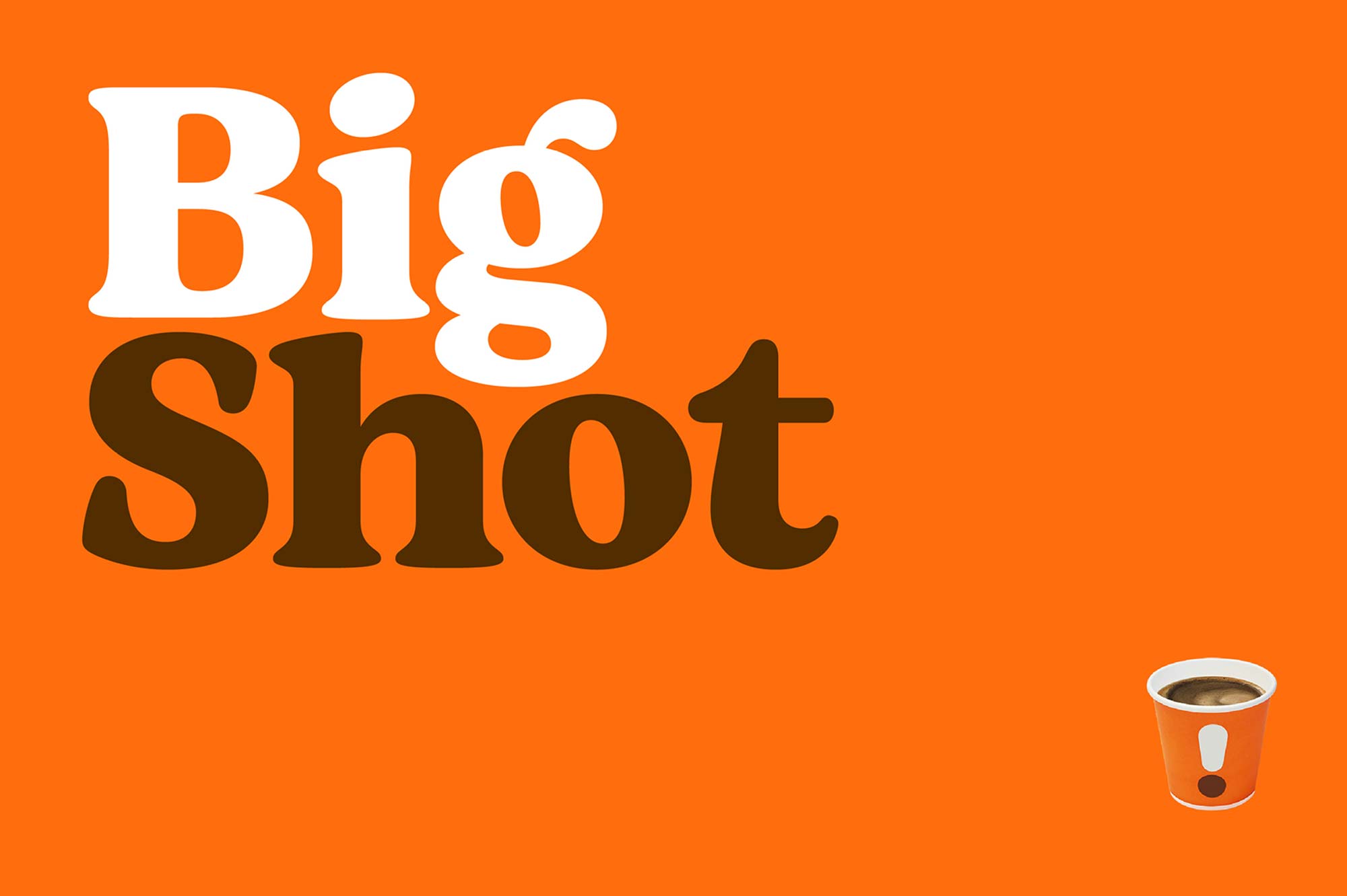
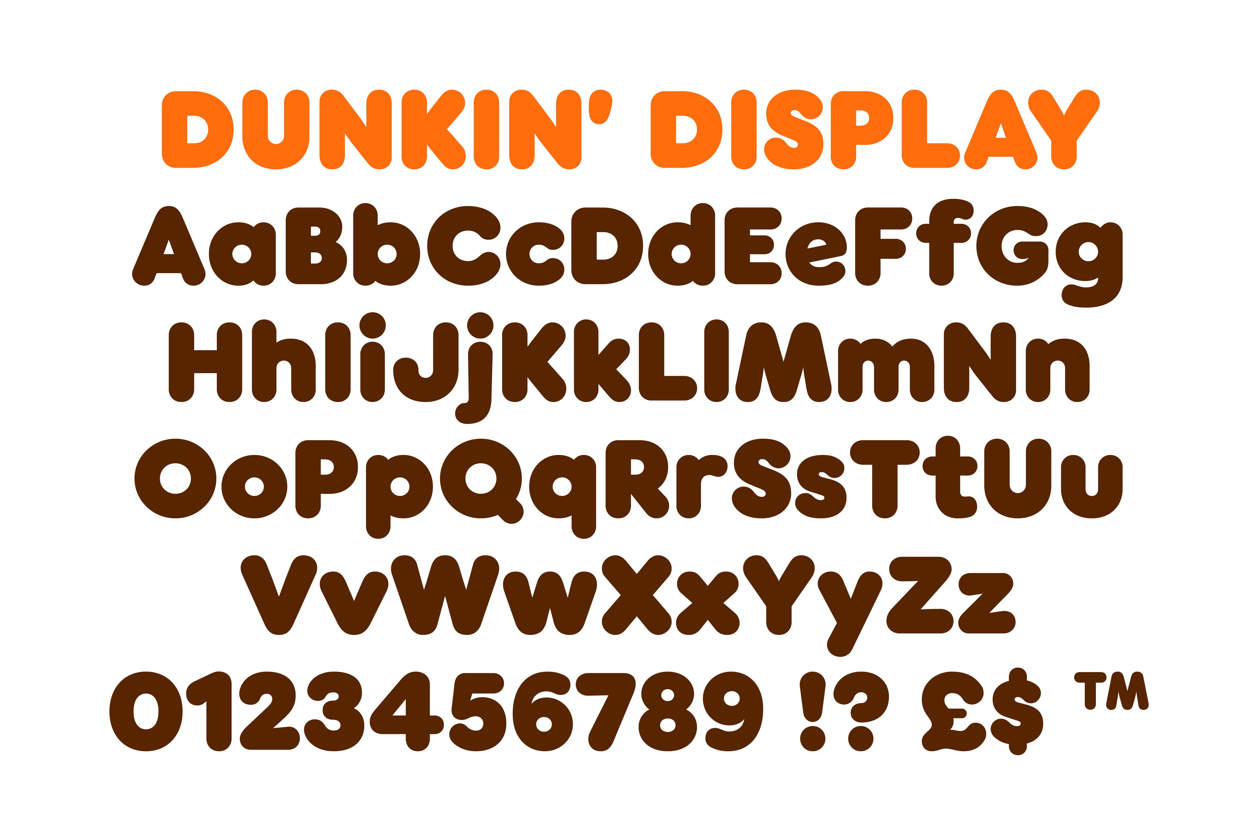
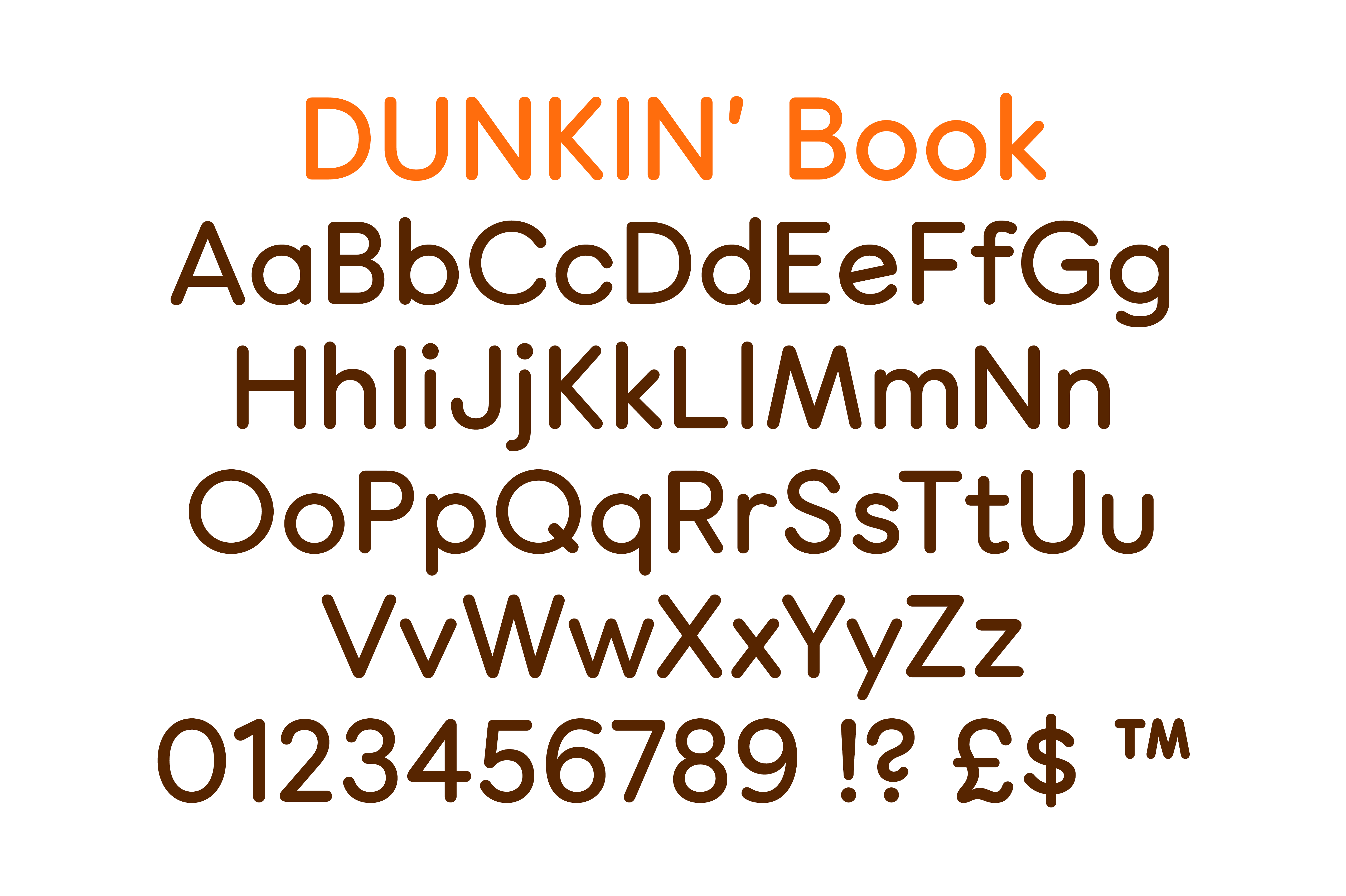
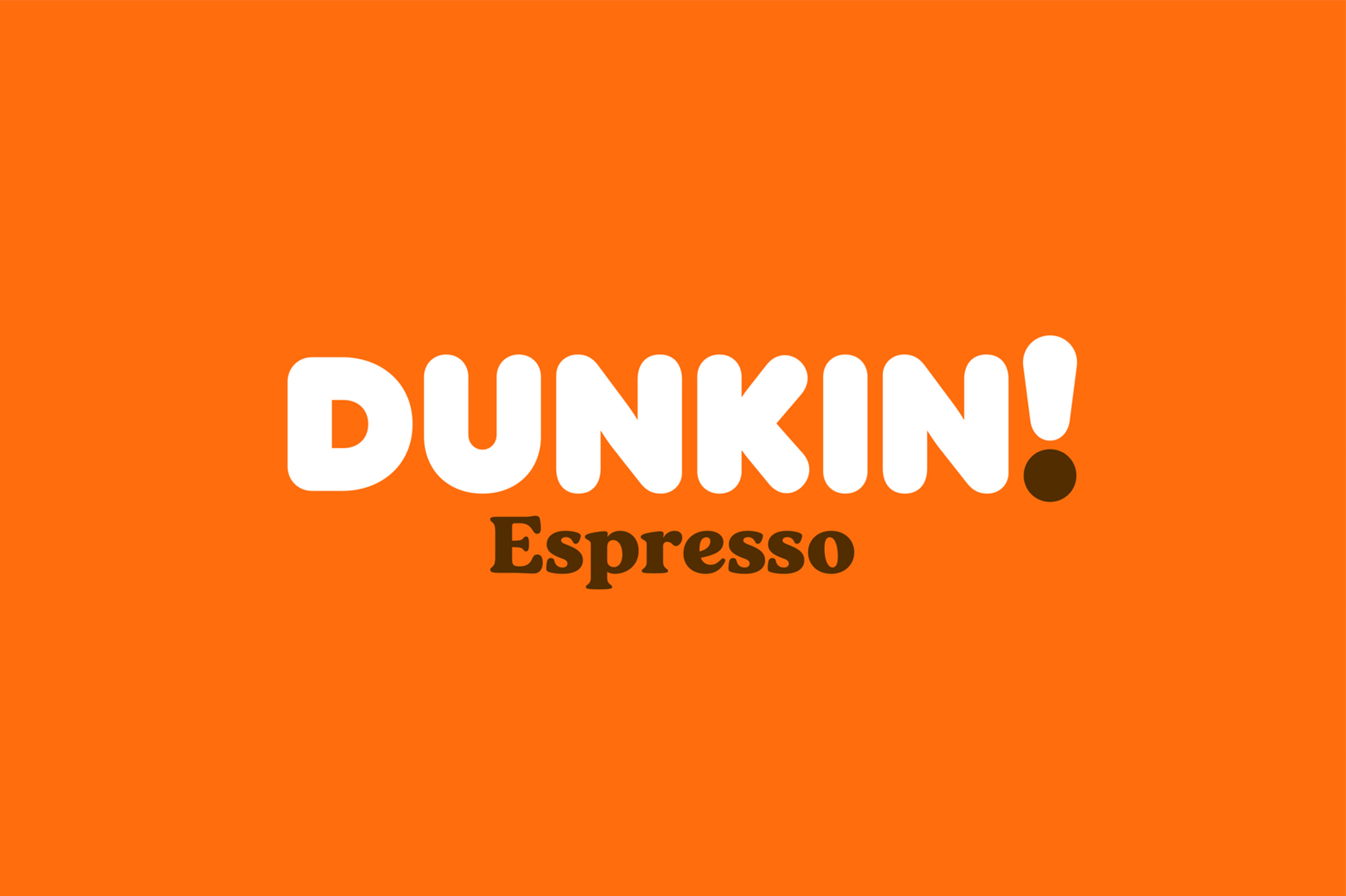
By creating not only a Headline Sans, used in their largest call-outs, but an accompanying, lighter “Book” variant allowed Dunkin’ greater flexibility and visual hierarchy across the brand identity. Sharing the same circular geometry and visual aesthetic, the Book style acts as the Headline’s smaller brother, being used in sizes where the Headline would be overpowering and demanding.
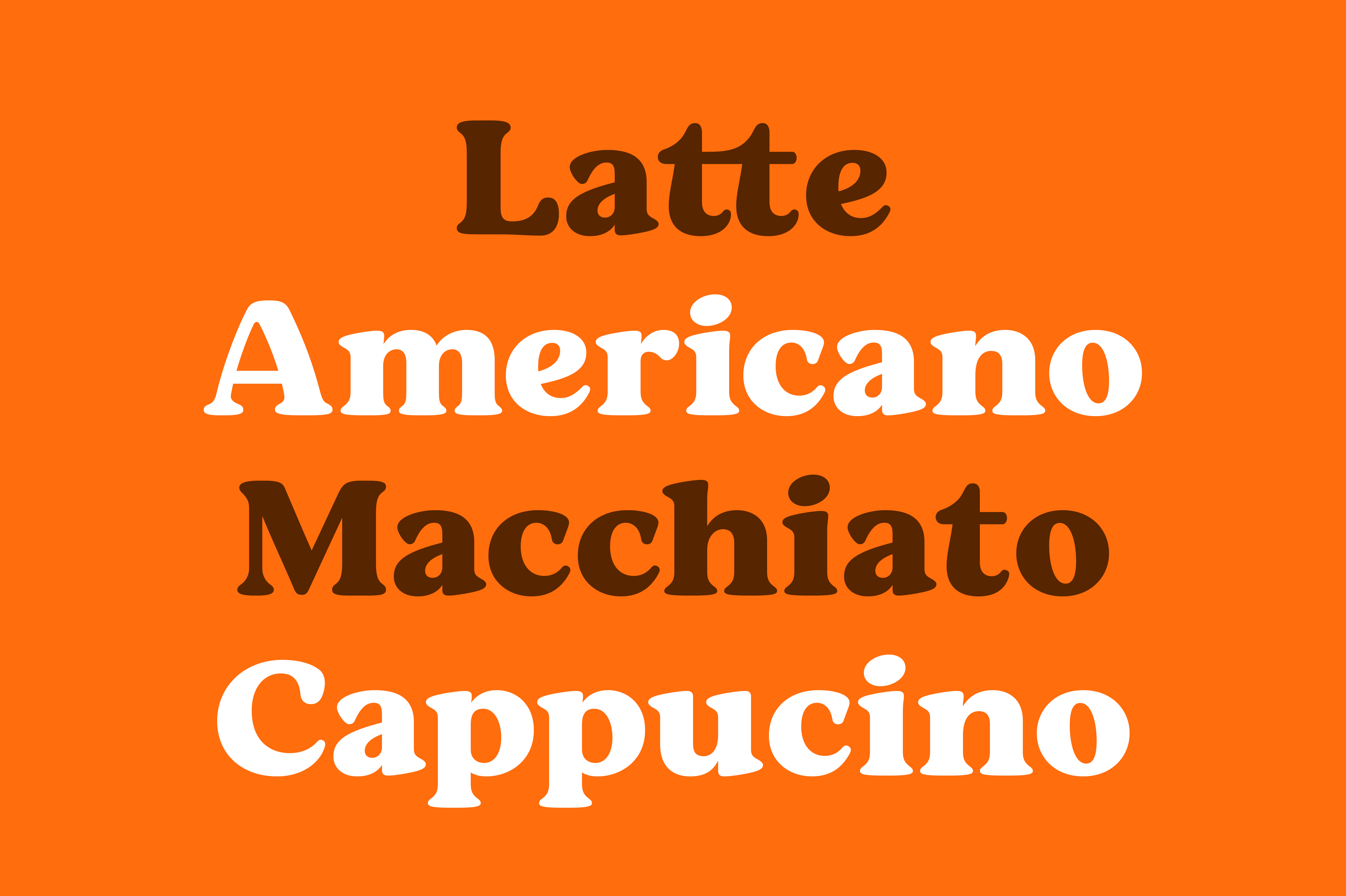
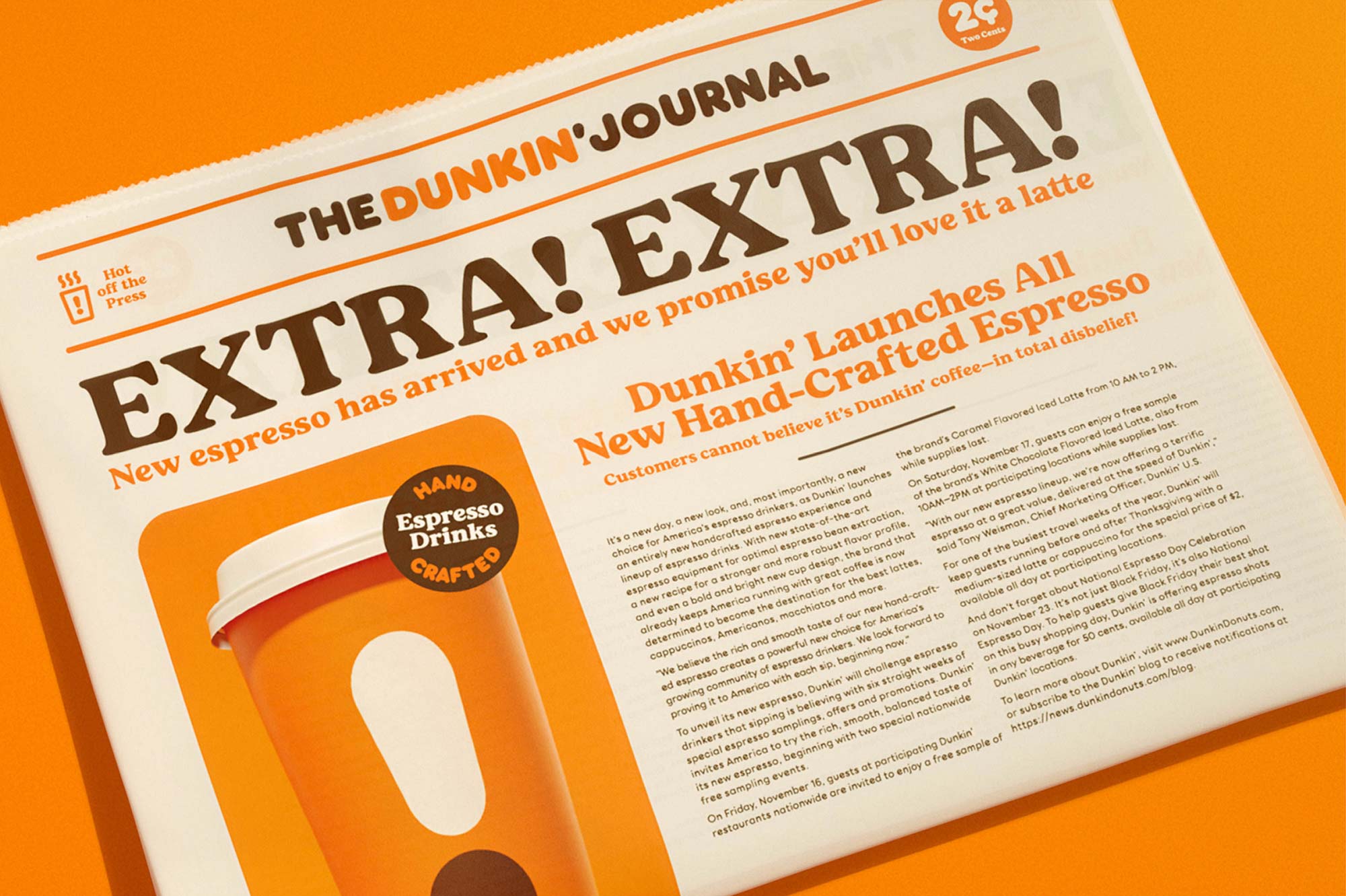
With a starting point of Dunkin’s literature dating back to the 70’s, we took visual cues from the typographic vernacular of the time. Classic types such as Cheltenham, Windsor and Cooper Black all helped shape the requirements that the accompanying Serif type had to accommodate. A low degree of contrast in the forms added a warmth to the forms construction adding a further layer of typographic texture, with focused usage on the coffee side of the business.
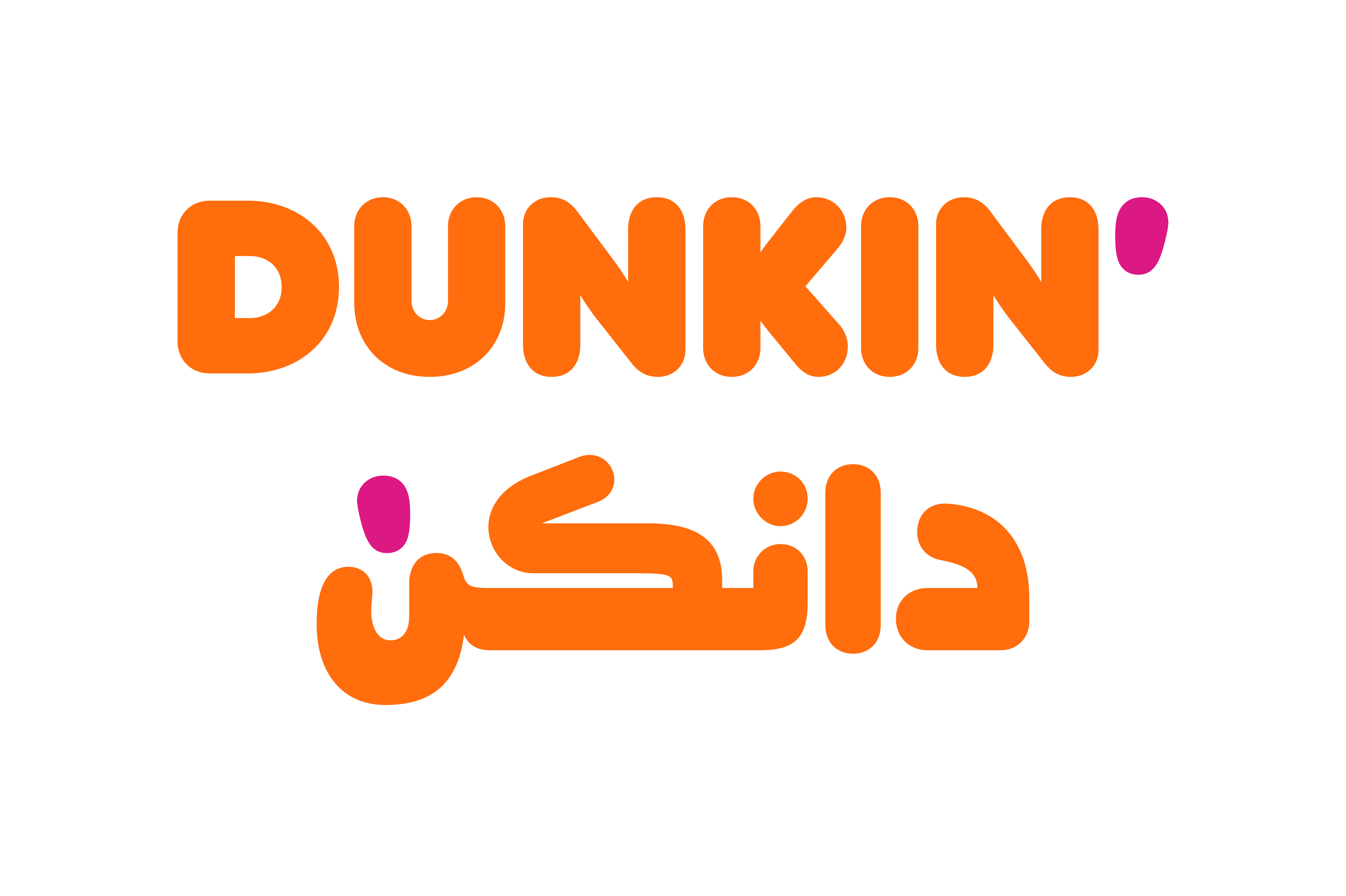
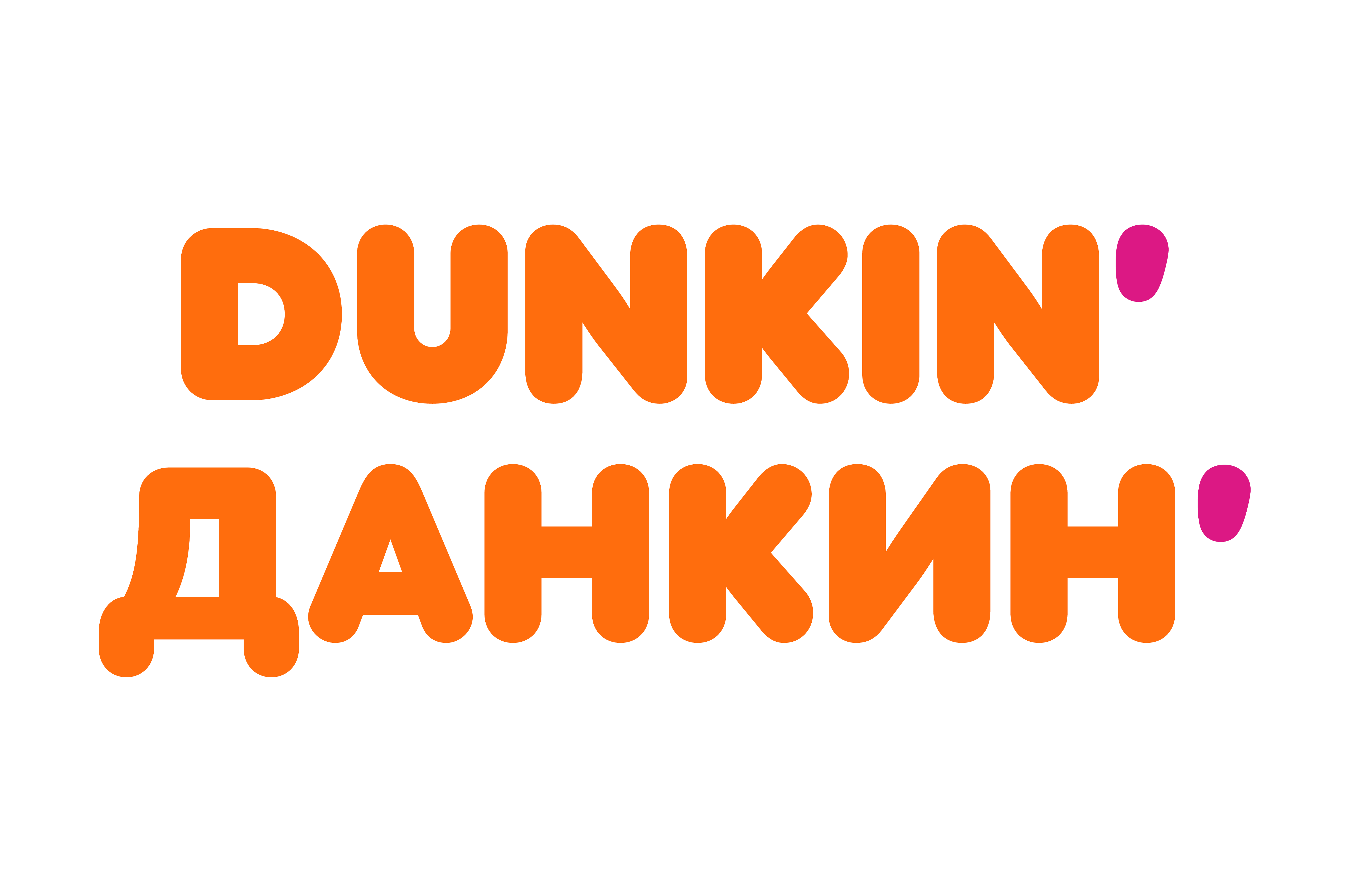
Whilst spanning 36 countries with their iconic branding, their new abbreviated mark, and name, required translation into additional scripts in non-latin territories. We collaborated closely with localised consultants to produce Dunkin’ equivalents in Cyrillic and Arabic speaking countries.
With thanks to JKR, New York for the images.
Recent Custom Projects
View all

Let’s Work Together
To talk to us about your project, please get in touch.
