)
Museum of the Home
Collaborating with DNCO, Colophon Foundry produced a variable typeface solution that would become a key pillar of the new identity for the museum, allowing flexibility across existing and novel applications.
- Typeface
- Home Sans
- Comissioner
- DNCO, London
- Year
- 2019
- Styles
- 2 Axis Variable Font
- Coverage
- Adobe Latin-1
- Classification
- VARIABLE FONT
- URL
- dnco.com
- museumofthehome.org.uk
Located on Kingsland Road in the Hoxton neighborhood of London, the former Geffrye Museum was initially opened in 1914 as a resource for the many locals that worked in the East End furniture industry. In its more recent incarnation, the museum has staged and hosted exhibitions that explore home life from the fifteenth century to the present, and has expanded its focus from England and the West to include programming with a global outlook, shining light on the internationality and universality of the concept of Home. In tandem with this renewed outlook, a holistic redevelopment of The Geffrye Museum began in 2018, led by Wright & Wright Architects. Creative agency dn&co was invited to re-brand the institution and through that process re-defined the museum's purpose: to reveal and rethink the ways we live, in order to live better together. In tandem with this renewed mission to shine a light on the many different meanings of home, they also settled on a new inclusive and broad-reaching name — 'The Museum of the Home’.
Collaborating with DNCO, Colophon Foundry produced a variable typeface solution that would become a key pillar of the new identity for the museum, allowing flexibility across existing and novel applications. “We started by thinking about light,” dn&co explains of the concept: “Our idea of home has always been defined by it, from fires to candles to electric light. The museum itself is a source of illumination, shining a light on how we live and how we can learn from different ideas of home. The new identity [and typeface] reflects this important new role.
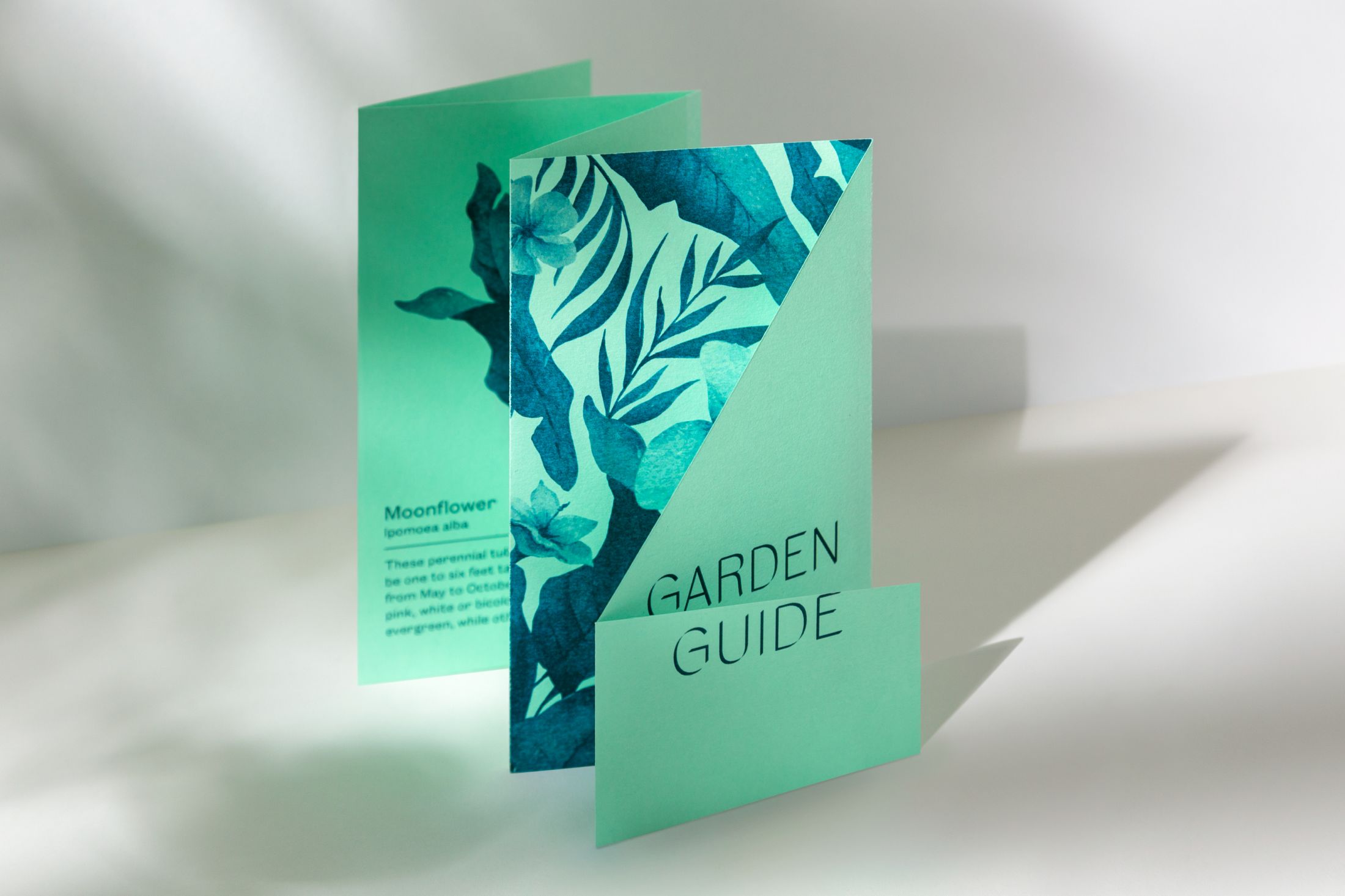
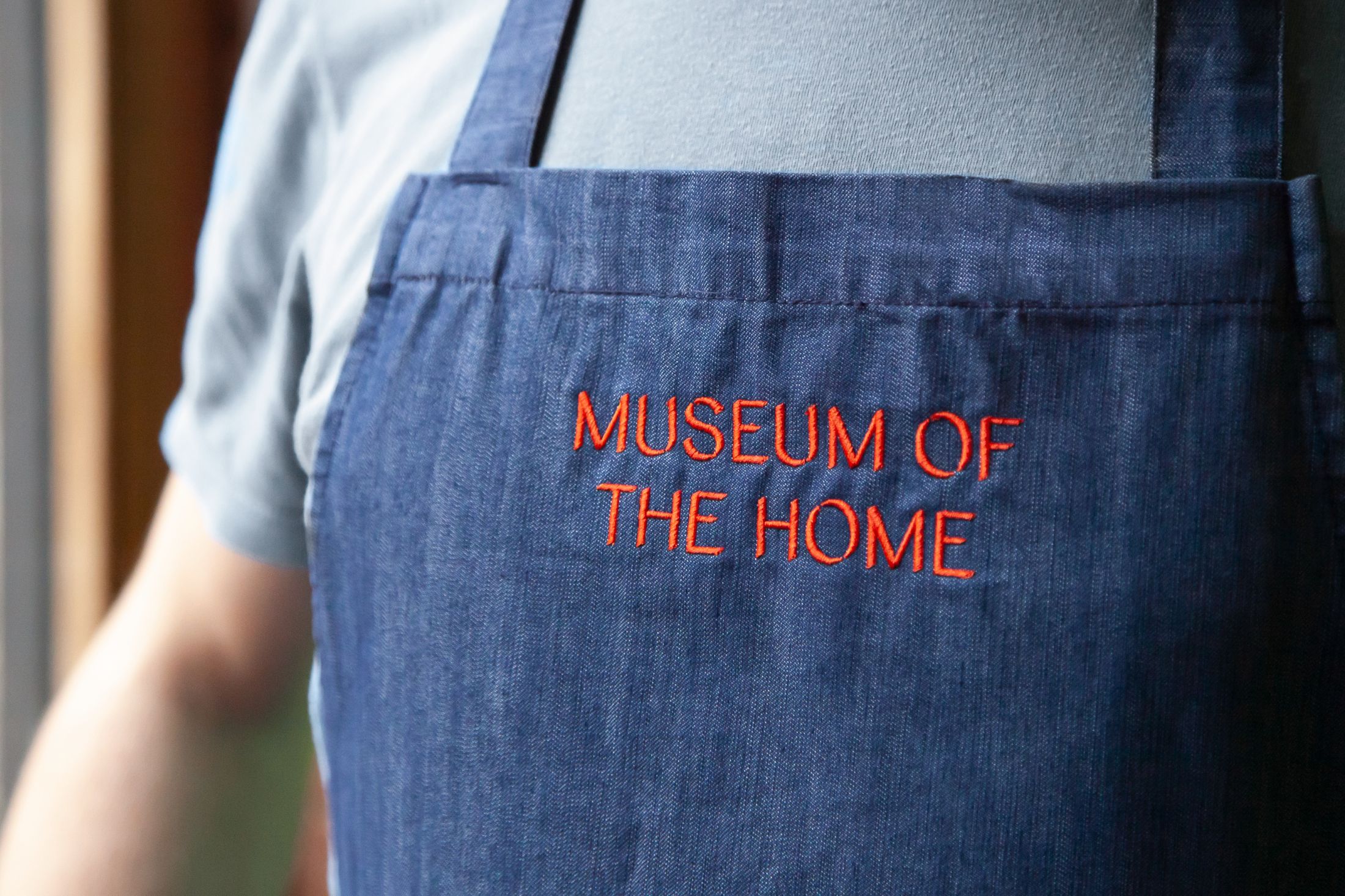
Production of the typeface was a technically-focused task with a visual concept at its core. The end-result needed to move beyond a typeface that could simply be animated; instead, a variable font would embrace technological advancements while allowing its users to apply the dynamic type across an array of different mediums. Engineering for variability allows for a variety of compatible and opposing expressions within a type family, from the bolder, seemingly calligraphic cuts on down to the delicacy and sensitivity of the barely-there lighter weights. In tandem with the institution’s repositioning, these contrasting forms and tones-of-voice give the Museum the range it requires to communicate a diversity of events, exhibitions, and viewpoints, all from a single — and singular — typeface.
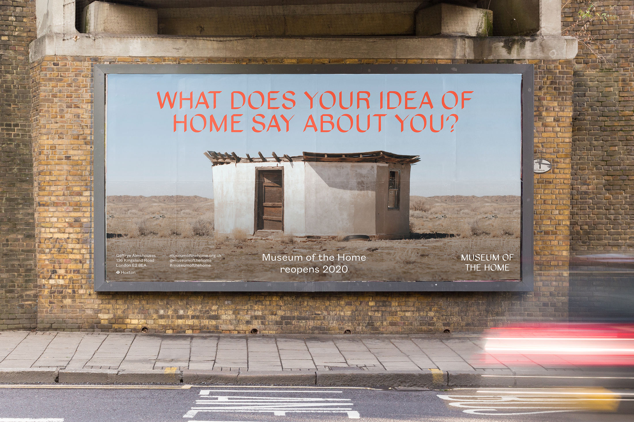
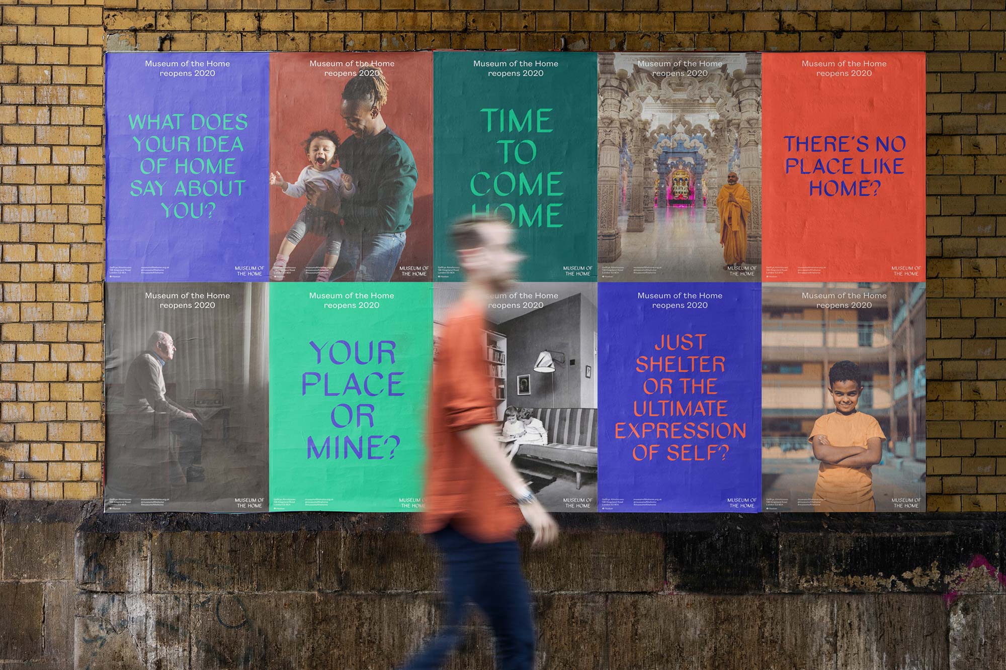
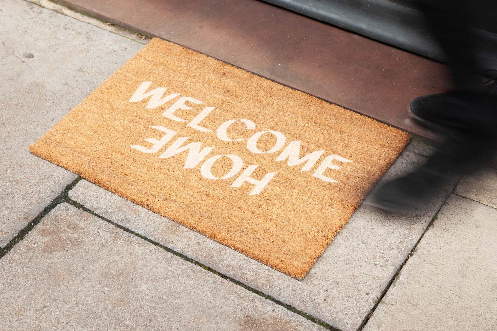
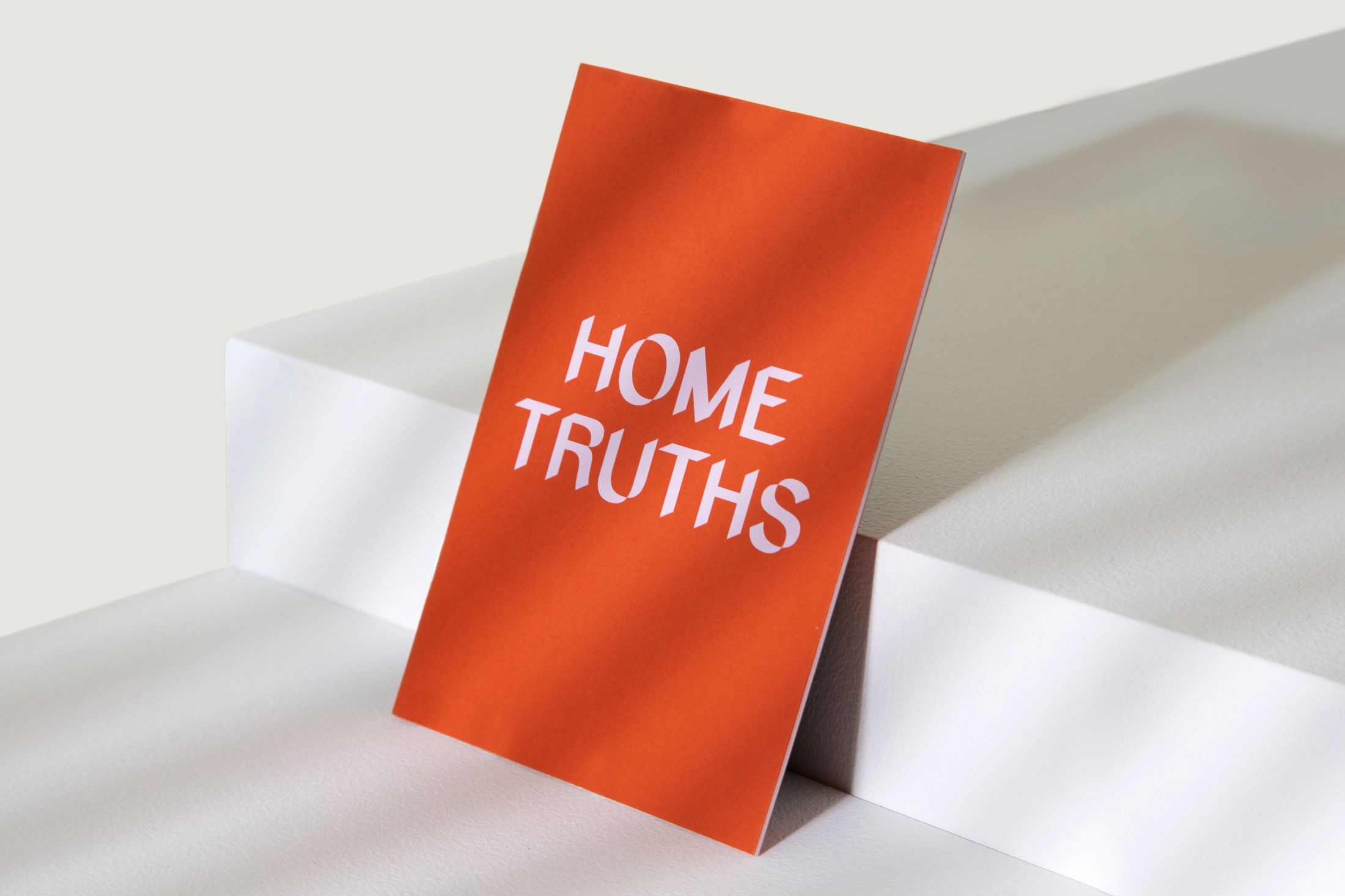
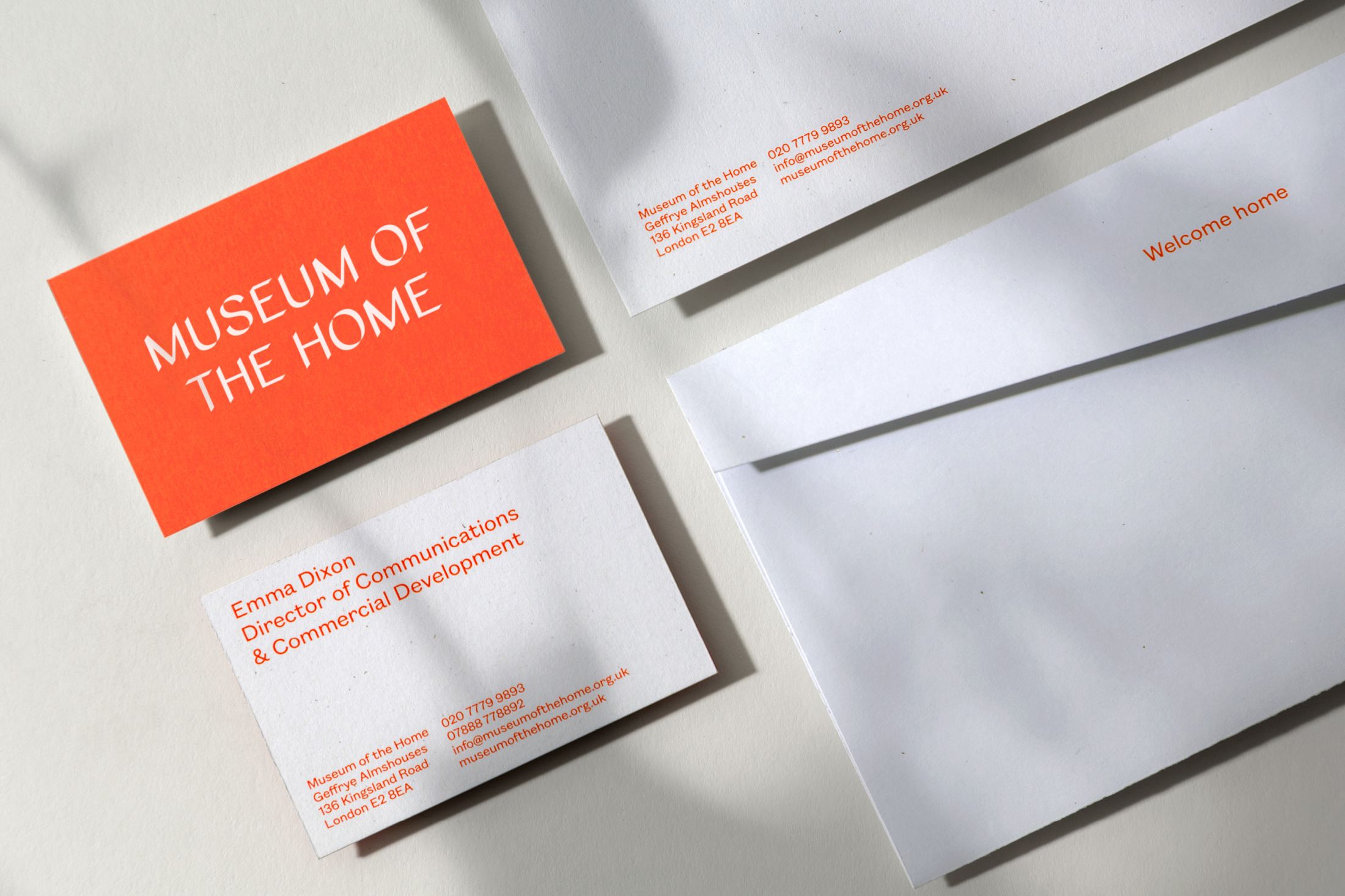
DNCO’s work on the Museum’s rebranding ultimately comprised a wide range of applications for the type, where it was implemented across signage, literature, outdoor advertisements, digital touchpoints, and home products (we’re particularly partial to the Welcome mat). Playing with elements of time — much like a sundial’s shadow shifting position over the course of a day — layers of light and dark tones conceal and reveal imagery, colour, and typographic information, acting in harmony with the angled terminals of various letterforms. Combined with a palette inspired by the Museum’s historic almshouses and gardens, the result is an expressive typographic language that highlights a multiplicity of messages and content.
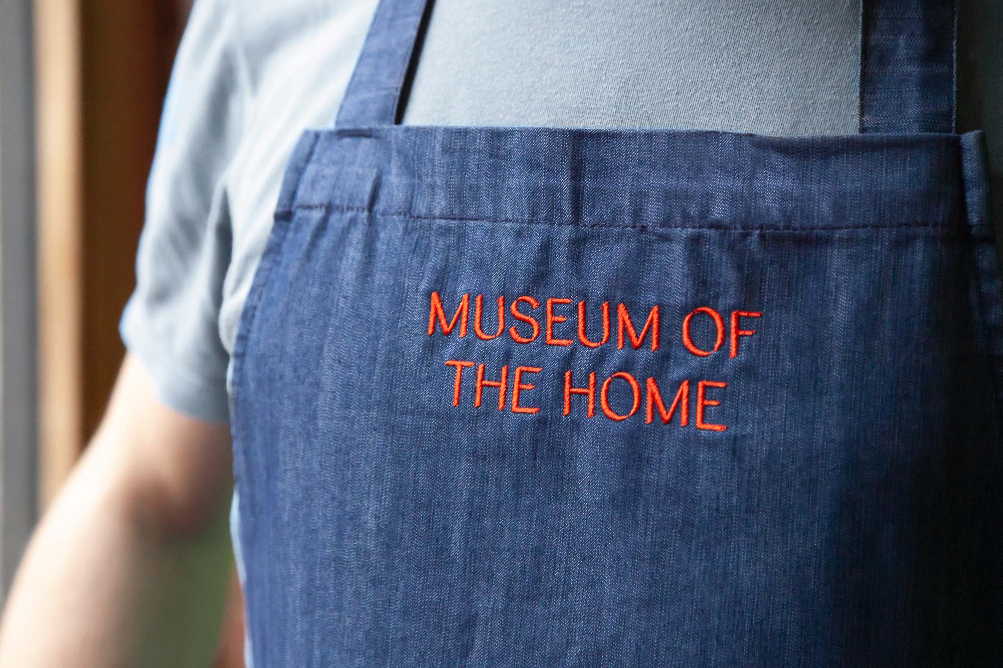
DNCO’s work on the Museum’s rebranding ultimately comprised a wide range of applications for the type, where it was implemented across signage, literature, outdoor advertisements, digital touchpoints, and home products (we’re particularly partial to the Welcome mat). Playing with elements of time — much like a sundial’s shadow shifting position over the course of a day — layers of light and dark tones conceal and reveal imagery, colour, and typographic information, acting in harmony with the angled terminals of various letterforms. Combined with a palette inspired by the Museum’s historic almshouses and gardens, the result is an expressive typographic language that highlights a multiplicity of messages and content.
With thanks to DNCO for the photography.
Recent Custom Projects
View all

Let’s Work Together
To talk to us about your project, please get in touch.
