)
Rostelecom
Rostelecom (Ростелеком) is one of Russia’s largest telecommunications companies, with over 145 million customers, and hardware networks stretching over 500,000 km over traditional telephone lines, broadband, TV and satellite communications. In this ever evolving industry, a refreshed tone to the Rostelecom’s output was required to ensure it retained its primary position in Russia’s telecommunications market.
- Typeface
- Rostelecom Basis
- Comissioner
- Saffron for Rostelecom
- Year
- 2018
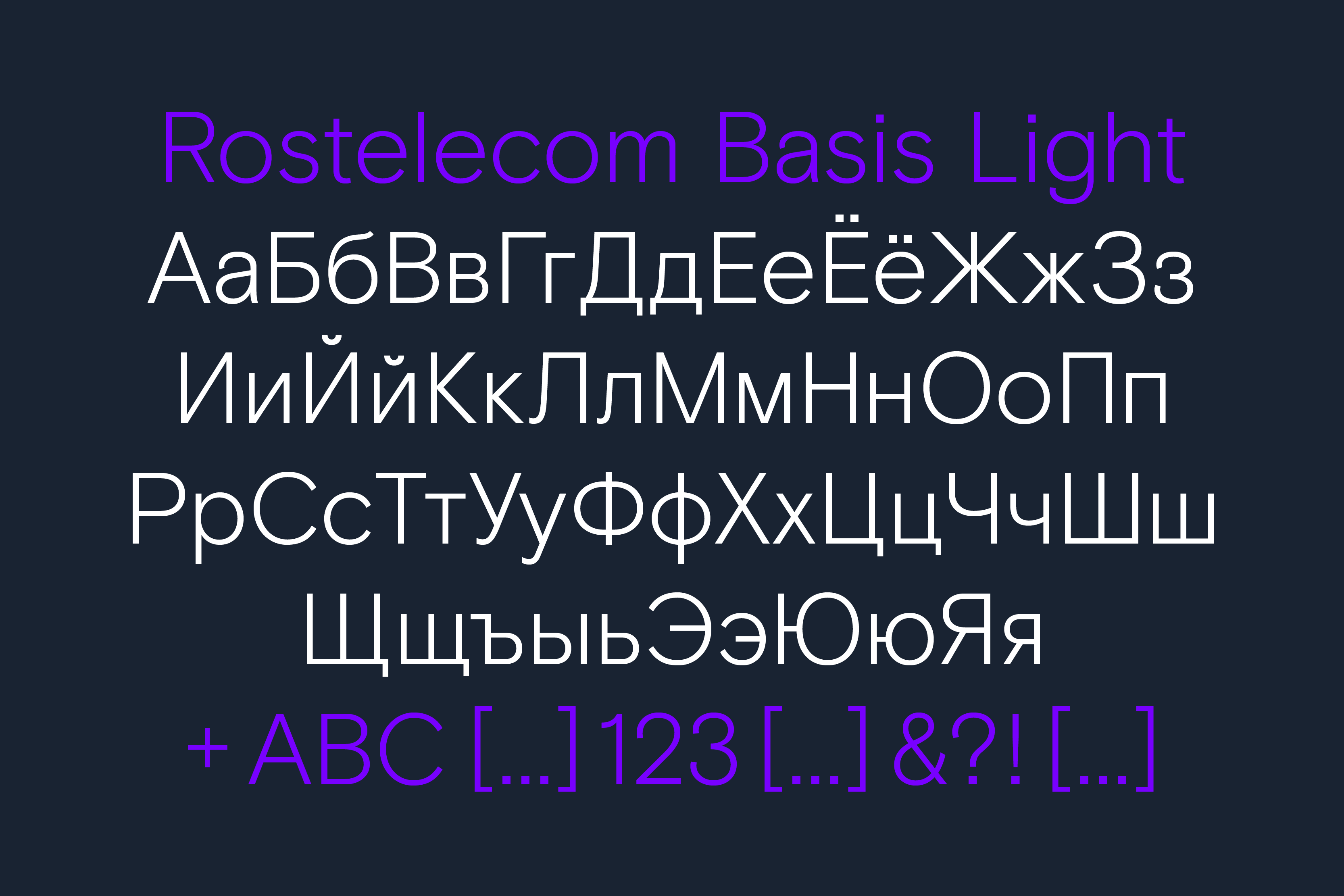
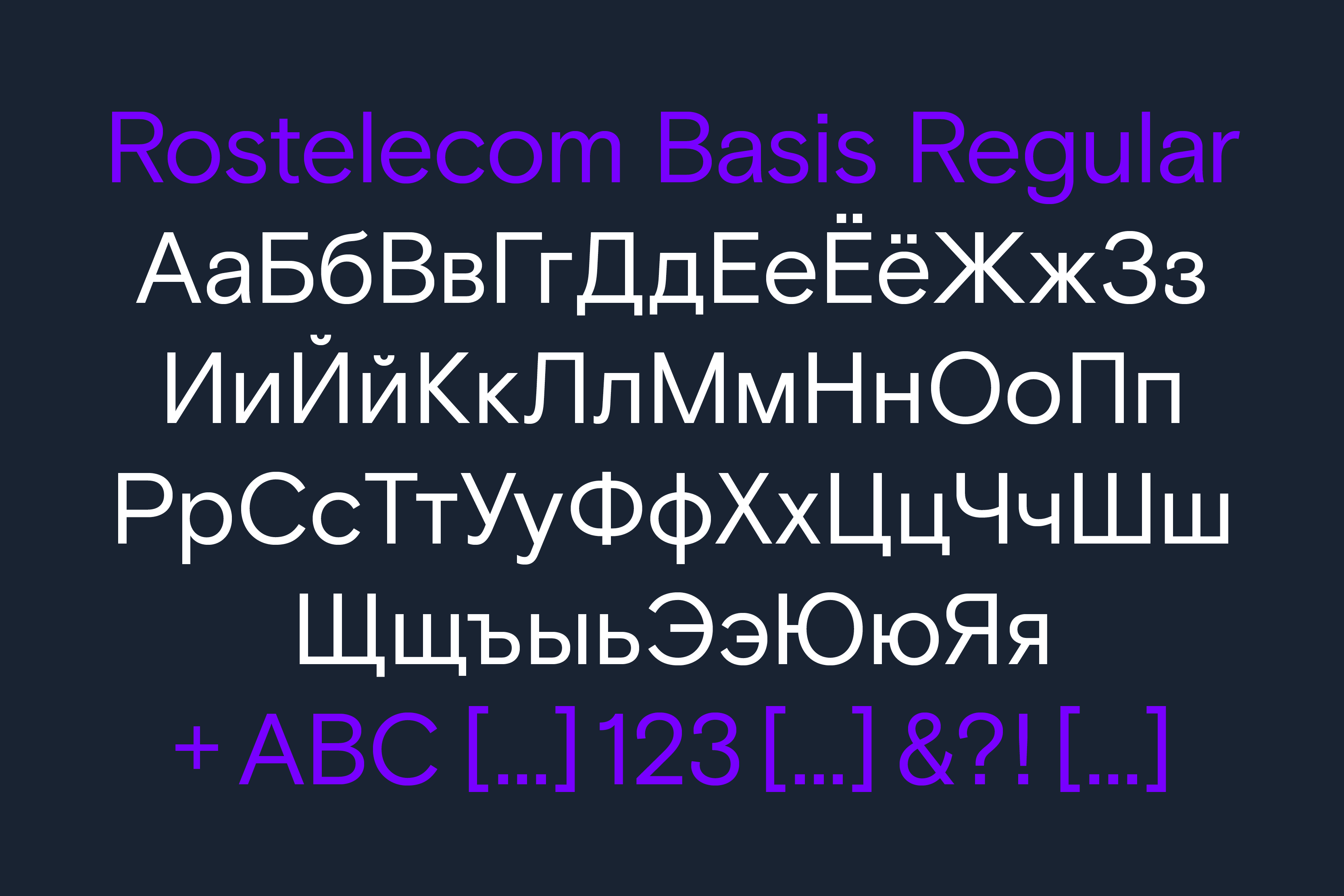
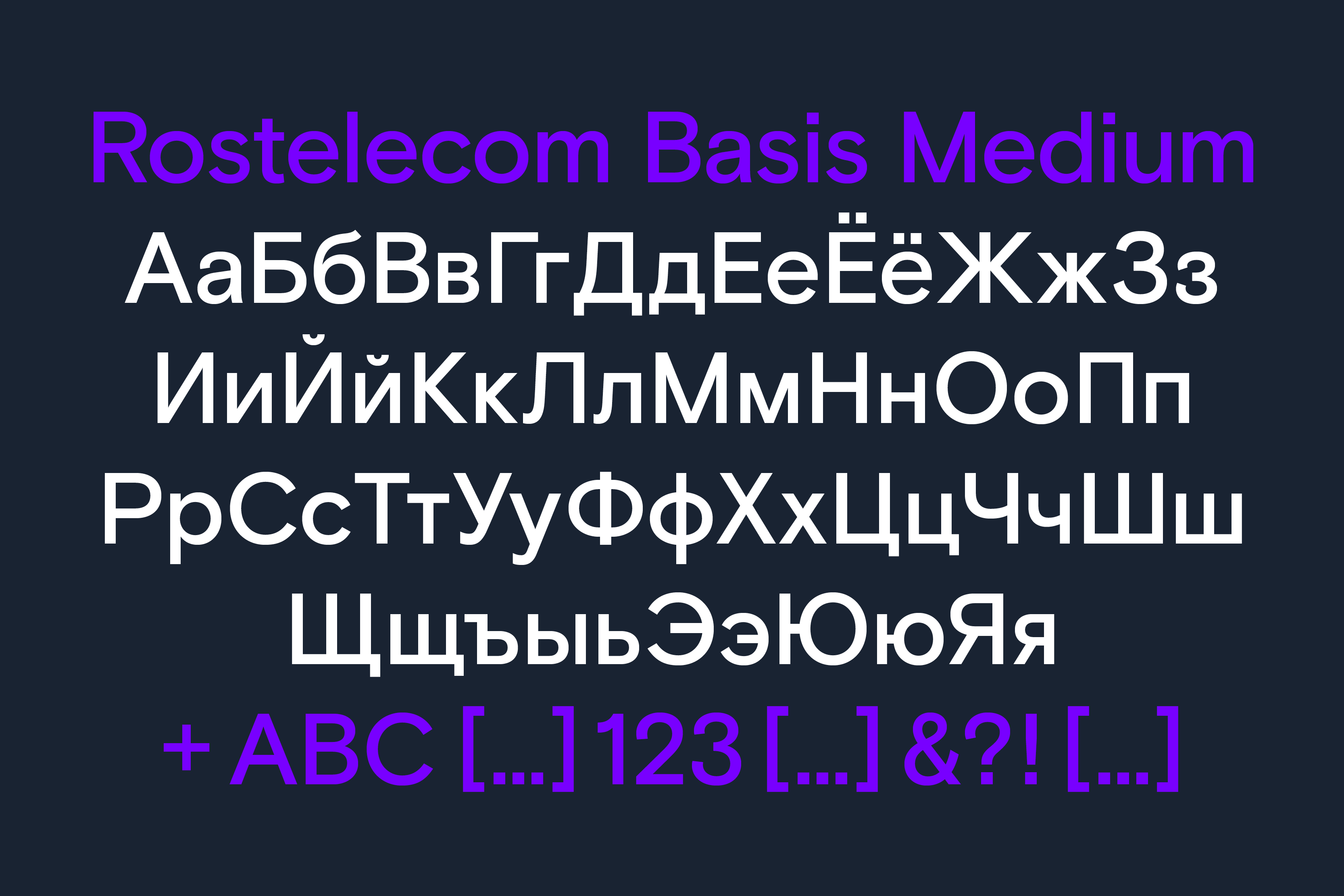
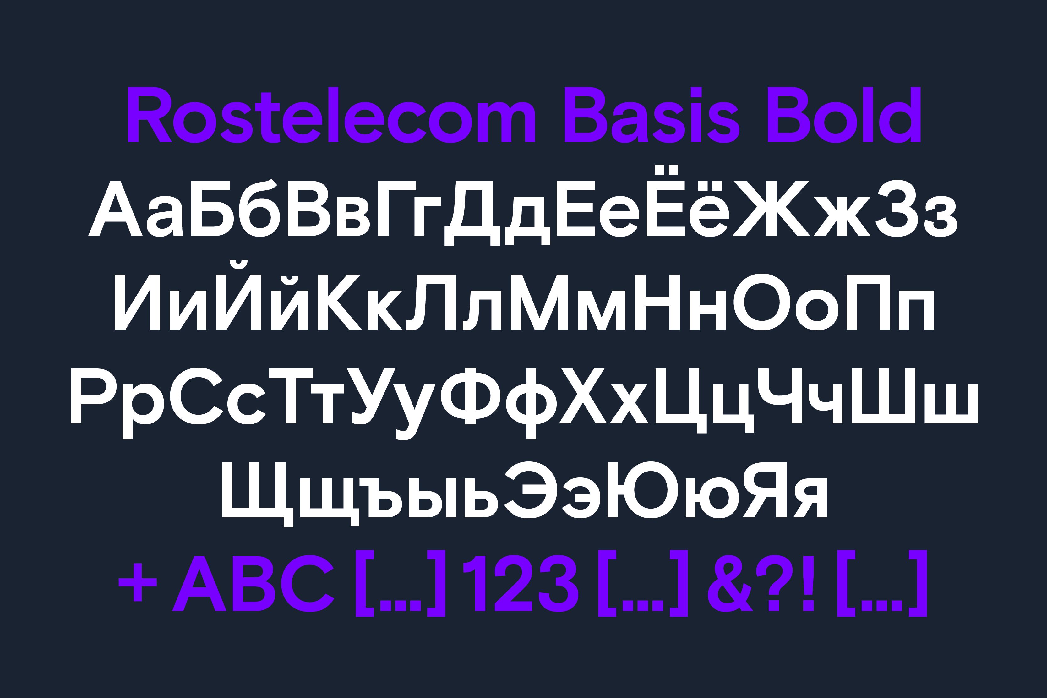
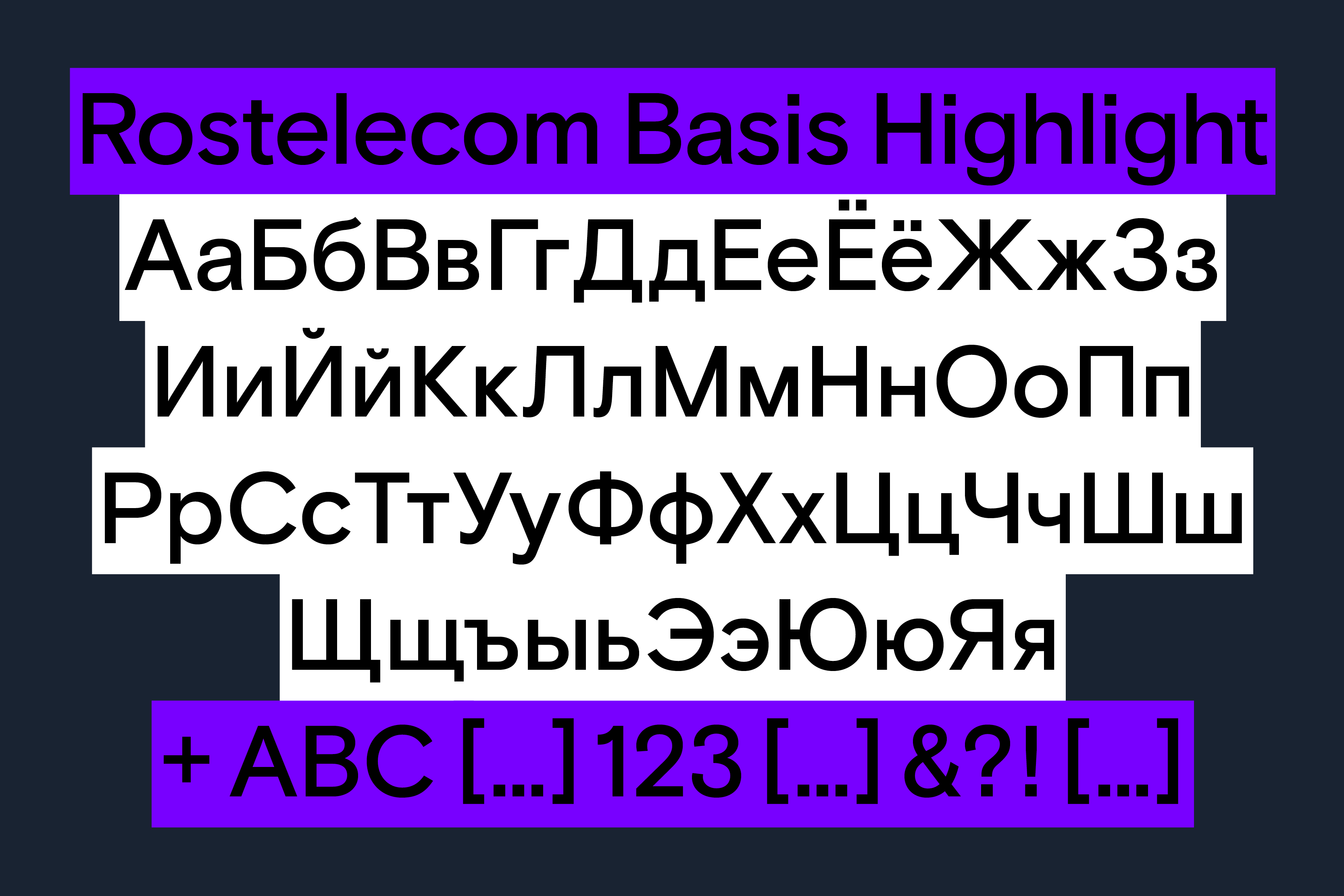
- Styles
- 5 Styles: Light, Regular, Medium, Medium Highlight & Bold
- Coverage
- Adobe Latin-3, Adobe Cyrillic-1
- Classification
- Neo-grotesque Sans Serif
- URL
- saffron-consultants.com
- URL
- company.rt.ru/en/
Saffron Brand Consultants specified Basis Grotesque as the brand typeface to be rolled out as part of a strategic new positioning of the company. In commissioning us to collaborate with both agency and client in tandem, Saffron ensured we were able to deliver a robust typographic solution. Their scope included a completely refreshed corporate identity across all touchpoints, including out of home advertising, digital media and print-based output – within this visual system Basis plays a key role.


We closely collaborated with a specialist Cyrillic consultant to ensure a robust and Cyrillic-centric project was delivered accurately to Rostelecom and their 145 million customers. Later, this became part of a larger update to our commercial type family Basis Grotesque which is distributed through our own type library. This work included refining forms for legibility and working closely with both agency and client to ensure smooth application into all requirements for the brand.
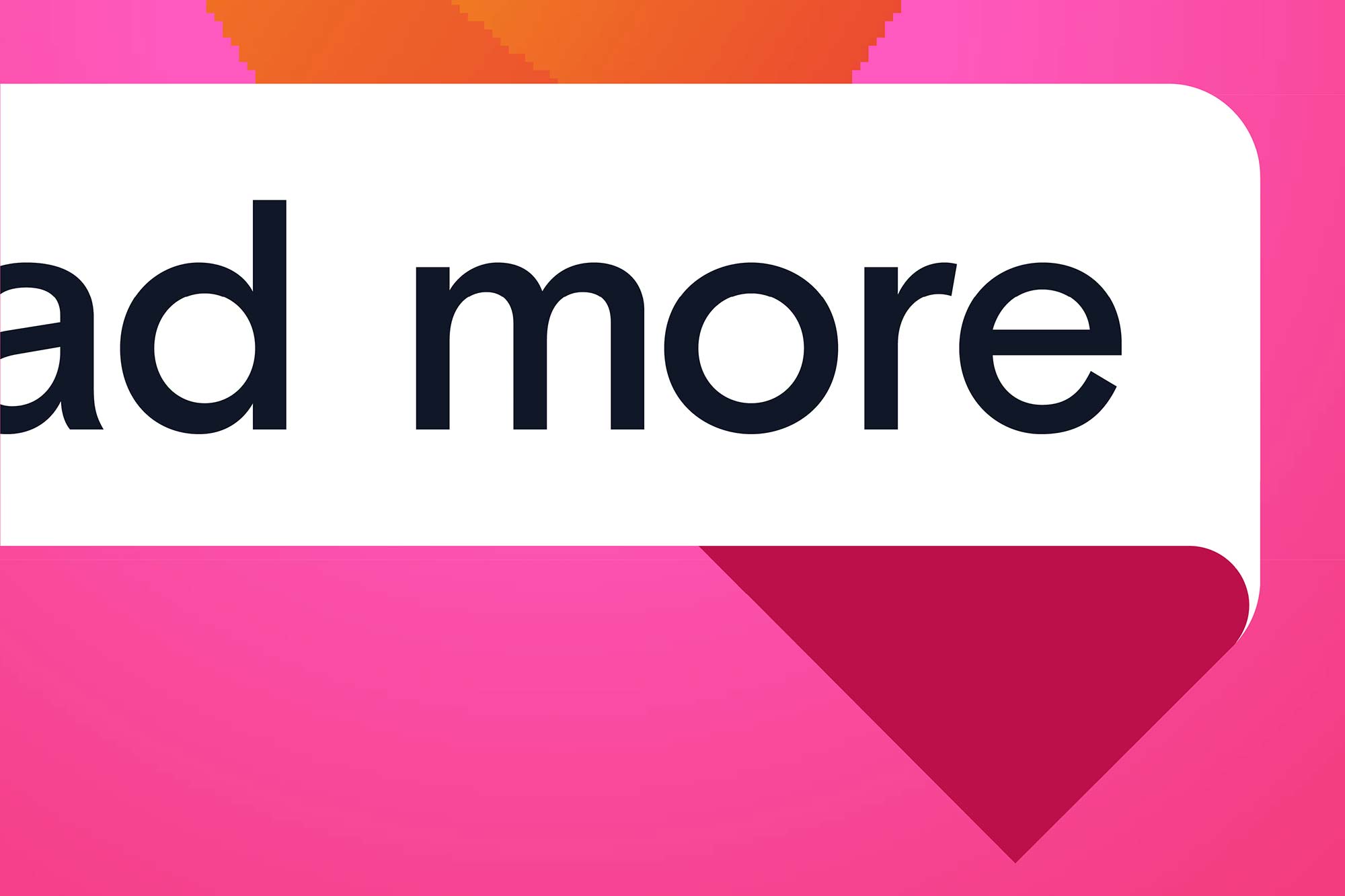
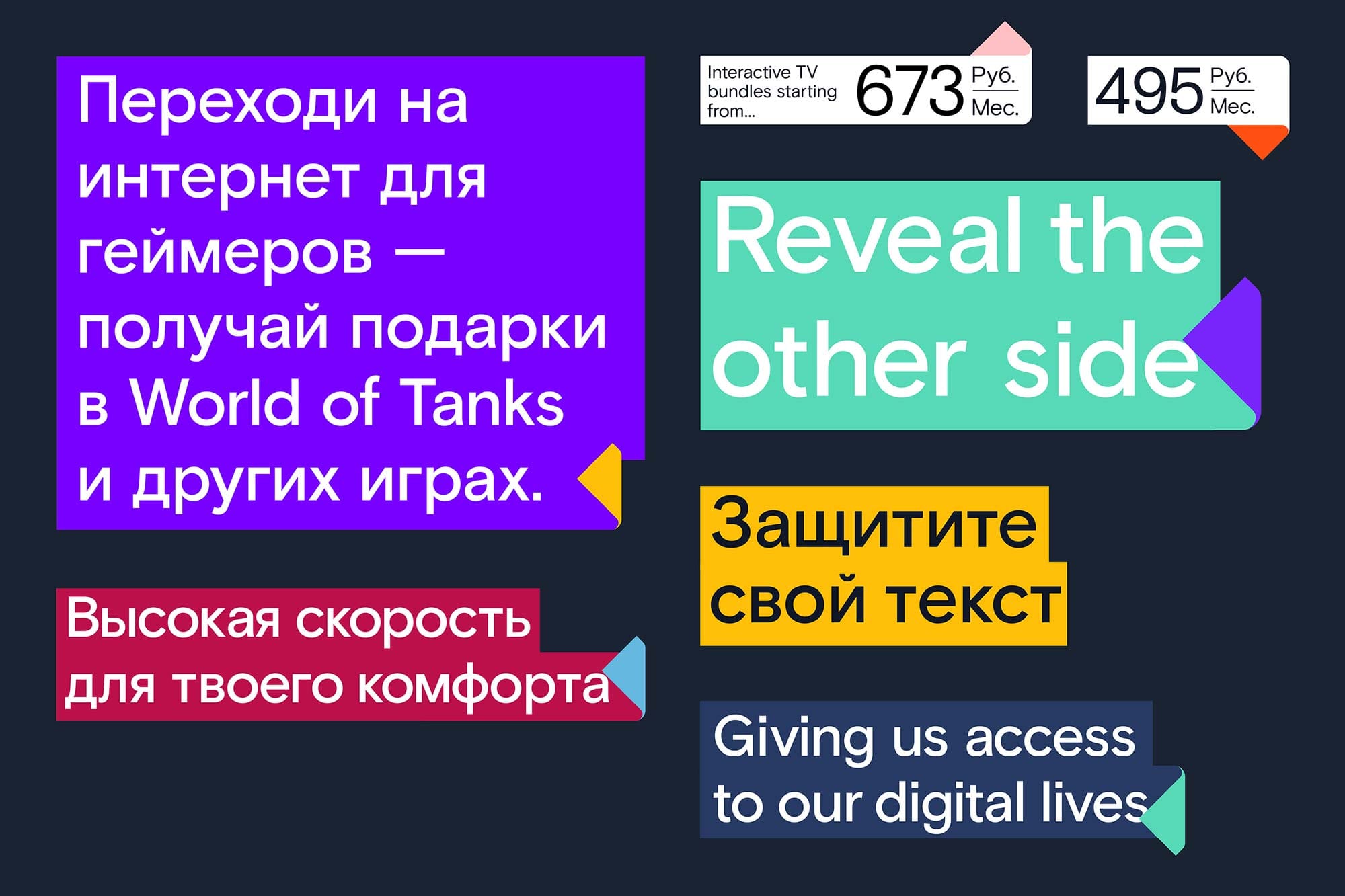
This led to Saffron’s core visual concept of ‘revealing the other side’ being made into a flexible highlight-and-reveal font style specifically for Rostelecom. This tool enabled in-house designers to quickly and easily apply this graphic system to a wide range of outputs, ensuring the same visual variables were always applied.
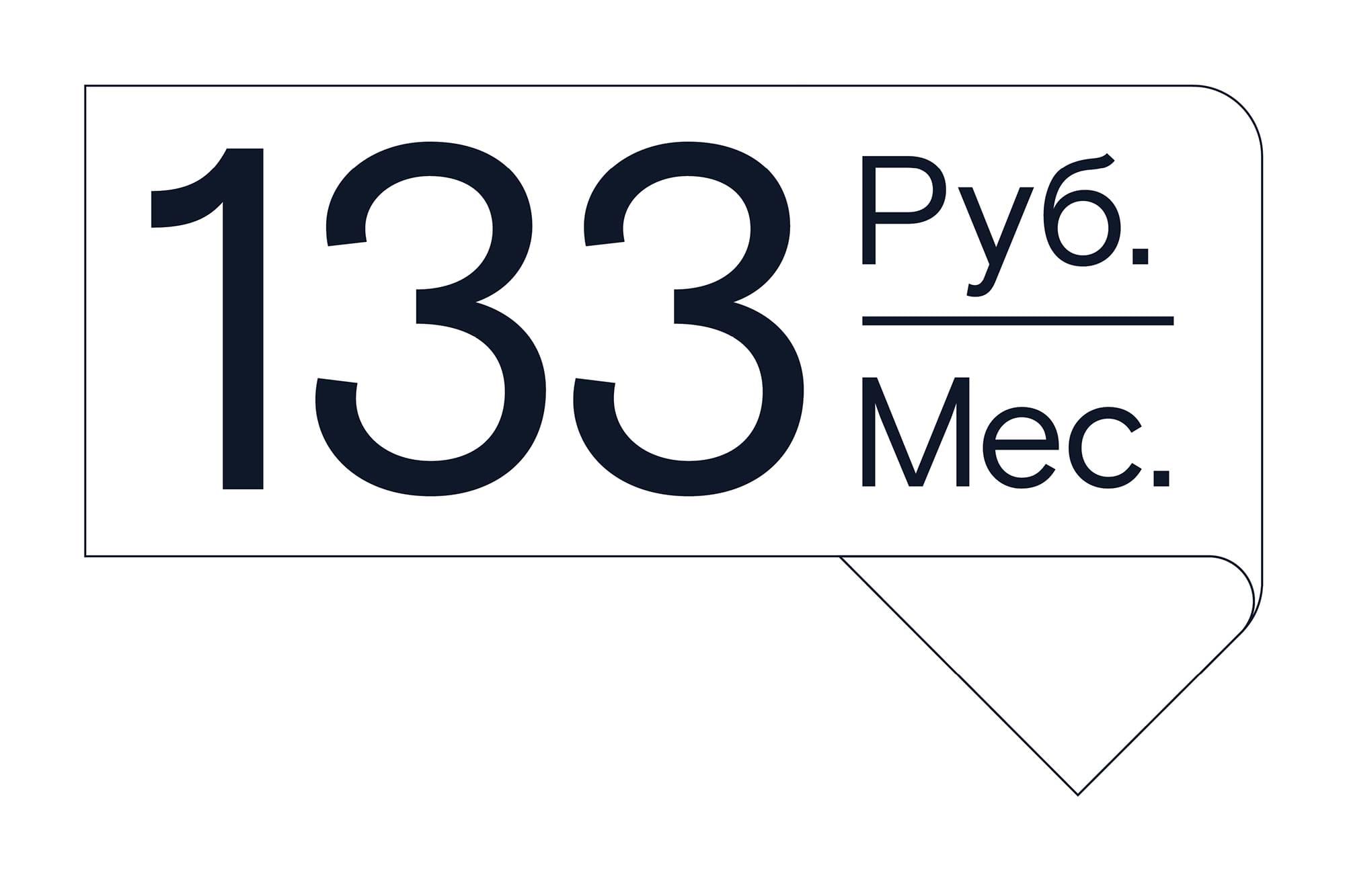
Alongside the flexible highlight cut of Rostelecom Basis, wordmark lock-ups for both Latin and Cyrillic variants of Rostelecom / Ростелеком were crafted and harmonised and several bespoke typographic lock-ups for pricing were created to ensure consistency and ease of roll-out through the whole brand.
Recent Custom Projects
View all

Let’s Work Together
To talk to us about your project, please get in touch.
