Aperçuعربي
Weights
4
Styles
4
Available
Variable
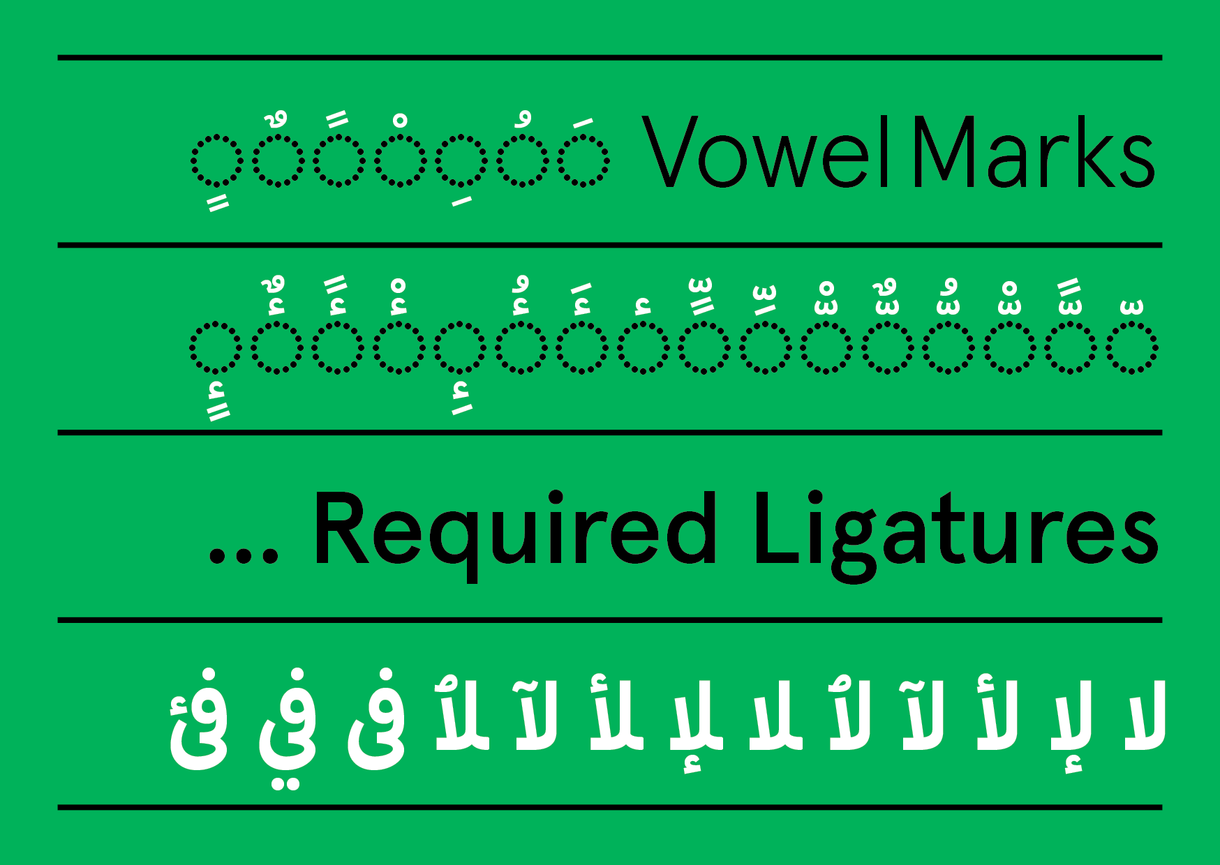
Stylistic Sets
5
أرنب ذهب سمك مفتاح
↑ Aperçu عربي Light
بطة حصان ضفدع قارب
↑ Aperçu عربي Regular
تفاحة غزال طائرة فراشة
↑ Aperçu عربي Medium
ثعلب خروف كتاب ليمون
↑ Aperçu عربي Bold


،ألفا، بابا
،إيكو، روميو
تشارلي، يونيفورم
،إيكو، روميو
تشارلي، يونيفورم
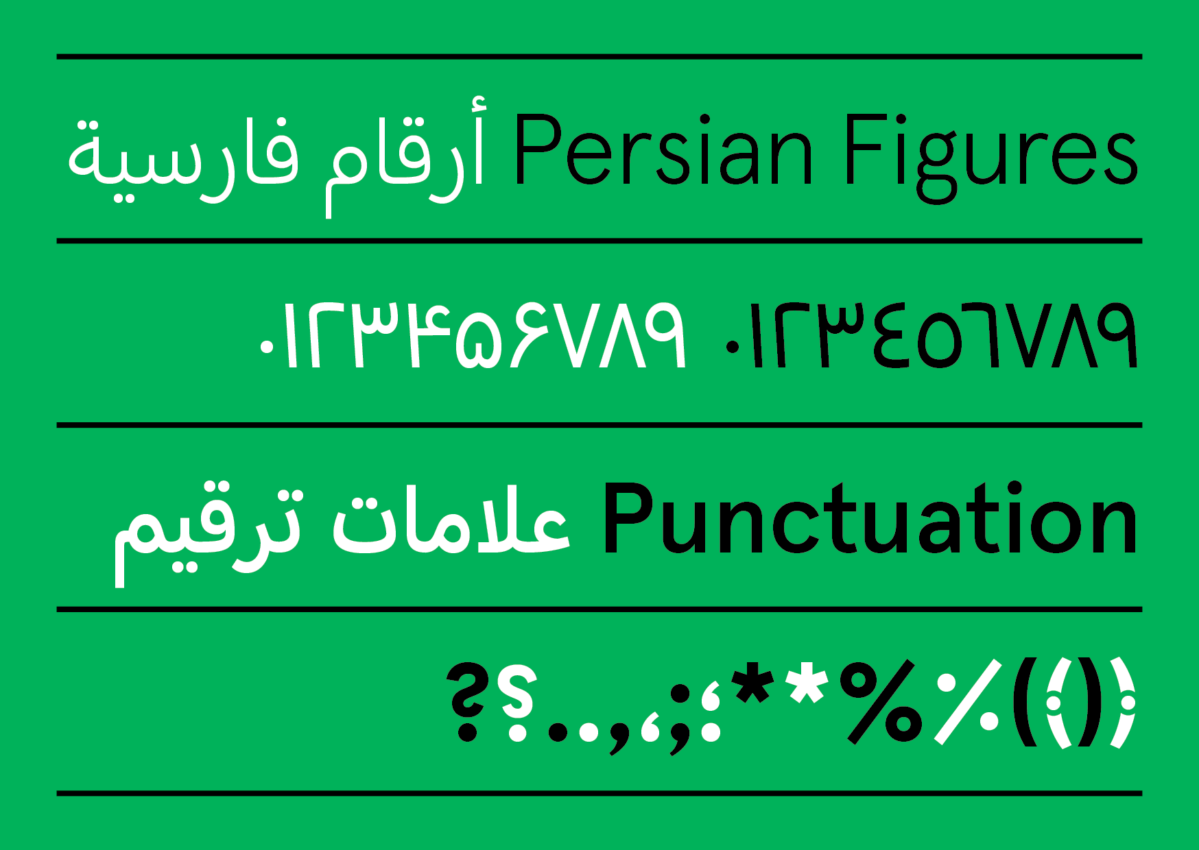
١.
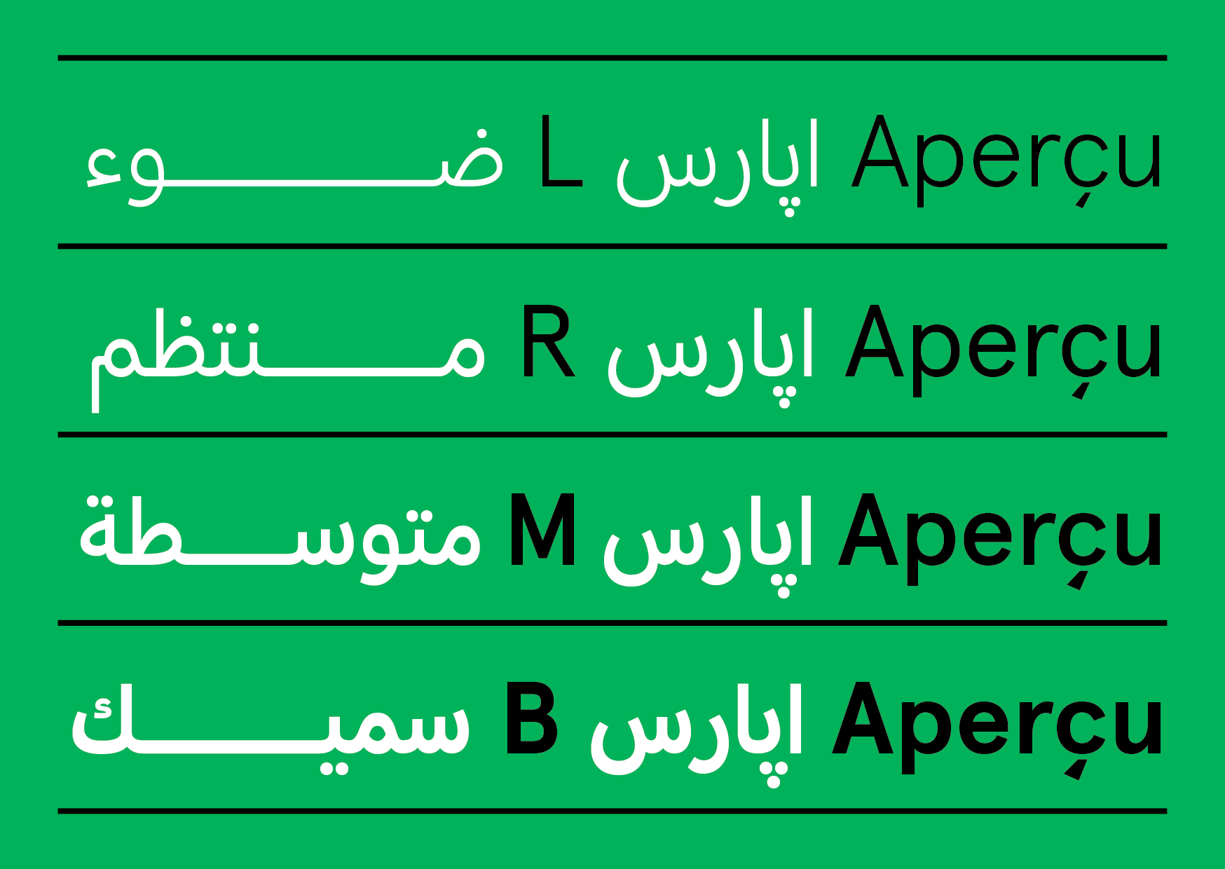
Aperçu أپارسو Light رفيع
٢. Aperçu أپارسو Regular عادي
٣. Aperçu أپارسو Medium متوسط
٤. Aperçu أپارسو Bold سميك
٢. Aperçu أپارسو Regular عادي
٣. Aperçu أپارسو Medium متوسط
٤. Aperçu أپارسو Bold سميك
لندن إلى لوس أنجلوس
(5437 ميل) 11: 15 م
LDN -> LA
مدينة نيويورك إلى سيدني
(9929 ميل) 22: 20 م
NYC -> SYD
جنيف إلى القاهرة
(7561 ميلاً)
GVA -> CAI
يونيفورم - يو
تي — تانجو
إس - سييرا
إكس — أشعة إكس
دبليو — ويسكي
فيكتور - في
زي - زولو
واي — يانكي
زيتون
٨٬٢٥٠ ليرة،
عصير برتقال ٦ ليتر،
خبز ٩ ربطات، زعتر ١٥ كغ، رمّان ٧٫٥ ريال،
بقدونس ٤ باقات، مياه غازية ٧ قناني،
حمّص وفول صحن ١، مكسّرات ٢٠٠ غ.
خبز ٩ ربطات، زعتر ١٥ كغ، رمّان ٧٫٥ ريال،
بقدونس ٤ باقات، مياه غازية ٧ قناني،
حمّص وفول صحن ١، مكسّرات ٢٠٠ غ.
يوكوهاما