
Apta; Inherent Similarities
Process
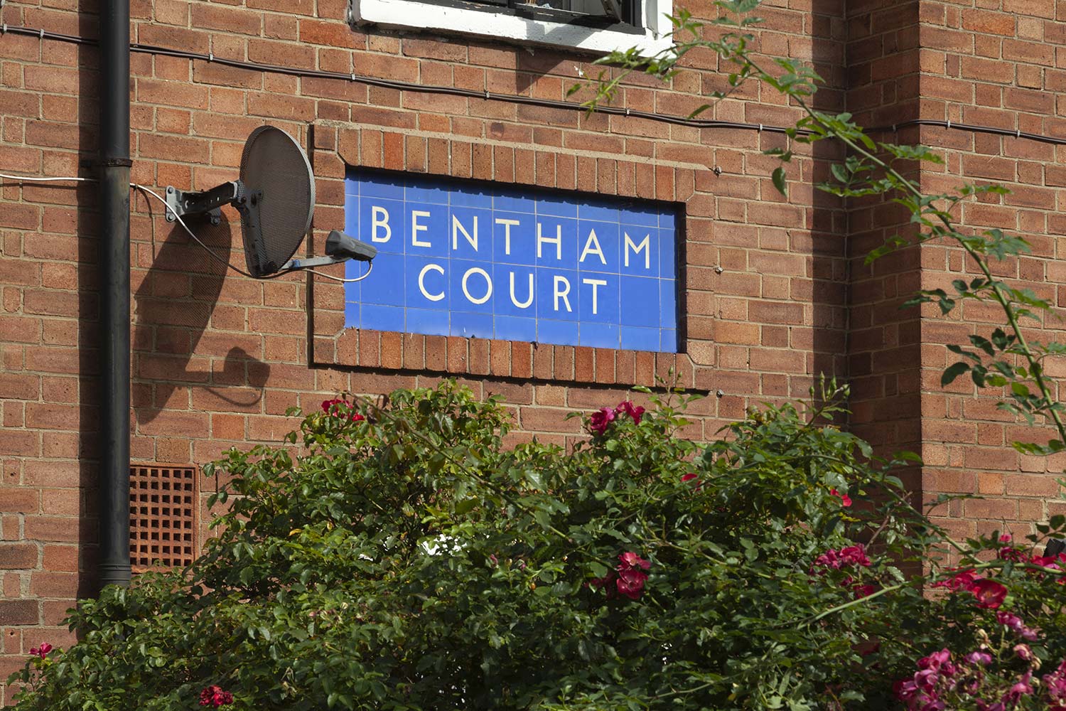
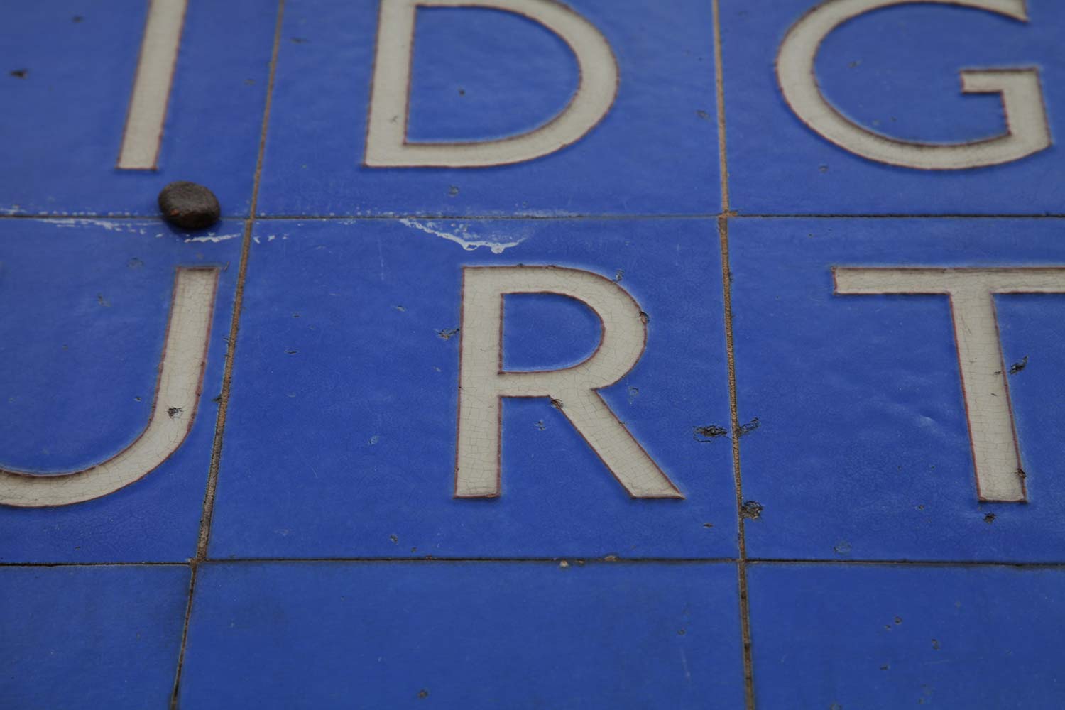
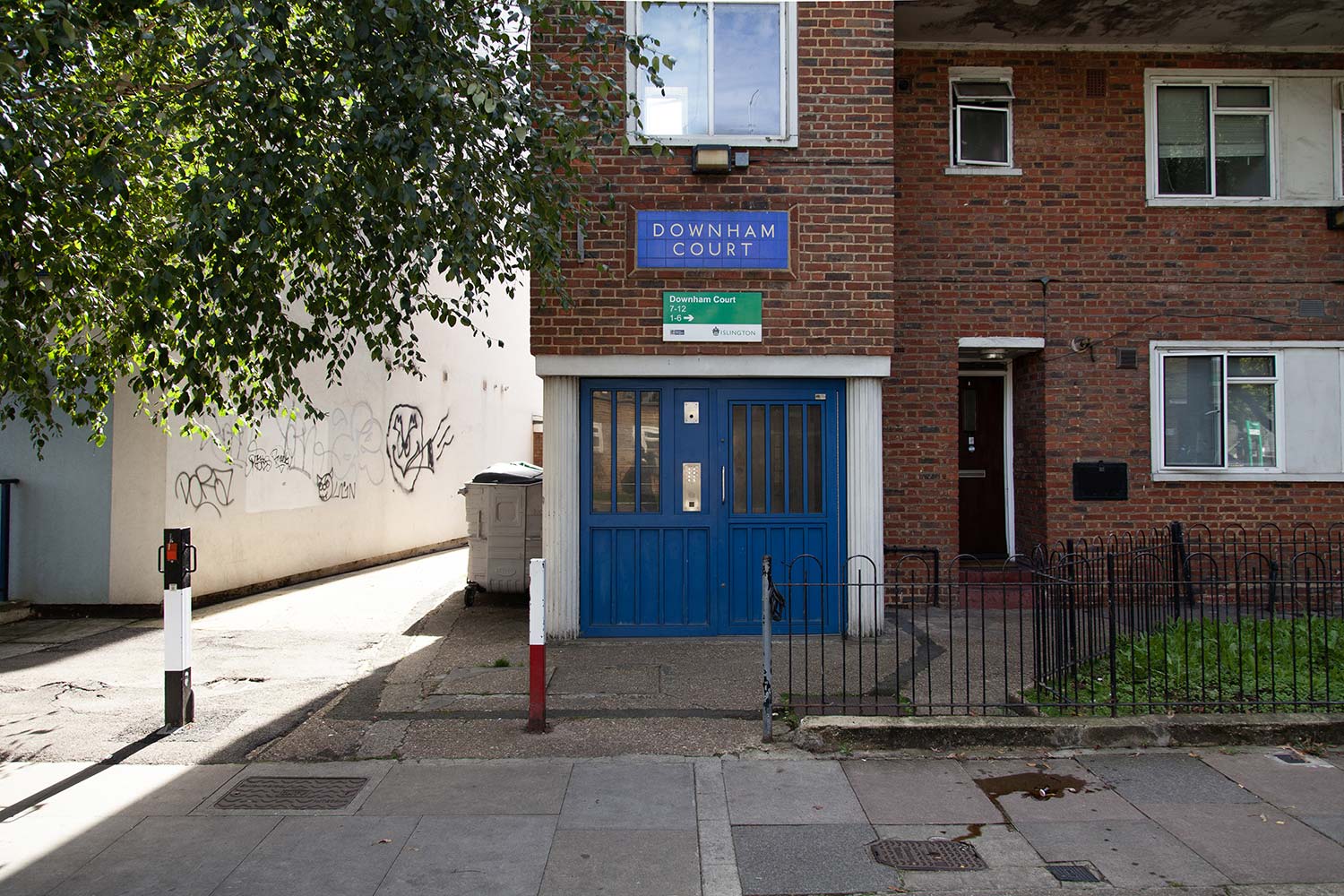
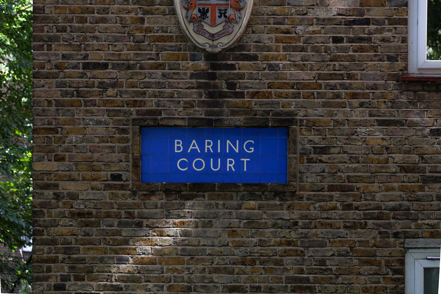
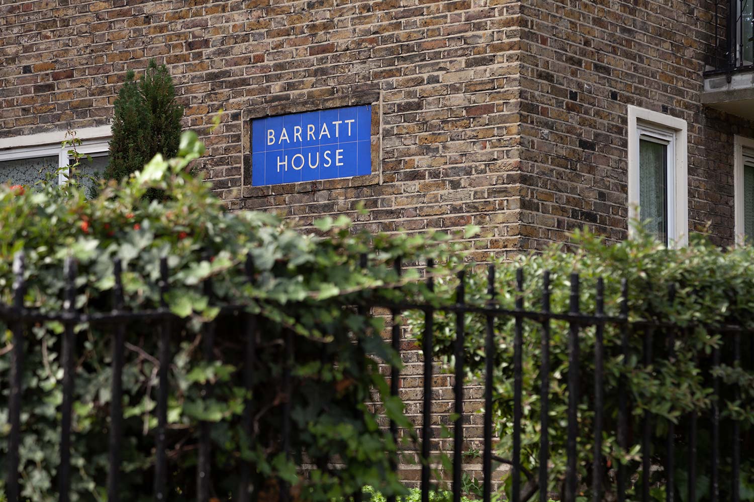
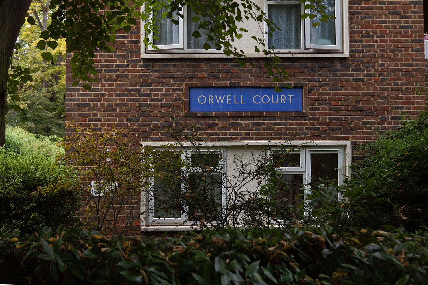
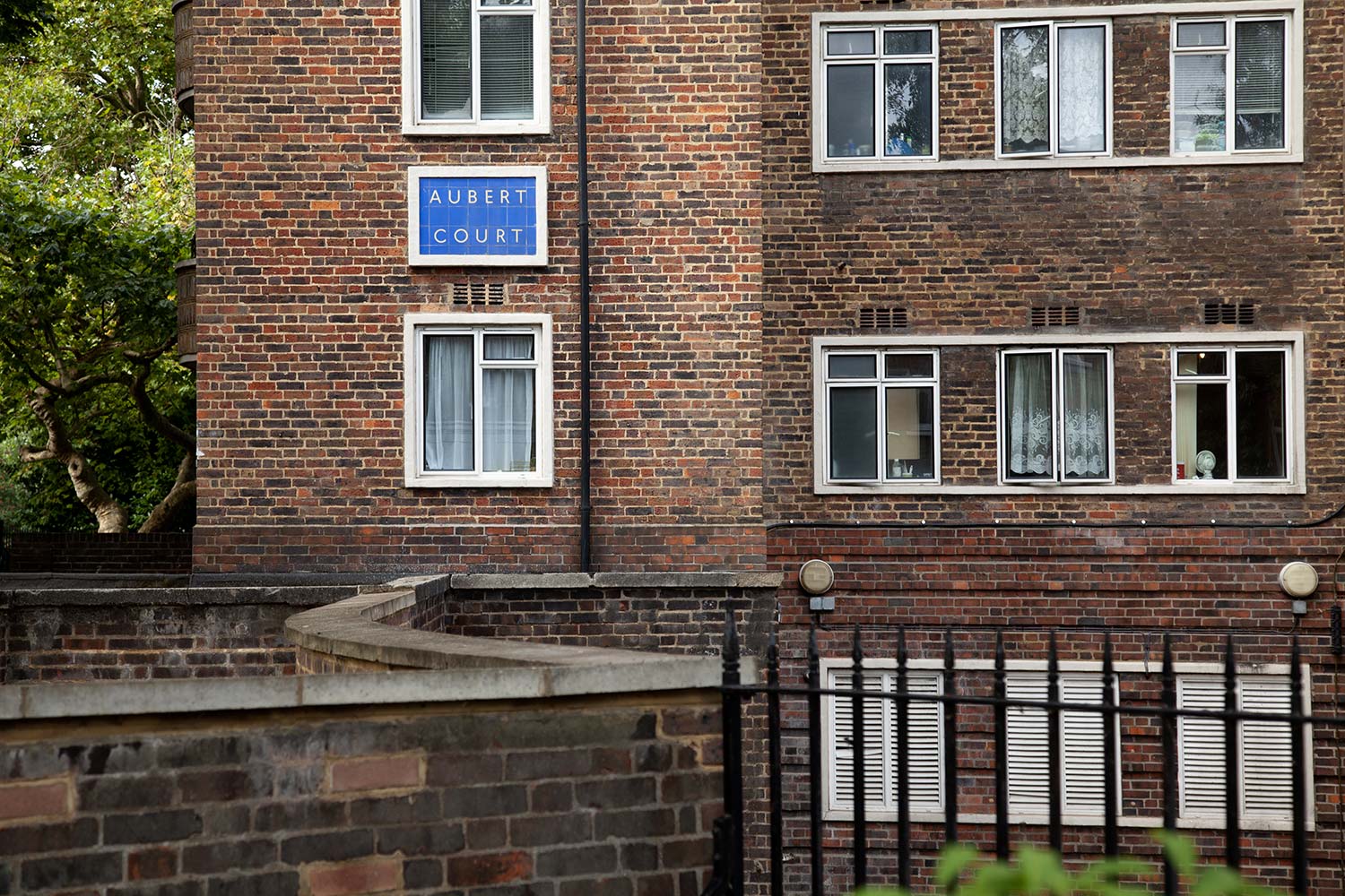
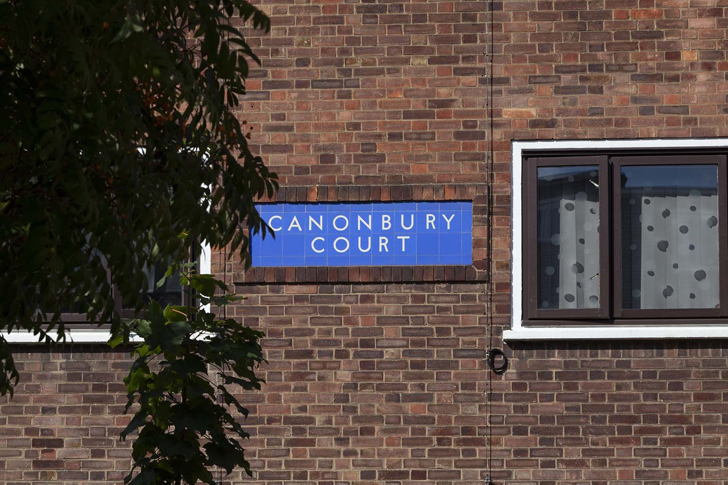
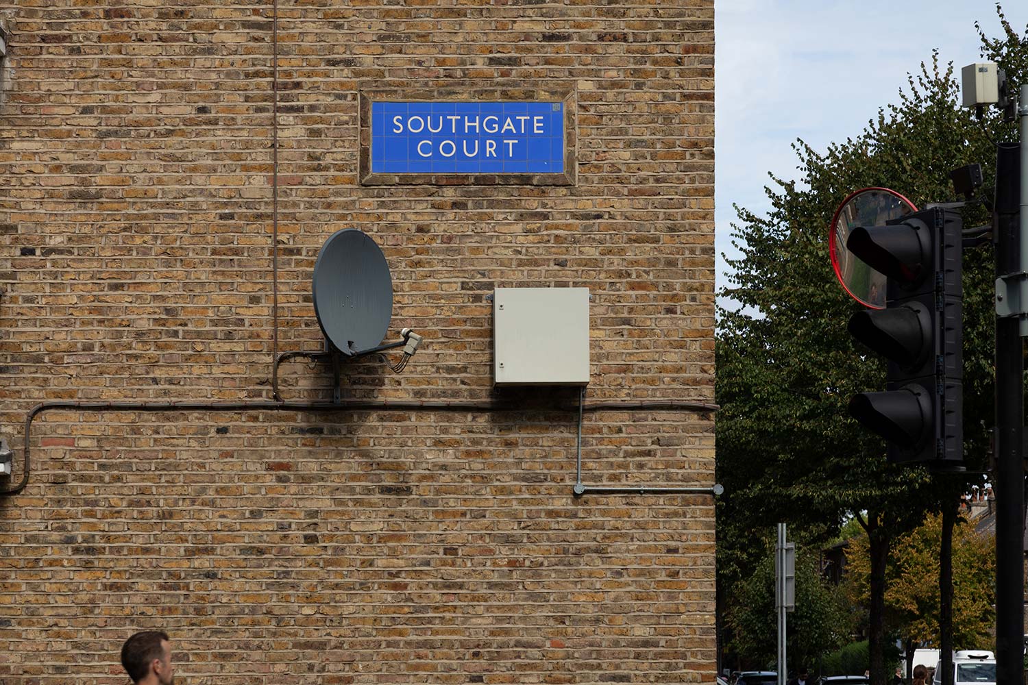
Apta began as a typographic study inspired by vernacular signage adorning mid-century social housing estates in Islington, North London. The estate names are set in elegant, mono-linear, sans serif capitals in white on cobalt blue, vitreous enamel tiles and are framed by red brick and inset flush to the exterior walls.
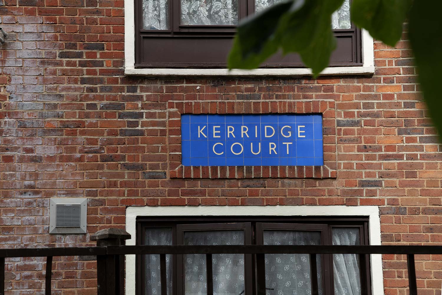
As well as finding these signs charming, we noticed the letterforms strike a curious balance between humanist and geometric sans serif designs. They combine grace, balance and movement with objectivity and austerity. At a glance, the generously open apertures and vertically cut terminals are reminiscent of Johnston or Gill Sans, while details such as the straight leg of the «R» and pointed bases of the «W» and «V» are reminiscent of Futura.
Intrigued, we took a closer look at two category-defining typefaces that likely influenced these signs, namely Johnston (Edward Johnston, 1913) and Futura (Paul Renner, 1927). Although these two iconic designs represent seemingly opposing approaches, we were interested to find similarities between them – from aspects of their origins to their structure and form.
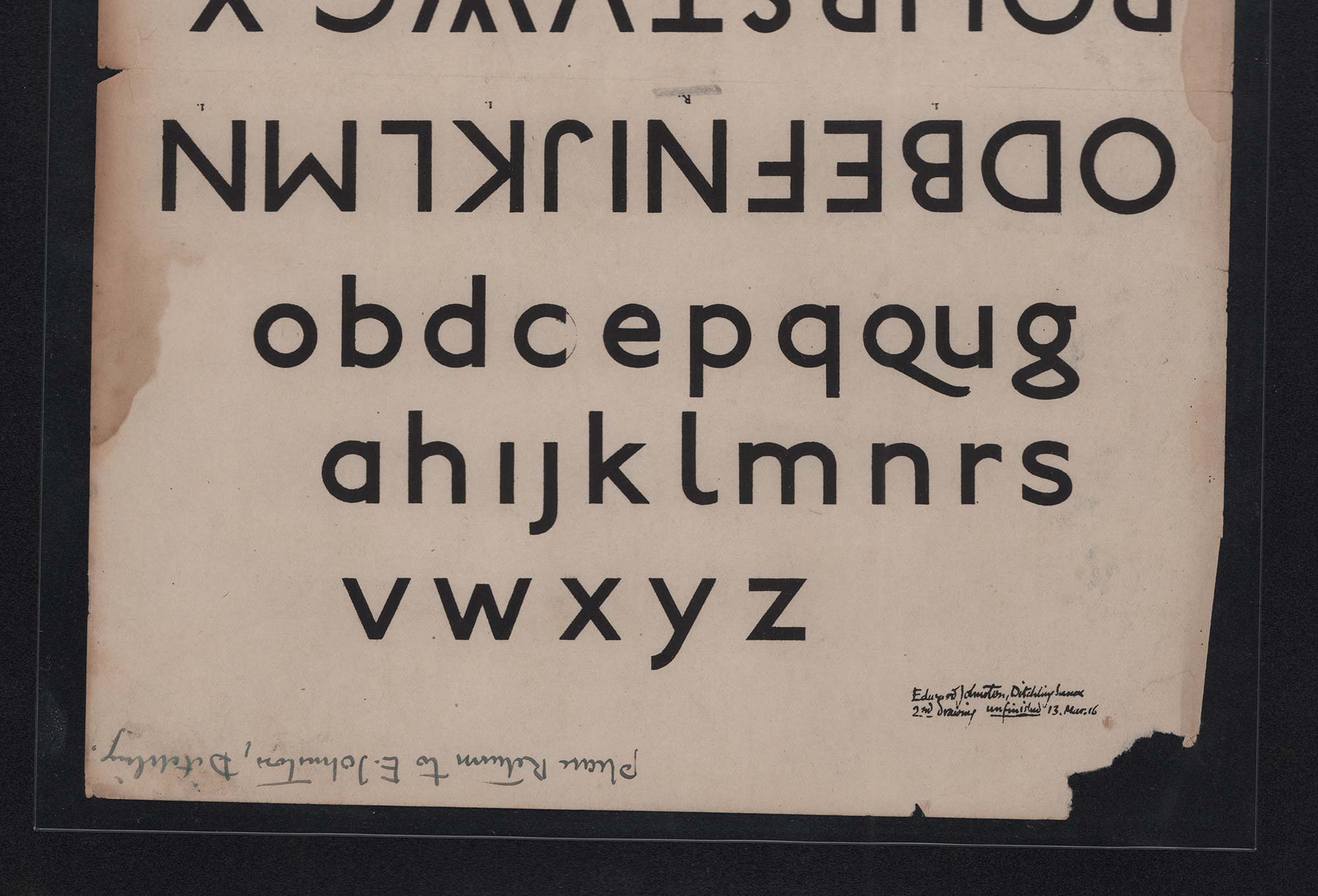
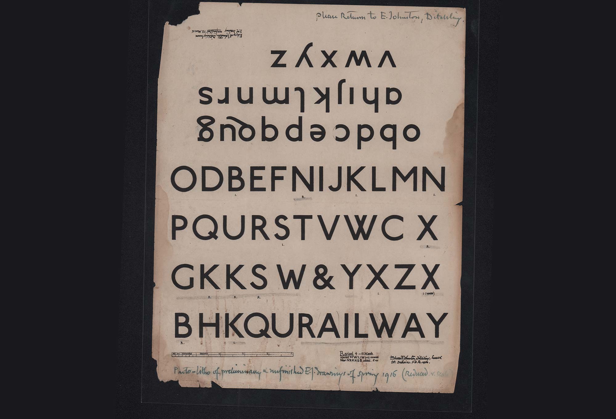
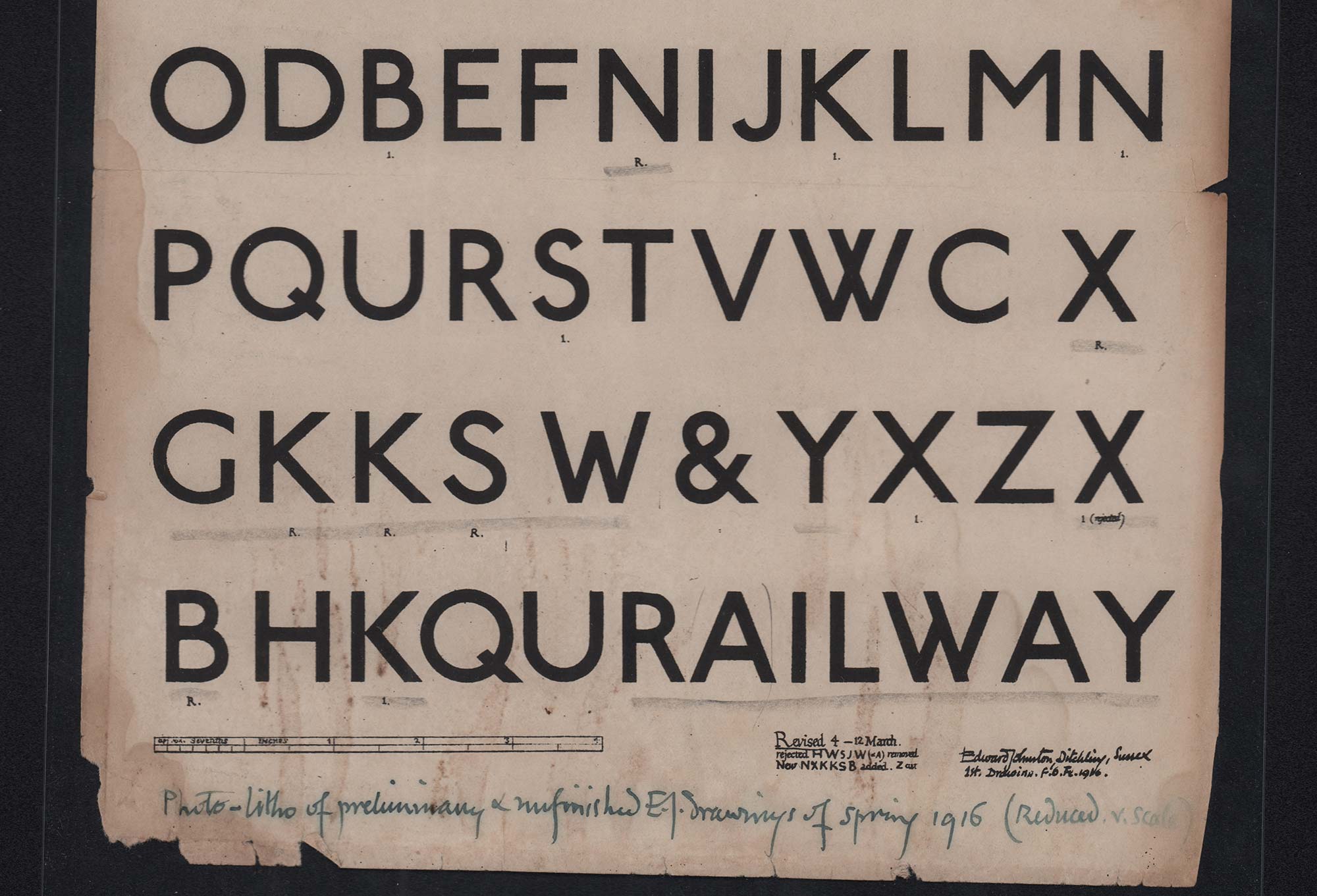
⁕ Johnston Specimen, 1916
Johnston and Futura were reactionary designs that broke from the conventions of their day. In early 20th century Britain, the urban and rural typographic landscape was dominated by Grotesques: no-nonsense, hard-working letters carved, painted and printed on public houses, banks, chapels and monuments across the country.
With his seminal typeface commissioned for the Underground Electric Railways Company of London, Edward Johnston aimed to create an ‘unmistakably modern’ typeface. To this end, Johnston combined humanist qualities of traditional serifs – namely open apertures and Roman proportions – with the mono-linear build associated with Grotesques.
Like Johnston, Renner's Futura – commissioned for the affordable public housing 'New Frankfurt-project' – also represented a break from typographic convention. Futura embodied efficiency and forwardness. The design not only marked a departure from Grotesques, but rejected the approach of the heavy, angular, calligraphic 'Fraktur' designs prominent in Germany at the time.
From a design perspective, Johnston and Futura embodied very distinct approaches. While Johnston channelled humanist calligraphic influences to structure his alphabet, Renner used a system of geometric forms – almost a typographic kit of parts. Interestingly, despite these unique strategies, the designs have an affinity that comes from shared foundational qualities.
Both Futura and Johnston looked to Roman block capitals for their proportions and are distinguished by a near mono-linear build. These qualities have a significant impact on the overall colour and rhythm of both typefaces. The application of Roman proportions results in a softening of Futura’s otherwise starkly geometric tone. Conversely, Johnston’s uniform stroke brings an unexpected engineered quality to its humanist forms.
A closer look at the two designs reveals further idiosyncrasies and perceived deviations from their respective classifications and approaches. Crucially, they both demonstrate varying degrees of geometric and humanist form and tone. For example:
⁕ The proportions of Johnston’s «E», «F», and «L» are wider than traditional calligraphic models. Futura, on the other hand, adheres more closely to Roman proportions than Johnston.
⁕ The strokes of both Futura and Johnston are near mono-linear, however, Futura demonstrates greater finesse in optical balance.
⁕ The open and slightly extended aperture of Johnston’s «C» is distinguished by vertical terminals, not dissimilar to Futura’s version. The former represents an expression of cursive writing, while the latter comes across as a more severely ‘cut’ geometric form.
⁕ In contrast to the open aperture of Johnston’s «C», the perpendicular terminals of Johnston’s «S» create a more closed form – as does Futura’s.
These typefaces – in particular, Johnston and its successors – had a significant influence on typography and sign-making in the UK. Post-Johnston alphabets were often used by sign makers who would interpret and adapt the letterforms to suit their requirements. Many sign-makers alphabets retained the structure and proportions of designs like Johnston or Gill Sans but took a reductive approach, removing the cursive qualities and finer detailing of their predecessors. These simpler forms were not only better suited for material and mechanical fabrication but also established greater command and legibility at a distance. The simplification of these forms may also have been a natural evolution. Subtle differences from sign-to-sign and a slightly naive quality to certain forms suggest an element of hand-lettering during the production process. Whether by preference or material constraints, this lettering has developed a tone of its own and has become a distinct part of the typographic landscape.
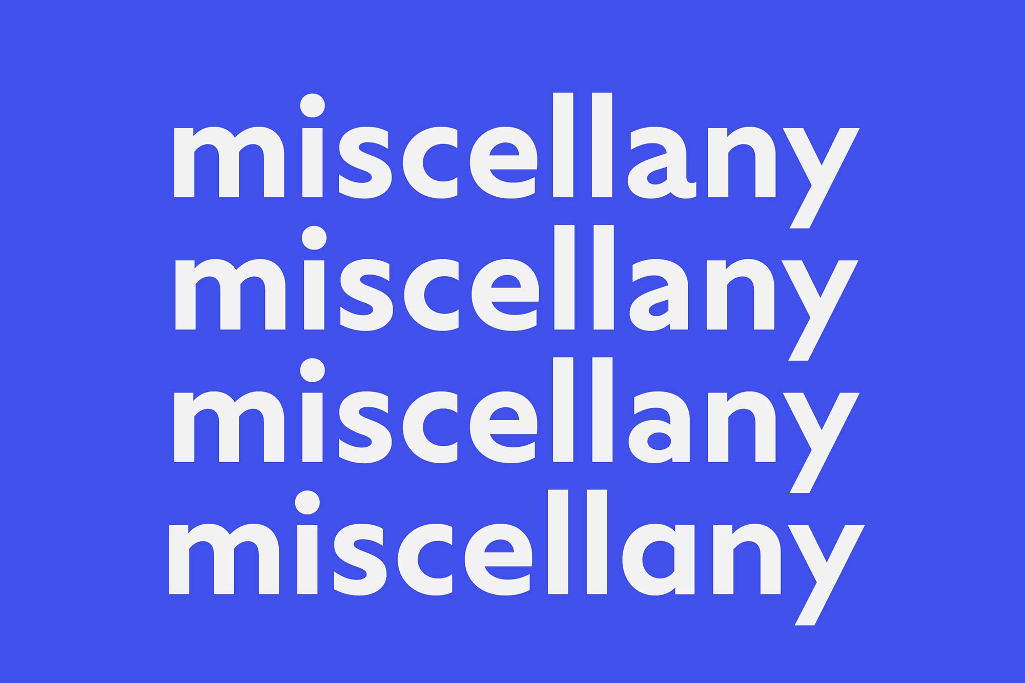
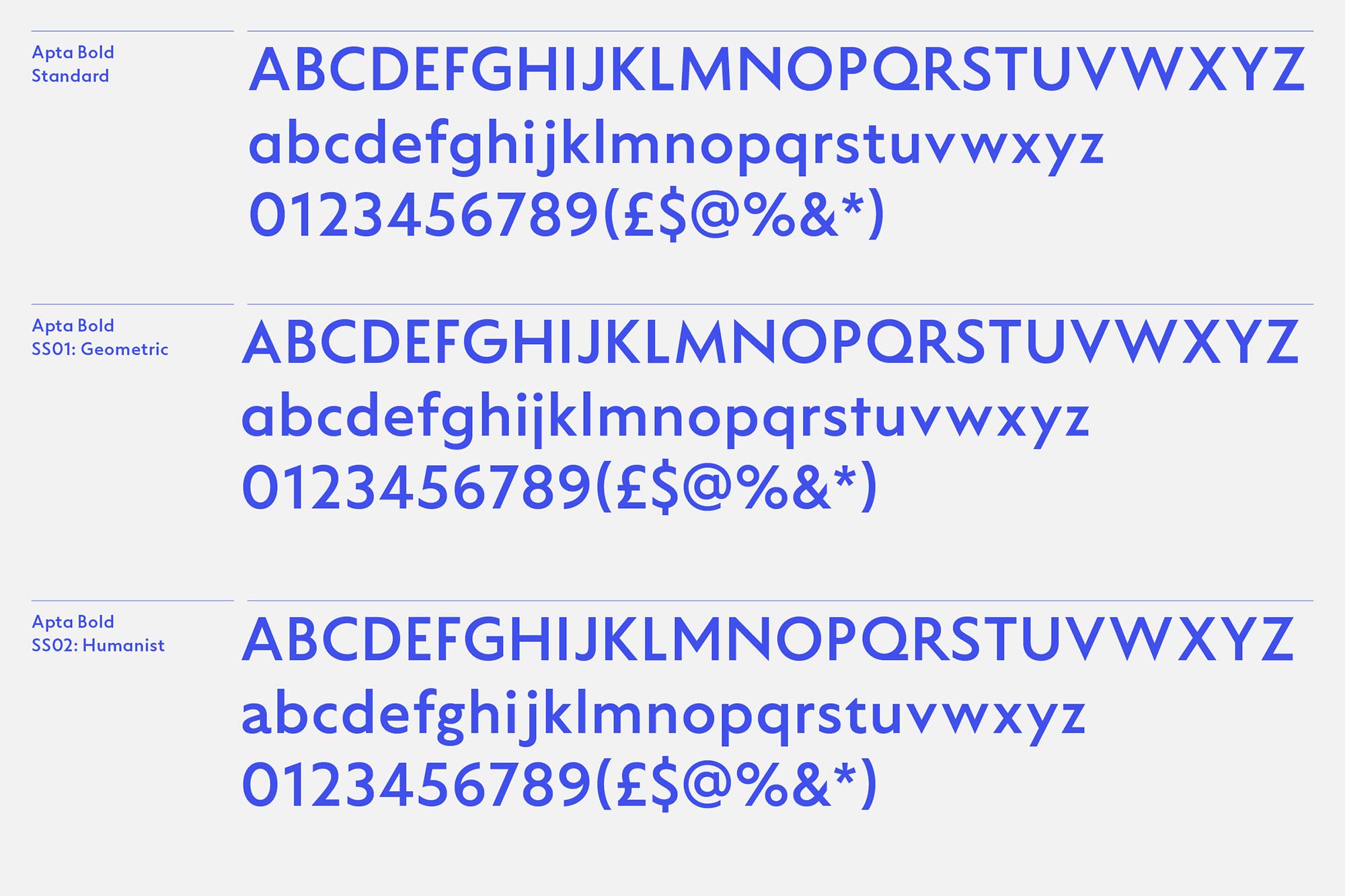
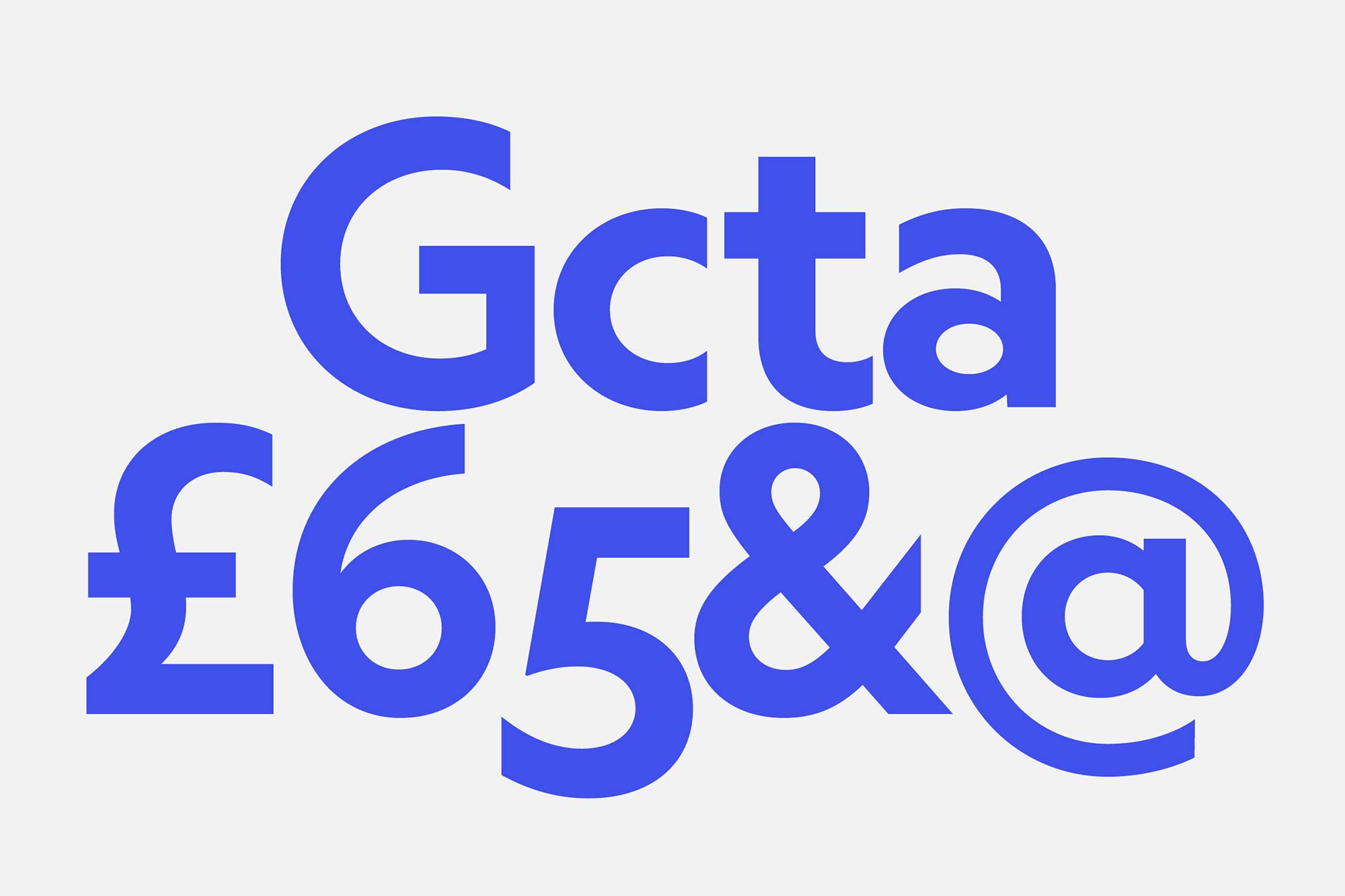
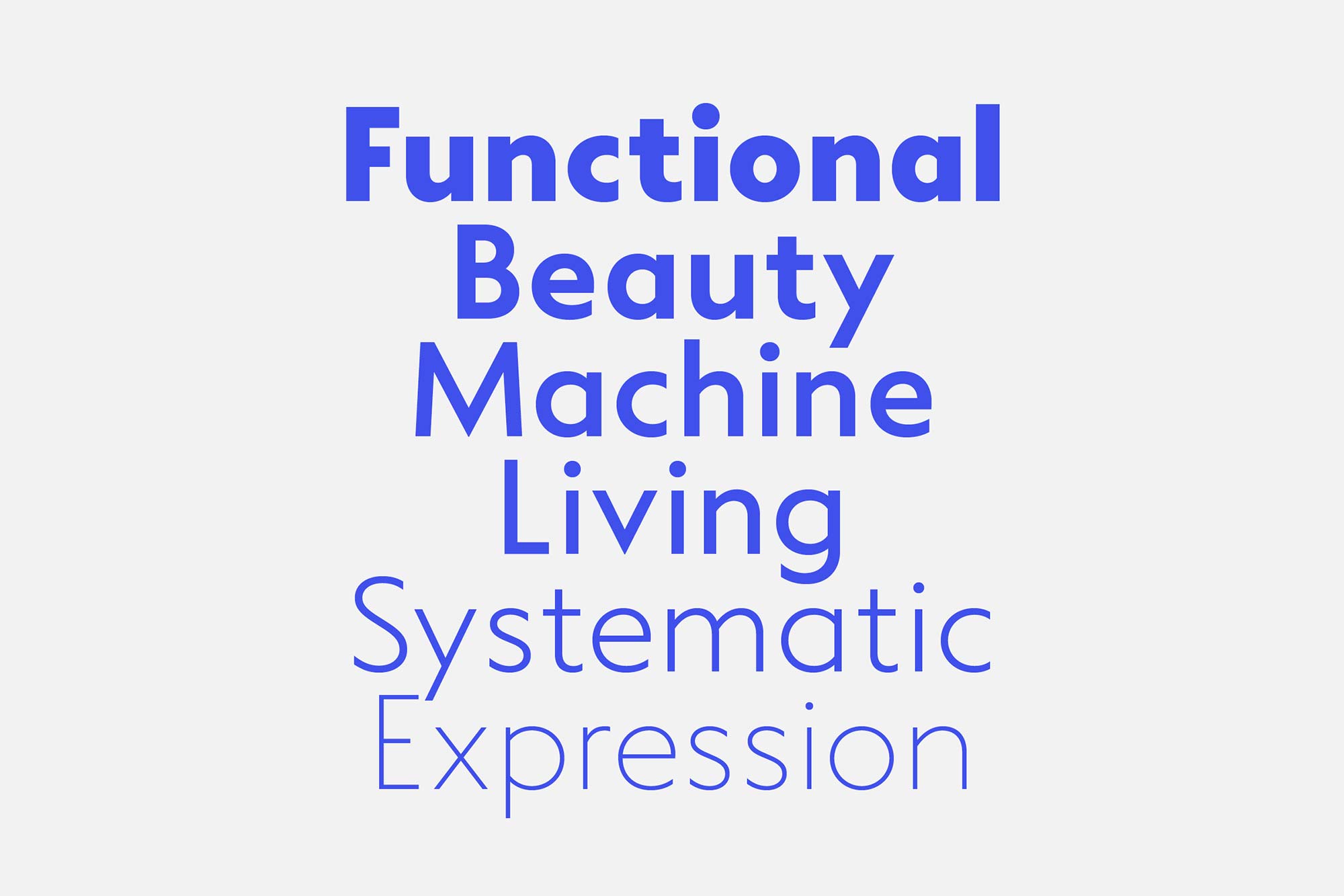
Apta is inspired by the elegance and ambiguity of post-Johnston sign-makers’ alphabets and celebrates the affinity between humanist and geometric sans serifs. Apta is structured with Roman proportions and distinguished by a mono-linear build and vertically cut terminals – derived from straight joins of shoulder to stem. While the rigorous application of vertical cuts brings an engineered quality to the design, the resulting recurring apertures with Roman proportions provide an even flow and warmth.
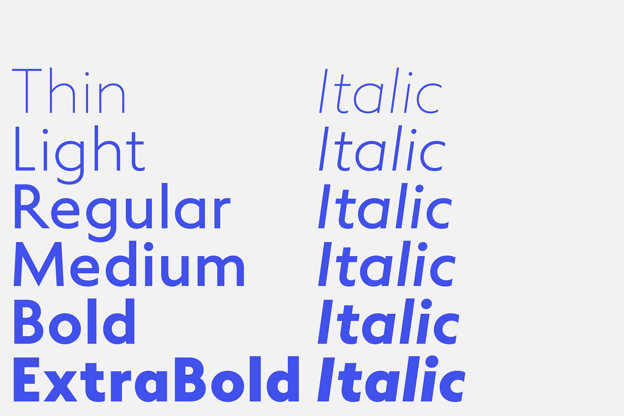
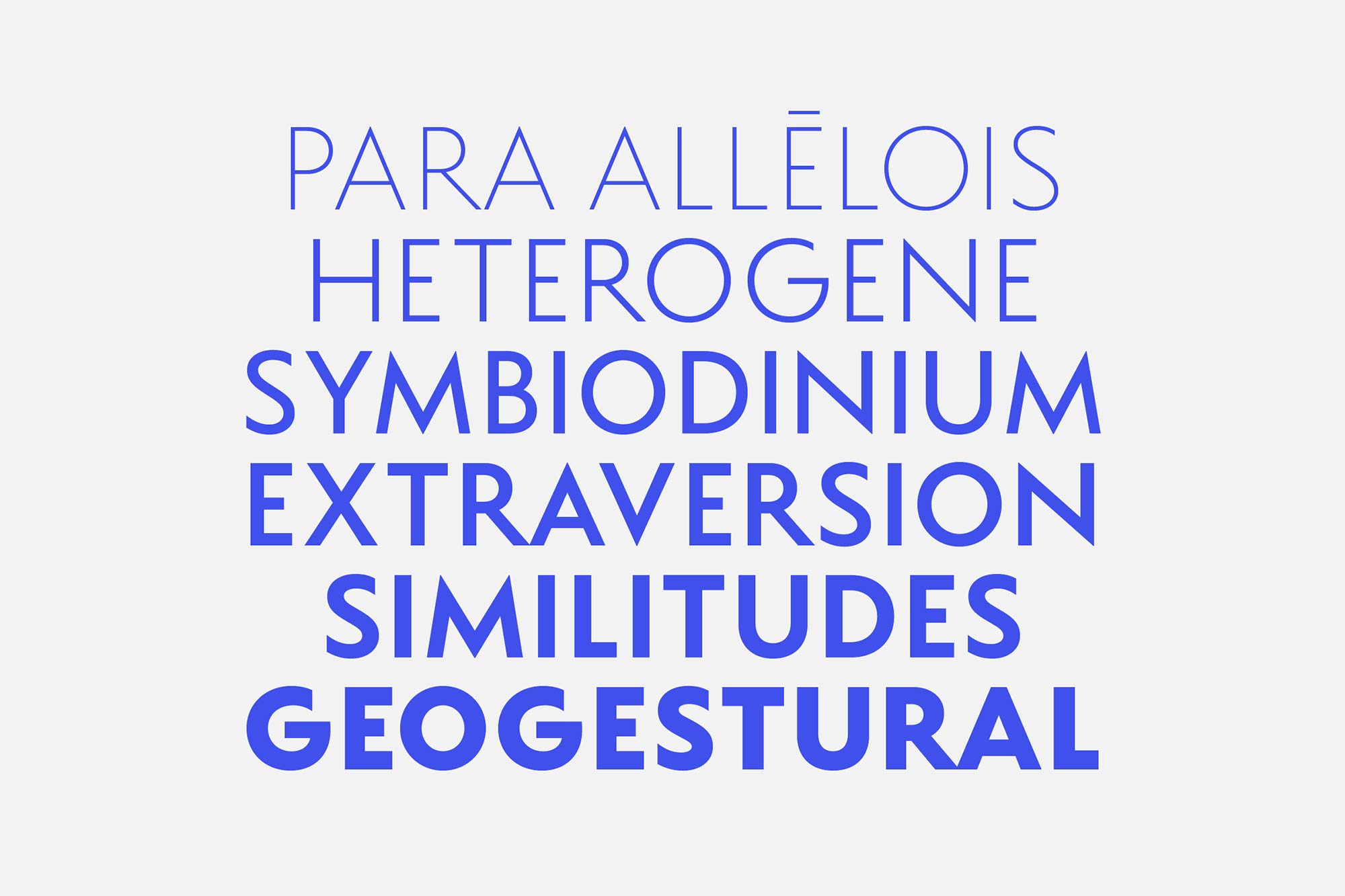
Apta is available in six weights, with corresponding semi-true italics, in both Standard (‘STD’) and Professional (‘PRO’) versions. The STD cut rests somewhere between Humanist Sans and Geometric Sans classes. The PRO version includes a selection of OpenType features with stylistic alternate sets that display Humanist, Geometric and Hybrid characteristics, allowing the typeface to take on a range of styles.
-> View and explore Apta