Brick; A New Font Brewing
Process
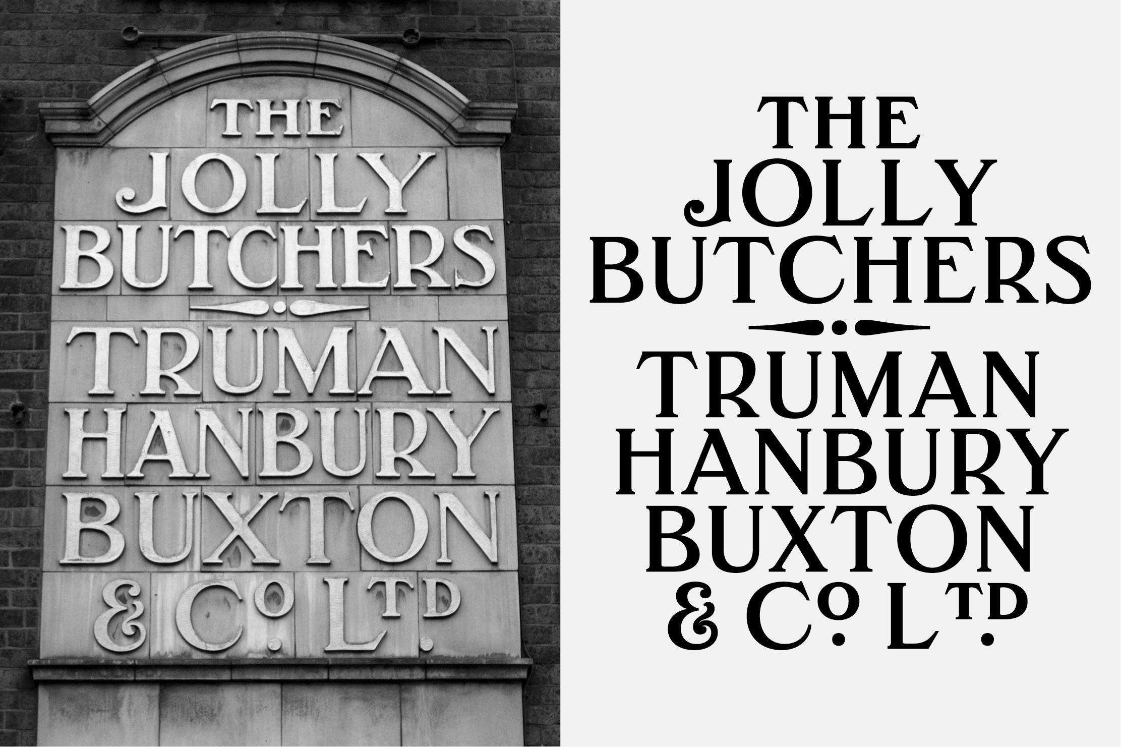
The story of Brick started back in 2015 whilst Fermin Guerrero was studying Typeface Design in Reading. Visiting London, and walking down Brick Lane (E2, London), Guerrero noticed an often overlooked, but incredibly beautiful sign for the now-closed pub, The Jolly Butchers.
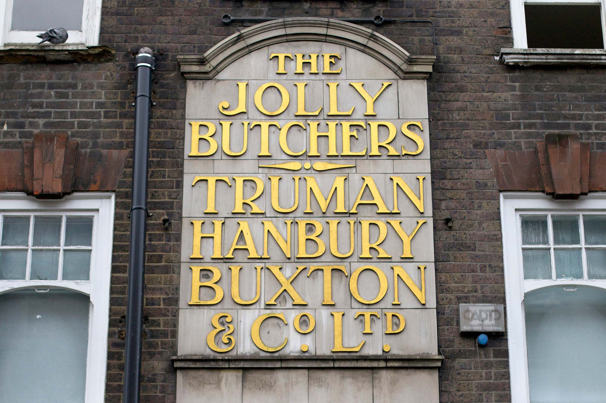
⁕ The Jolly Butchers, E2 (London, UK)
There was an instant fascination with the forms found within the sign. The style exquisitely blends Art Deco with a touch of Art Nouveau, resulting in highly unique features and a world of possibilities for a potential revival. With this initial reference point, Guerrero looked to explore the history of the Truman Brewery and more specifically if there was additional information that could be brought out from this lost signage.
The sign photographed on Brick Lane belonged to Truman Hanbury, Buxton & Company Limited, where the original brewery site still resides today.
Brewing has been a part of Brick Lane since the late 1670’s, with one of the notable, early brewers being Joseph Truman¹. Throughout the centuries, the Truman family expanded and acquired other competitors, expanding to become one of the largest breweries in London, and eventually by the turn of the 19th Century, the largest in the world.
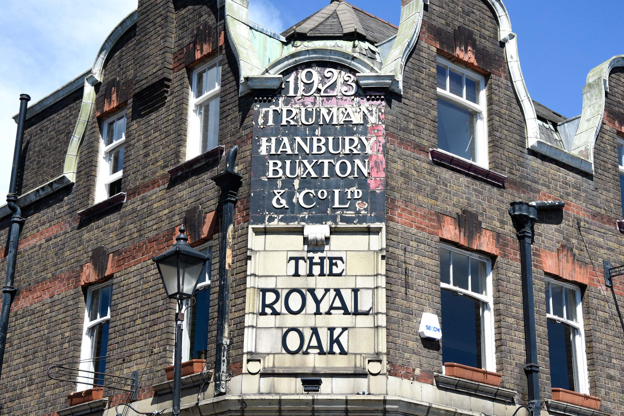
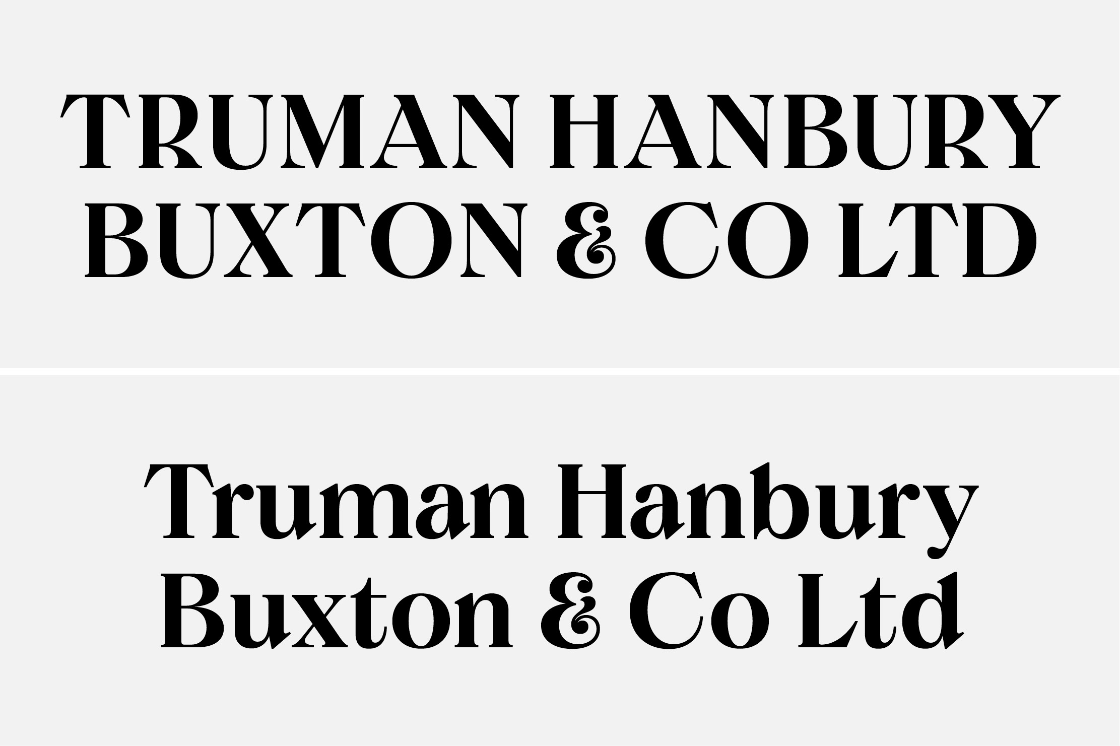
⁕ The Royal Oak, E2 (London, UK)
Although the Truman Brewery closed in 1988, there still remain several former Truman’s pubs in the London area that preserve the original signs. Notably the Royal Oak in Columbia Road, The Prince Albert in Acton Street along with the original reference from The Jolly Butchers found in Brick Lane. It’s from a combination of these multiple relics that started to give a sense of direction to the design and how it could potentially look.
When starting to design Brick, it became apparent that this wasn’t to be a stringent revival, but instead the process utilised the referenced signs as a catalyst for a new design, whilst enjoying a certain sense of carte blanche to adapt and develop the design in a new direction.
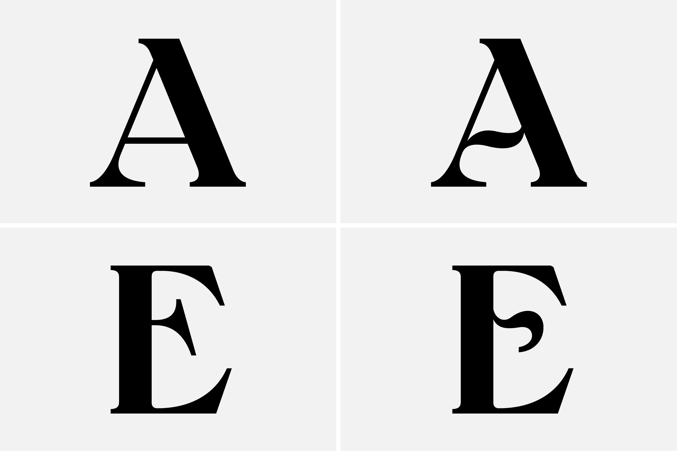
⁕ A taste of Brick’s stylistic alternate forms — Top & Bottom: Brick Display Medium
The source material provided guidance for the UPPERCASE forms, along with a number of stylistic variations that even in the original signage had a certain degree of artistic flair and freedom. However, the letterforms widths and proportions from the sign were not consistent, and were drawn to fit the context of the sign specifically, rather than an all-encompassing type system.
Whilst designing Brick, the proportions had to be redefined to create a balanced composition, whilst still capturing the natural feeling of the original signage. Referencing other Art-Nouveau and -Deco lettering helped hugely with the creation of Brick’s proportions.
⁕ Early sketches of Brick utilising Small Caps, Superscripted forms and Alternate Arrows
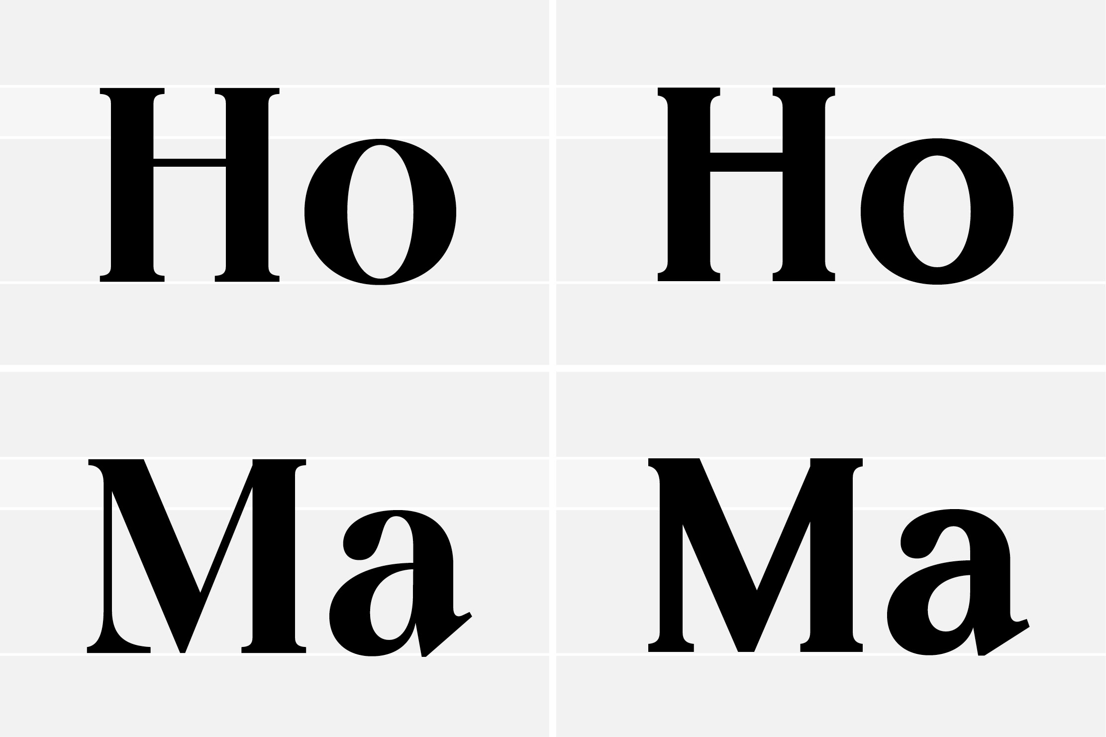
As type designers, the tendency is to focus on the lowercase first, as there is more opportunity to add genre-defining character and flair. It was the reverse with Brick, as the Uppercase was defined, along with endless possibilities of stylistic variations. Originally the inclusion of a lowercase was in doubt, whether the font could live without this expansion or not.
Curiosity of how the type could look got the better of Guerrero, and an exploration into a lowercase pairing was started. From the viewpoint of the type designer, it’s an interesting proposition to create a lowercase accompaniment to such a stylistically driven Uppercase. Questions of the lowercase overshadowing or stealing the show from its parent was a key concern, but also a great challenge of subtly and expression in equal measures.
⁕ Brick Display Medium Uppercase / Bottom: Brick Display Medium Sentence case
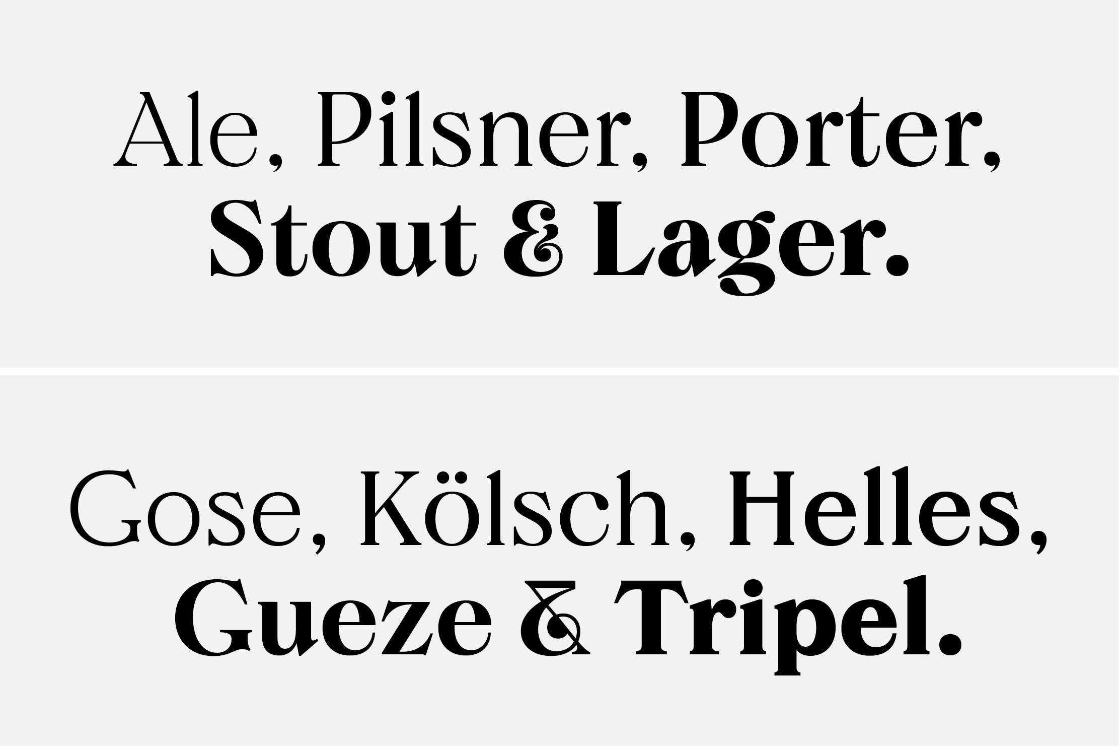
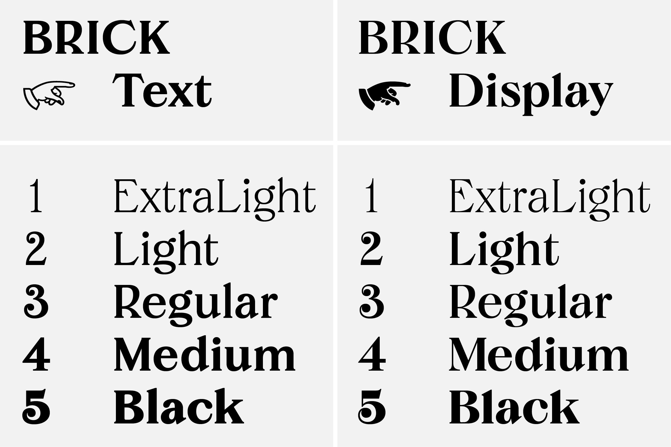
Although the original weight of the signage was reminiscent of a Regular, or SemiBold weight, through multiple stages of exploration a larger range of weights was conceived. Originally ranging from Regular, Medium & Black styles, Brick encompassed the original sign’s charms and quirks across two optical sizes. This decision was made to make Brick even more flexible. Through the original manufacturing process of the signs, the type had a low amount of contrast, most likely so the letter’s didn’t break when being made or installed. The design could easily afford, especially in more Display oriented settings, to take on more finesse and detail. The optical size variant, in the Display flavour, utilises a vertical, high contrast, Didone-esque model, whereas comparatively the Text is a squat and retains a low contrast design.
⁕ Text VS Display — Left: Brick Display / Right: Brick Text
Originally released in 2019, Brick has been extended further, with the inclusion of two new weights — an incredibly delicate and nuanced ExtraLight, along with a Light style sitting below the Regular’s denser appearance.
⁕ The Overview of the Brick Family — Left: Brick Text / Right: Brick Display
These new styles, along with the entire Brick family, are available to buy exclusively through Colophon Foundry.
View and explore Brick at Colophon Foundry.