Coign; The Most Condensed Font Ever (Probably)
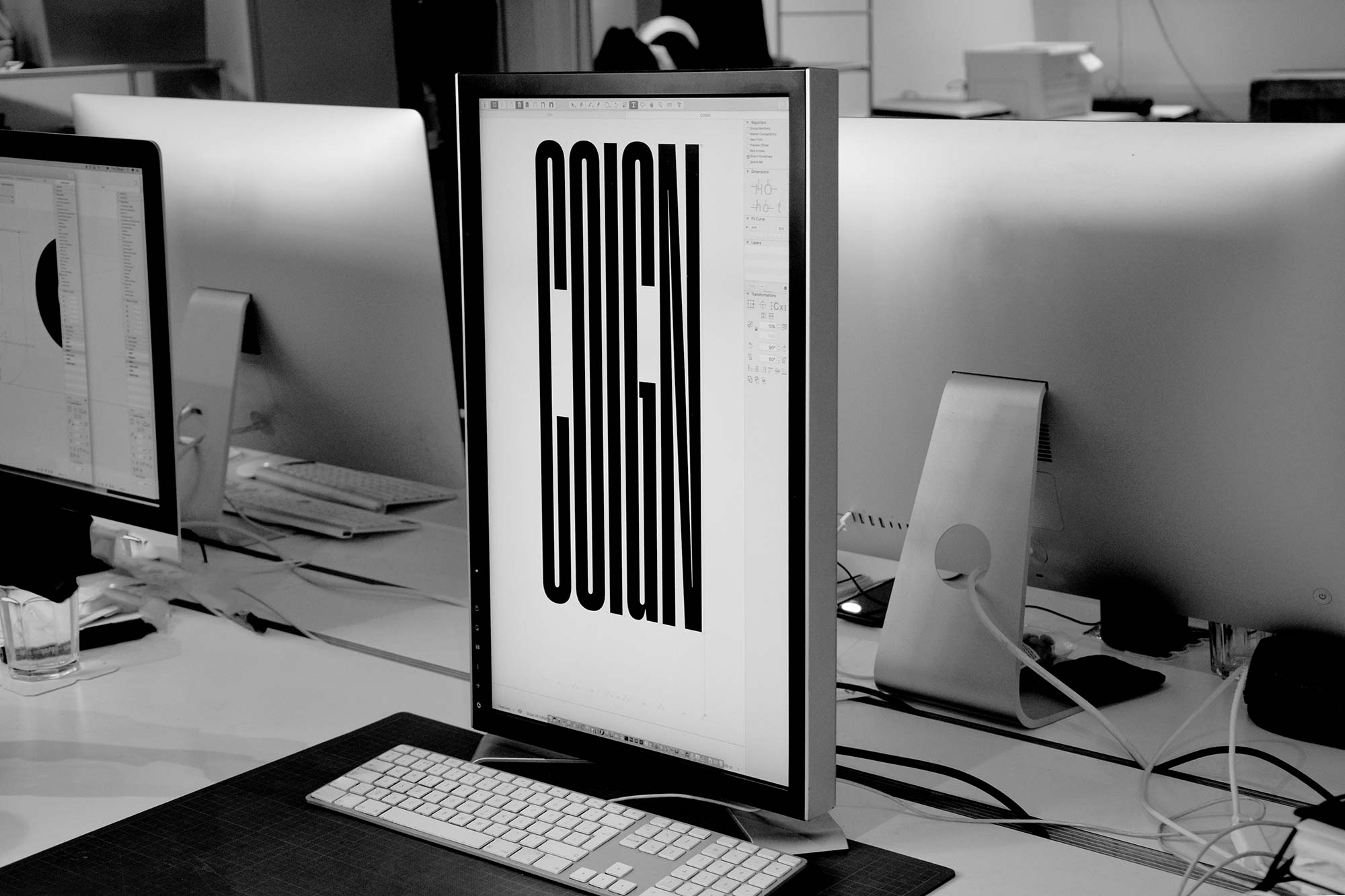
Process
Coign — released in December 2018 — is an extensive study of condensed forms based on the DeLittle type foundry’s Elongated Sans. Borrowing its name from letterpress printing terminology, Coign brings DeLittle’s ideas firmly into the 21st century, applying the systematic thinking of Adrian Frutiger’s Univers to create a comprehensive and cohesive family with a large range of weights and widths.
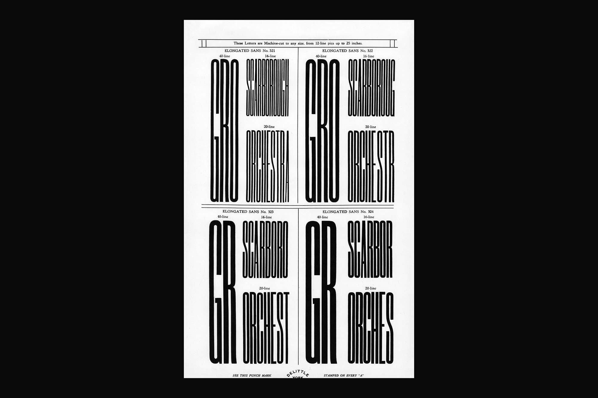
⁕ DeLittle’s Elongated Sans. Image courtesy of David Wolske
Of course, super condensed styles have been drawn with great success before, however they are usually offered as part of a much larger family. Areas such as weight and counterspace are usually predefined, offering little exploration into how these traits can affect the mood and texture of the type. The DeLittle company was founded in 1888 by Robert Duncan DeLittle and ran for over 100 years, producing some of Britain’s finest wood type for theatre bills, railway posters and advertisements. On occasion, the DeLittles also cut wood type for the revered Stephenson Blake — England’s leading type foundry. At a glance, DeLittle’s most condensed offerings appear as though they are simply a novelty. However, as R James DeLittle explains, the distinctive theatre bills often required very narrow lettering:
“If you were more important than the other chap, your name had to be in larger letters…If you were unfortunate enough to have a long-winded name you had great difficulty in fitting it into those narrow theatrical bills.”¹
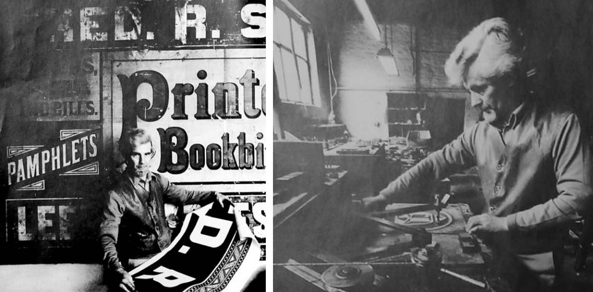
⁕ Jim DeLittle at the family workshop. Images courtesy of The York Press
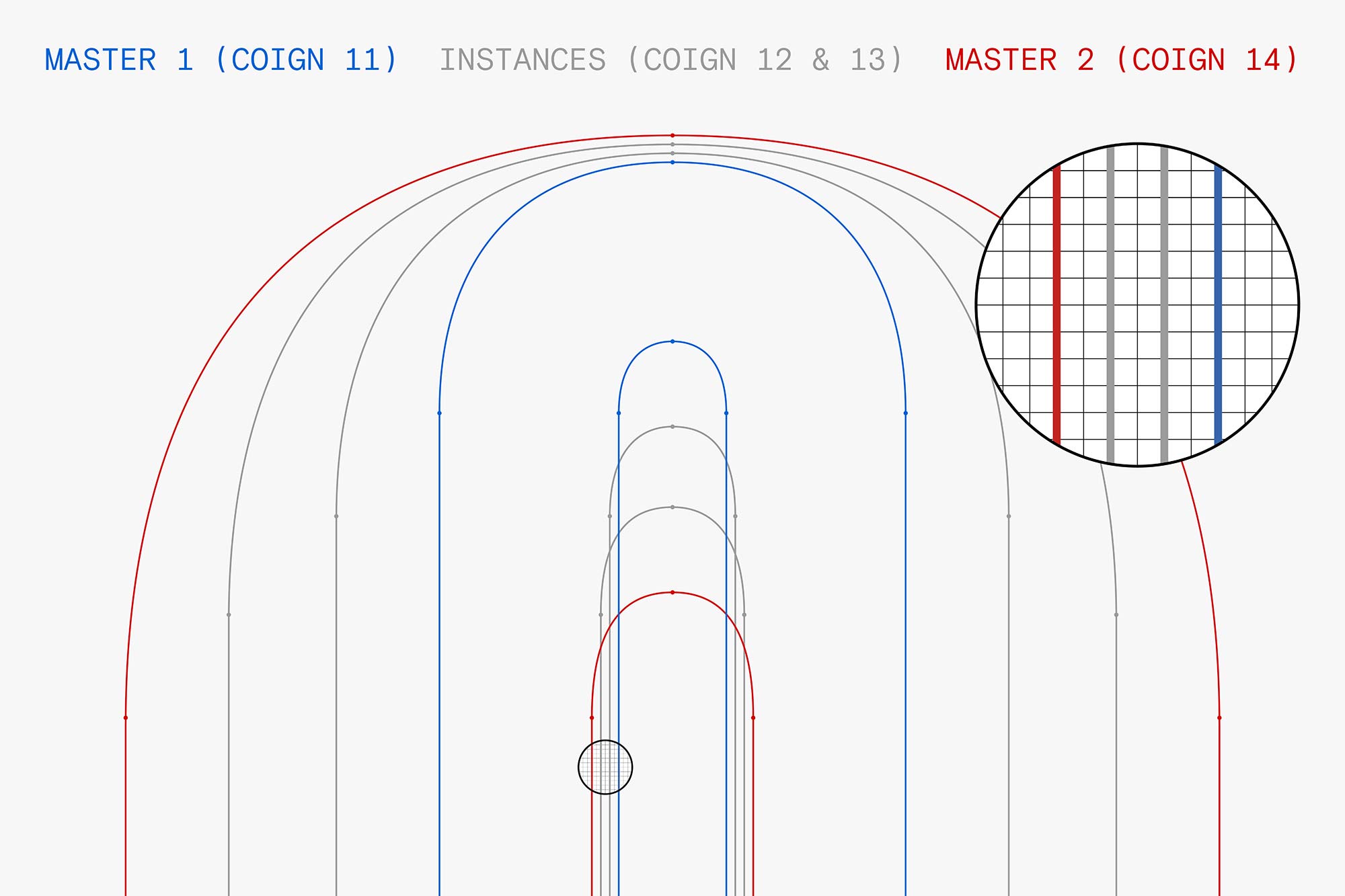
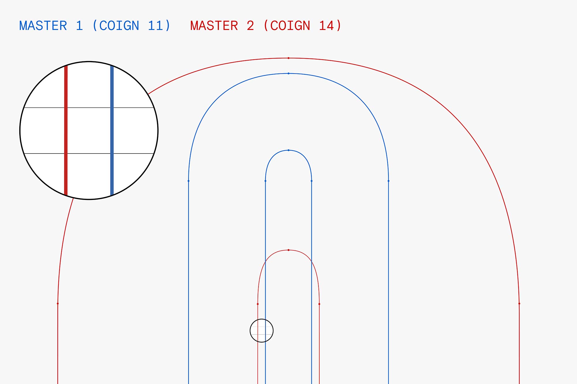
When discussing and designing typefaces it is important to understand two terms relating to the tools and processes of contemporary type design — a master and an instance. If, for example, we were drawing a family of three styles — a Light, Regular and Bold — it would be possible to mathematically generate the middle style by simply drawing at the two controlling ends of the spectrum; the Light and the Bold.
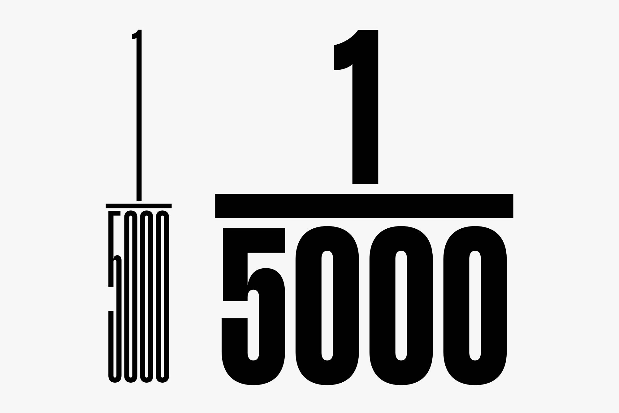
Most fonts are constructed on a grid of 1000 units per em (UPM), which usually allows the type designer to draw at the desired level of detail. However, during the early stages of sketching Coign it quickly became clear that the standard grid would not be sufficient to house the extremely compact curves of the most condensed styles. Letterforms that can ordinarily take up 600 units of horizontal space had to be condensed into as little as 26 units in Coign, leaving very little room on the grid to place positional nodes without resulting in uneven curves.
By increasing the grid to 2000 UPM it became possible to draw in a satisfactory level of detail and produce a smoother curve.
⁕ 4000 UPM grid
⁕ Left: 1000 UPM grid / Right: Coign’s design space
^- Top: 1000 UPM Grid
Bottom: Coign’s design space
However, we encountered a similar problem with the grid when we began trying to create our instances. Although our newly expanded grid provided enough units to draw satisfactory curves in our masters, there were not enough units to produce instances that fit evenly. For example, when drawing a letter ‘O’ the form would ordinarily have perfectly symmetrical curve segments. If one of the instances had curve segments that were one or two units out of sync, therefore asymmetrical, it would not be at all noticeable. However, said curve segments would ordinarily be in excess of over 100 units wide. In Coign’s case, where curve segments can be as little as two units wide, one or two units is the difference between a nice smooth curve, and an irregular asymmetrical curve. By increasing the grid again, this time to 4000 UPM, we found there was sufficient room to create instances with symmetrical curve segments.
Realising that our grid had to encompass equal distances between all of our Masters and Instances, we devised a systematic approach to drawing — setting each node within an equidistant pattern. This incessant approach to the construction of our overarching grid allowed us the control necessary to output designs in each width and weight exactly as intended.
Coign’s character set offers a range of OpenType features — rooted in historical references of 19th and 20th century printing — including a full set of Small Caps, numerous Number styles, as well as dynamic arbitrary nut fractions. Within the constraints (and flexibilities) of OpenType code, the inclusion of dynamic fractions is a simple addition. However, Nut fractions, those commonly found in our historic references highlights a more complex problem to resolve. It is with this that we implemented an adaptation of TiroTypeworks fantastic Nutso feature. Making extensive use of the mark-to-mark OpenType feature, the numerators and denominators are positioned in context, centrally aligning to their dividing bar.
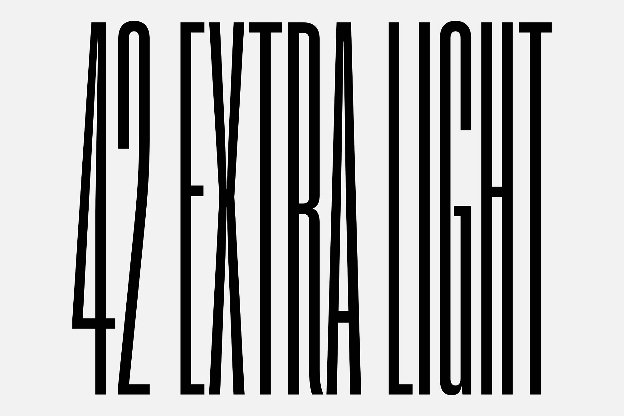
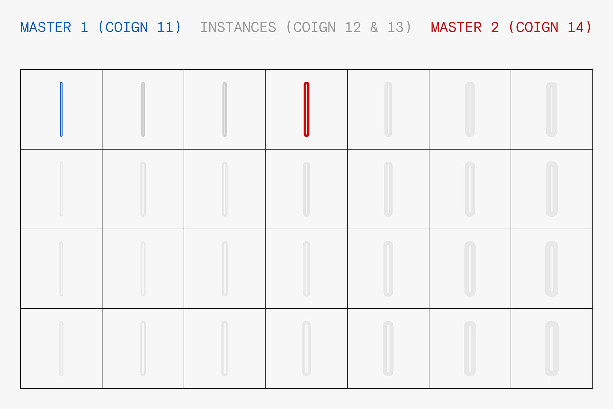
Coign places the super condensed under the microscope, imaging a vast range of possibilities — 28 styles comprising of 4 widths in 7 weights — all of them super condensed.
View and explore Coign at Colophon Foundry.