System85; CF-DOS is booting…
Process
When designing a new type, it is often hard to find a starting point devoid of any source material or reference. Modern revivals and contemporary faces are abundant in the Western hemisphere, but it wasn’t until a visit to Japan in early 2017 that this became particularly prevalent. The pairing of Latin and Asian typography is particularly difficult, with often recognised associations and visual directions being misinterpreted in Japanese culture.
)
)
The Japanese language, across its three writing systems, contains thousands of individual glyphs that can be composed in both a horizontal and vertical setting, which in the modern day, has evolved into a grid-like structure that facilitates this multi-directional orthography. This restriction, through repetition and convenience, lends itself to a design space that is as predictable as it is constraining, visually creating a grid-like form in running-text instances.
Within Latin typography, this is usually only found when designing Monospace typefaces (see Space Mono). This connection between Western and Asian typography, in the context of a Monospace (whereby every character has the same advance width), is a poignant moment where the two scripts occasionally struggle with complexity.
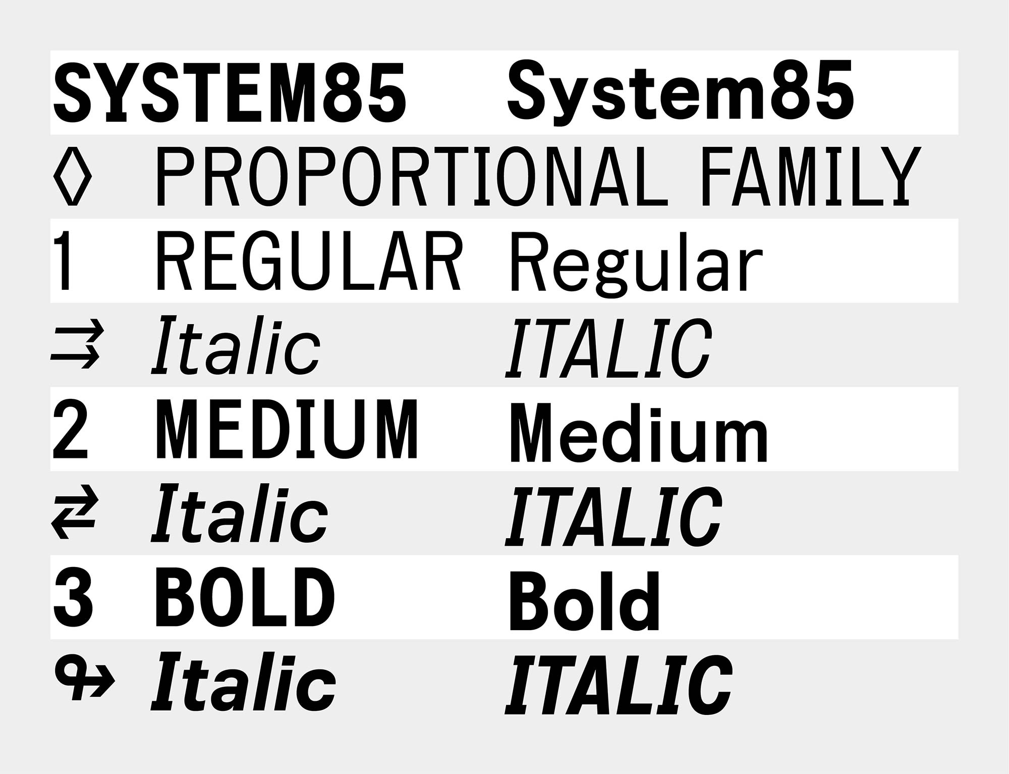
⁕ The Proportional family, in 3 weights, with accompanying Italics.
Upon researching the Japanese vernacular, it became apparent that [Japan’s] most diverse and visually exuberant landscape is actually — typographically [Latin] speaking — quite sparse. Of course, there are many visual styles and cues, but when it comes to their Latin equivalents, translations and pairings, they fall back to System defaults, and crudely modified abstractions of type that juxtapose their Kanji siblings.
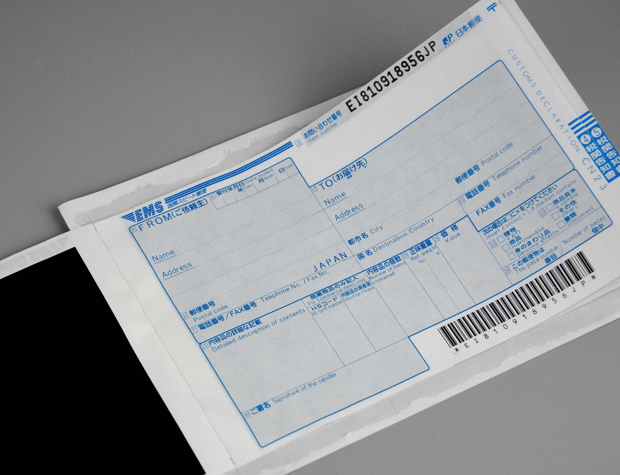
⁕ Found ephemera from Tokyo, Japan (circa 2008).
It was these initial references, often neglected, overlooked and ignored, that really stood out. These types, often bundled within larger CJK sets, were our key reference points. MS Gothic (1992, Microsoft Corporation), a typeface that has been bundled, and subsequently used extensively, within Windows systems as far back as Windows 3.1¹, has been the go-to for an off-the-shelf Japanese-ready font, while the Latin accompanying it lacked a certain sense of refinement, but was endowed with the charm and something not-quite-right, yet not-quite-wrong.
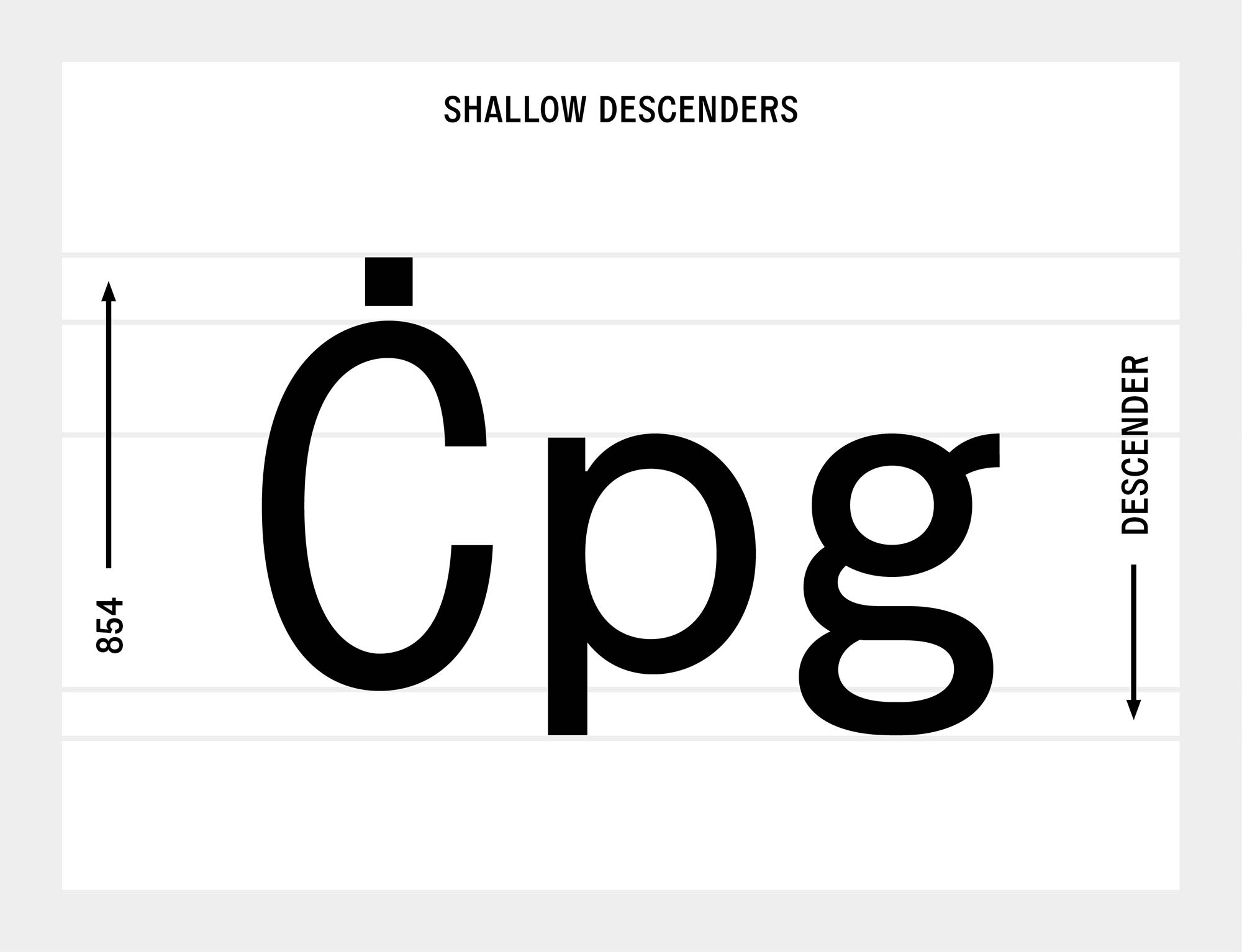
⁕ System85’s small descenders and cramped design space inform its design.
This default nature, which typically presents a vertically restrained aesthetic due to its vertical UI-specific limitations, can be dated back even further to the first TUI² systems. Systems such as NCURSES, and MS-DOS used graphical symbols to create menus, boxes and other dividers necessary for a legible user interface. Now often found in terminal commands and table construction, System85 Mono includes the full Unicode Block of Box Drawing Tools, as well as accompanying Block Elements with stylistic variations used for shading and fills. The set is further expanded by softer, curved variations, inspired by the printed forms of Japan’s postal system.
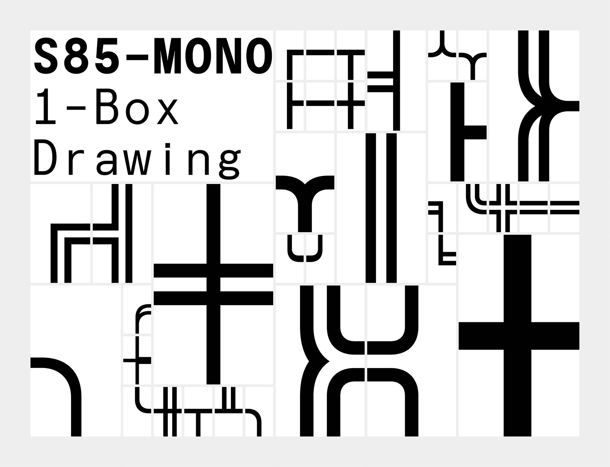
⁕ Unicode Box Drawing Tools — u+2500 > u+257F
Upon using these tools within our own studio, we decided they needed further development, and, by referencing our previous notions of awkward juxtapositions, wondered what would logically fit within these design elements. The most obvious was the alignment within the characters’ vertical space, allowing a perfect 1000x600 UPM alignment, but more interestingly, was the arrow set. Exploring Unicode’s ³ list of arrows, we found a suitable number of them would make interesting combinations when used with the Drawing Tools block.
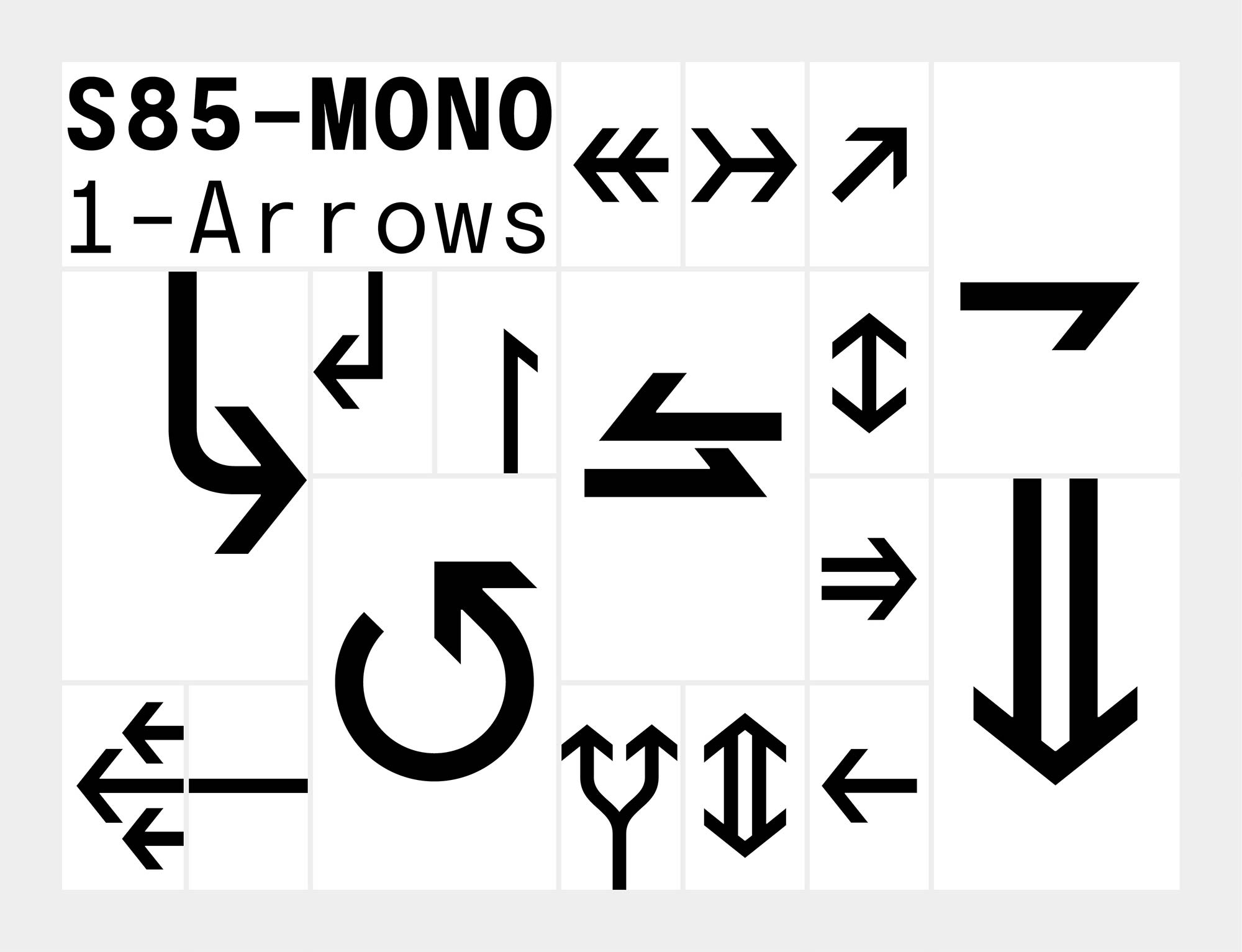
⁕ Combined with the Box Drawing Tools, accompanying arrows extend the set.
By limiting the available vertical space, our goal was to achieve a squat appearance with short descenders, whilst also retaining the generalised, blocky-form so often found in our references. The overall dimension that we deemed suitable was 850, of which the type takes an abbreviated name. This height spanned the core design of the type, from the descenders and lower accents, up to the tallest ceiling diacritical marks. The reduction in vertical space and descent allows for setting the type in parity with its own leading⁴. These short descenders and cramped restrictions imparted their own aesthetic onto the design, creating compositions in their own right, whilst the serif-less monospaced lowercase leaves singular forms (i, j, l) isolated and baron in a sea of space. This creates an awkward feeling of something being out of place, yet right at home.
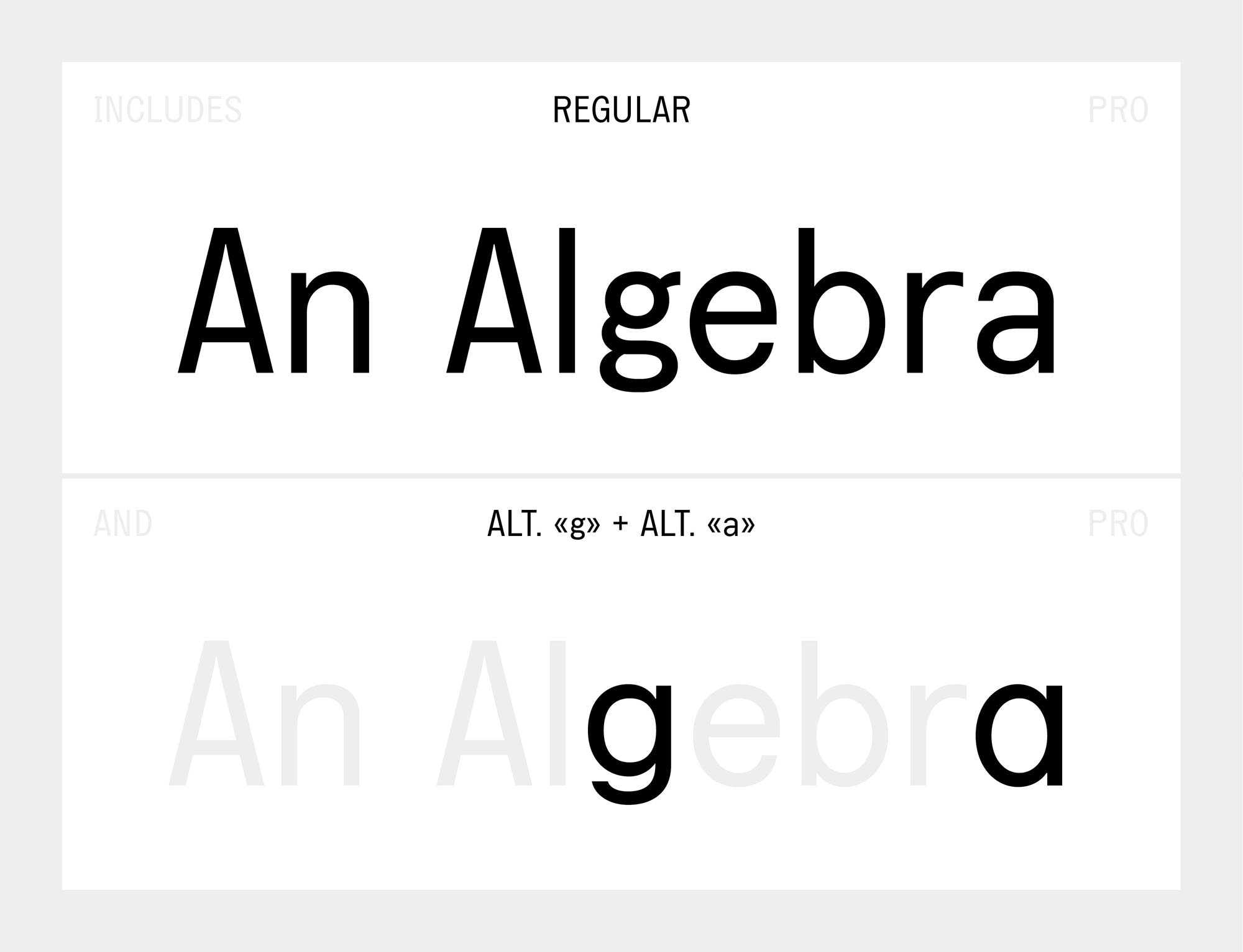
⁕ Showing one of System85’s 15 different Stylistic Sets.
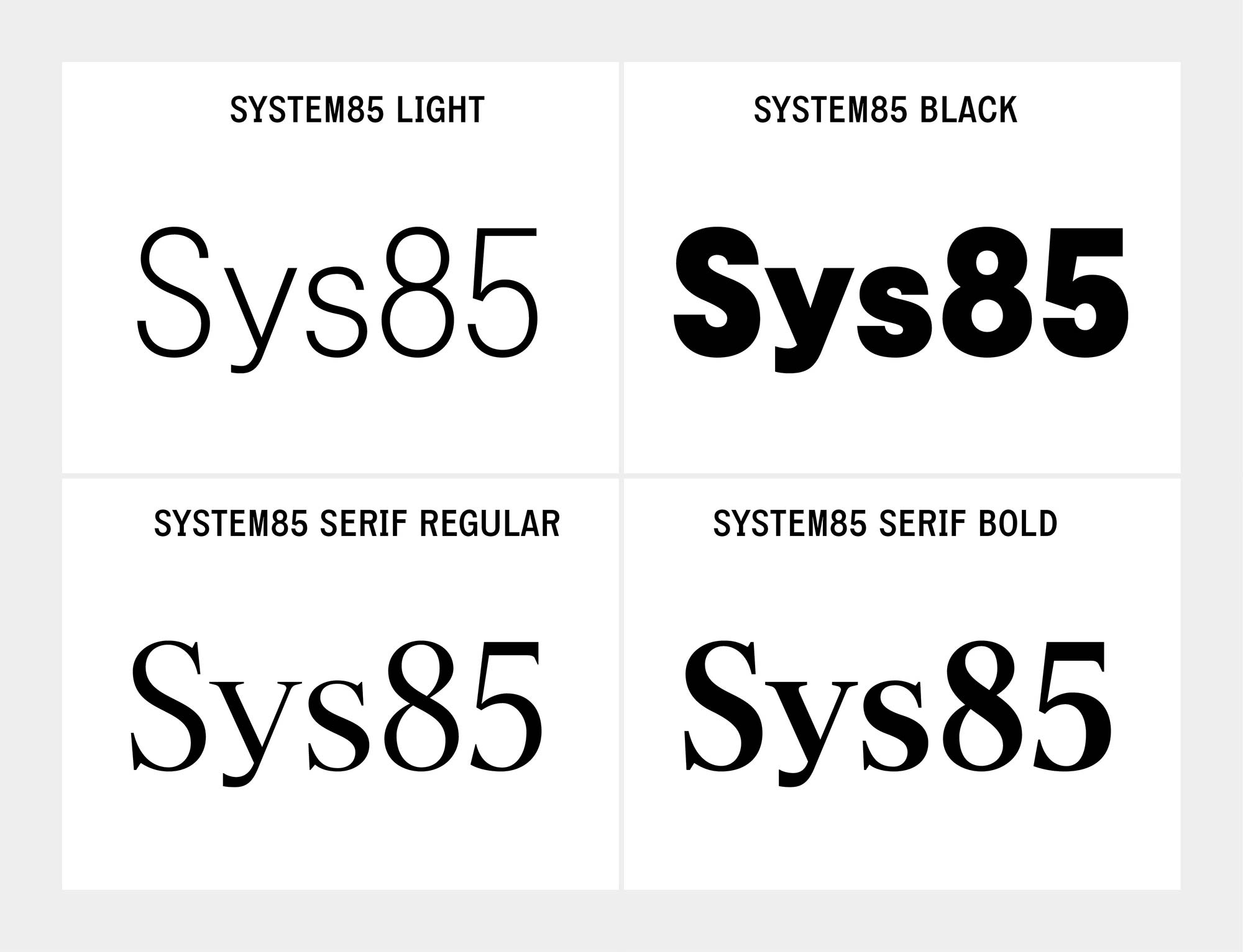
System85’s design space spans three main weights, Regular, Medium and Bold, with corresponding grade-weighted italics. This grading is achieved with an exact replication of its metrics, with Upright Roman to Italic (or rather, a True Oblique) retaining its respective width, weight and form. The two main design axis of Weight and Slant are available in an inclusive Variable font.