
Central Saint Martins
A bastion of the British Art School system, Central Saint Martins was formed in 1989 from the union of two existing institutions: the Central School of Art and Design, and Saint Martin’s School of Art. Fast forward to 2011 and Central Saint Martins moved to a converted warehouse on Granary Square at King's Cross (notably adjacent to Coal Drops Yard). Most of the school is based within the building but it also uses the former Byam Shaw building in Elthorne Road, Archway, and a location in Richbell Place, Holborn. CSM offers a range of education courses at a variety of levels including undergraduate, post-graduate and short courses, to both national and international students.
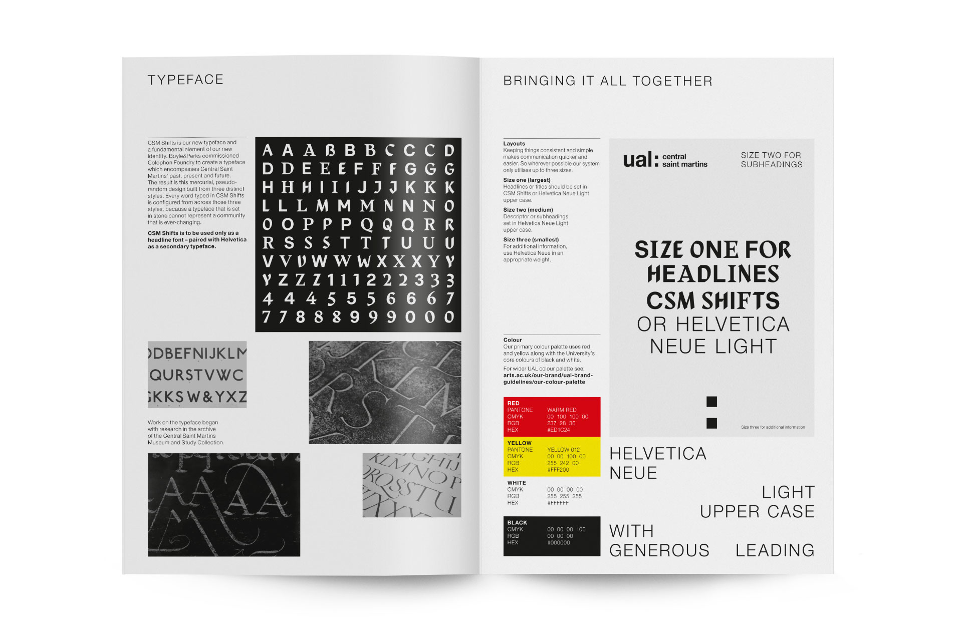
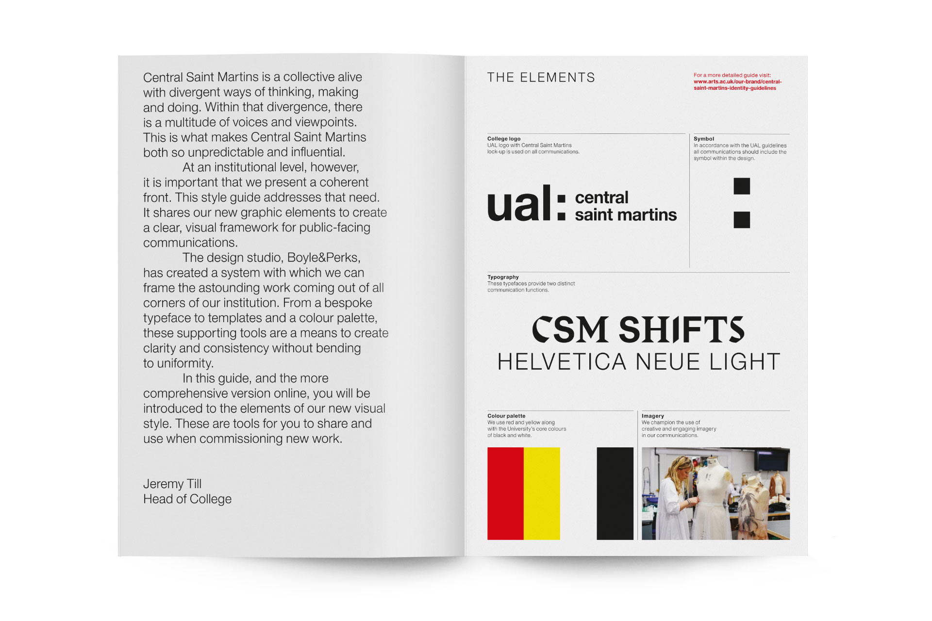
- Typeface
- CSM Shifts
- Comissioner
- Boyles & Perks, Brighton, and CSM, London
- Year
- 2018 – 2019
- Styles
- 3 Separate type styles
- Coverage
- Adobe Latin-2
- Classification
- Sans-Serif Serif Display
- URL
- arts.ac.uk/colleges/central-saint-martins
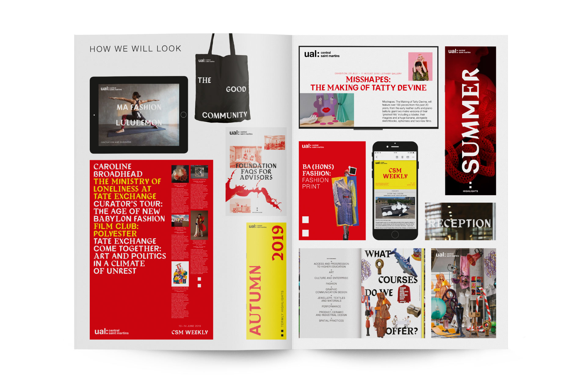
Boyle and Perks were tasked to create an identity that would still sit within the brand architecture of the University of the Arts London Group (which encompasses Camberwell College of Arts, Central Saint Martins, Chelsea College of Arts, London College of Communication, London College of Fashion and Wimbledon College of Arts) but allow CSM to have its own voice and vision within this framework. A bespoke typeface seemed a fitting choice and would still allow flexibility within the parameters.
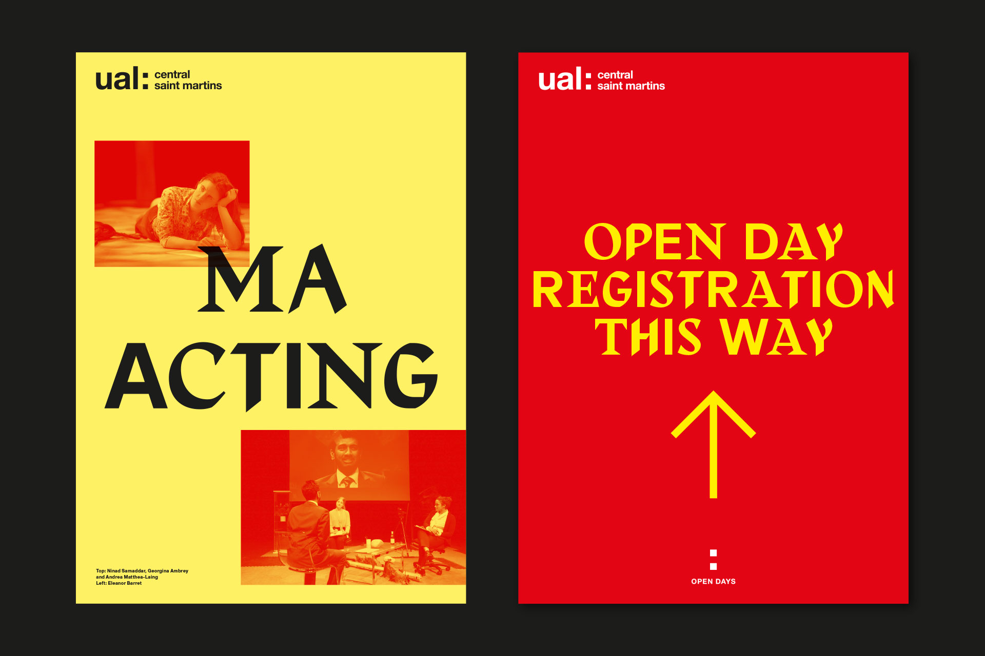
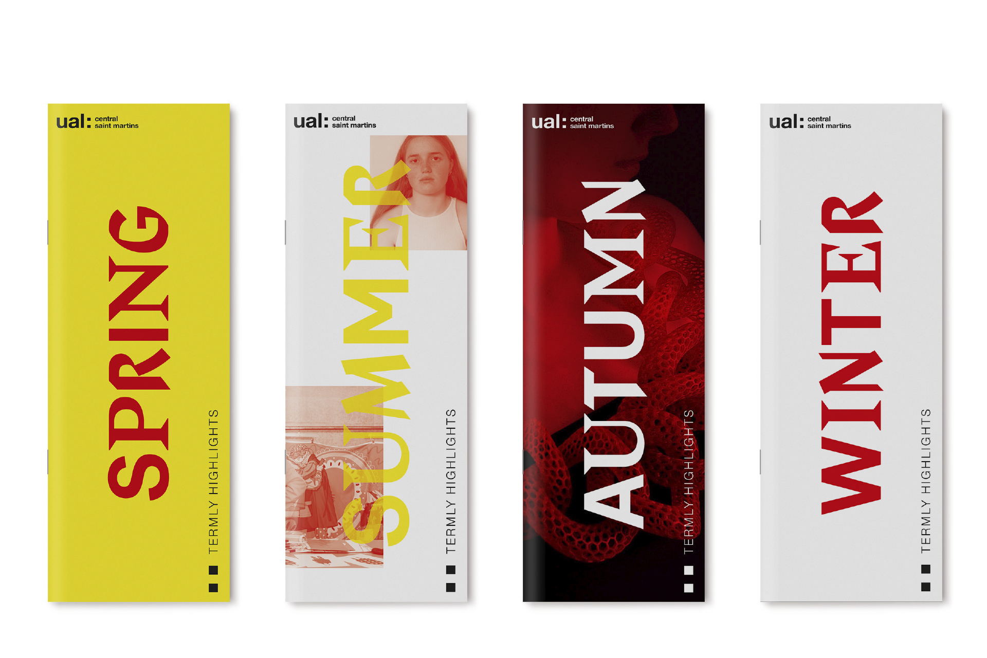
Collaborating with Boyle & Perks, the brief was carved into three avenues that each represented the past, present and future of Central Saint Martins, allowing both cohesion, flexibility and dynamism through the different variants. Our process of callobaration started with visiting the archives at UAL, specifically the Central Saint Martins Museum & Study Collection.

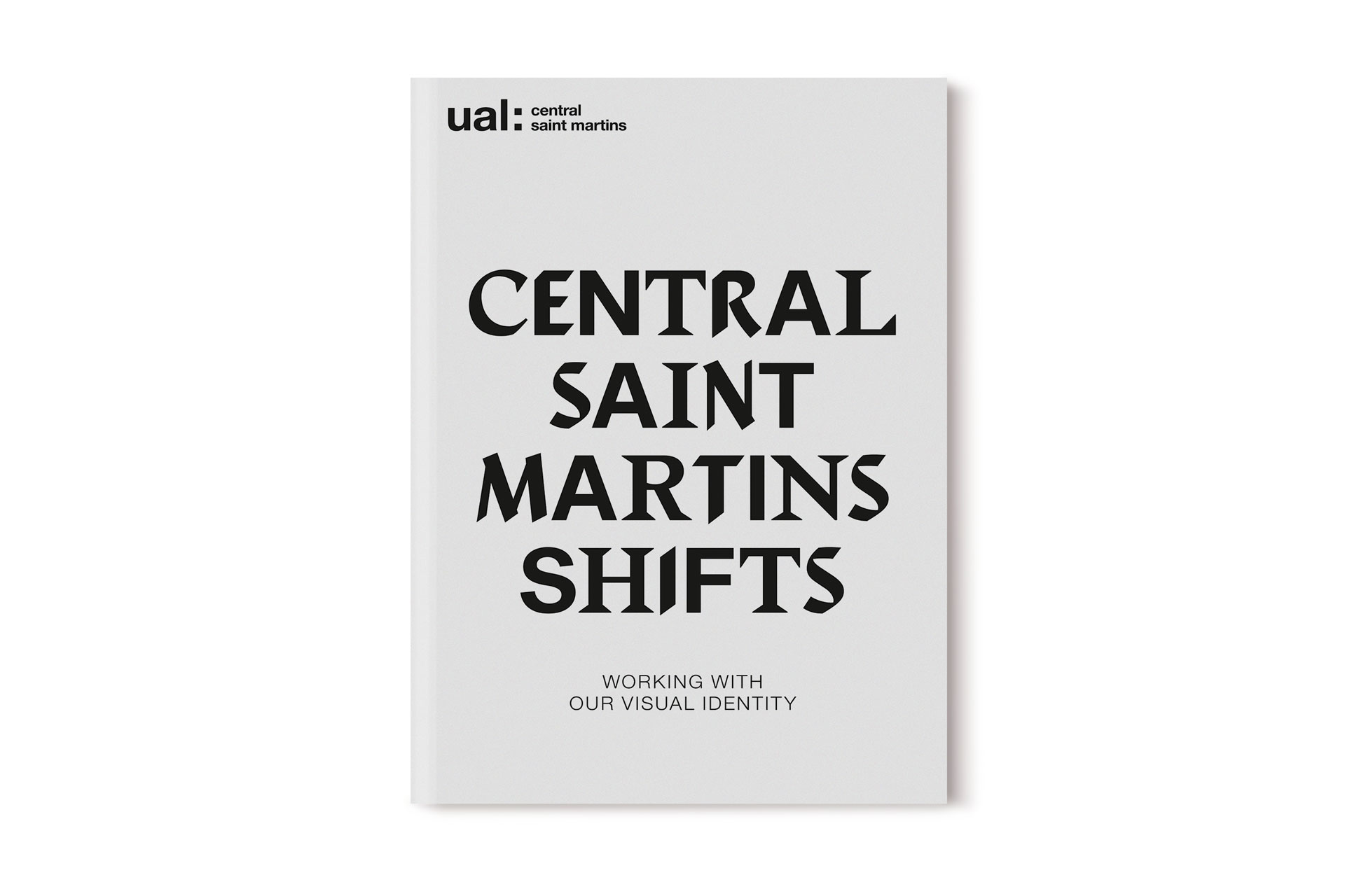
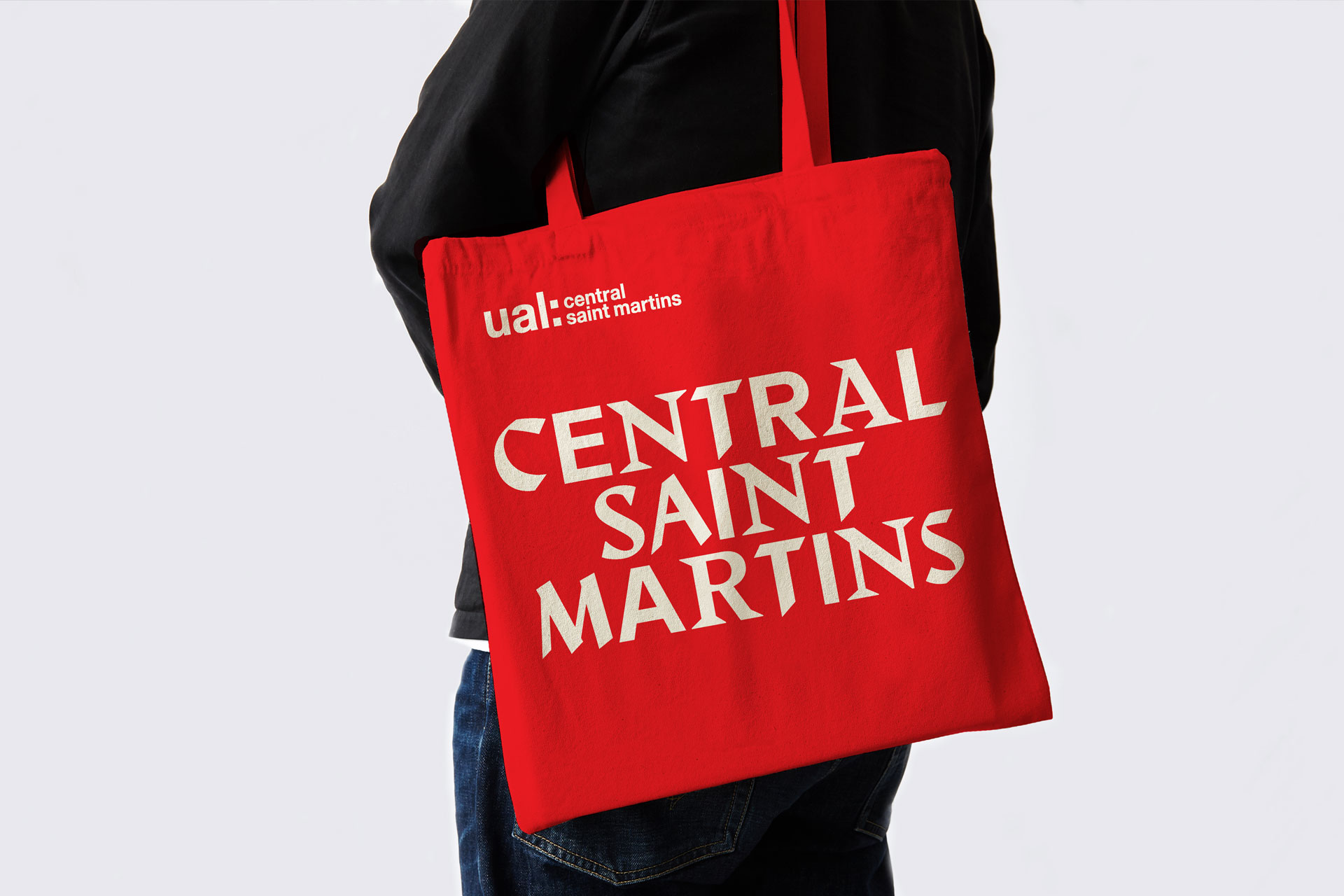
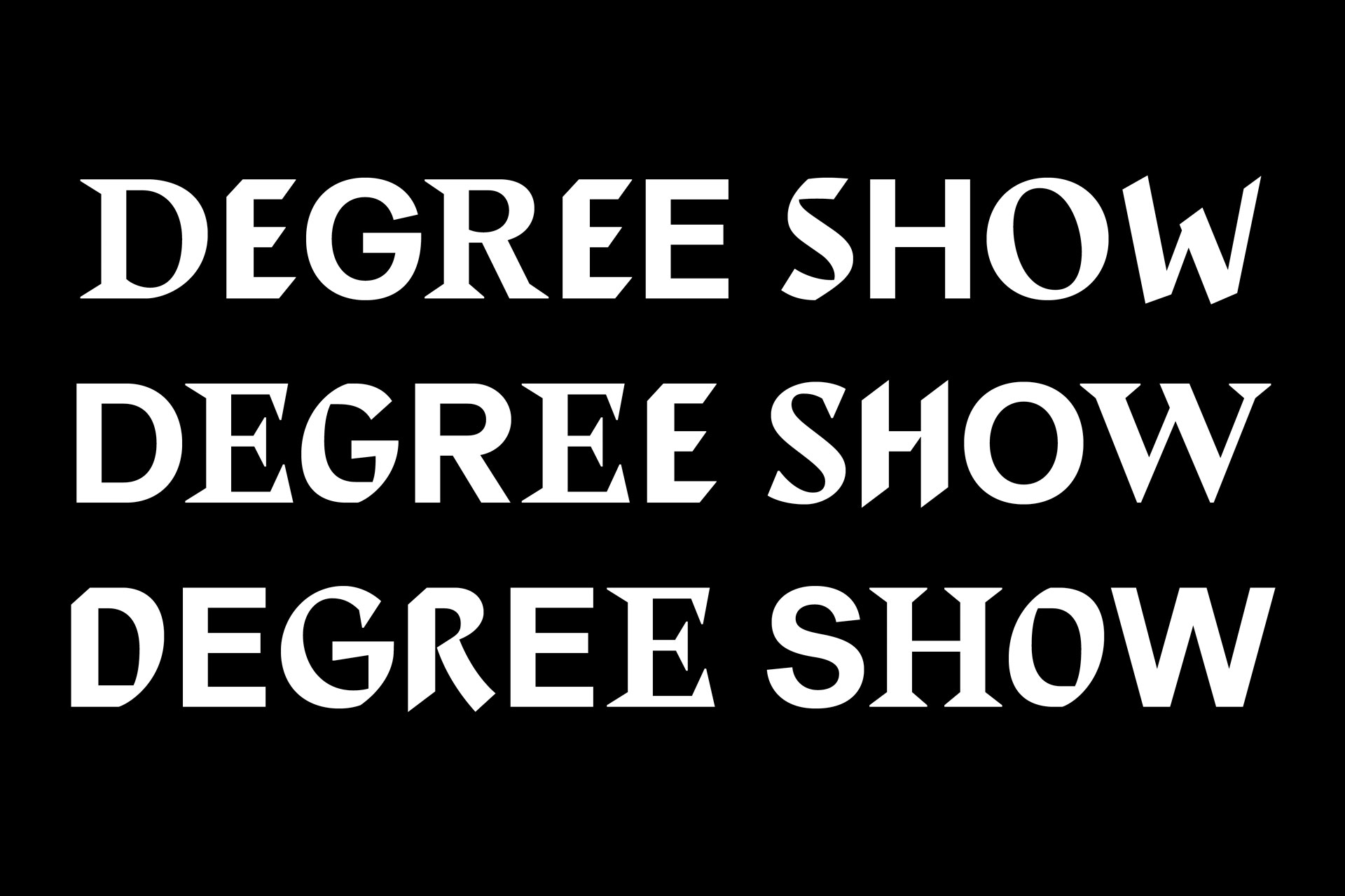
The dynamic multi-personality typeface was inspired by found references and periods relevant to the history of the College: the past (the incredibly rich heritage and history), the present (the students there now) and the future (ambiguous and open to interpretation). Somewhat unsurprisingly, we were directly drawn to Edward Johnston’s work, inspiring the ‘Past’ element of the typeface — taking inspiration from a number of calligraphic sketches and type specimens by Johnston. The present forms the stable foundation of the typeface and, as a sans serif, it reflects the modern movement of letterforms. The future was the trickiest to pin down. The style became a reinterpretation of the past, a recognition that whatever is coming, responds to what was there to begin with.
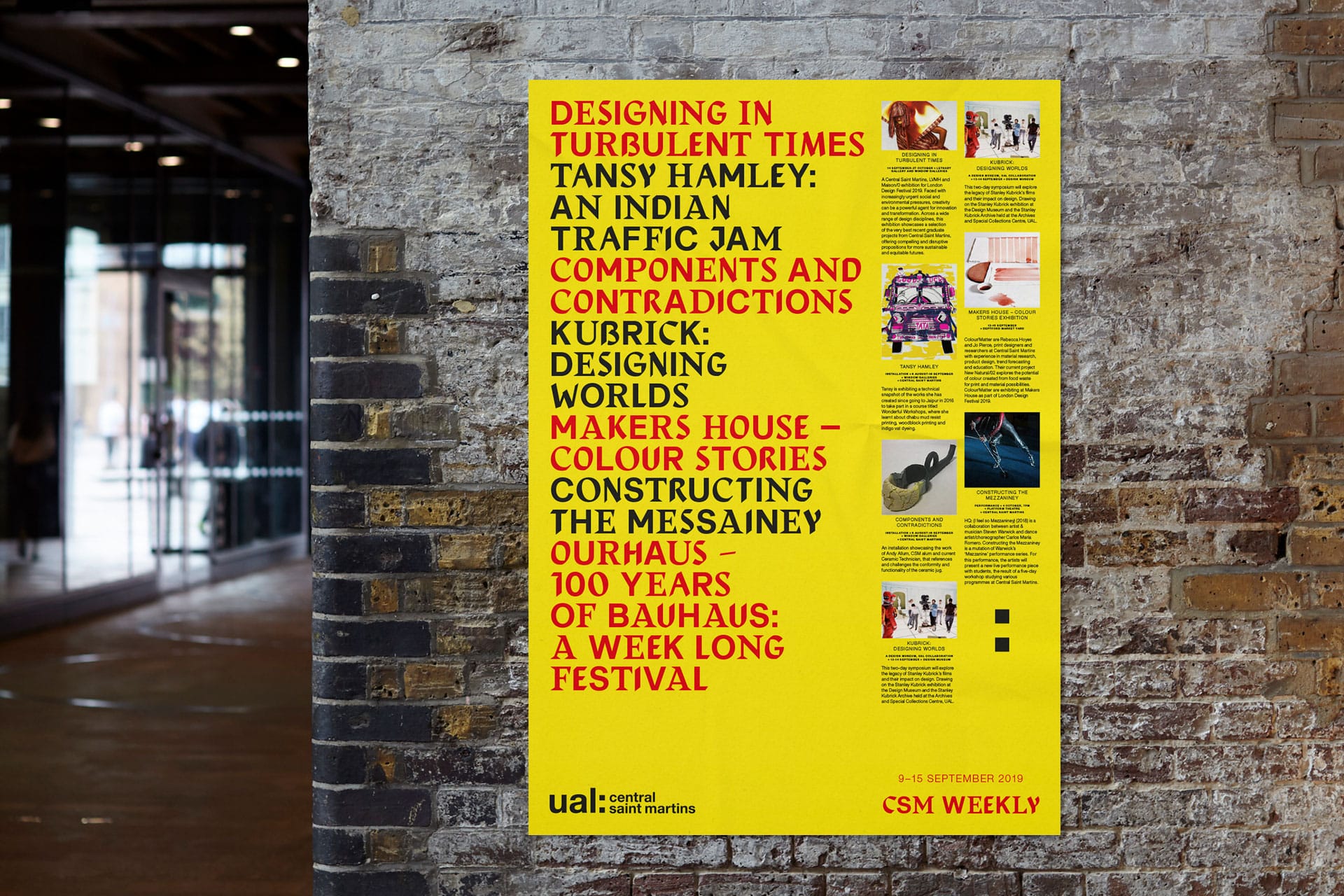
Utilising a pseudo-random script (similarly utilised in our Lafayette Anticipations project), enabled a reactive and dynamic output that would seemingly cycle through the three variants to create an unpredictable mixture of the Past, Present and Future. Initially, Boyle & Perks applied this as a headline typeface, for print publications such as the College prospectus, but soon realised the digital potential of this typeface due to the performative nature of the typeface added another dynamic to the project. As many friends, collaborators and team members have studied either at CSM itself or within the UAL group this was an exciting project to be part of, and a unique solution to represent a socially diverse range of creative individuals.
Recent Custom Projects
View all

Let’s Work Together
To talk to us about your project, please get in touch.
