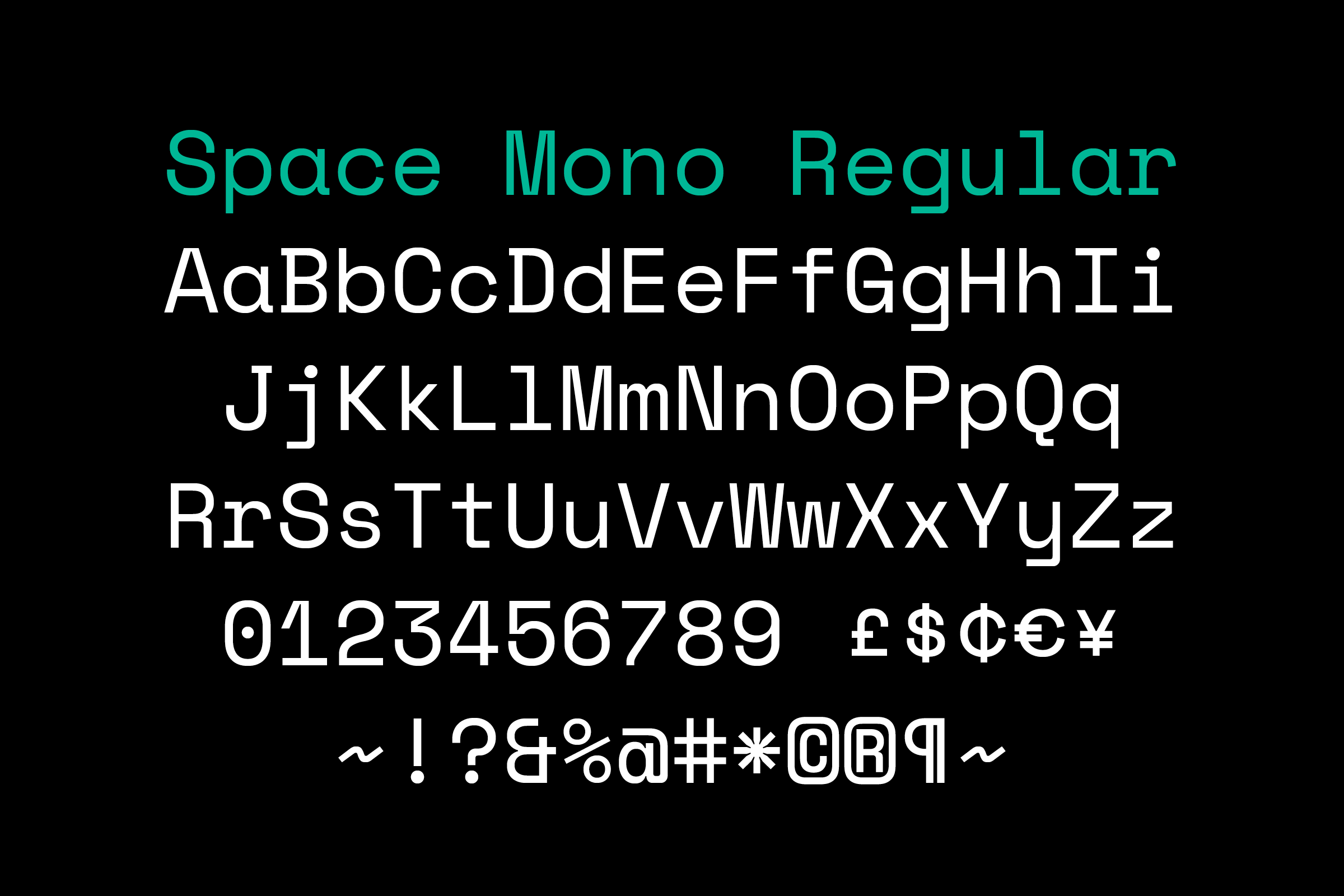

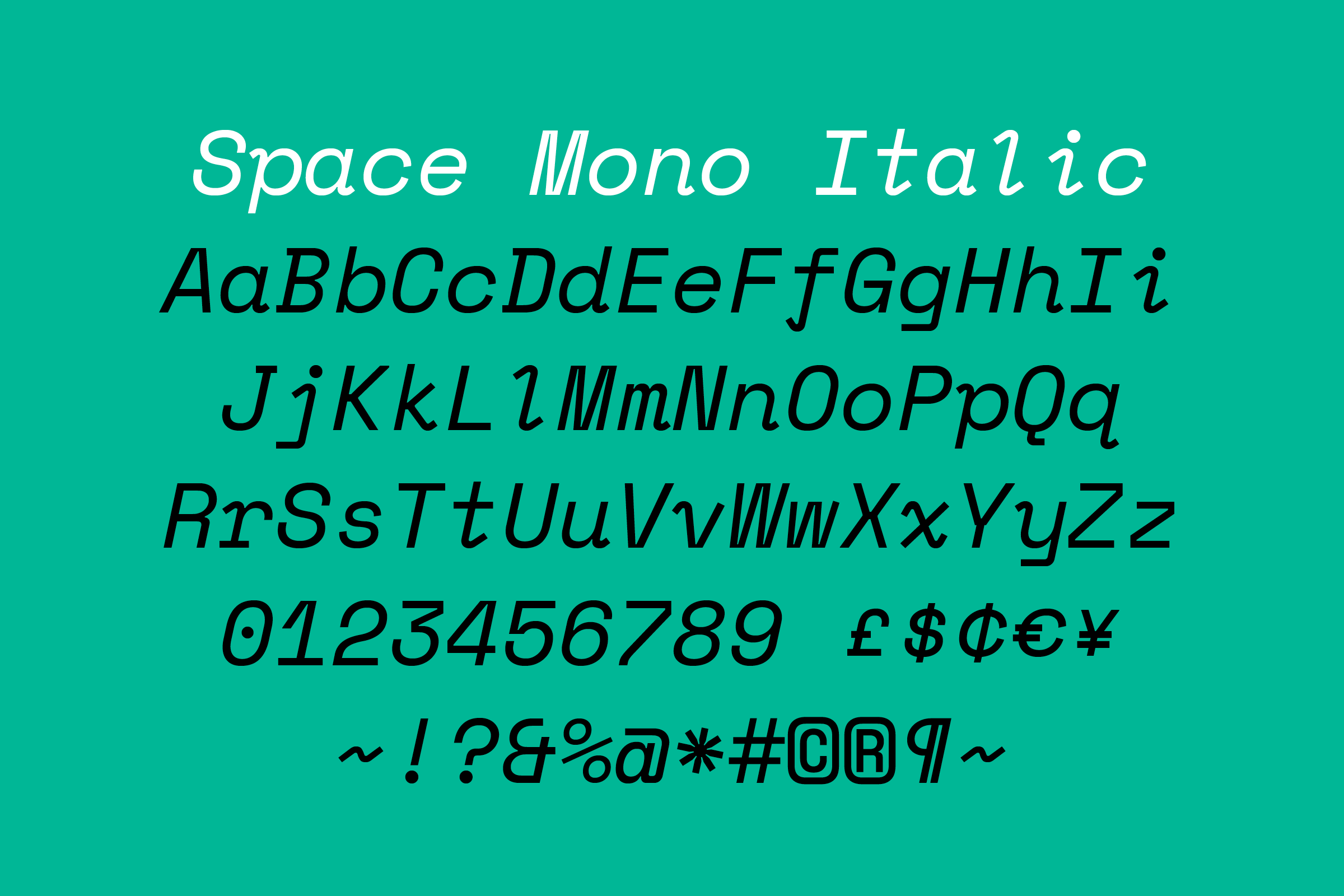
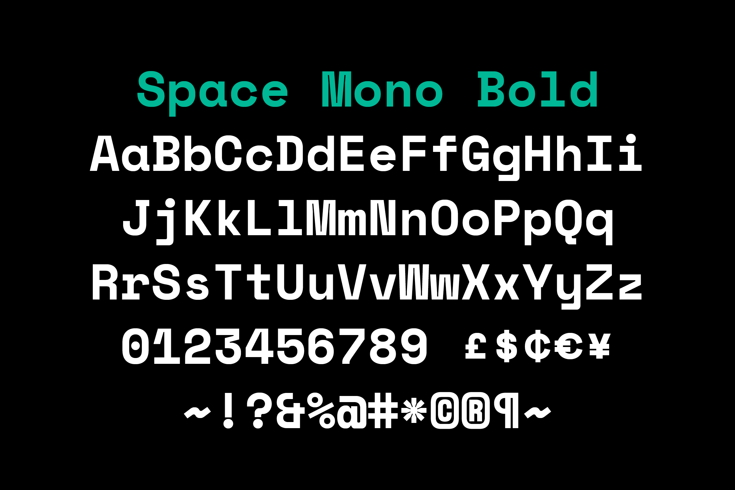
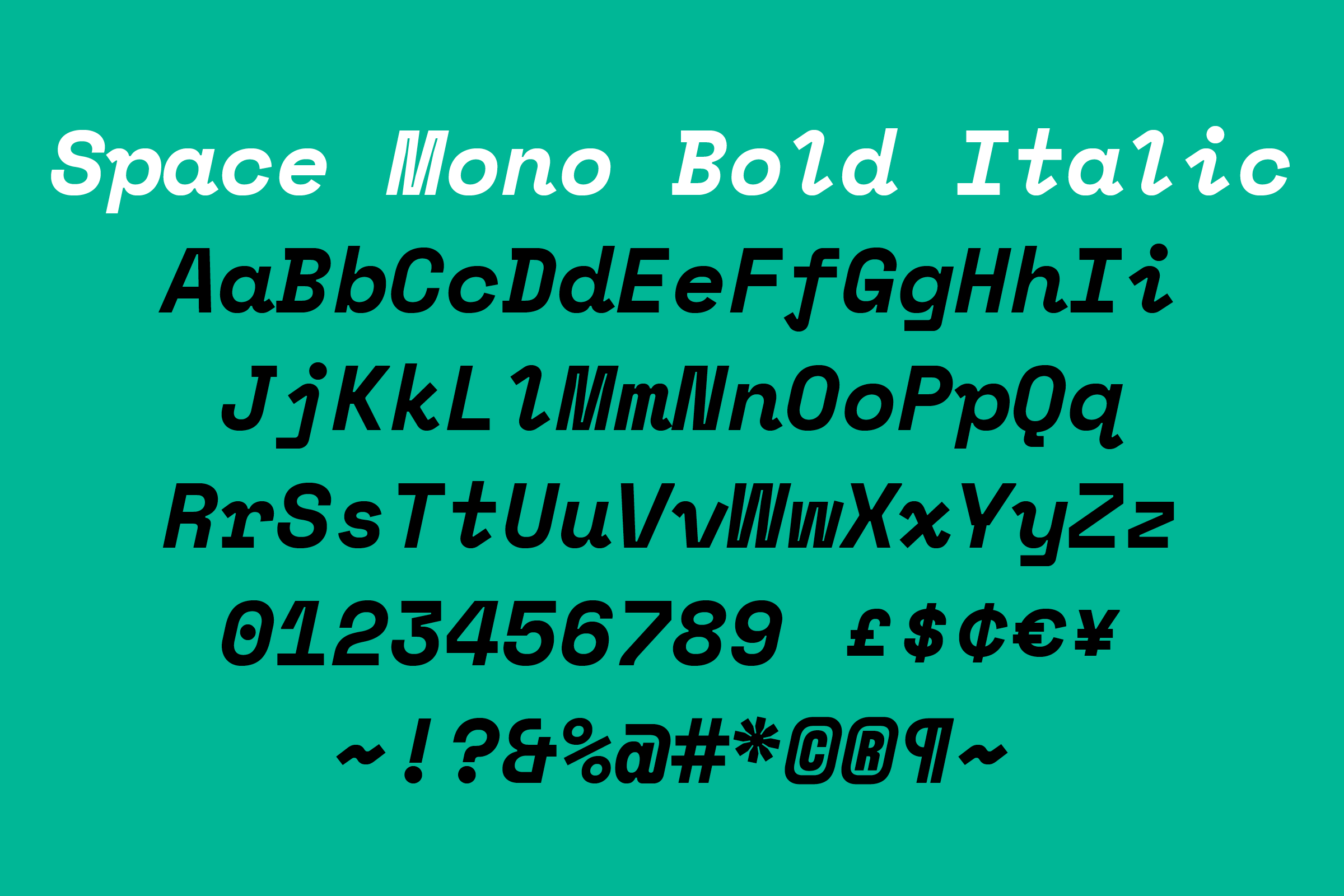
Space Mono
Space Mono — whose name inverts its own typographic classification — is a monospace (sometimes called fixed-width, fixed-pitch, or non-proportional) typeface that comprises Regular, Italic, Bold, and Bold Italic cuts, commissioned for the 2016 update of Google Fonts.
- Typeface
- Space Mono
- Comissioner
- Year
- 2016
- Styles
- 4 Styles: Regular Mono, Regular Italic Mono, Bold Mono, Bold Italic Mono
- Coverage
- Adobe Latin-4
- Classification
- Monospace
- URL
- fonts.google.com

While certain type classifications (Grotesque, Humanist, Etc.) describe historical context or appearance, a monospace type doesn’t describe its character, but rather its construction. And while that construction often dictates form (an ‘m’ may get smushed into its container; an ‘i’ extended outwards with foot and bar), we found it interesting that despite these formal constraints, monospaced type is widely used in editorial settings to give a certain style or feel rather than hit a specific character count or meet a technical limitation.

Delving into this process got us thinking about what monospace means to us: If we drew a natively monospaced typeface as an homage to our abstract perceptions of that typographic designation, what form would it take? Maybe instead of trying to optimise for readability or performance, or capture an amalgamation of monospace attributes, we could instead mine our cultural associations and exploit the limitations of fixed-width type.

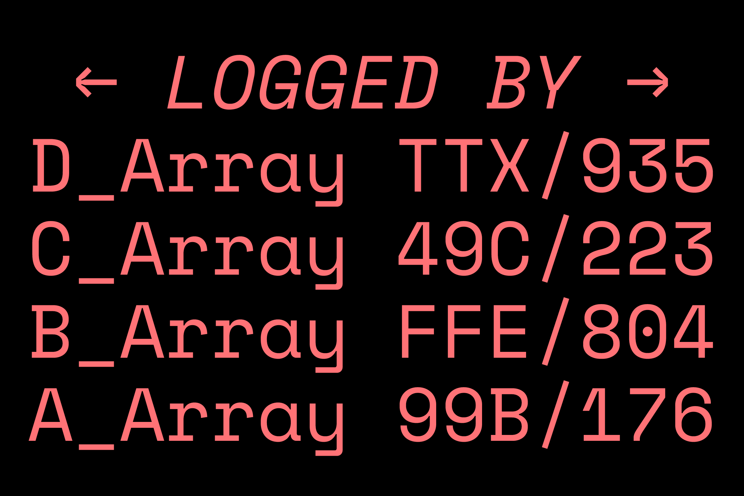
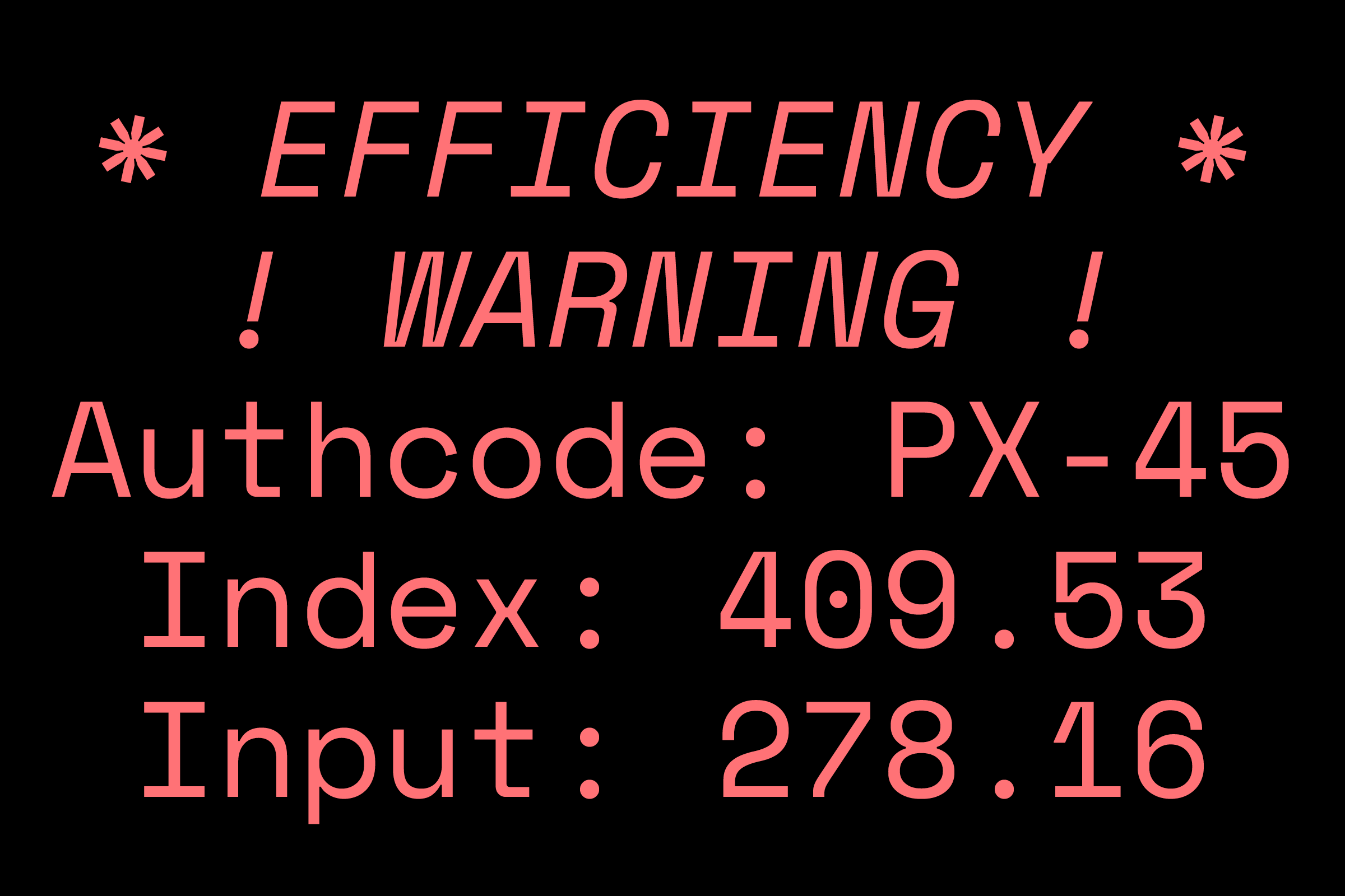
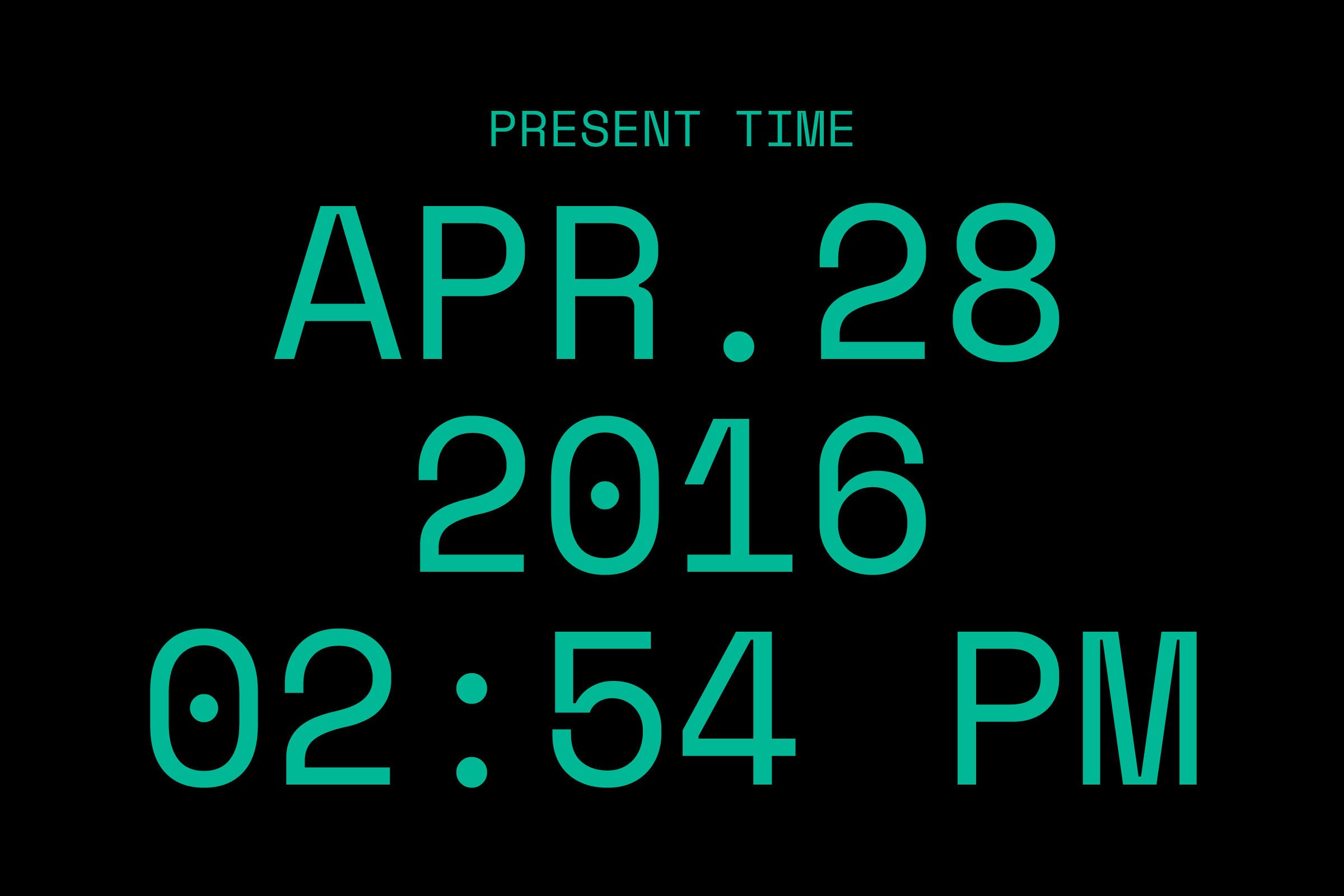
So while the click-clack of the typewriter occurred to us for a brief moment (Film Noir! Olivetti! Sottsass!), the idealised monospace that is closer to our hearts and more aligned with our cultural touchstones are the displays, monitors, and screens of Speculative Fiction — the imagined or not-yet-real interfaces of canonical Sci-Fi films and television programs.

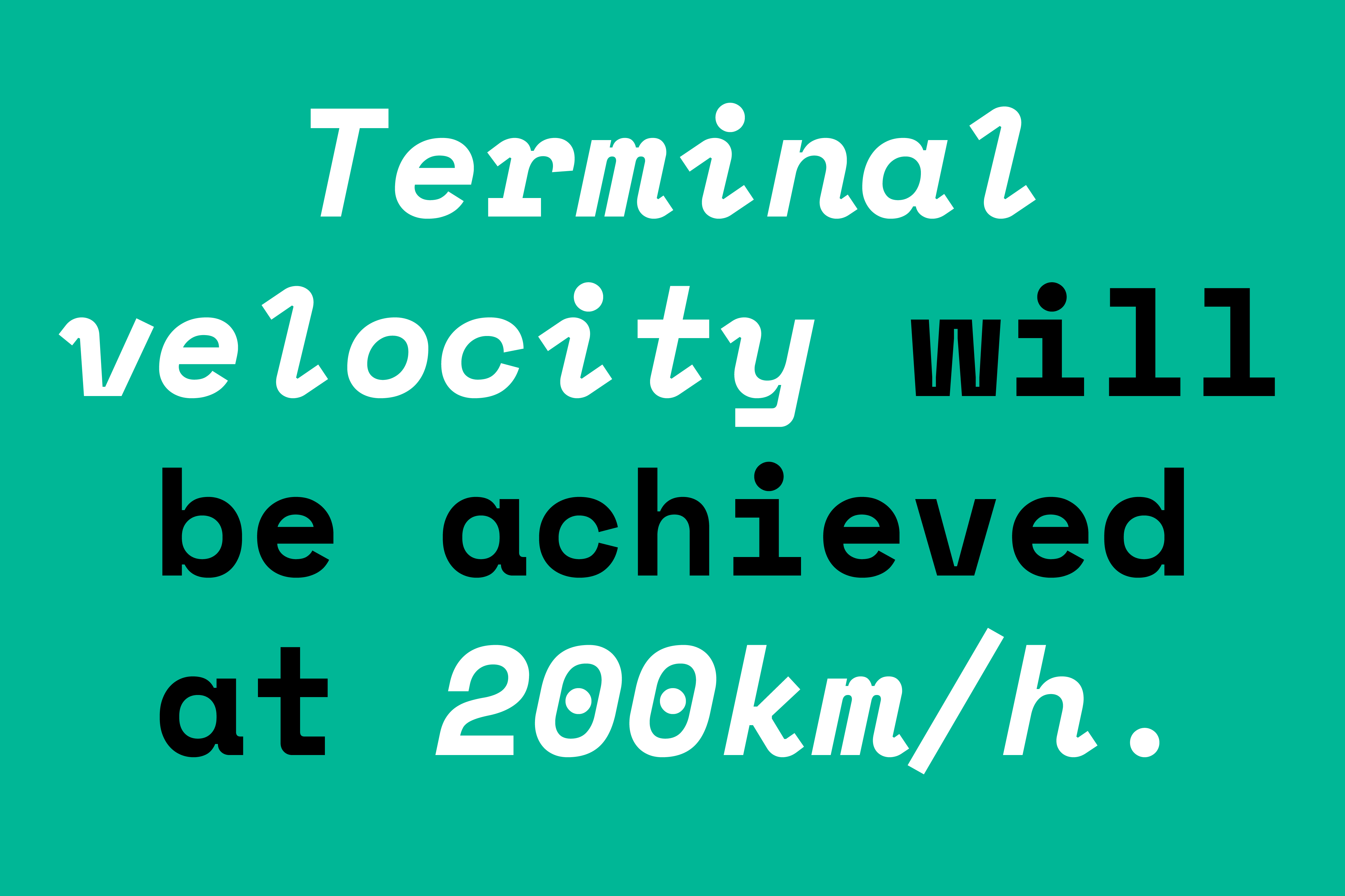
Most monospaced types are dictated by text-intensive usage at small point sizes, but we were captivated by the possibility of a monospace writ large, as it is in our collective mind’s eye: a few words projected on a large display, rendered in simplified, appealingly vague pieces of warning or counsel that only a trained operator understands, all witnessed via screen-within-imaginary-screen, aboard interplanetary vessels and hovering automobiles.
Our evergreen touchstone for this, despite its proportional construction, is Aldo Novarese’s Microgramma, 1952 (and later Eurostile, 1962), its distinctive uppercase ‘R’ leading the way and subsequently echoed in our own drawing.
)
)
Over the course of eight months, Space Mono’s personality started to take shape, particularly as we began drawing the lowercase ‘g’ (the third letter we composed, just after the ‘G’ and ‘o’, just before the ‘l’ and ‘e’). Starting from a geometric, affable upper-half, the descending foot of the character is drawn to create a strong juxtaposition with its above-baseline counterpart.
)
)
Space Mono is available to download for free from Google Fonts
Recent Custom Projects
View all

Let’s Work Together
To talk to us about your project, please get in touch.
