)
Tripadvisor
In close collaboration with the bright minds at Mother New York, Colophon developed a four-weight, five-style type family for the globally-minded, US-based travel company Tripadvisor.
- Typeface
- Trip Sans
- Comissioner
- Mother Design New York
- Year
- 2019
- Styles
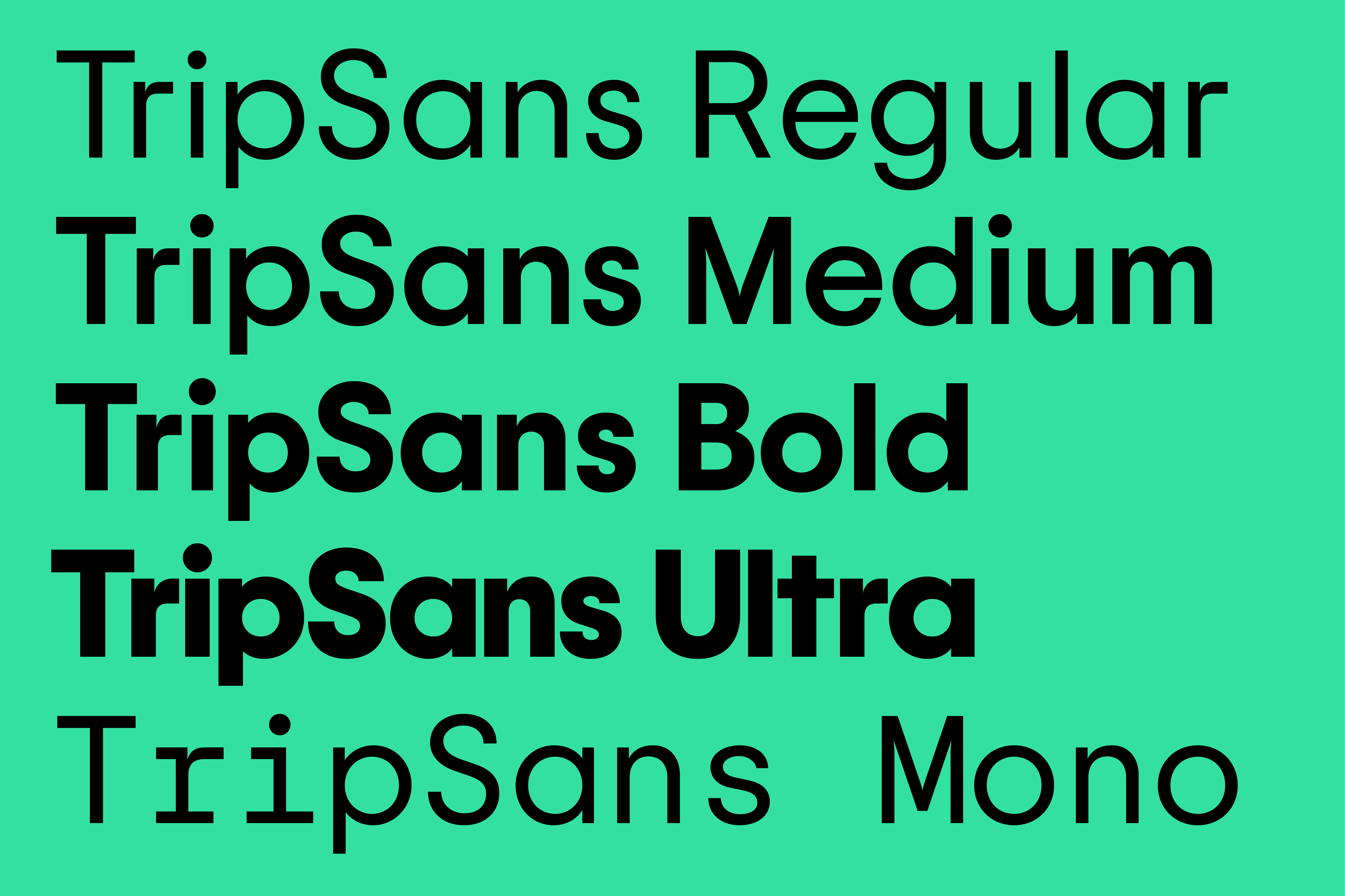
- 5 Styles: Regular, Medium, Bold, Ultra, Mono
- Coverage
- Adobe Latin-1
- Classification
- Sans Serif Monospace
- URL
- motherdesign.com tripadvisor.com
Coming off a rebrand by Mother that saw the company’s name subtly but meaningfully changed from TripAdvisor to Tripadvisor in tandem with a geometric re-working of the company’s logotype, Colophon was commissioned to derive and fully express several comprehensive weights from said logotype. These five types would come to be known as Trip Sans, Tripadvisor’s new proprietary corporate type family.
Founded on the notion that real humans give the best advice, Tripadvisor provides travel guidance for nearly 460 million site visitors each month. Some twenty years after its inception in the small town of Needham, Massachusetts, the company knew that the world of travel had evolved; it made sense that the platform’s branding would follow suit. Appreciating the global recognition of the company’s iconic Owl mark, Mother retained that mark’s inherent personality but refined its geometry for better reproduction at all sizes. This geometry set precedent for the development of the accompanying brand typography, which was initially built using unforgiving mathematics, and then optically corrected over the course of its development to allow for legibility, affability, and the humanism that Tripadvisor is known for.
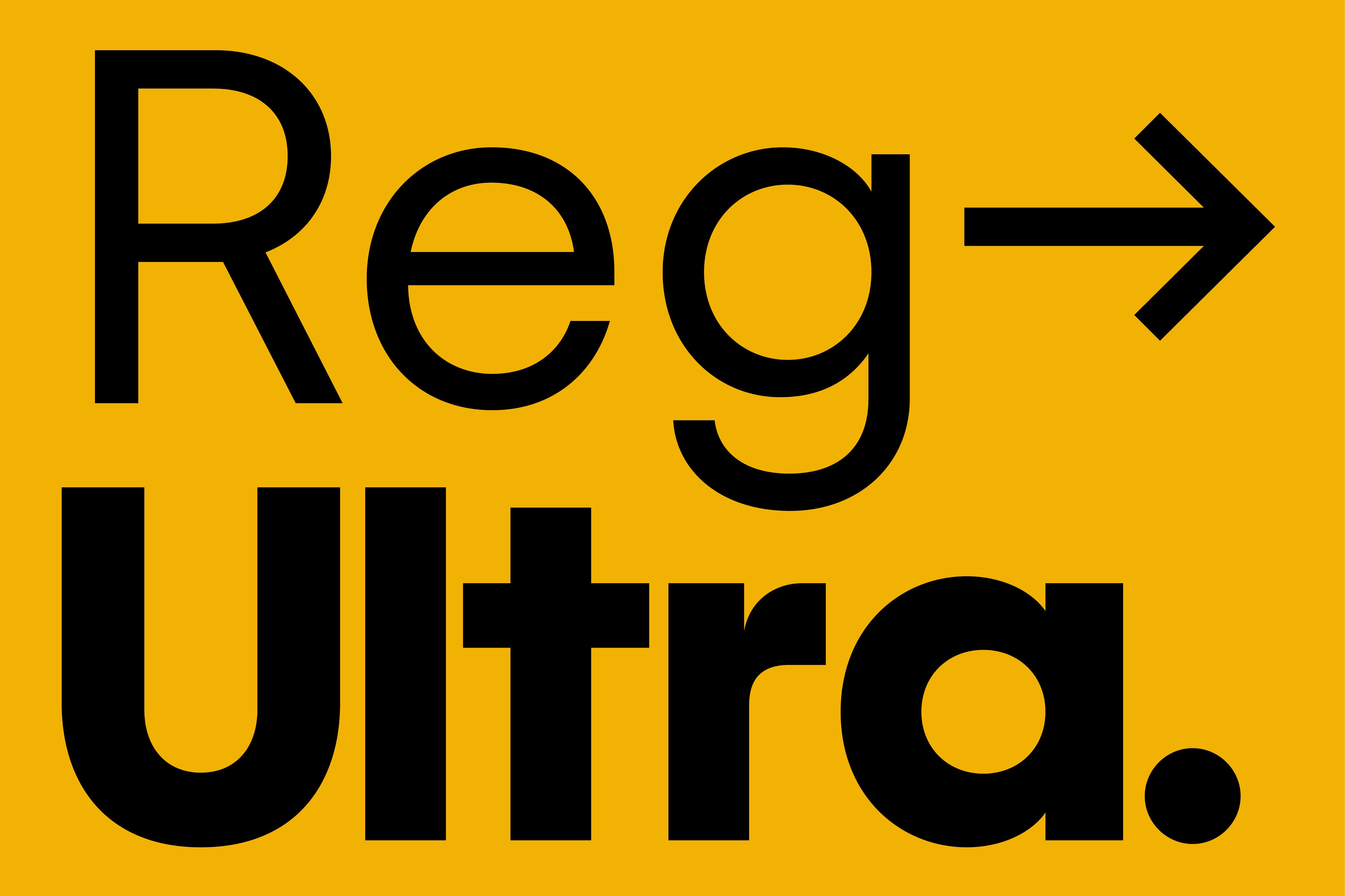
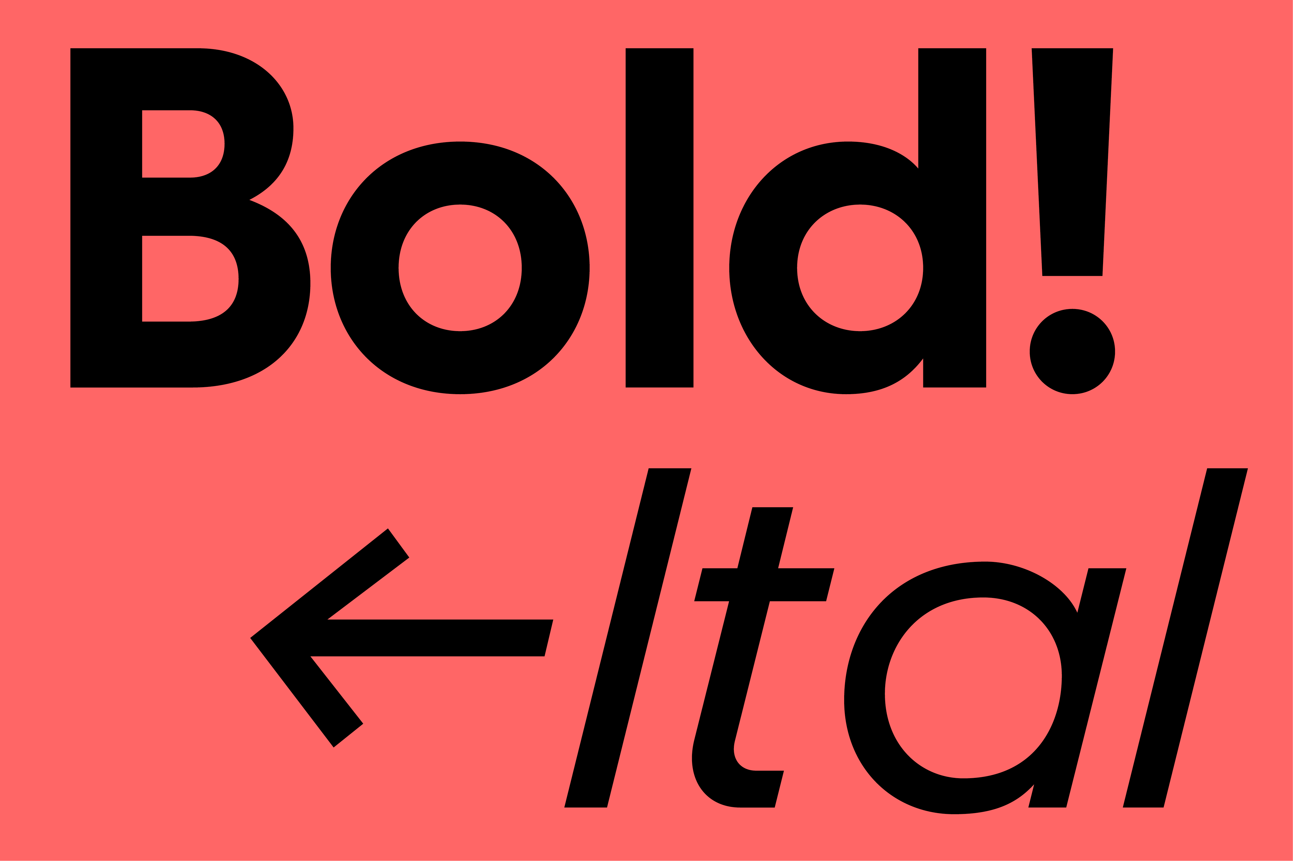
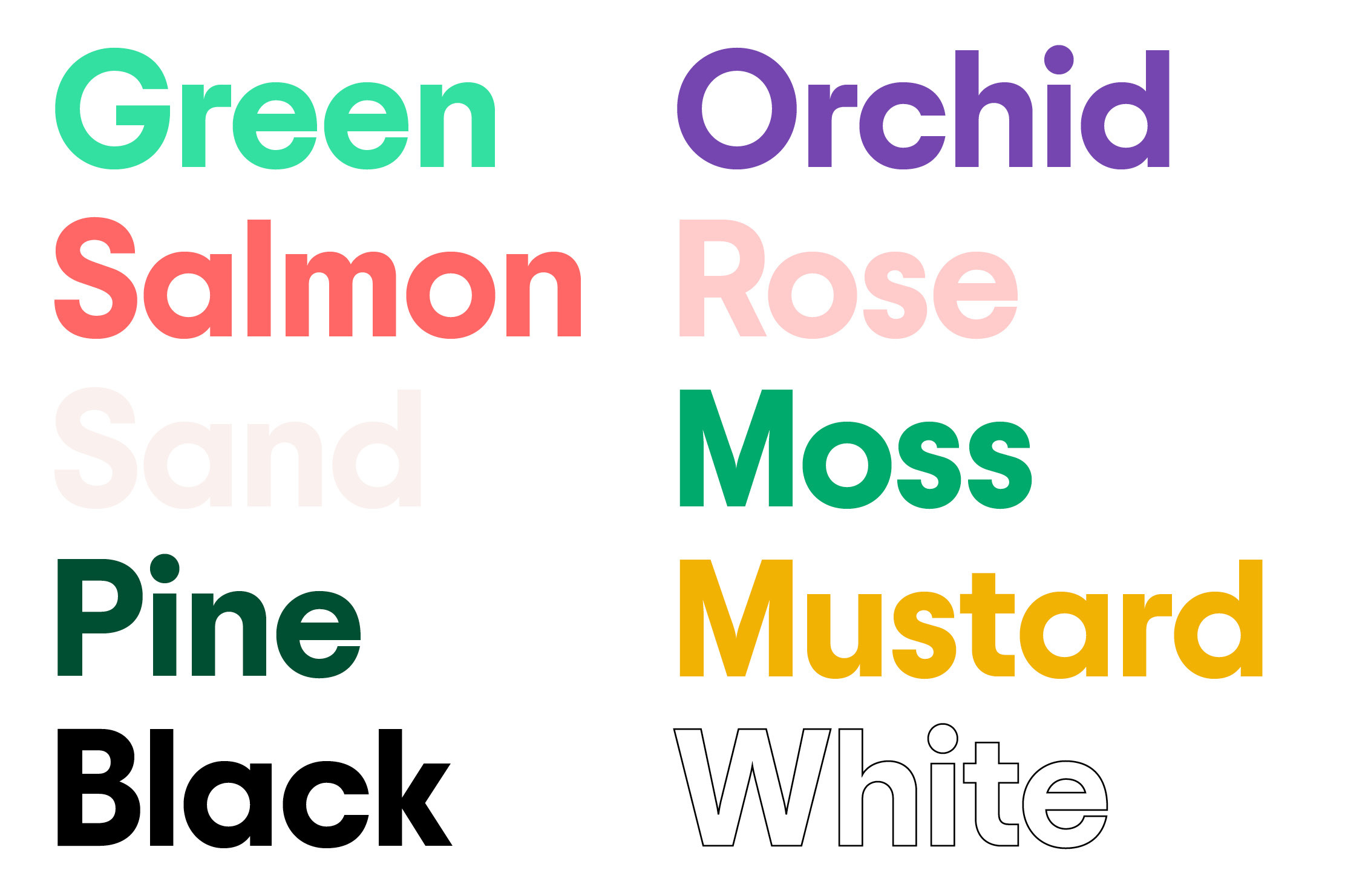
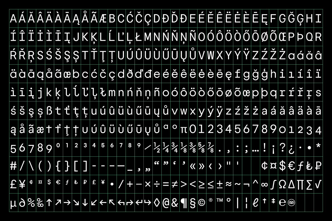
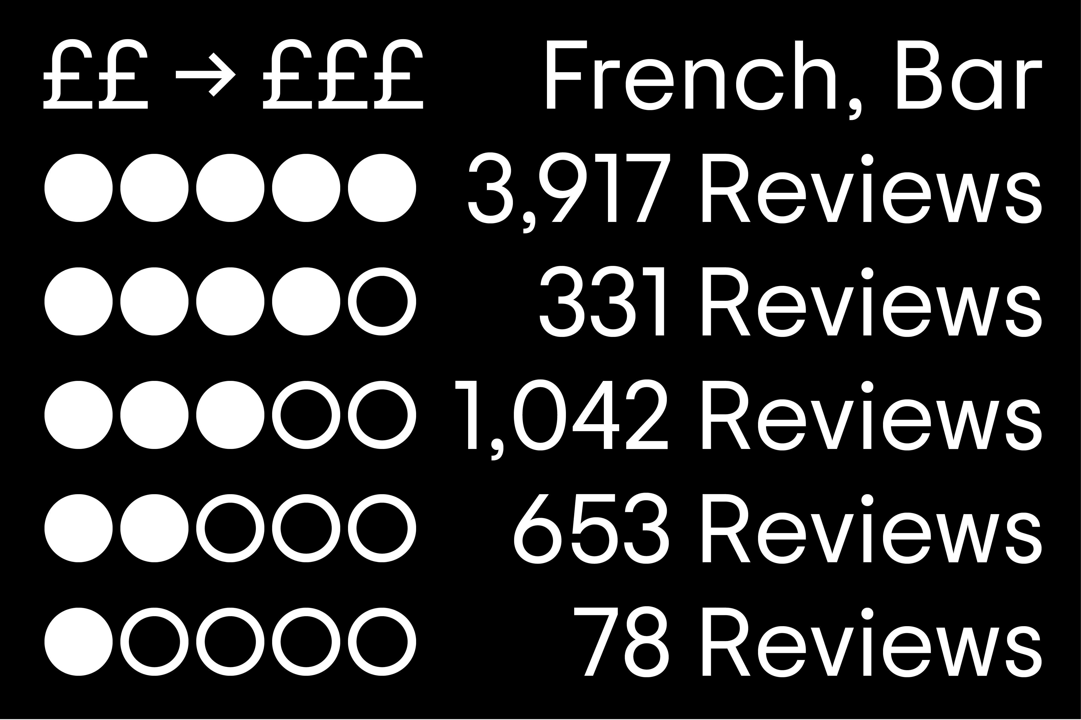
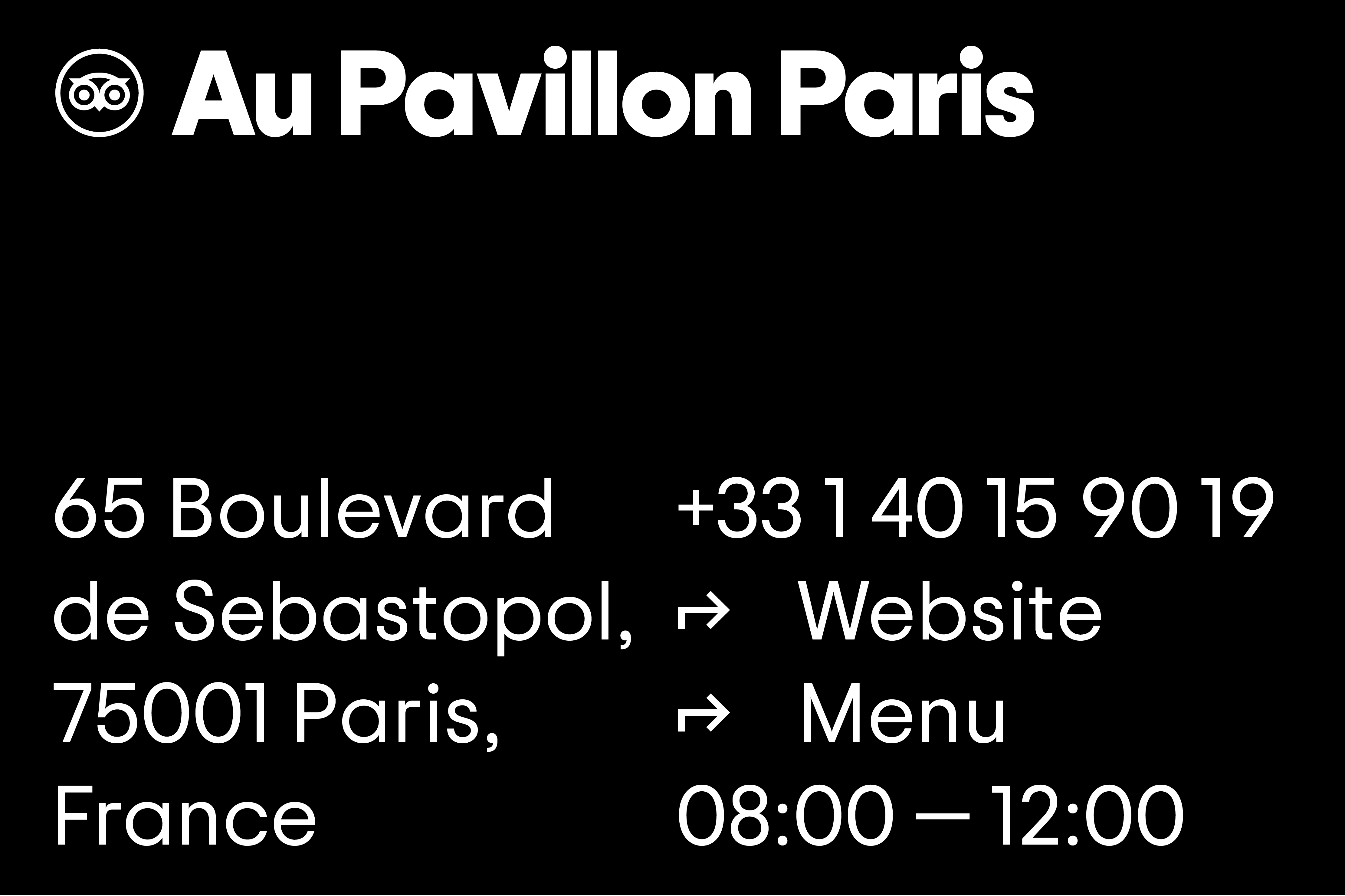
This approachability began in part with the default inclusion of notoriously friendly characters—among them a single-storey ‘g’ and ’a’ (again emphasizing the company’s subtle renaming), and cruciform ’t’, all hallmarks of so-called ‘schoolbook’ styles, known in part for their feeling of inclusivity and universality. Additional character-based features include directional arrows—critical for a company dealing in travel guidance and direction-giving—and a series of dots (empty, half-filled, and filled) as a replacement for the ubiquitous stars found across other review systems. All of these features appear across hyper-functional Regular, Medium, and Bold weights (along with corresponding italics); extra attention was given to super-tight spacing in Trip Sans’ Ultra weight (perfect for impactful headline use); and still further functionality was given to the type’s users with the inclusion of a Monospace variant, helpful in numerical contexts and when character counts must be strict or exacting.
Working closely with the Tripadvisor product teams over the course of the creative process, Colophon was happy to facilitate the supply of a variable version of the type family that would enable lighter files sizes and thus speedier load-times for Web and Application environments. In tandem, close collaboration with those same product teams allowed for seamless implementation and changeover as Tripadvisor rolled out their comprehensive and uniquely ownable new visual identity across countless touchstones, both digital and analogue.
Recent Custom Projects
View all

Let’s Work Together
To talk to us about your project, please get in touch.
