
Grey Goose
Makers of ‘The World’s Best Tasting Vodka’, Cognac-based Grey Goose commissioned Colophon to create a multi-weight type family that would confidently bring the libation from its late 90s heyday into a current (and by now far more crowded) marketplace.
- Typefaces
- Grey Goose
- Comissioner
- Made Thought / Grey Goose
- Year
- 2014
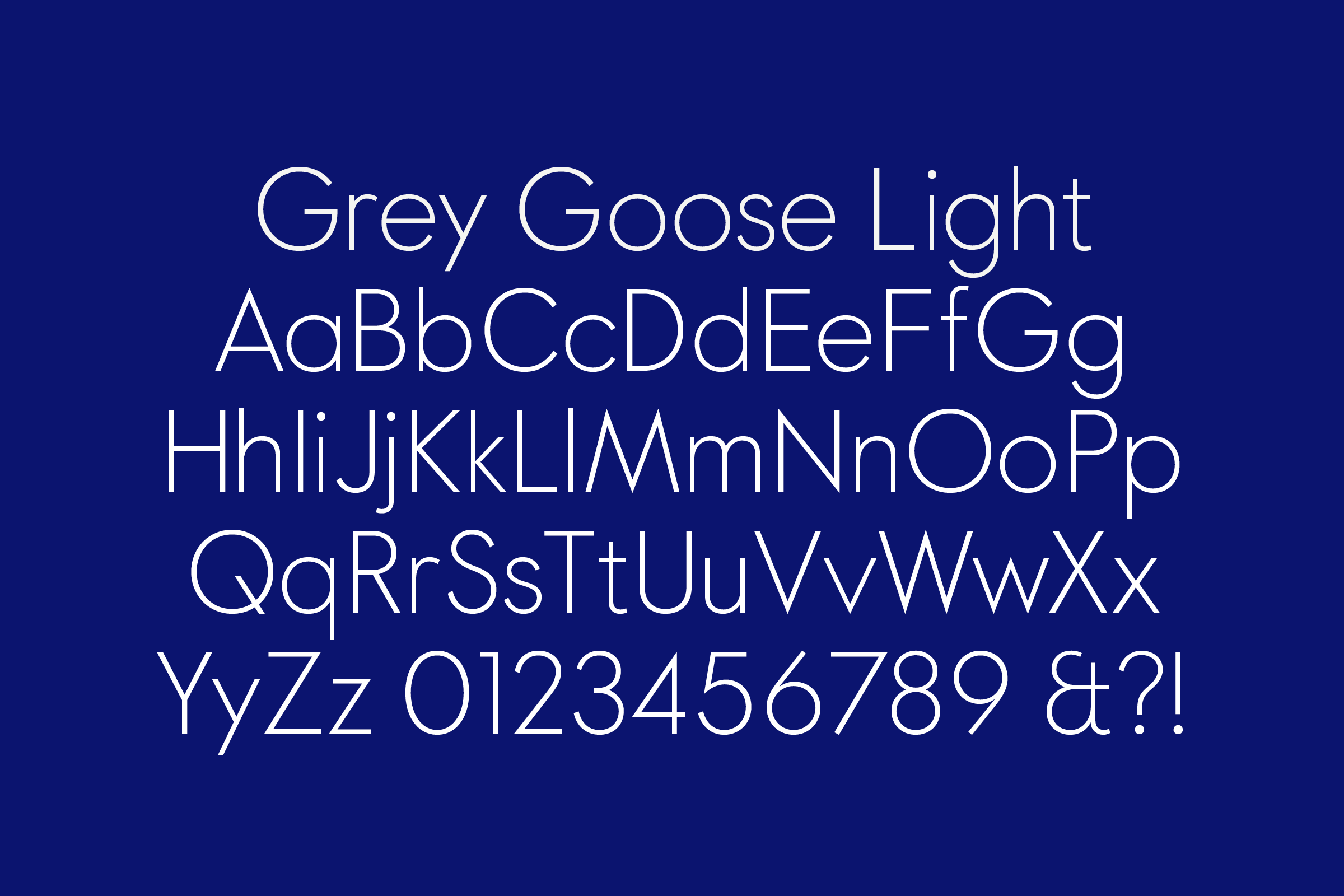
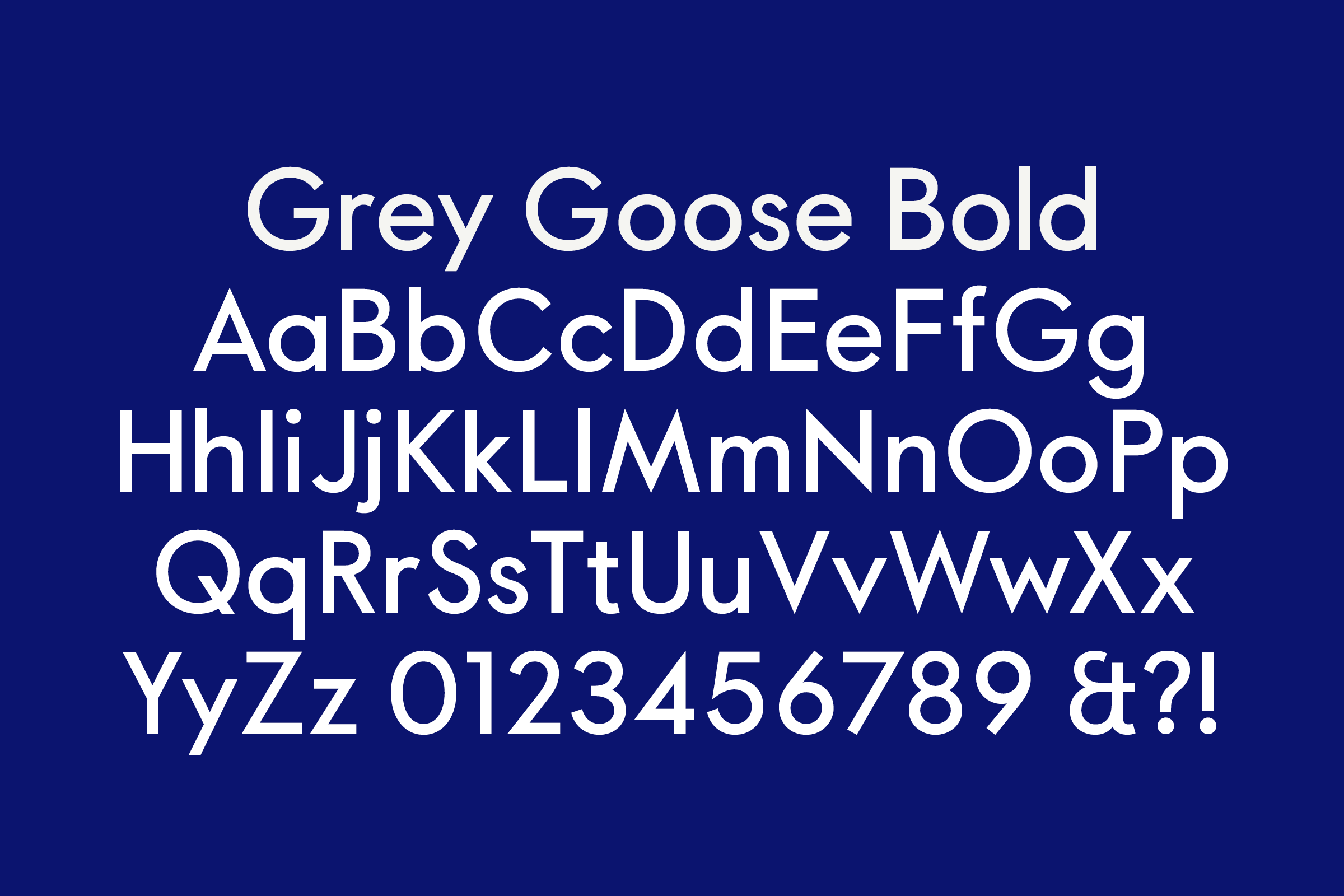
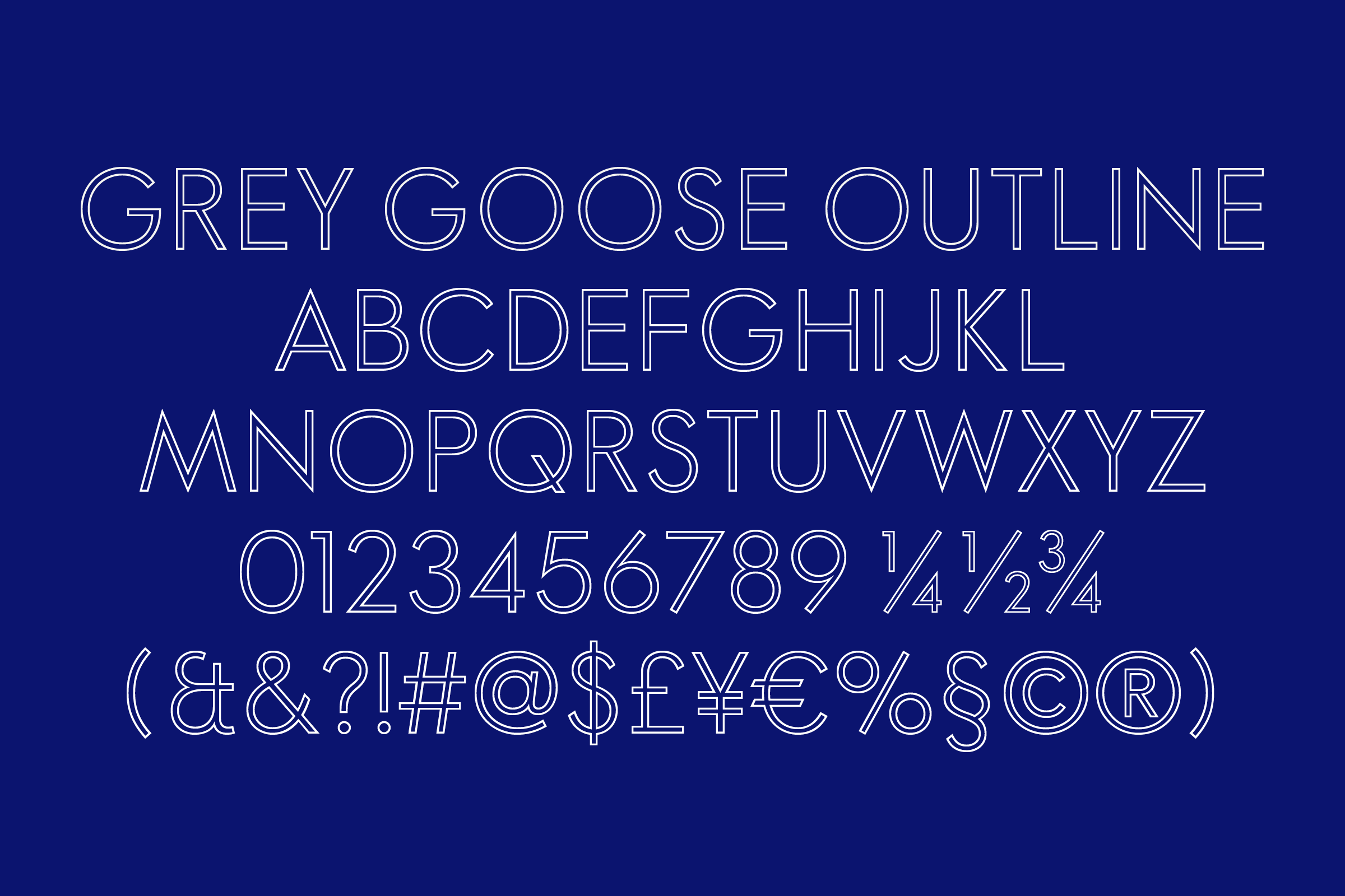
- Styles
- 4 Styles: Light, Regular, Bold, Outline
- Coverage
- Latin-A Encoded
- Classification
- Geometric Sans Serif
- URL
- greygoose.com
- madethought.com
Working with London design consultancy Made Thought, we proposed a three-weight, four-style suite of types that would capture the particular je ne sais quoi of the French distiller: something rooted in nearby European pedigree to provide timelessness, but also something that maintained a contemporary sharpness both in form and feeling.
)
)
Attempts to translate the taste of the distilled spirit led to abstract visual descriptors: Crisp, Even, Acute, Smooth. The ensuing task of translating those qualities back into a typographic context led us toward the geometric classics of the early 20th Century, with Paul Renner’s early cuts of Futura (1927) leading the way.
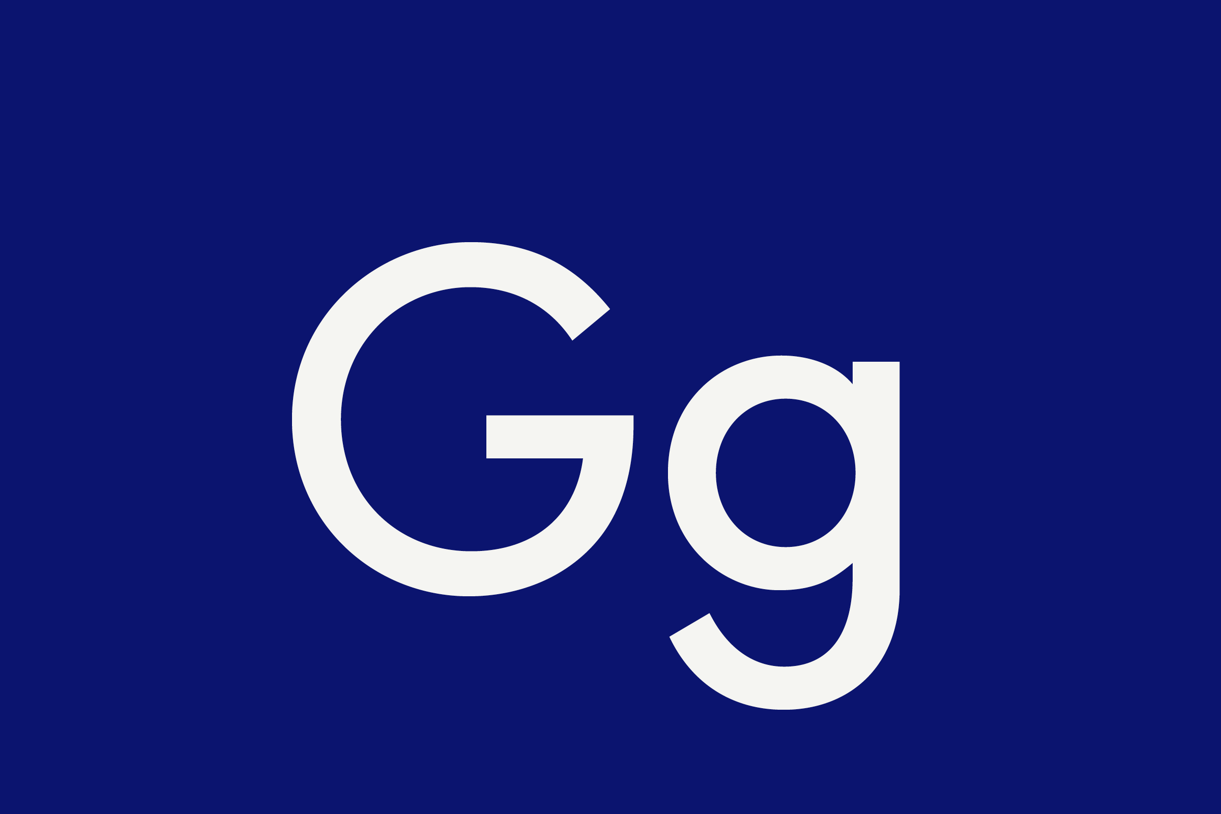

A subsequent distillation process of our own led to the graphic, economic forms that define the Grey Goose type. Pointed vertexes on A, M, N, V, W, and Z pair with near-perfect circles on C, G, O, and Q to provide a harmony and balance that relies on mathematical precision matched with subtle optical correction — a typeface beholden to rules and measures at first but ultimately given over to gesture and mannerism. Note, for example, the traditional Latin ‘et’ as ampersand; and the inclusion of a unique outline face to complement and juxtapose solid cuts.


With the craft of the Maître de Chai and the tradition of spirit-making in mind, the typographic update for the the Bacardi-owned Grey Goose established the first visual ingredient of the brand’s comprehensive update.
)
)
Recent Custom Projects
View all

Let’s Work Together
To talk to us about your project, please get in touch.
