
Klarna
Based in Sweden, Klarna is one of Europe’s largest banks and provides payment solutions for upwards of 80 million customers via 190,000 merchants across 17 countries. Klarna had previously commissioned a custom typeface, but over time and application felt that it wasn’t performing as required across the bank’s multiple platforms and locales. Looking to simultaneously refresh its typography programme and create an evergreen solution that was technologically sound, Colophon Foundry was approached to evaluate the existing offering and suggest a new approach.
- Typeface
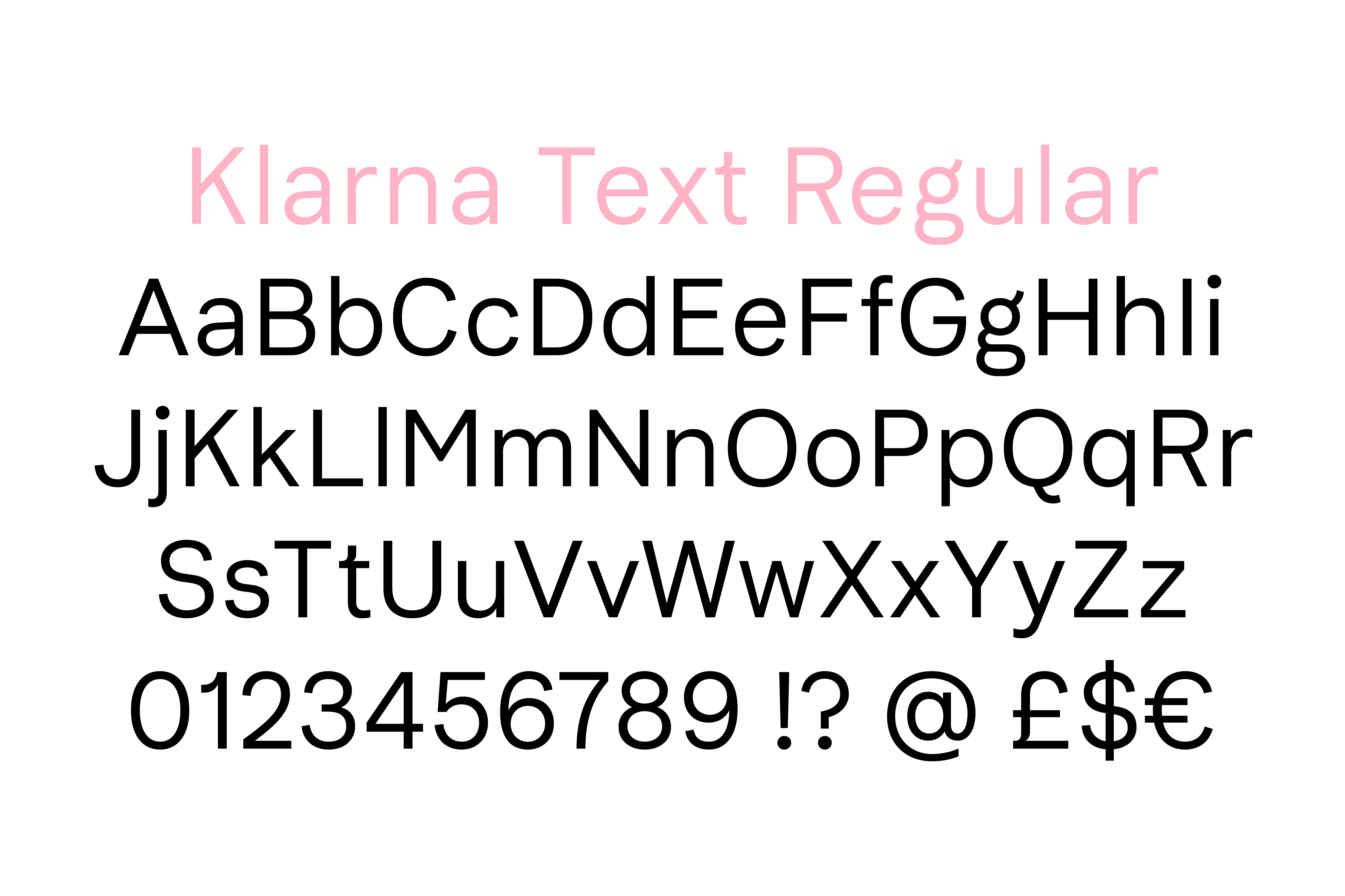
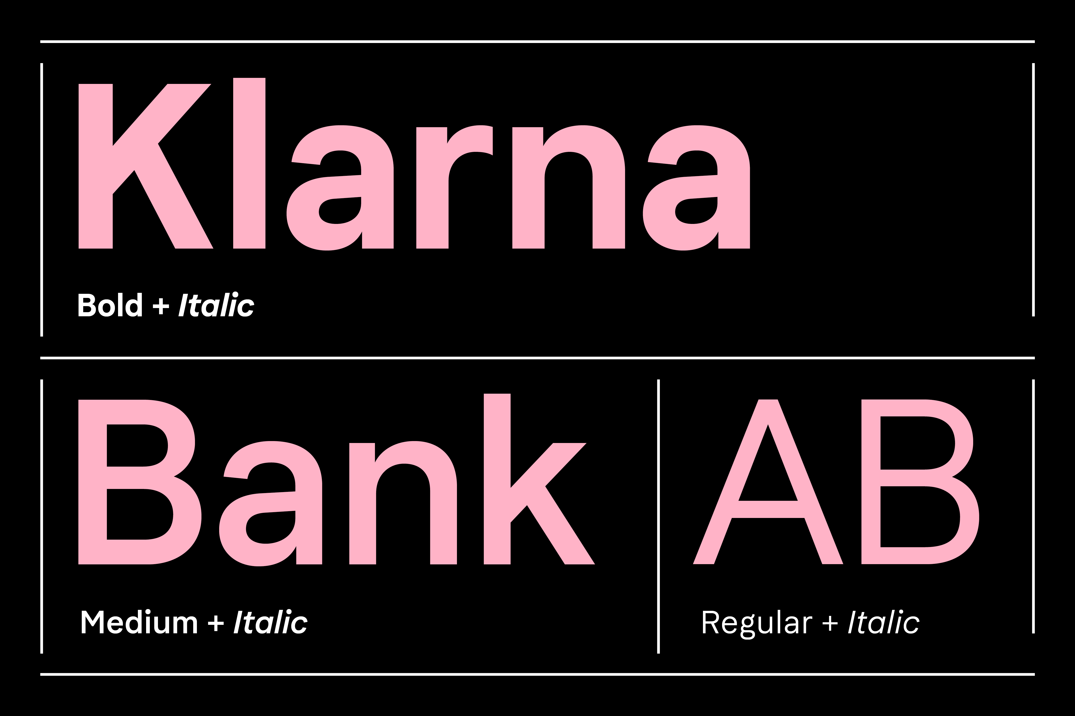
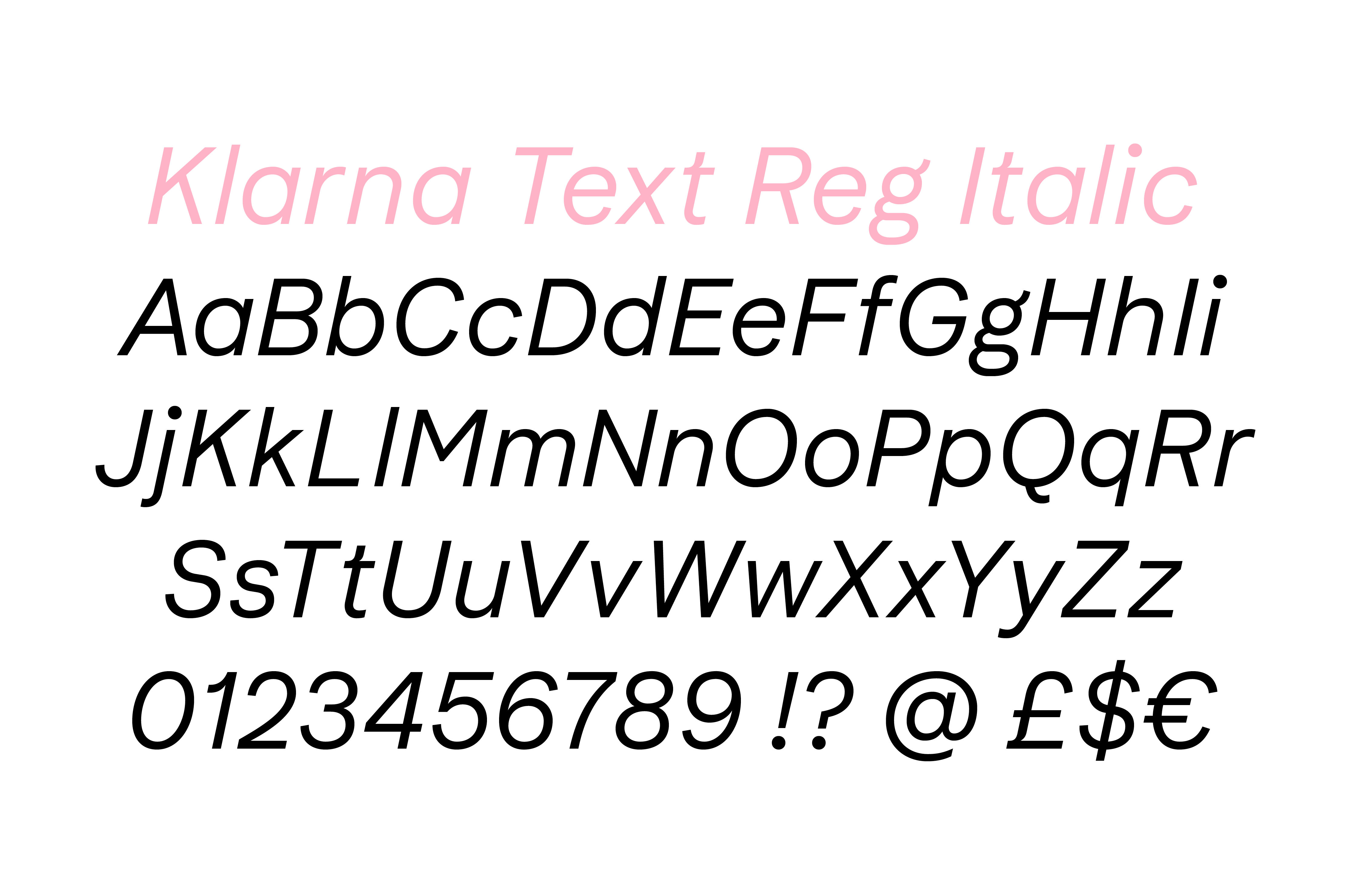
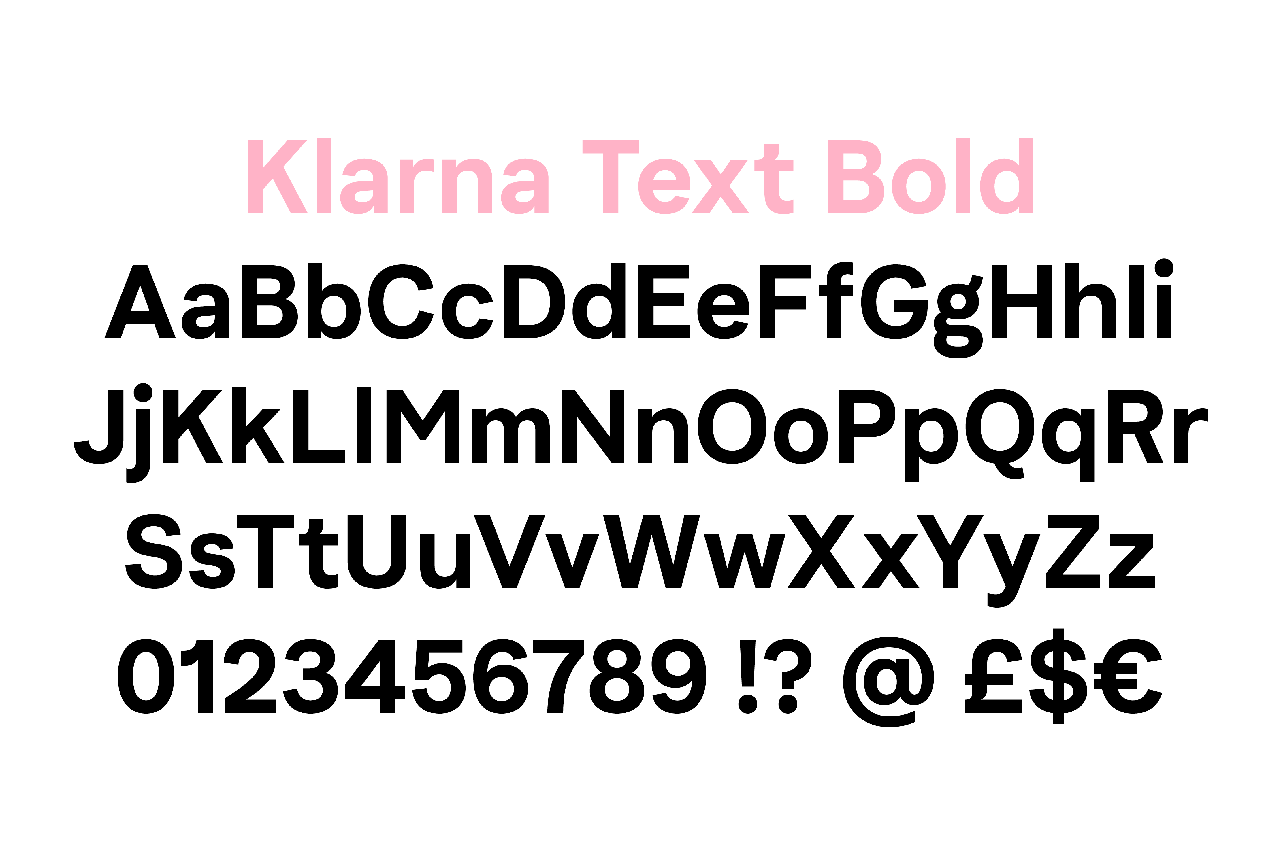
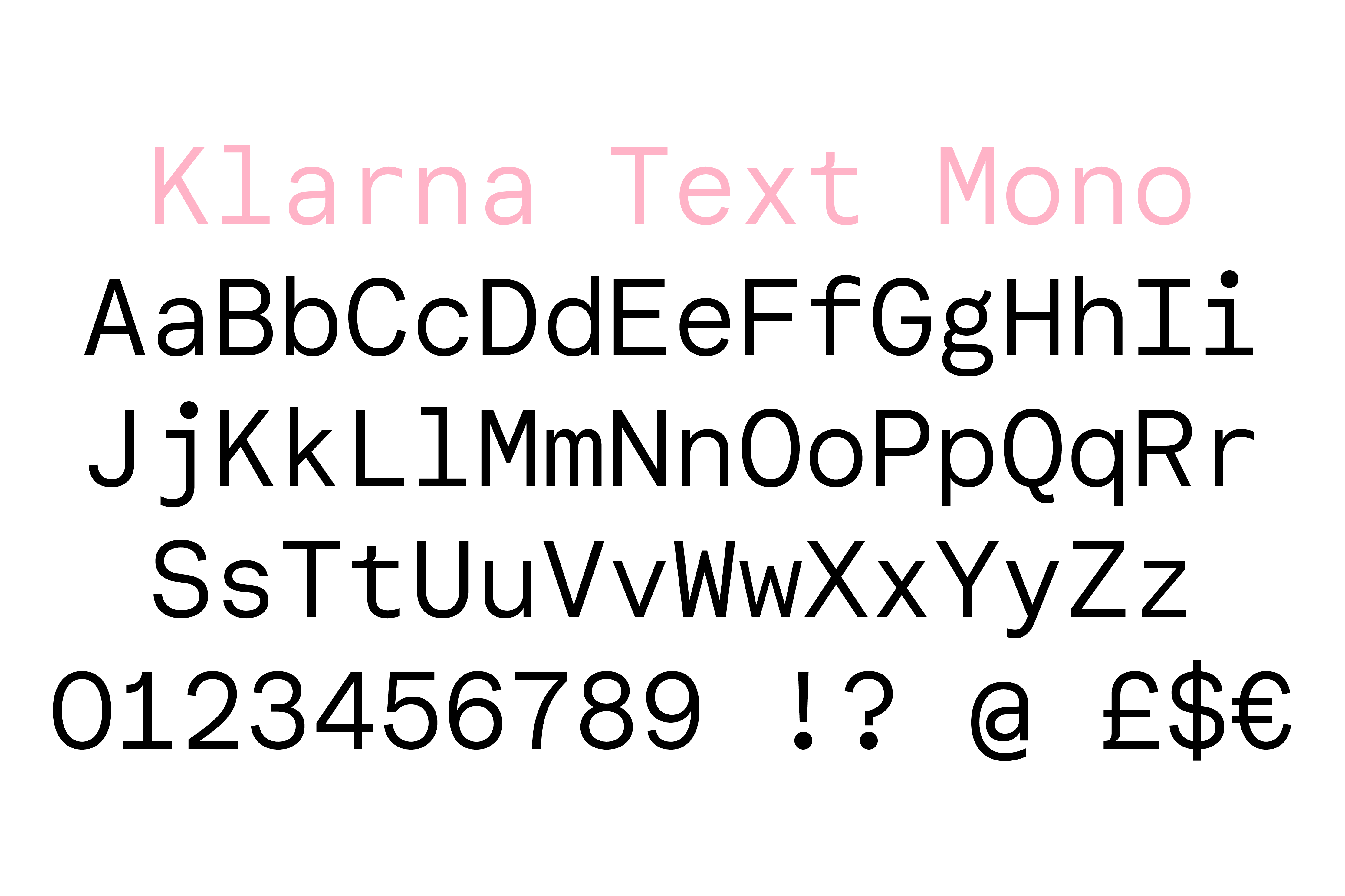
- Klarna Text, Klarna Text Mono
- Comissioner
- Klarna Bank, Stockholm
- Year
- 2019
- Styles
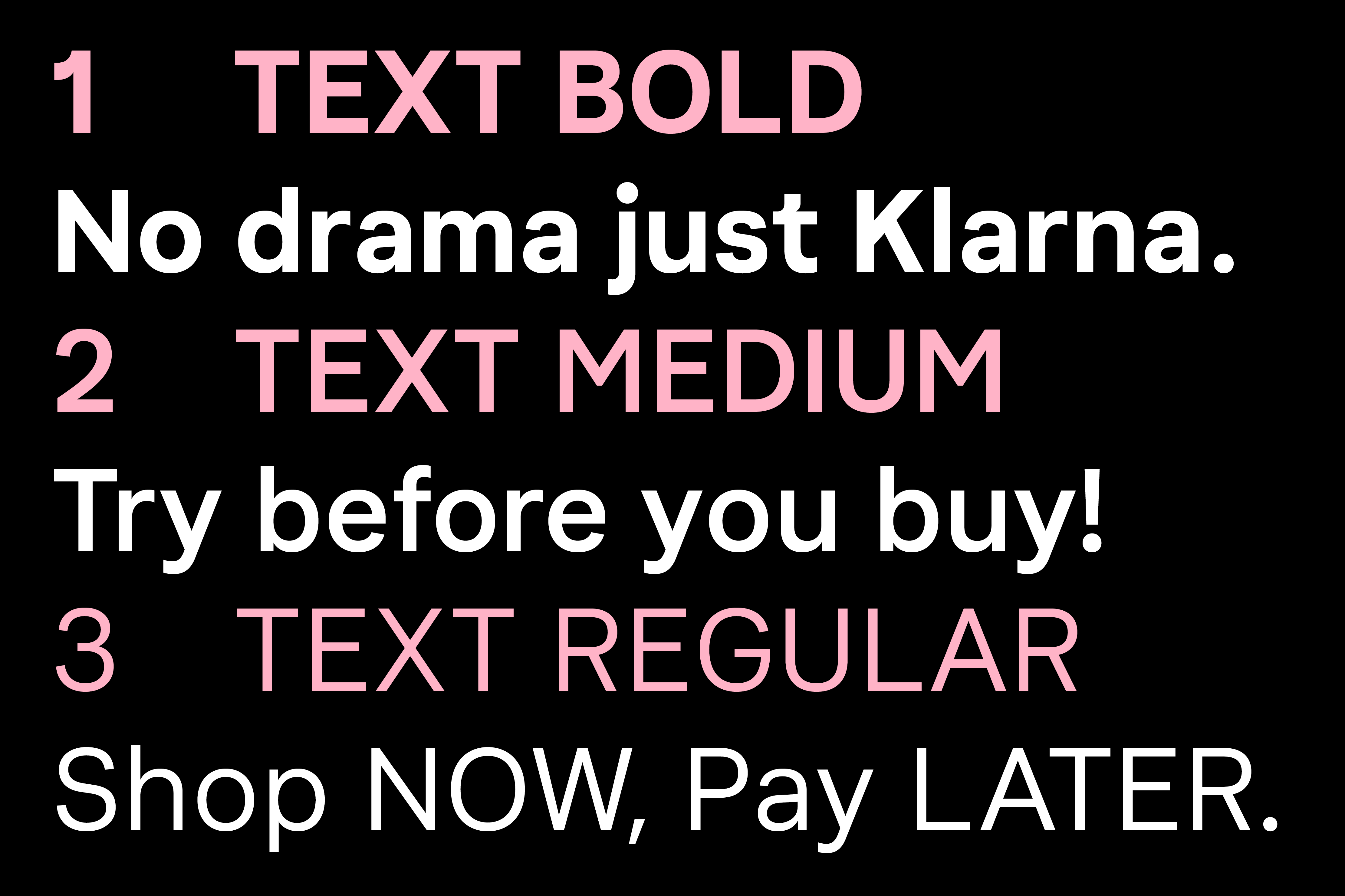
- 8 Styles, Regular, Medium, Bold, Italics + Monospace
- Coverage
- Adobe Latin-3
- Classification
- Sans Serif Monospace
- URL
- klarna.com
To commence the process, Colophon team members proposed a workshop at Klarna’s Stockholm headquarters in order to further understand the requirements of all stakeholders involved, and to better identify precisely where the current typography was lacking in function. Both creative and product teams were brought together not only to understand the visual requirements moving forward, but also to plan smooth implementation and rollout with minimal impact on the product side. As this was a typographic refresh rather than a comprehensive evolution, an elegant and seamless transition was crucial for the client so as not to interrupt the consistent, active use of Klarna’s products and services.
Borrowing subtle cues from the existing and unchanging Klarna headline typography, the end result of this complementary set of tools is a refined, restrained type family conducive to smaller sizes and longer reading. The new sans-serif workhorse maintains the Klarna brand expression at its core, extracting the essence of the original Klarna Sans while expanding usage instances and legibility across touchpoints. Key moves in the new Colophon-drawn Text family make the two disparate types feel more like cousins than siblings, ultimately strengthening brand flexibility while improving legibility and usability across the board.
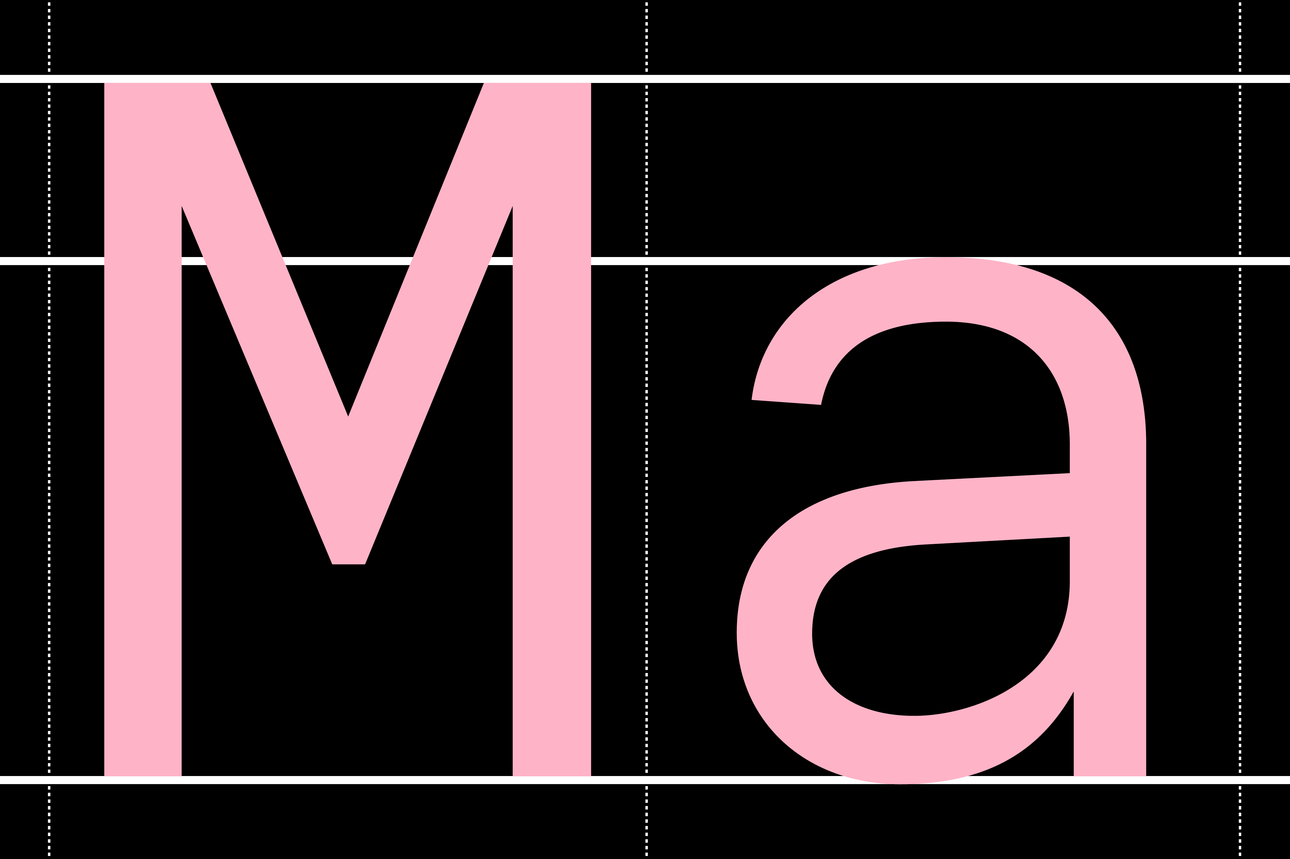
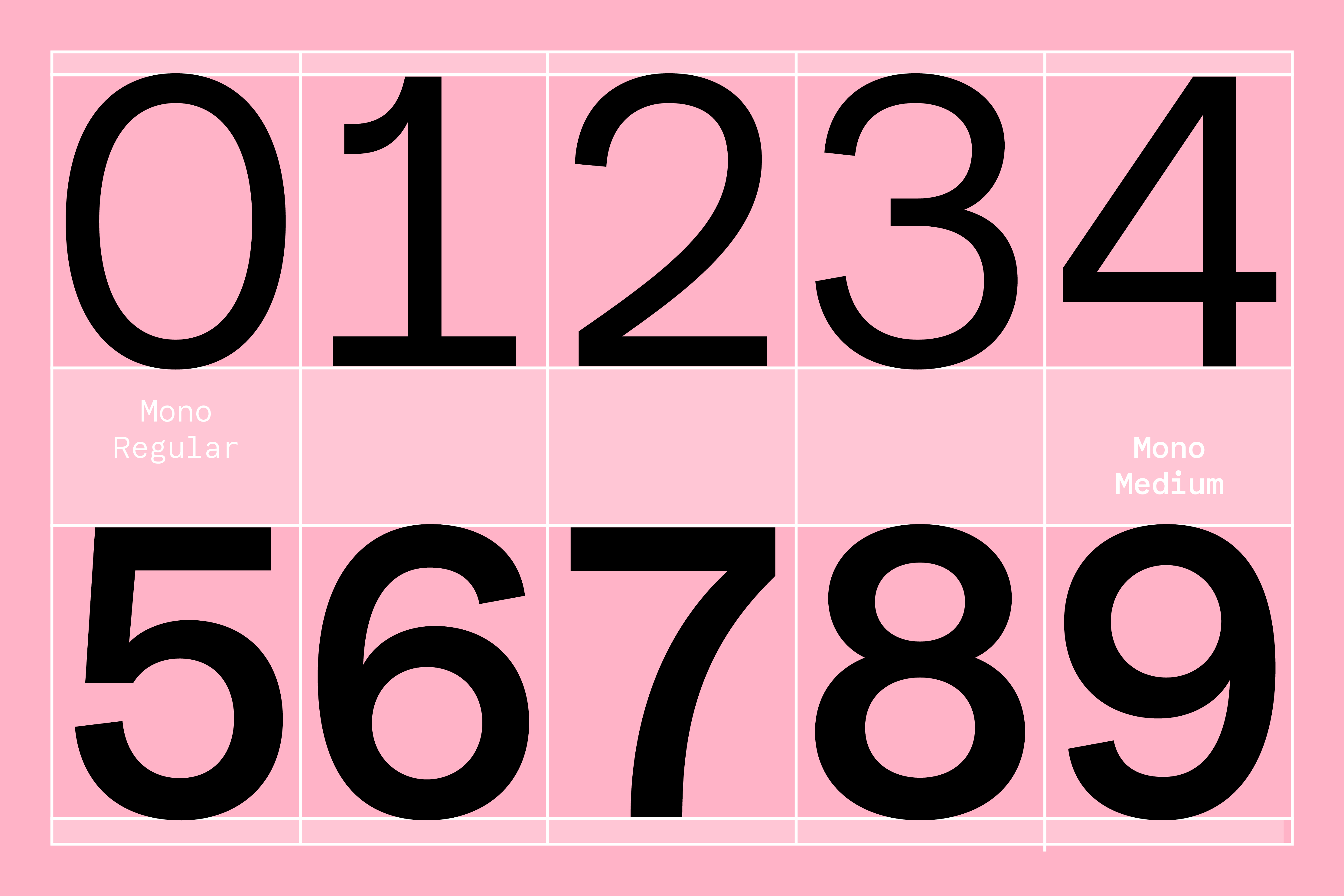
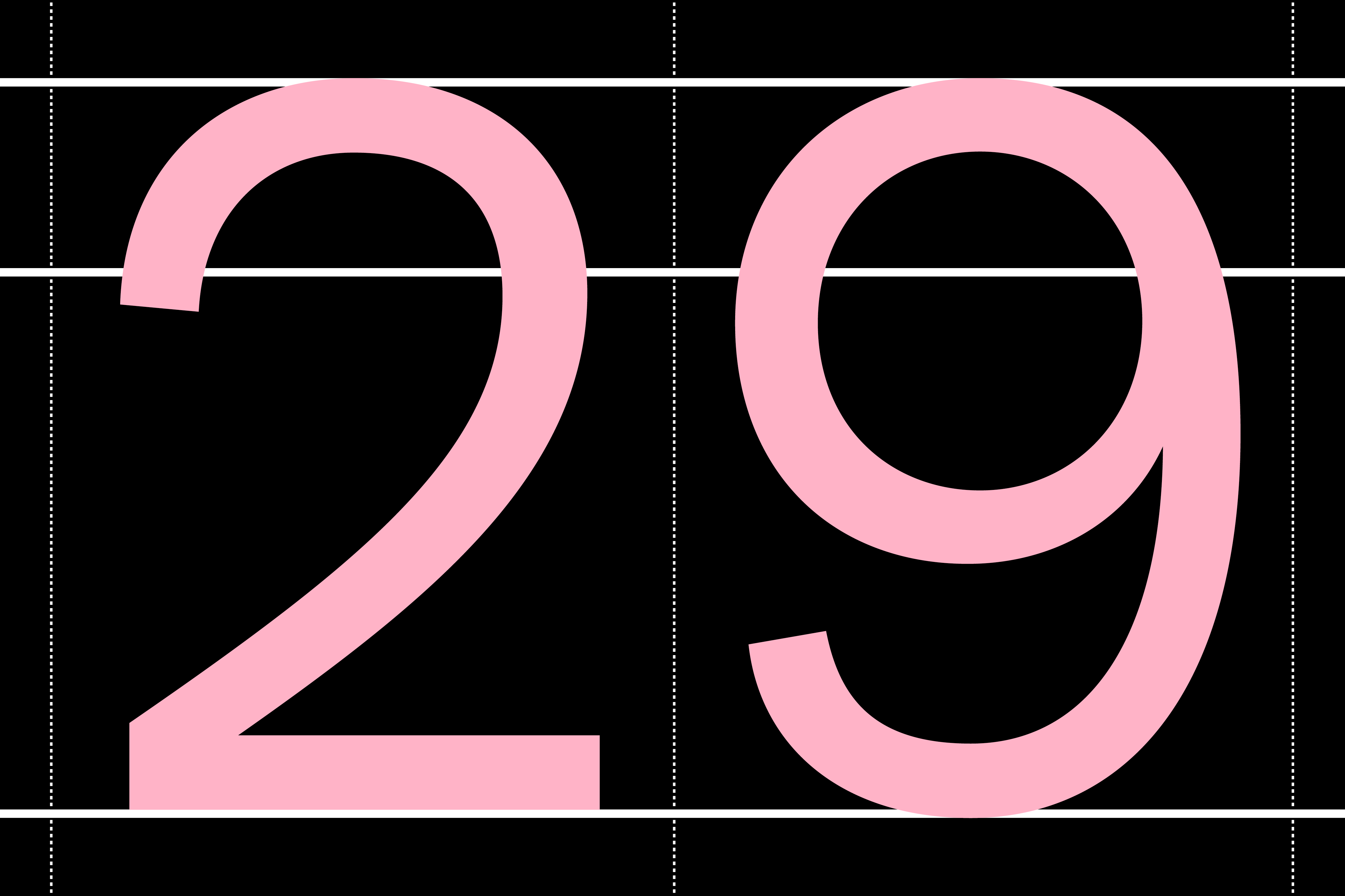
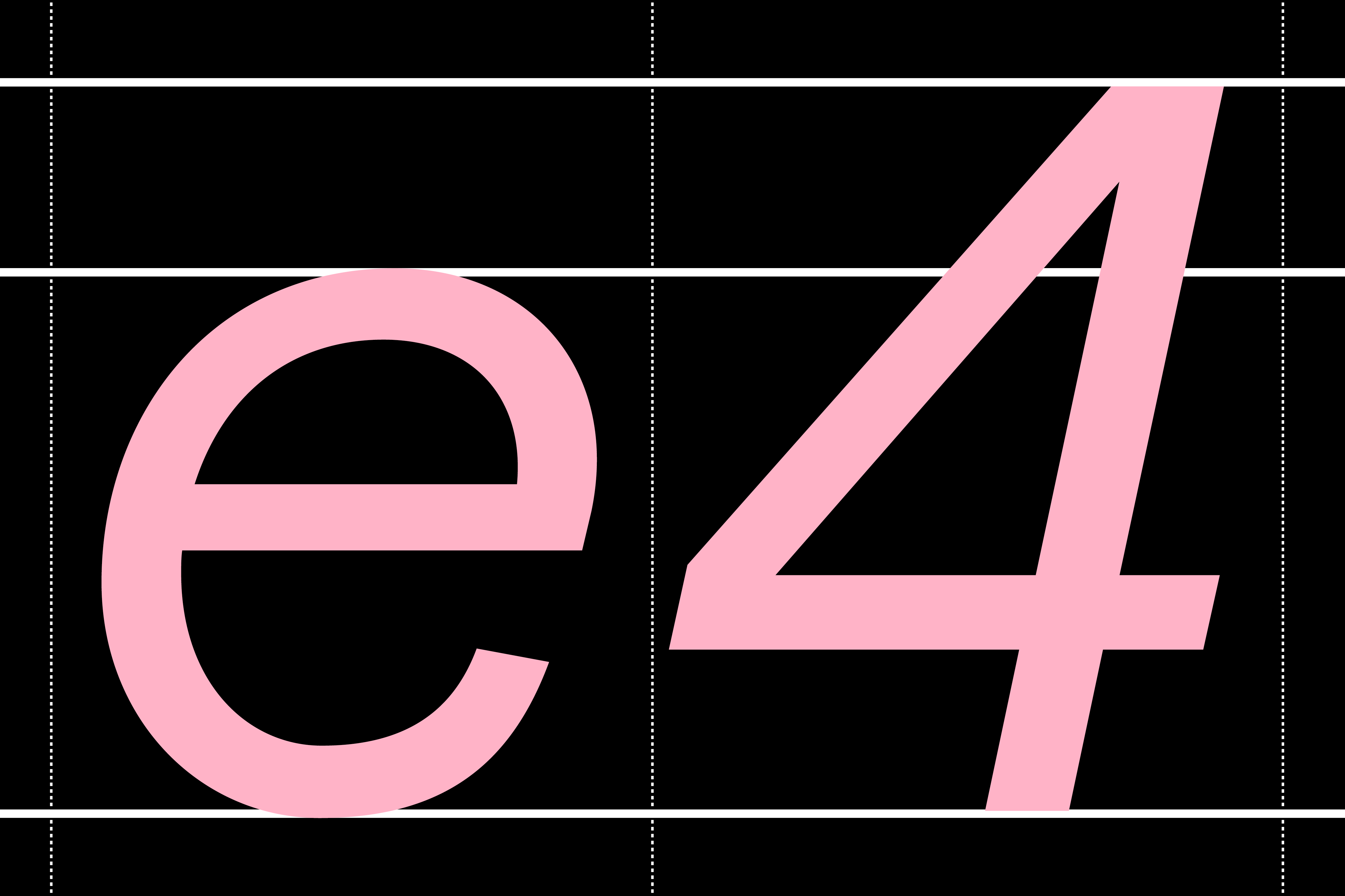
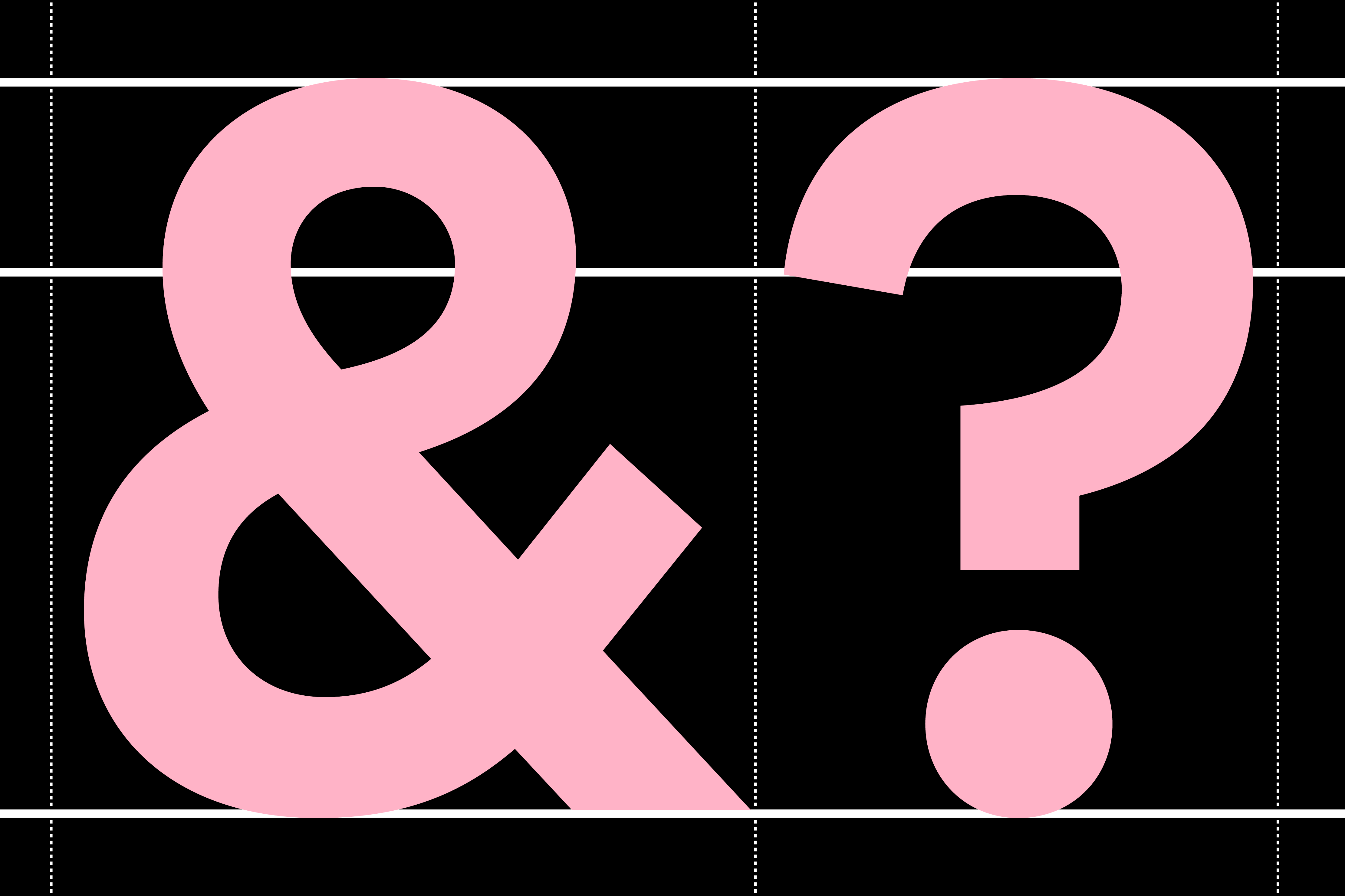
Raised ascenders, a generous x-height, and geometry-retention in forms like the ‘C’, ‘G’, and ‘O’ all enable coherence between the existing type (utilised for headlines) and the new (used at all other scales). Aware of the heavy typographic lifting expected the realms of finance and analytics, numerical data was sure to play an important part in the overall role of the type; numbers, therefore, were drawn to reflect a discreet playfulness that manages to maintain delight amidst mathematical tedium.
Recent Custom Projects
View all

Let’s Work Together
To talk to us about your project, please get in touch.
