)
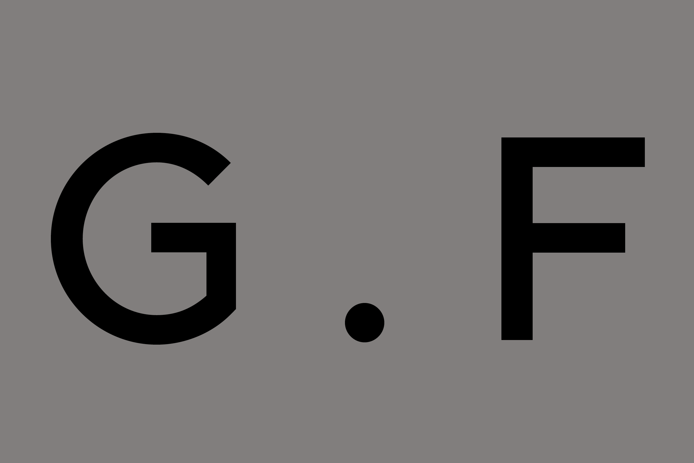
G . F Smith
We began our typographic work for the well-regarded paper merchants G . F Smith creating a tongue-in-cheek ‘paper’-weight type for their most popular and wide-ranging offering: Colorplan. The Bold-weight G . F Smith Type was commissioned as a follow-up nearly a year later in tandem with an identity overhaul by collaborators Made Thought.
- Typeface
- G . F Smith, Colorplan Paperweight
- Comissioner
- Made Thought, London
- Year
- 2013 — 2014
- Styles
- 2 Styles: Light, Bold
- Coverage
- Latin-A Encoded
- Classification
- Sans Serif
- URL
- gfsmith.com
- madethought.com
Colorplan
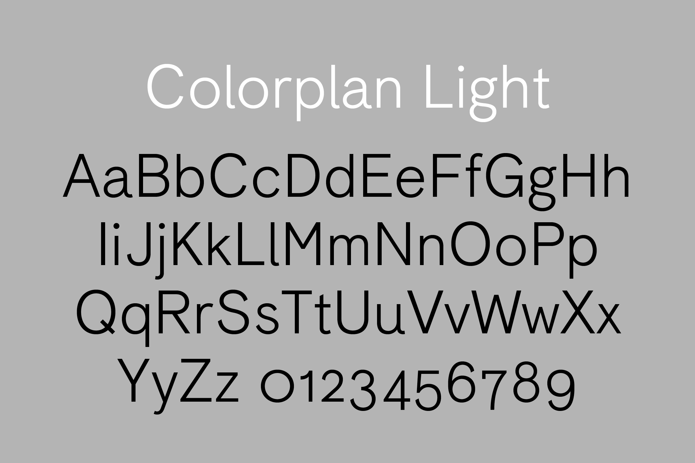
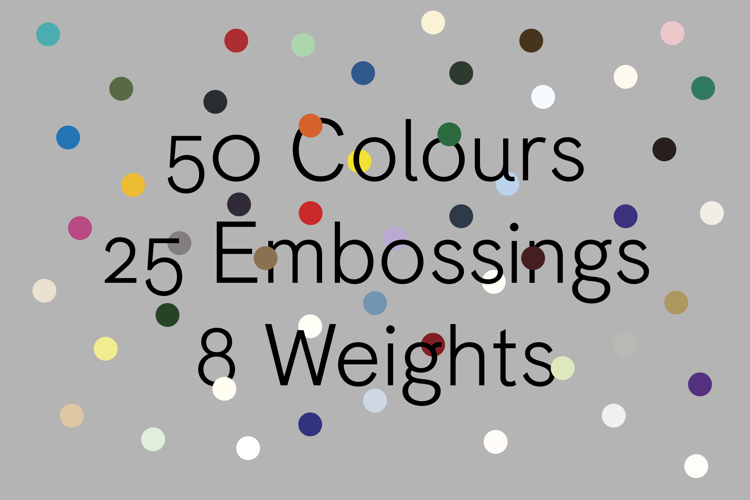
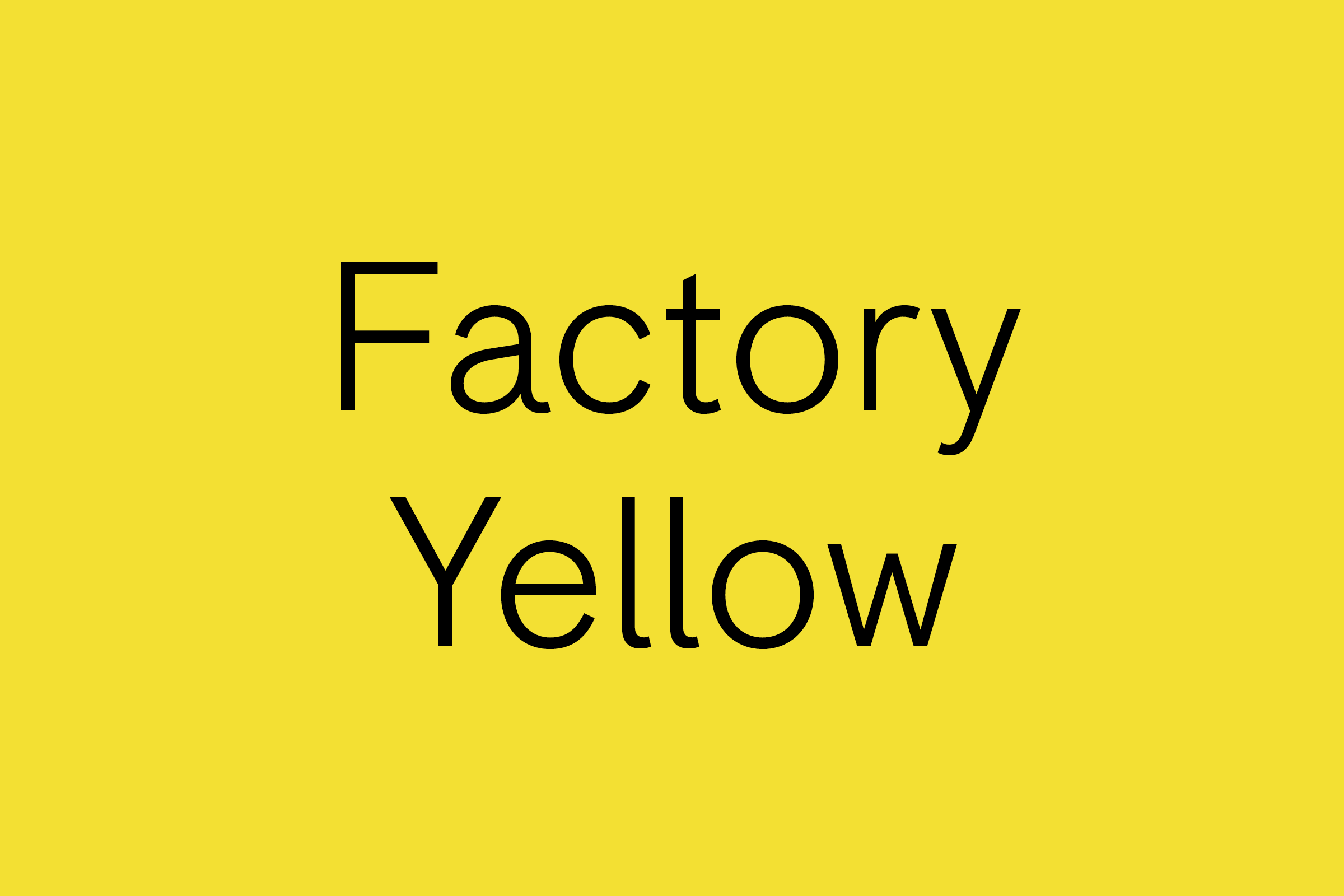
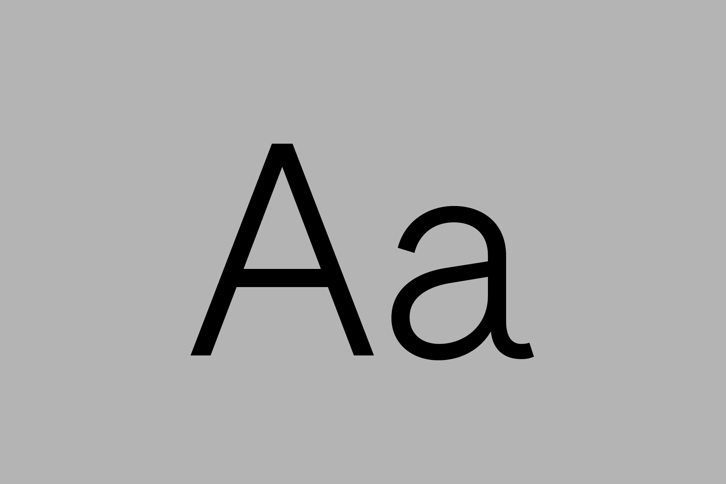
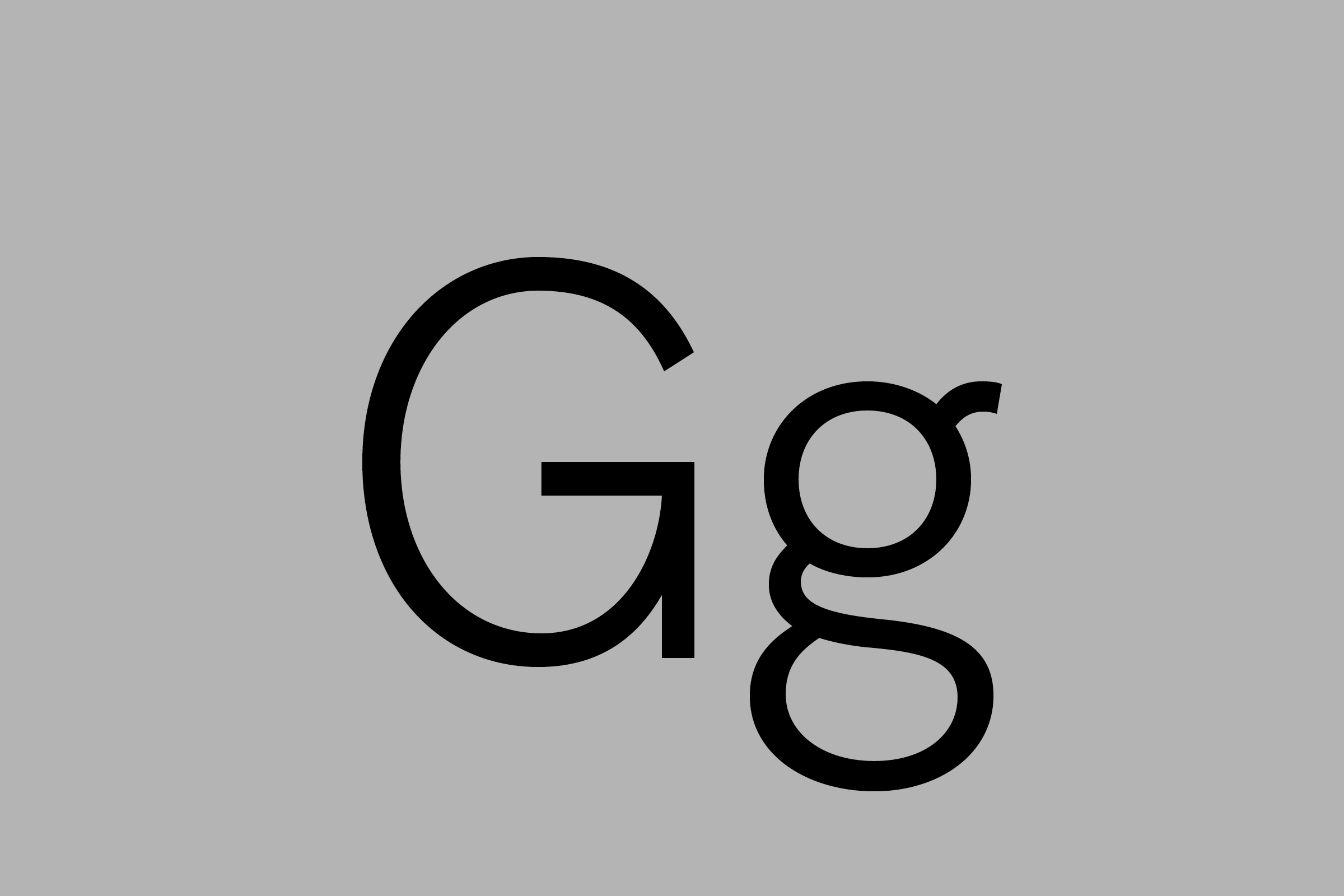
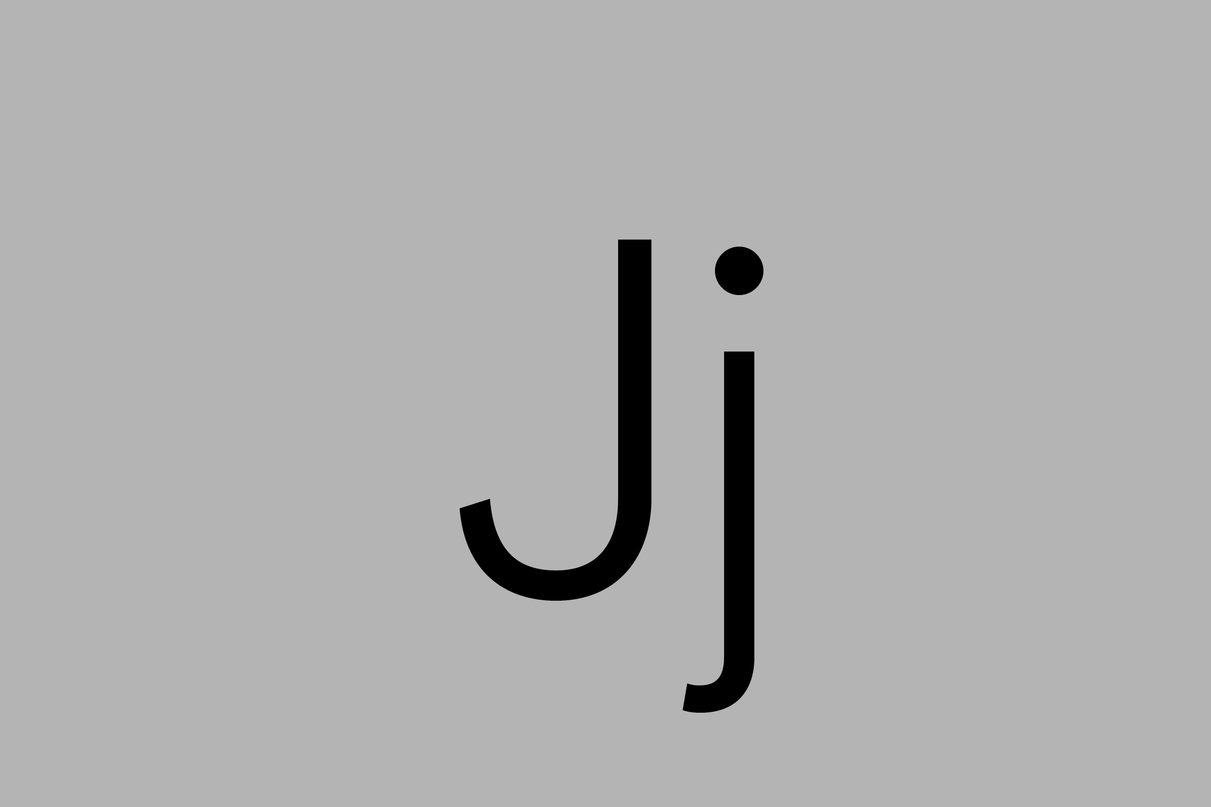
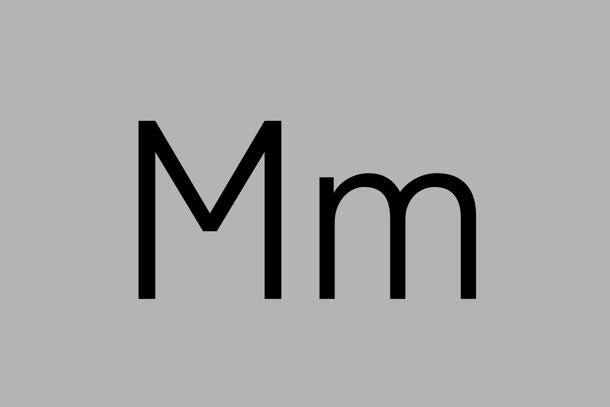
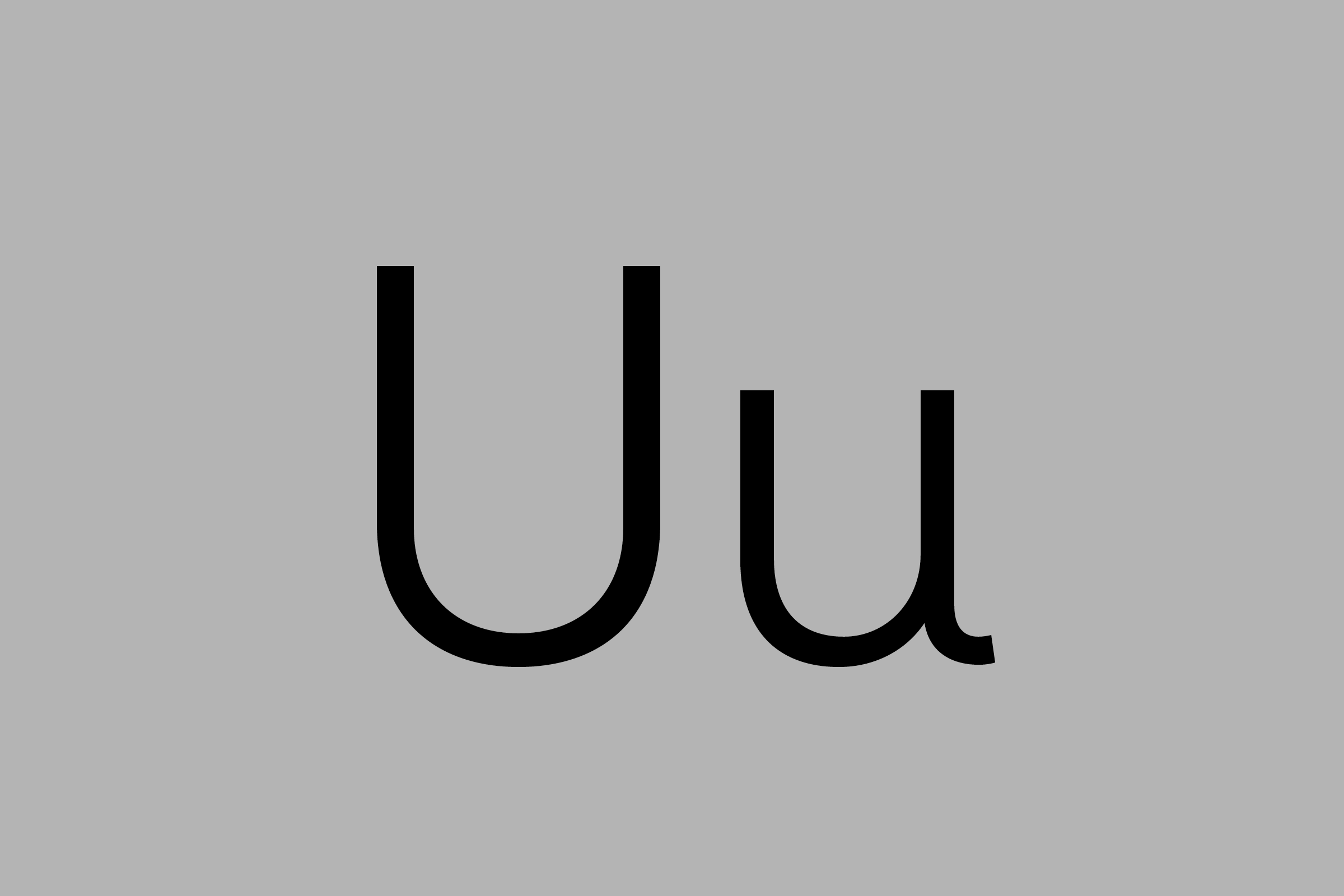
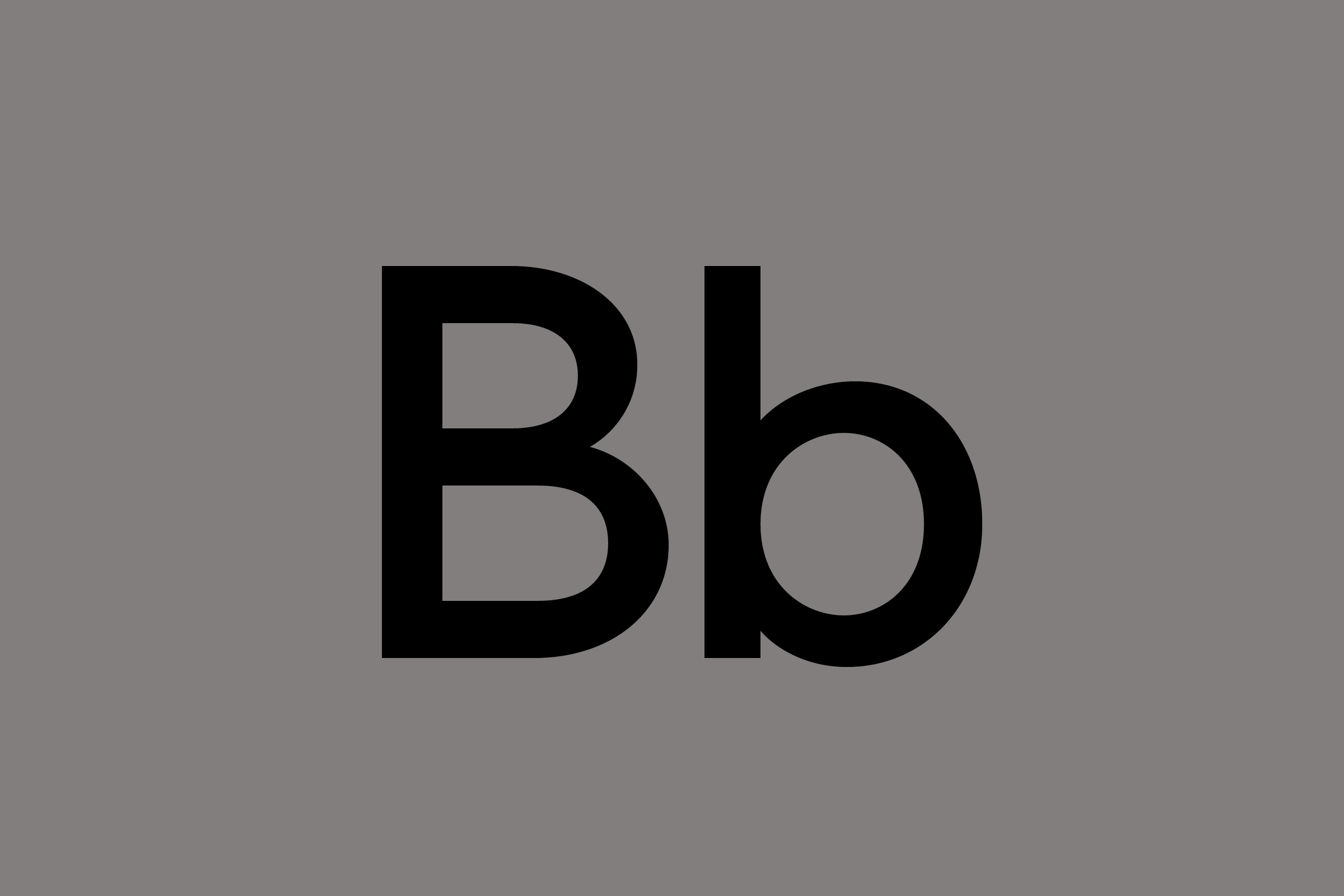
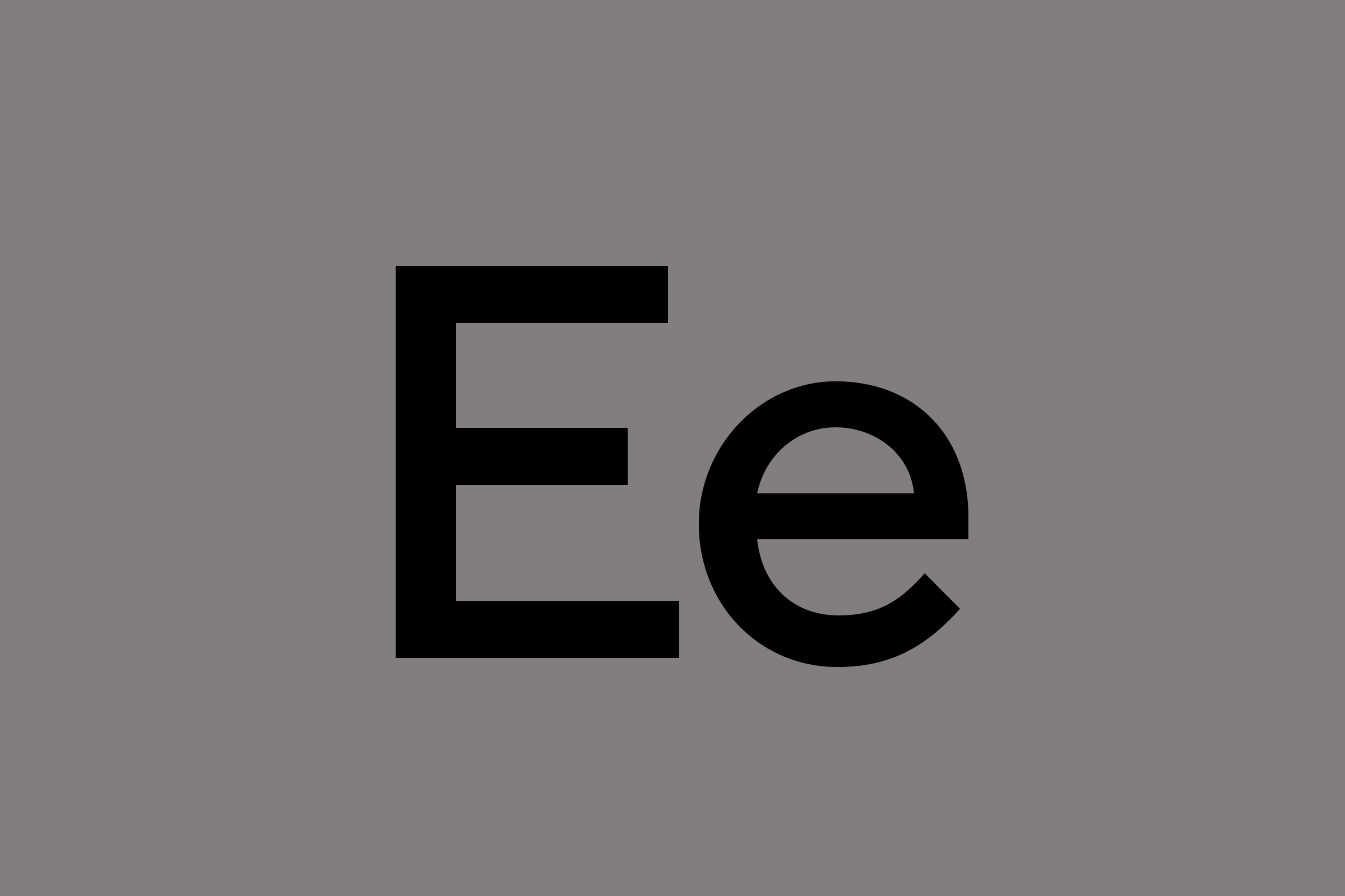
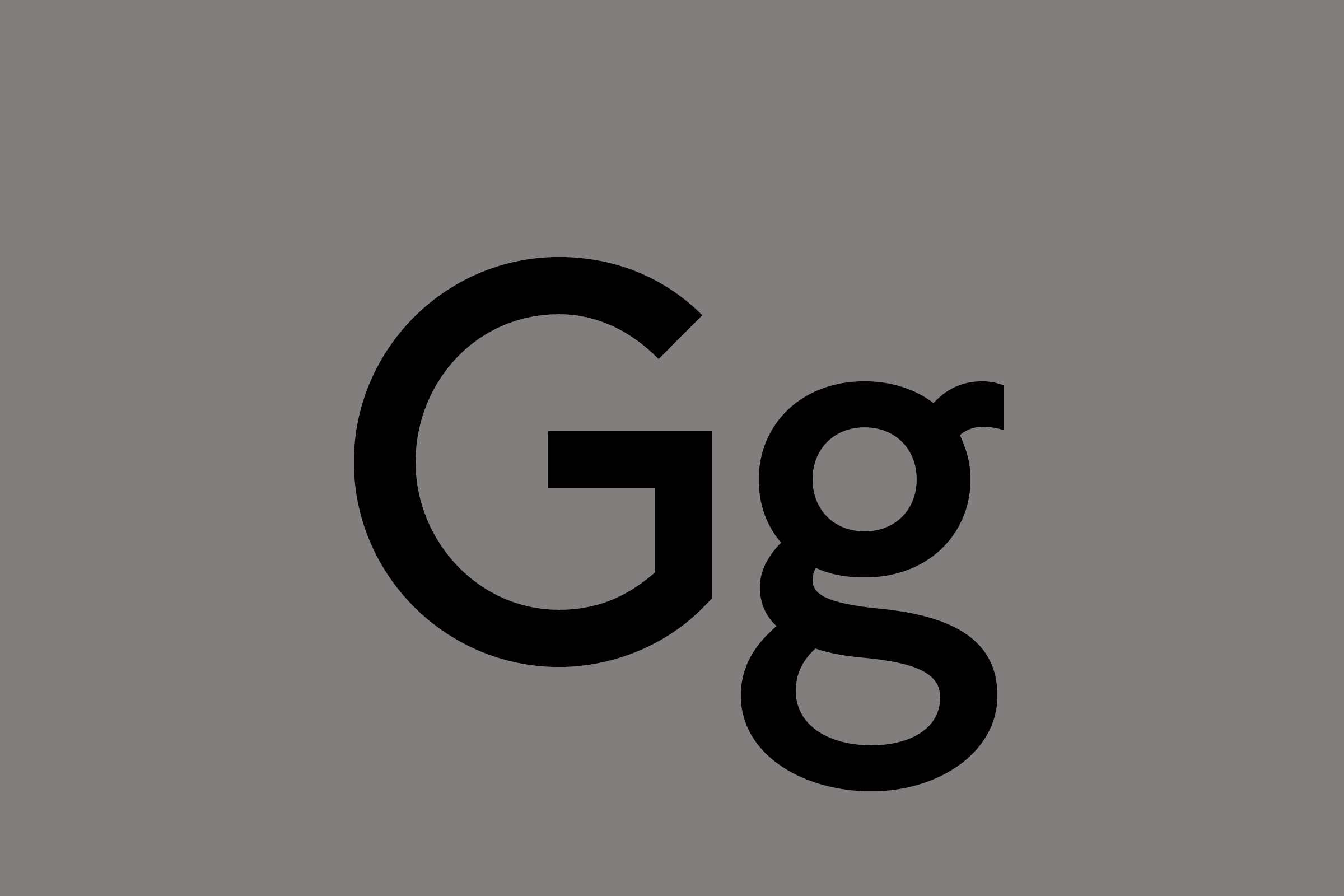
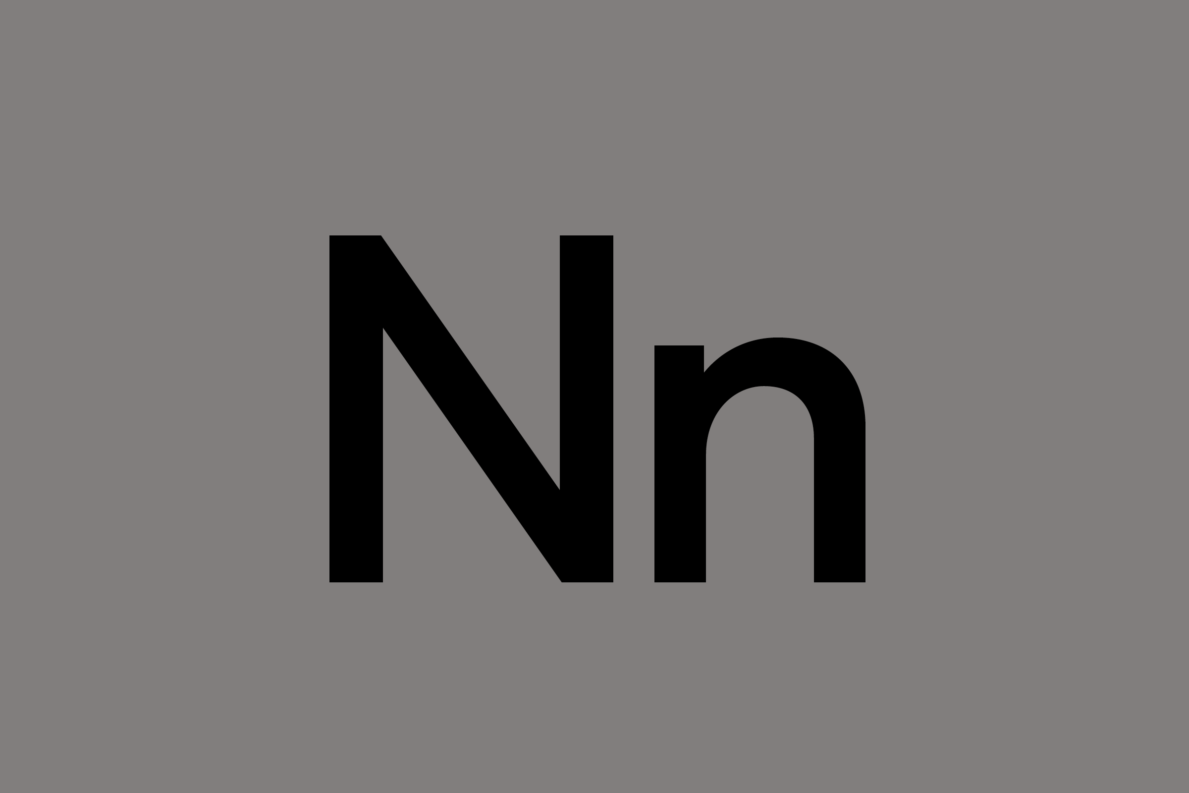
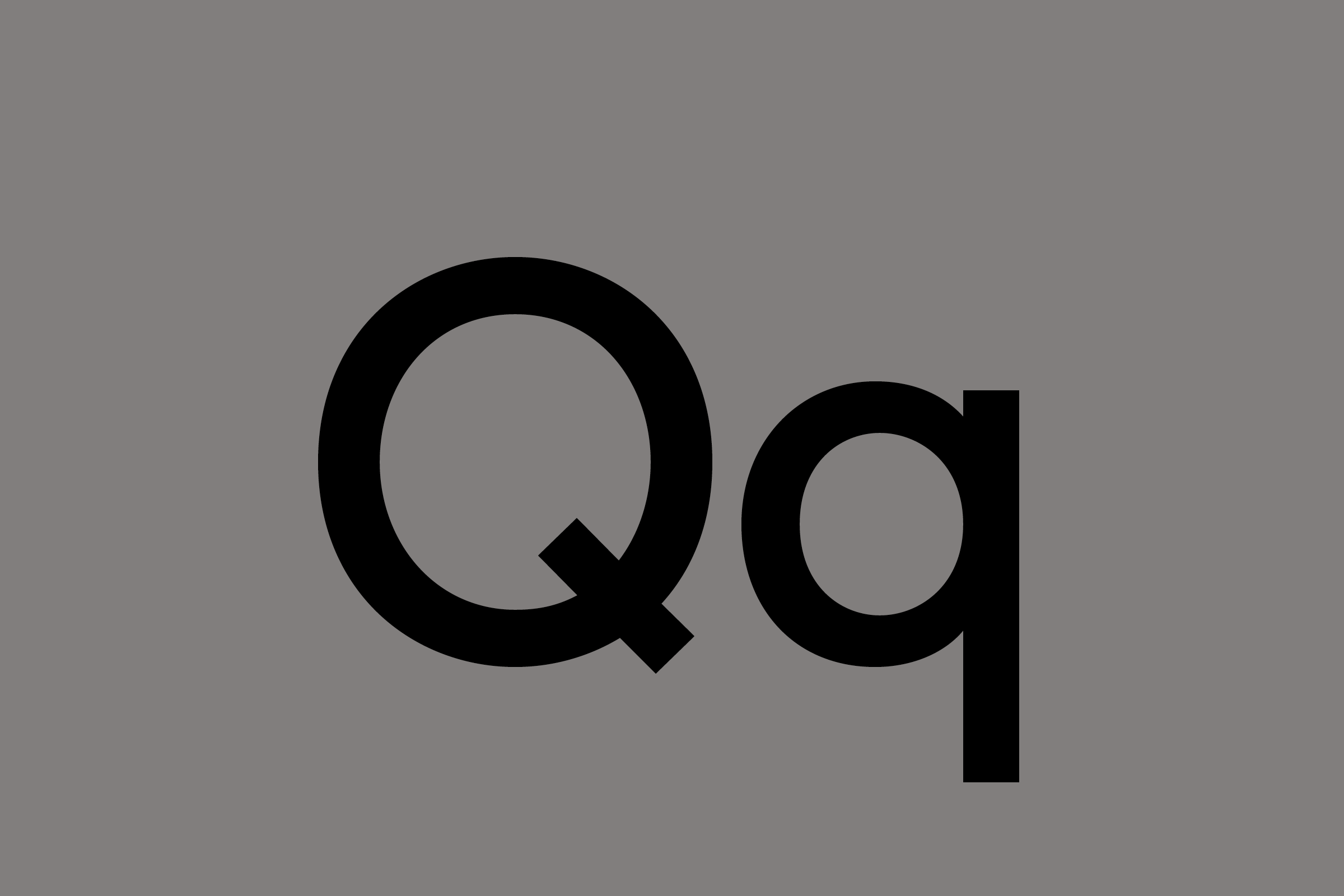
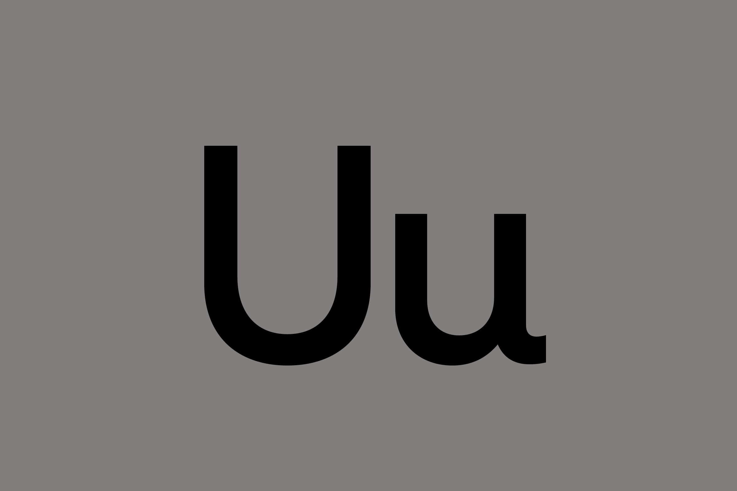
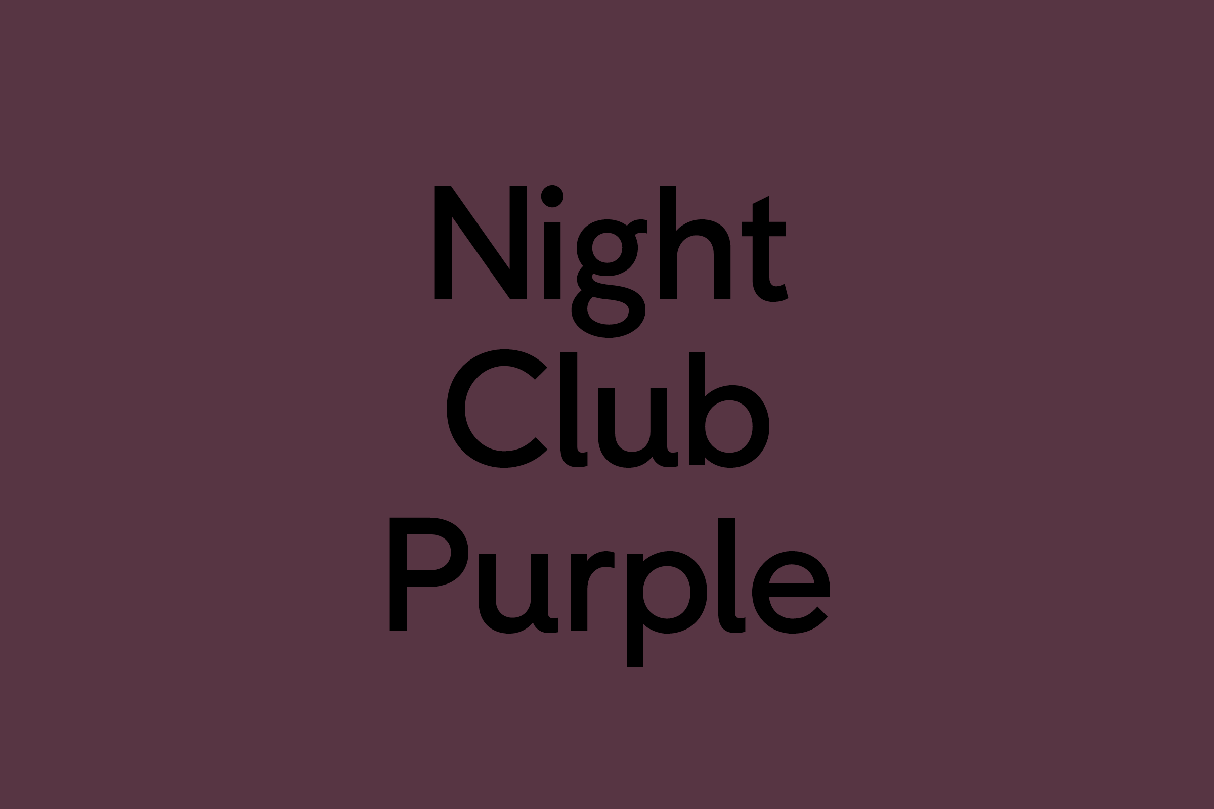
Beginning work on Colorplan in 2013, Colophon focused first on the letters that would comprise the brand’s new logo mark, arriving early at a distinct set of forms that would inject the proper amount of simultaneous gravitas and lightness for the 50-color range: playful flicks on the dual ‘l’ characters, a mirroring of that behavior on the lowercase ‘a’, and generous apertures in the case of ‘o’ and ‘p’ letterforms.
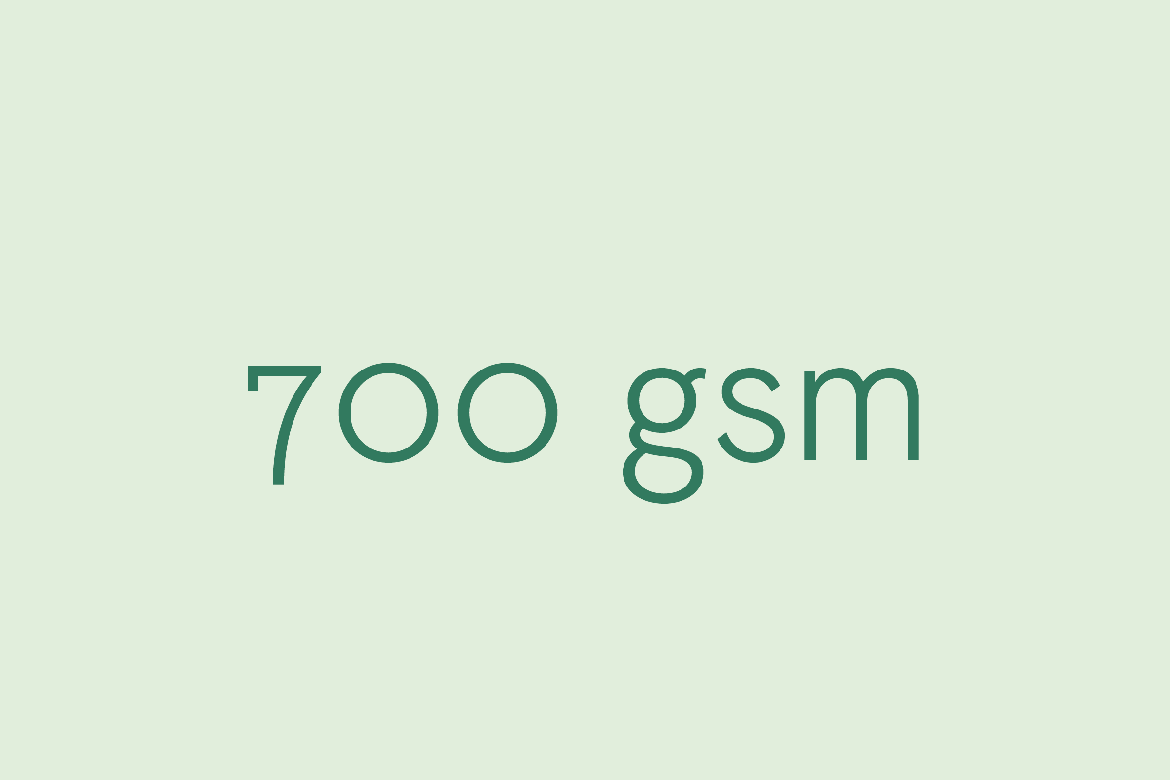
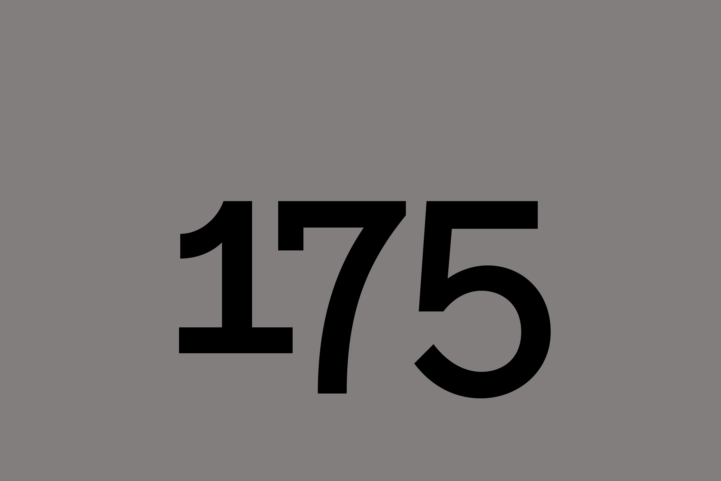
In addition, the Colorplan product line dictated certain typographic behaviors: when numbers act as a stand-in for tactility in promotional material, the type must embrace those settings in kind. For instance, the innate delicacy of a well-milled text stock may be conveyed to the customer simply as ‘100gsm’ (Grams per Square Meter). This numeric necessity prompted the creation of special old-style (or non-lining) numerals, which not only increase legibility of this technical data, but also introduce classical elements into an otherwise contemporary setting.
)
)
G . F Smith
Nodding to the canon of 20th century British realist types — in particular the sans serif works of Edward Johnston and Eric Gill — we ultimately crafted an understated, refined, light-weight face that would function elegantly across promotional materials and printed collateral, which the typography-centric brand creates regularly to showcase its offerings.
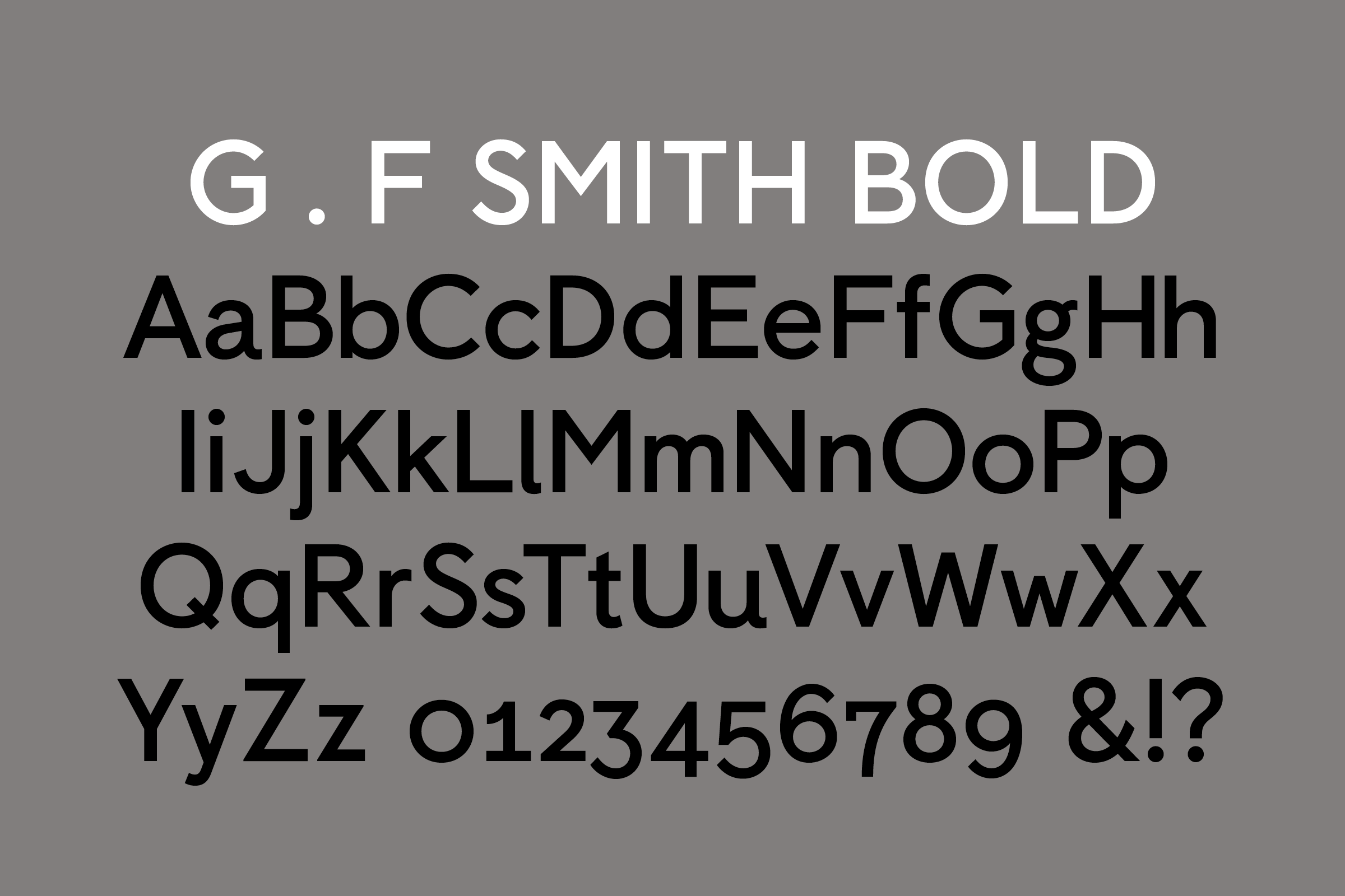
Later expanded into a Bold weight, the initial one-weight approach encouraged consistency across the Colorplan micro-brand while also acknowledging the inherently visual nature of the offering: in providing a focused palate with just one initial typographic variable, the type deferred to the abundance of colors, textures, and weights that otherwise define the company’s product range. G. F Smith Bold, commissioned in 2014, builds on the equity of Colorplan Paperweight, allowing for more varied brand expression while maintaining a still understated branding system.


Recent Custom Projects
View all

